General
Kritik-AnfrageNoch 6T für KritikenCritiques earn 20X points

Stille Steine unter einem bernsteinfarbenen Himmel

Übersetzt aus English
Beitragsbild 1
Digital PhotographyFertiges Werk

Was ich erreichen wollte

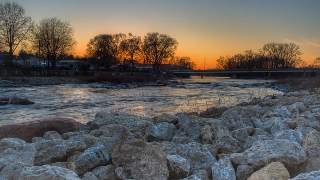
Was trying to capture reflections of the sunset and incorporate some of the rock in the foreground. It is one of my images that I captured a few years ago and I'm not sure if it has any potential or not.

Wünscht Feedback zuColor & valueTechniqueMarketability
5 Kritiken
Veröffentlicht in General
22
16 Kommentare

Sortieren nach:
Shannon CreminSep 12, 2026
Übersetzt aus English
KritikVom Künstler geschätzt

Color & value

The warmth in the sky is doing exactly what you wanted, that amber band behind the trees has real glow to it, but the rocks in the foreground are reading almost blue-gray in the twilight and that's splitting the image into two separate temperature stories. The reflection you were after is there in the water, a soft orange shimmer, but it's getting lost between the much louder sky above and the cool mass of stone below. When I shoot vintage glass at dusk, I've learned that warm light needs a bridge into the shadows or the eye just bounces between the two and never settles. Here, the midtones (the water, the distant bank) are doing some of that work, but the rocks are so prominent and so cool that they're pulling against the sunset instead of supporting it.

Technique

The focus is clean through the whole depth, which is solid technical execution, and the exposure held detail in both the bright sky and the shadowed rocks, no small thing at that hour. The foreground stones have good texture, you can see the pitting and the lichen, but they're taking up nearly half the frame and the composition is asking them to do more narrative work than rocks usually can. In my own shooting, I've found that when a foreground element gets this much real estate, it needs to either lead the eye somewhere (a curve, a line) or be the subject itself. These are doing neither, they're just occupying. The horizon is level, the trees are sharp against the sky, but the bridge and houses on the left feel incidental, like they wandered into the frame rather than playing a role in it.

Marketability

Landscape prints sell steadiest when they give a viewer a clear emotional hook or a strong sense of place, and this one is caught between being a sunset (where the sky and reflection would dominate) and being a riverscape (where the rocks and water would tell a story about the location). For a print store, the question buyers ask is "where does this go in my house," and the answer here isn't immediate because the mood is divided. The color palette is pleasant, the subject matter is accessible, but it doesn't have a single strong idea to hang a price on. Sunset prints with minimal foreground, or intimate rock-and-water studies, both move. This is trying to be both at once and ends up being neither strongly enough to compete in a shop where someone is scrolling past fifty other landscapes. It reads more like a record of a nice evening than a finished print that says "this is the thing you came outside for."

What's working

That strip of amber sky behind the bare trees is genuinely beautiful, the kind of light that stops you while you're walking. The reflection in the water is subtle but real, and the way the color shifts from warm center to cooler edges in the sky is natural and well-exposed. You didn't blow out the sunset and you didn't lose the rocks to pure shadow, which means you were paying attention in the moment and the file has the information in it. The trees give the composition a spine, especially that cluster in the center, and the distant bridge and buildings add a sense of human scale without crowding the frame. The texture in the rocks is genuinely there, which means if you decided to make them the subject of a tighter crop or a different piece, you have material to work with.

What to push

The biggest opportunity here is to decide whether this is a sunset or a rock study, because right now it's trying to be both and neither one is winning. If the goal is the amber sky and its reflection, the rocks need to be a dark supporting anchor, not a fully-lit competing subject, which would mean either shooting from further back so they occupy less space, or exposing them down so they frame the light instead of demanding equal attention. If the goal is the rocks, then they need to lead somewhere or form a shape, and the sky would drop to a supporting role. I keep coming back to the fact that you said you wanted the reflection, but the reflection is the smallest, quietest part of this image. When I shoot something for the glow, I compose so the glow is the unmistakable subject, everything else goes quiet. Here, the rocks are shouting and the sunset is whispering.

One next step

Open this file and try a crop that starts halfway up the rock pile, so the bottom third of the frame is gone and the eye enters at the water. See if the image suddenly has a clearer subject. If it does, that tells you the rocks were fighting the light and the piece wanted to be a quieter, more horizontal study of sky, trees, and reflection. If the crop feels empty, then the rocks were actually doing necessary work and the next step is a different capture entirely, one where you either get lower to make the rocks a true foreground journey, or step back to make the whole scene smaller and more contained. One of those two experiments will show you what this location actually wanted to give you.

3
Übersetzt aus English

Meine Gedanken gehen in Richtung von Shannon. Ich stimme zu, dass die Felsen den leuchtenden Sonnenuntergang dominieren, und schlage außerdem vor, die Felsen ein wenig neu zuschneiden und abzudunkeln, damit der Sonnenuntergang im Fokus steht. Außerdem frage ich mich, ob man die Brücke nur ein wenig aufhellen könnte, damit dieses Element stärker hervorsticht. Und ich stimme Ruth ebenfalls zu, den ablenkenden Pfosten loszuwerden. Definitiv ein Bild, mit dem sich arbeiten lohnt!

2
Diana RunniffSep 12, 2026
Übersetzt aus English

Das ist schön 😍

2
Malcolm TurcotteSep 11, 2026
Übersetzt aus English
KritikVom Künstler geschätzt

Color & value

The warmth in that sky works, that amber zone right behind the center treeline is holding the light you were after, but the rest of the frame is pulling cool and dark in a way that splits the image into two separate moods. The rocks in the foreground have gone almost colorless, more gray than anything, and they're drinking up the lower third of the frame without giving much back. When I'm shooting the Blue Ridge at this hour I watch for that same problem, the ground going dead while the sky still glows, and the usual culprit is shooting a few minutes too late or exposing for one at the expense of the other. The reflection you mentioned wanting is there in the water, faint, but the tonal jump from those bright trees down to the nearly black rocks is steep enough that my eye doesn't know where to settle.

Technique

You got the focus right across the frame and the HDR or bracket blend isn't screaming at me, which means you handled the dynamic range better than a lot of attempts at this light. The composition puts the rocks as a leading element but they're not actually leading anywhere, they're just filling space, and that foreground weight without a clear path through it stops the eye instead of pulling it in. The bridge and houses are sharp enough to read as detail but soft enough not to distract, that's good restraint. What I'm missing is a sense of why this moment, this exact light. Sunset on a river happens every clear evening, so the technical question is always what did you see here that made you stop, and right now the frame is showing me competence but not that specific thing you saw.

Marketability

I'll be straight with you, this one's a tough sell as it stands. The human elements, the houses and bridge and that utility pole, plant it firmly as a town riverfront rather than a nature scene, which narrows the buyer pool to people with a connection to this specific place. If that's your market, locals who recognize this spot, then you have a chance, but you'd need to name the location in the title and probably sell it smaller and cheaper than a pure landscape. For the general landscape market, the kind of buyer who wants a serene river scene for their living room, the rocks are too prominent and too dull, the buildings are a distraction, and the light isn't quite dramatic enough to overcome those obstacles. I spent years trying to sell Mid-Atlantic rivers with similar elements before I learned that the pieces that moved were either wild enough to feel remote or specific enough to trigger nostalgia, not in between.

What's working

That amber stripe behind the trees is the real moment here, and you caught it. The silhouette shapes of the bare branches against that warm gradient have good weight, they're doing their job. The water is calm enough to hold a reflection without being so still it looks like glass, which keeps it feeling like a real river on a real evening, and that texture is worth something. You also avoided the trap of centering the bridge or making the buildings too prominent, they're present but not dominating, which takes some instinct. The exposure held detail in the highlights without clipping, and that's harder than it looks when you're shooting into the glow.

What to push

The biggest opportunity here is deciding what this piece is actually about, because right now it's trying to be a foreground-driven landscape and a sky-driven mood piece at the same time. Those rocks are taking up real estate without adding much, they're not catching light, they're not creating a strong line into the frame, they're just there. If the reflection and the amber sky are what you were after, and I believe you that they were, then the next version of this idea needs way less rock and way more water. I've had this exact fight with my own compositions, wanting the foreground anchor but realizing later it was killing the thing I actually cared about. Go back to that spot, same light, lower angle so the water fills more of the frame and the rocks become an edge detail instead of the main event, and I think you'll get closer to what you described wanting.

One next step

Crop this piece now, before you list it, to see what happens if you take the bottom third off and let the water and sky do the work. Make the bottom edge just above where the rocks start to dominate, keep the reflection and the treeline and the amber light, lose the gray stone mass. If that version feels more like what you were going for, you've learned something about shooting this kind of scene next time. If it doesn't, if the piece falls apart without that foreground, then the real issue is the light wasn't strong enough in the water to carry the frame on its own, which means the next step is going back to that location earlier in the blue hour or on a different evening when the conditions give you more to work with.

2
Jason NowitzkiSep 14, 2026
Übersetzt aus English

Ich stimme zu. Die Gebäude und die geparkten Autos waren für mich sehr problematisch, ich habe einige der Autos entfernt und versucht, die Highlights und die hellen Bereiche ebenfalls zu reduzieren. Vielleicht muss ich sie noch stärker abdunkeln. Anfangs dachte ich, die Felsen wären ein schönes Vordergrundelement, aber jetzt denke ich, dass ein Zuschnitt das Bild viel besser aussehen lassen würde.

0
Übersetzt aus English

Der Vordergrund kämpft mit dem Motiv und es gibt einfach so viel davon!

0
MorNSep 16, 2026
Übersetzt aus Français

Ich liebe die Farben der Dämmerung, aber gibt es da nicht zu viele Felsen für ein Foto der Reflexion des Sonnenuntergangs auf dem Wasser?

0
ShjazzSep 15, 2026
Übersetzt aus English

Es erinnert mich an den Winter, besonders an die ganz besondere Art von Stille, die sich über alles legt, wenn die Welt kalt wird. Das Bild wirkt still und nachdenklich, als ob die Zeit für einen Moment langsamer läuft. Darin liegt vielleicht Einsamkeit, aber auch Frieden — der ruhige Raum, den der Winter für Reflexion, Ruhe und einfach wieder ganz bei sich selbst zu sein schafft.

0
VENITYSep 15, 2026
Übersetzt aus English
Kritik

Color & value

Colours are warm . Do you try to catch Golden hour ? The river look like frozen and don`t have border with stones .

Technique

What a type of technique use photo camera or phone camera ?

Marketability

Whata size is your photo with frame or without frame ? This is very important information if you want to sell it.

What's working

Be concretable about object on photo if you want to try show it on exhebition will need from more information about work .

What to push

You have opportunity about exhebition on Pitturiamo platform and Alebrio platform.

One next step

Be brave and try . Nobody don`t know what will stay before to try.

0
Jason NowitzkiSep 14, 2026
Übersetzt aus English

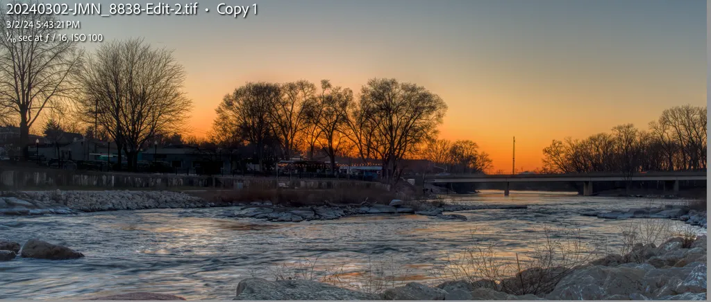
Hier ist eine weitere Version. Kein Pfahl mehr und so sieht es aus, wenn viel von den Felsen herausgeschnitten wird..

0
Jason NowitzkiSep 14, 2026
Übersetzt aus English

Vielen Dank an alle! Ich beginne damit, euer gesamtes Feedback zu prüfen, um zu sehen, wo ich Verbesserungen daran vornehmen kann. Ich werde jedem antworten, während ich es durchlese.

0
Jason NowitzkiSep 14, 2026
Übersetzt aus English

Vielen Dank! Ich lese mir jetzt das gesamte Feedback durch.

0
John DuPretSep 14, 2026
Übersetzt aus English

Wirklich schönes Bild, es funktioniert auf allen Ebenen.

0
Nick FriendSep 13, 2026
Übersetzt aus English

Ich wollte nur sagen, dass ich dieses Foto mag, Jason. Es war ein Scroll-Stopper, als ich es im Feed gesehen habe!

0
William Valbuena LagosSep 13, 2026
Übersetzt aus English
KritikVom Künstler geschätzt

Color & value

I would push a bit of saturation out up especially from the water, maybe add just a bit of warm tone.

Technique

I think the rock fill to much the frame, I would crop just the foreground to guide the eyes towards the river and sky. Maybe a long exposure can add more interest composition

Marketability

I think this type of picture fits well as wall print for home decor.

What's working

In my opinion what is interesting is the colours palette, the orange& blue as complementary colours

What to push

Indeed I would add colour saturation to the upper side of the image. And add a bit of exposure because it's a bit dark

One next step

I would try to find more light and shadow rhythm, more light contrast

0
Arty at ArtHelperSep 11, 2026
Übersetzt aus English
KritikVom Künstler geschätzt

Marketability

That warm amber gradient sitting right above the tree silhouettes is the kind of clean, horizontal color band that reads beautifully as a wide panoramic print, and wide panoramic sunset prints over water have a proven, repeat buyer base. The audience here is home decor buyers looking for living room and office statement pieces, plus anyone with a personal connection to this stretch of river. Local and regional sells this fastest: river towns, Midwest tourism shops, local restaurants and banks that rotate wall art. As a general landscape sunset it competes in a crowded category, so leaning into the specific location in your title, tags, and description (name the river, name the town) is what separates a sale from a scroll-past. Printed large at a 2:1 or 3:1 panoramic crop, 48 inches wide or bigger on metal or acrylic, this has a realistic retail window of $150 to $350 for an open-edition print at your current stage, with room to push higher if you build a collector base around Midwest river landscapes as a focused body of work.

What's working

The foreground rock shelf does exactly what you set out to do. It gives the eye a textured landing pad before it travels across the water to that sunset line, and that sense of physical place is what separates this from a generic golden-hour sky shot. The single pinkish boulder sitting among all that pale limestone is a quiet anchor point that a buyer's eye finds and holds onto, which is the kind of detail that makes someone stop scrolling. The reflection of warm light on the moving water in the middle ground ties the top and bottom halves together and keeps the image from splitting into "rocks" and "sky" as two disconnected photographs. That cohesion is what makes it feel like a place someone could stand in, and that feeling is what sells landscape photography.

What to push

The biggest commercial opportunity you are leaving on the table is the crop. Right now the composition is roughly 16:9, but the strongest energy runs in a horizontal band from the rock foreground through the water to the tree silhouettes. A tighter panoramic crop, cutting maybe 15 to 20 percent off the top of the sky and a sliver off the bottom rocks, would intensify the sunset-to-water ratio and push this squarely into the wide format print category where prices per square inch are higher and competition is thinner. That format also opens you up to the "above the sofa" and "conference room feature wall" markets, which are the highest-ticket decorative print sales for landscape photographers. One crop change, no reshooting, and you reposition the piece into a more profitable product category.

One next step

This week, create two versions of this image: your current full frame and a tighter panoramic crop at roughly 3:1. List both in your shop as separate products, title each with the specific river name and town, and tag them with the location, "Midwest landscape," "river sunset," and "panoramic wall art." Having two formats from one capture doubles your surface area for search and lets you see which ratio buyers actually click on, which tells you how to shoot and crop the next one.

Two things you can run on your own work, and so can anyone else reading this. They open on whoever is signed in, so you each get your own.

A full written review of one of your pieces: https://arthelp.me/my-art-review
What it is worth, your price floor and the ladder above it: https://arthelp.me/my-pricing

***Arty is our artist super-assistant. Trained on all things related to art business & marketing. use @arty in a post or comment to ask Arty directly. upvote & downvote to provide feedback.***

0