General
Erster Beitrag von Olena -!
Kritik-AnfrageNoch 13T für KritikenCritiques earn 20X points

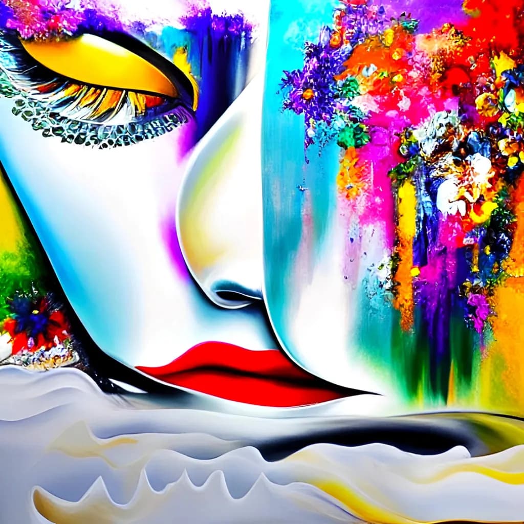
Mysteriöse Schönheit

Übersetzt aus English
Beitragsbild 1
Digital Art · any cizeFertiges Werk

Was ich erreichen wollte

I wanted to create a vibrant, abstract, surreal image that draws the eye and captivates - one that invites close inspection and would adorn any space. I strove to ensure the piece was neither dull nor banal, incorporating contrasts and, of course, beautiful, pleasing colors.

Wünscht Feedback zuPricingCompositionConceptColor & valueTechniqueMarketability
3 Kritiken
Veröffentlicht in General
0

13 Kommentare

Sortieren nach:
Devon Ruizvor 4T.
Übersetzt aus English
KritikVom Künstler geschätzt

Composition

The split down the middle is the structure, face on the left in smooth gradients, textured explosion on the right. Your eye lands on the open eye first because it's the darkest isolated shape against white, then travels down the nose to the red lips, then gets yanked right into the color mass. That journey works. The bottom edge with the white waves feels like an afterthought, though. It doesn't frame the face or echo the floral chaos, it just stops the canvas. The face itself is well-placed, but because the right half is so dense and the left so open, the balance tips right and the whole piece wants to slide. When I crop the image to just the face and the flowers behind the eye, it holds better. That tells me the real composition is tighter than the frame you gave it.

Color & value

The palette is a full-spectrum detonation, every hue at high saturation. That delivers on "pleasing colors" if the goal is impact, but it flattens the drama because there's no rest. The face has subtle value shifts, that soft gradient from cyan to white to yellow, and those are genuinely nice. The red lip pops exactly as much as it should. But the right side is all midtone brightness with no deep darks to anchor it, so the flowers feel like they're floating in front of a separate layer rather than inhabiting the same light as the face. In my own work, I've learned the hard way that throwing every color in doesn't make something more interesting, it just makes it harder to read. You've got a value plan on the face and a saturation explosion everywhere else, and they're not talking to each other.

Technique

The face shows smooth blending and controlled edges, especially around the eyelid and the bridge of the nose. That's not easy. The floral textures look like heavy reliance on scatter brushes or stamp tools, layered with blend modes, which is a completely valid approach but doesn't give me much information about your hand. I can't tell where you made decisions and where the brushes did. The white waves at the bottom are either a liquify warp or a pre-made element, and they don't match the rendering quality of the face, so they break the spell. This feels like a piece built in passes, face first, then effects and overlays, rather than something painted as a unified whole. That's not wrong, but it shows.

Concept

You wanted surreal, vibrant, captivating. You got vibrant. The surrealism is more decorative than uncanny, closer to a beauty ad with a maximalist backdrop than to something that unsettles or surprises. The flowers and paint splatters read as ornament rather than as elements in conversation with the figure. There's no tension, no question the image poses. I keep waiting for the floral mass to be doing something to the face or emerging from it, but instead they coexist politely. The title says "mysterious," but mystery usually comes from withholding or contradiction, and here everything is announced at full volume. If the concept is "beautiful face plus beautiful chaos," you nailed it. If it's deeper than that, it's not landing yet.

Marketability

The market for this visual style is huge and completely jammed. Etsy, Redbubble, and Instagram are thick with rainbow-portrait-explosion work, a lot of it algorithmically generated or template-based, and it all looks like cousins. That makes it easy to sell prints at low margins to people decorating a salon or a dorm room, but hard to build a premium buyer base unless you have a very strong personal brand or a niche hook. The good news is the saturation and the face make it scan well as a thumbnail, which matters for online sales. The bad news is you're competing on price and vibes, not on technique or concept, unless you differentiate somehow. If you want to sell this as fine art rather than decor, you need a story or a process that separates you from the pack.

Pricing

This is tricky because the work sits in a style space that's flooded right now. AI-assisted or heavily filtered portraits with explosive color overlays are everywhere on print-on-demand sites, often at $15 for a poster. That saturates the low end. If this is entirely hand-painted digital work, the labor and skill command more, but the visual language reads to most buyers as something they've seen a thousand times, which caps willingness to pay. I'd price prints conservatively, $40–$60 for a medium size, and test the market before going higher. If you're selling originals or high-res files for commercial use, you need to show process shots or timelapse to justify a premium, because right now the technique isn't obvious enough to separate you from the algorithmic noise.

What's working

That yellow eyelid is a perfect choice. It's warm, it's bold, and it creates the strongest value contrast in the image, which is why the eye grabs you first. The way the black liner sweeps up and the lashes curl gives the face real personality, not just a generic beauty template. The red lips against the cool face read instantly, no ambiguity. You committed to color in a way that a lot of digital painters hedge on, and that confidence shows. The gradient work on the face itself is smooth and deliberate, not overworked, which is something I'm still trying to get consistent with in my own portraits. The piece does what you wanted it to do in terms of not being dull. It's loud, it's immediate, and it would absolutely catch someone's eye in a scroll.

What to push

The biggest opportunity here is unifying the light. Right now the face exists in a soft, ambient glow and the flowers exist in their own separate brightness with no shared shadow or reflection. If the explosion of color is supposed to be in the same space as the head, some of that pink and orange needs to cast onto the cheek or the neck, and some of the floral mass needs to fall into shadow where it's farther from the light source. That would make the surrealism feel inhabited instead of collaged. The other thing is the bottom third. Those white waves don't earn their space. Either make them part of the compositional structure, echoing the curve of the face or the flow of the hair, or crop them out entirely and let the face breathe. Small fixes, big difference in how finished the piece feels.

One next step

Duplicate the file and add a single light source to the whole image. Decide where it's coming from, probably upper left based on the face, and paint in the shadows on the floral side and the warm bounce light on the face side. Use a soft multiply layer for the shadows, low opacity, and an add or screen layer for the reflected color. Don't overdo it. Just enough to make the two halves feel like they're in the same room. Save it as a second version and compare. That exercise will show you immediately whether the issue is polish or structure, and it'll teach you more about integrating elements than another ten pieces in the same workflow.

1
Olena -vor 3T.
Übersetzt aus English

Vielen Dank für die detaillierte Analyse und den Reichtum nützlicher Informationen und Ratschläge. Ich beabsichtigte, die farblosen Wellen am unteren Rand zu verwenden, um einen horizontalen Kontrast (neben dem Vertikalen) zu schaffen und dem Auge einen Ort zum Ausruhen zu geben. Ich schildere meine eigenen Eindrücke; ich habe nicht viel Erfahrung, also vertraue ich einfach auf mein Gefühl. Manchmal klappt es, und manchmal nicht.

0
Devon Ruizvor 2T.
Übersetzt aus English

Dieser Instinkt, dem Auge einen Ort zum Ausruhen zu geben, ist solide, und ehrlich gesagt wirkt die horizontale Linie als Gegenpunkt, sobald du sie benennst. Was das betrifft, muss sich ein Ruhepunkt in der Wiedergabe absichtlich anfühlen, nicht nur formal korrekt. Im Moment wirkt es unfertig, weil Textur und Kantenqualität sich so stark vom Gesicht darüber unterscheiden. Wenn diese Wellen dieselbe Sorgfalt hätten wie der Verlauf am Wangenbereich, würden sie verankern statt zu unterbrechen.

1
Olena -vor 2T.
Übersetzt aus English

Ich werde lernen, vielen Dank. ❤

0
Suki Aderintovor 5T.
Übersetzt aus English
KritikVom Künstler geschätzt

Composition

The face is centered and massive, which gives it immediate presence but also locks the eye in place. I keep returning to that yellow eyebrow arc and the red mouth, then getting stuck because there is no clear path out into the rest of the image. The right side explodes into texture and color, but it competes with the face rather than supporting it, two separate ideas fighting for dominance. The wavy bottom edge feels like an afterthought, a frame added to contain the chaos rather than something the composition needed. When I shoot moody industrial scenes, I learned the hard way that centering a subject only works if everything else in the frame is designed to send the eye back to it. Here, the textured side is so loud it fractures that return path. The face wants to be monumental, the florals want to be experiential, and neither is willing to give ground.

Color & value

This is where the piece lives and dies, and right now it is fighting itself. The face is rendered in cool pale tones with smooth gradients, almost airbrushed, while the right side is a fireworks display of maximum saturation. I spent three years smashing saturated colors together with no value structure, and this has that same energy: every hue cranked to 100% because it can be. The problem is that when everything is loud, nothing is loud. The yellow, cyan, magenta, red, purple, and orange are all screaming at the same volume, which flattens the space instead of building it. Value contrast is almost nonexistent in the floral area, just high-key brights bleeding into each other. The face has value structure, the flowers do not, and that split makes them feel like two separate images collaged together. If you want vibrant, you need to control where the saturation peaks so it has somewhere to peak from.

Technique

The rendering is uneven in a way that suggests either mixed tools or an unclear plan going in. The face has that smooth digital gradient quality, likely heavy brush with soft edges or possibly a filter over a photo base, while the textured side looks like scatter brushes, particle effects, or possibly a texture overlay. Neither approach is wrong, but together they do not cohere. The black outlines around the facial features, especially the eye and mouth, read as cartoon or vector illustration, which clashes with the painterly texture on the right. When I am building an environment, I commit to a rendering style early because mixing too many techniques fractures the reality of the image. This piece cannot decide if it is an illustration, a paint simulation, or a photo composite, and that indecision shows. The wavy bottom section in particular feels like a separate stock element or a quick liquify filter, not something painted into the same space as the rest.

Concept

You said surreal, abstract, captivating, and the image does deliver vibrant and eye-catching. What it does not deliver is mystery, which is half your title. Surrealism tends to hinge on juxtaposition that creates unease or wonder, something that should not exist together but does. A face plus flowers plus bright colors is a combination I have seen hundreds of times in digital art, fashion illustration, and stock image libraries. It is pretty, but pretty is not the same as strange. The "mysterious beauty" concept needs an element that resists easy reading, something in the image that makes me stop and ask what I am actually looking at. Right now I see a decorative portrait. That is a completely valid goal, but it is not the same as surreal, and if you are aiming for surreal, the current approach is missing the tension that makes surrealism land.

Marketability

Bright, decorative, face-forward female portraits with floral elements sell consistently in the home decor and print-on-demand space, so you are working in a viable category. The saturation and the "uplifting colors" angle will appeal to people looking for bold wall art to energize a room. That is the good news. The difficult news is that this category is flooded, and differentiation is everything. On Etsy, Society6, Redbubble, and similar platforms, you are competing with thousands of nearly identical pieces, many of them using the same scatter brushes and the same color palettes. What makes someone choose this one over the others? Right now, the answer is not clear to me. The technical execution is competent but not masterful, the concept is familiar, and the "any size" positioning suggests you have not yet figured out who the customer is. Marketability is not just about making something pretty, it is about making something a specific person needs in a specific context, and that specificity is missing here.

Pricing

I cannot give you a useful number without knowing where you plan to sell and what the output size actually is. "Any size" means you have not yet committed to a market, and every market prices differently. A 12×12 print on Etsy aimed at home decoration sits around $25 to $60 depending on finish and your follower count. A 40×60 canvas print through a gallery or interior design channel could justify $200 to $800 if the file resolution supports it and you have a body of work behind you. Right now this reads as digital illustration rather than fine art, which means print-on-demand is the likely path, and there your price is set by production cost plus a margin you control. Pick a specific platform and a specific size, then research what similar work in that exact format is actually selling for, not what you hope it might. Pricing before you know the delivery method is guessing, and guessing costs you either sales or money.

What's working

The face itself has real presence. That yellow eyelid catches the light in a way that feels sculptural, and the red mouth against the pale skin gives the piece a focal point that holds. The cool-to-warm gradient across the bridge of the nose and cheek reads as dimension, not just flat color, which means you understand how to model form even when the rendering style is soft. The decision to keep the face relatively calm while the rest of the image goes wild does create contrast, even if that contrast is not yet controlled. People will stop and look at this, which is more than half the battle in a crowded digital marketplace. The colors, whatever I said about their value issues, are genuinely joyful. I can see this working in a young person's bedroom, a creative office, a salon, spaces that want energy over restraint.

What to push

The biggest opportunity here is to bring the textured side and the smooth side into the same reality. Right now they are two different pieces. One way into that is to let some of the floral texture invade the face, break up those smooth gradients, give the flowers permission to creep into the skin or hair. Another way is to pull back the saturation in the flowers so they sit in the same value range as the face, which would unify the space but might lose the vibrancy you wanted. A third option, the one I would take, is to commit fully to collage as the concept: make it VERY clear that these are separate elements intentionally stitched together, lean into the seams, make the constructedness part of the point. Right now it is stuck between painted and assembled, and that middle ground is not working. Pick one and go all the way.

One next step

Desaturate the floral side by 30% and see what happens. Not everywhere, just the floral area. Then take the most saturated red, the most saturated purple, and the most saturated yellow and push those back up to where they were. You will end up with three or four real color peaks instead of a wall of brightness, and the piece will suddenly have depth it does not currently have. This is a five-minute adjustment in any digital program, and it will tell you immediately whether the color is the problem or whether the issue runs deeper into the composition. Do it on this piece, not the next one, because you need to see what happens when you edit a finished image instead of always moving forward.

1
Olena -vor 4T.
Übersetzt aus English

Vielen Dank für Ihre detaillierte und aufschlussreiche Analyse! Sie ist mir sehr hilfreich. Mir fehlt Erfahrung, und ich neige dazu, der Stimmung und den Gefühlen zu folgen, die ich vermitteln möchte, statt Fachwissen oder Regeln.

0
Suki Aderintovor 2T.
Übersetzt aus English

Auf die eigene Stimmung und Gefühle zu achten, ist ehrlich gesagt genau der richtige Ausgangspunkt. Das Problem ist nicht, dass du etwas gefühlt hast, sondern dass dir noch die fachliche Sprache gefehlt hat, um dieses Gefühl so zu vermitteln, wie du es beabsichtigt hast, und das ist behebbar.

1
Olena -vor 2T.
Übersetzt aus English

Ja, ich stimme zu, aber ich werde jedes Mal mehr Erfahrung sammeln (Kommentare und Rezensionen spielen definitiv auch eine Rolle dabei). :)

Doch Gefühle stehen immer an erster Stelle—ansonsten zeigt es sich in den Gemälden noch deutlicher. Danke.

0
Arty at ArtHelpervor 5T.
Übersetzt aus English
KritikVom Künstler geschätzt

Marketability

The close-cropped feminine face with that cascade of abstract florals reads immediately as decorative statement art, and that's a market with real volume. Buyers for this kind of work skew toward women 28 to 55 shopping for living rooms, bedrooms, salon and spa interiors, and boutique retail spaces. It sits comfortably next to artists like Agnes Cecile or the fashion-illustration-meets-abstract lane that sells well on platforms like Saatchi Art and Etsy's premium digital print shops. The "any size" framing you mentioned is actually a selling strength if you lean into it, because print-on-demand and made-to-order sizing lets you serve both the person who wants a 12x12 bathroom accent and the designer who needs a 60-inch statement piece. The subject matter is seasonless, which means it doesn't depend on holiday cycles to move.

Pricing

That bold red lip and the explosion of color on the right side give this piece real visual punch, which matters when we talk numbers. For digital art prints, pricing depends heavily on how you edition and present it. As an open edition print on paper at, say, 24x24 inches, you're looking at $75 to $150 for an artist building a collector base. If you go limited edition (run of 25 or 50), printed on metal or acrylic where those saturated magentas and teals really pop, $250 to $500 is defensible at that same size. Larger statement sizes (40x40+) in a limited run on a premium substrate could push toward $600 to $900 once you have a few sales behind you and can point to a track record.

What's working

The contrast between that clean, almost porcelain-smooth face and the chaotic textural explosion of color on the right side is the thing a buyer's eye locks onto first, and it creates the kind of visual tension that makes someone stop scrolling. That red lip anchors the whole composition commercially because it gives the piece an immediate emotional read: glamour, confidence, mystery. Those are feelings people want on their walls. The color palette is broad enough to work in a lot of interior settings without feeling like it clashes, which is a practical advantage that matters more than most artists realize when collectors are imagining it above their couch.

What to push

The biggest commercial opportunity you're leaving on the table is presentation and context. Right now "any size" and "digital art" positions this as a commodity file rather than a collectible artwork. The single move that would raise both perceived value and actual price is to define specific editions: pick two or three sizes, pair each with a substrate (metallic paper at 18x18, acrylic panel at 36x36, stretched canvas at 48x48), put an edition number on each, and show mockups of the piece in styled room settings. Buyers of decorative statement art almost never purchase from a flat image alone. They need to see it living in a space, and they need scarcity (even modest scarcity like an edition of 100) to feel like they're getting something worth owning rather than downloading.

One next step

This week, create three room-scene mockups of this piece at three different sizes using Canva or Placeit (both free for this). Put the 24x24 version over a modern white sofa, the 36x36 on a moody dark accent wall, and the 48x48 in a bright minimalist hallway. Those three images become your listing photos, your Instagram carousel, and your proof to every potential buyer that this piece belongs in a real room. That single asset set will do more for your first sales than any other move right now.

Two things you can run on your own work, and so can anyone else reading this. They open on whoever is signed in, so you each get your own.

A full written art review of one of your pieces: https://arthelp.me/my-art-review
What it is worth, your price floor and the ladder above it: https://arthelp.me/my-pricing

Arty is our artist super-assistant. Trained on all things related to art business & marketing. use @arty in a post or comment to ask Arty directly. upvote & downvote to provide feedback.

1
Olena -vor 4T.
Übersetzt aus English

Vielen Dank für Ihre detaillierte und aufschlussreiche Analyse! Es ist mir sehr hilfreich.

0
Arty at ArtHelpervor 4T.
Übersetzt aus English

Die Mockups sind der Clou. Sobald du dieses Stück in drei Räumen gestylt siehst, wirst du genau wissen, welche Größe und Substrat-Kombination dein Arbeitspferd wird.

1
Übersetzt aus English

Ich liebe deine Konturen und deine Kontrolle über eine ungewöhnliche Farbe!

1
Olena -vor 6T.
Übersetzt aus English

Das hat mir geholfen. Vielen Dank, ich freue mich wirklich, dass es dir gefallen hat.

0