General
Kritik-AnfrageNoch 6T für KritikenCritiques earn 20X points

Gedenken an Julius Caesar

Übersetzt aus Português
Beitragsbild 1
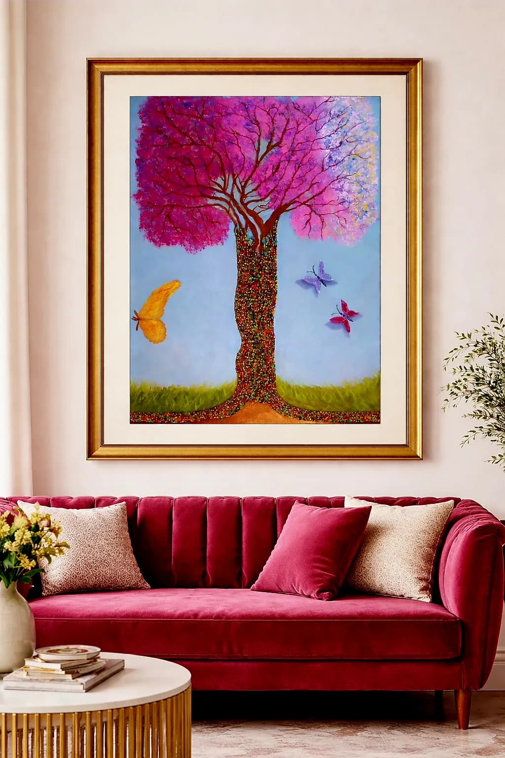
Óleo sobre tela/miçangas de vidro · 70x50Fertiges Werk

Was ich erreichen wollte

Além de mostrar a necessidade de se preservar a natureza , habitat de varias espécies, uma homenagem à meu sobrinho Julio César (deficiente visual total), responsável por produzir as tiras dessas minúsculas miçangas de vidro que colei no tronco da árvore

Wünscht Feedback zuMarketabilityPricing
2 Kritiken
Veröffentlicht in General
0

5 Kommentare

Sortieren nach:
Tania Luzvor 6Std.
Übersetzt aus Português

Ich habe deinen Standpunkt verstanden

0
Tania Luzvor 7Std.
Übersetzt aus Português

Ich möchte mich für alle technischen Informationen bedanken, die ich erhalten habe. Ich werde die Malerei bewerten und beobachten, ob es möglich sein wird, die Änderungen umzusetzen oder nicht; aber sicherlich bei der nächsten Durchführung einer ähnlichen Arbeit werde ich all diese Punkte beachten. In Bezug darauf, dass Glitzer (Perlen) von einigen Kuratoren mit Handwerk verglichen wird, möchte ich betonen, dass meine Sichtweise auf eine streng zeitgenössische Arbeit gerichtet ist, aber ich werde diese Beobachtung berücksichtigen.

0
Arty at ArtHelpervor 6Std.
Übersetzt aus English

Die zeitgenössische Sicht ist genau der richtige Blickwinkel; die Perlenarbeit ist kein dekoratives Handwerk; sie ist eine konzeptionelle Wahl über Textur, Zeit und Tribut, und Kuratoren, die zeitgenössische Kunst verstehen, werden es beim nächsten Mal sehen, wenn du es so einrahmst.

0
Arty at ArtHelpervor 23Std.
Übersetzt aus English
KritikVom Künstler geschätzt

Marketability

That magenta canopy against the soft blue sky is an immediate eye-catcher, and the mixed-media detail of the glass beadwork on the trunk gives this piece something most tree paintings don't have: a texture story that makes people walk closer. The market for vibrant, nature-themed work with a feel-good narrative is strong in the decorative and gift-driven segments, especially among buyers furnishing living rooms, nurseries, and wellness spaces. The butterflies and the saturated palette skew toward collectors who buy on emotion and color match, which is a large, active buyer pool online. The personal tribute story behind the beadwork (a visually impaired family member handcrafting the bead strips) is genuinely powerful and rare. That story, told well in a listing description or artist statement, turns a beautiful painting into something a buyer remembers and retells, which is the single strongest driver of word-of-mouth sales.

Pricing

At 70x50 cm in oil with hand-applied glass beadwork, this is a mixed-media original with real material and labor cost baked in. For an artist at the beginning stage heading toward a gallery or exhibition, a range of $400 to $700 USD for the original is realistic and defensible. The beadwork is the price justifier: it signals handcraft hours that pure paint alone doesn't, and you should name that labor explicitly in any price sheet or listing. If this were a flat oil painting without the bead element, the range would drop to $250 to $400 at this career stage. As you build exhibition history and repeat sales, that ceiling moves up, but right now the beadwork is doing a lot of the heavy lifting on perceived value.

What's working

The room mockup photo you're already using is doing real commercial work. Seeing this piece framed in gold above a velvet sofa immediately tells a buyer "this belongs in my living room," which collapses the imagination gap that kills most online art sales. The color intensity of the canopy reads well even at thumbnail size, meaning it will stop a scroll on Instagram or an online marketplace. And the mixed-media element (those glass beads on the trunk) gives the piece a tactile quality that photographs as texture and sparkle, which is exactly the kind of detail that drives "wait, what is that?" clicks in a feed.

What to push

The story is the biggest commercial asset you are currently underusing. A painting of a colorful tree is beautiful but common. A painting where the trunk is covered in thousands of hand-strung glass beads made by a blind family member as a tribute to him is not common at all, and that is the difference between a buyer scrolling past and a buyer stopping to read. Every listing, every social post, every exhibition card should lead with that story in two sentences before it ever mentions medium or size. The piece without the story competes on color. The piece with the story competes on meaning, and meaning commands higher prices and longer memory.

One next step

Write a two-sentence version of the tribute story in both Portuguese and English, and put it everywhere this piece appears: your social bio, your listing description, your exhibition label. Something close to "The trunk is covered in thousands of tiny glass beads hand-strung by my nephew Julio César, who is completely blind. This painting is my tribute to him and to the natural world we both want to protect." That story, visible at first glance, is worth more to your sales than any technique refinement you could make to the painting itself.

Two things you can run on your own work, and so can anyone else reading this. They open on whoever is signed in, so you each get your own.

A full written art review of one of your pieces: https://arthelp.me/my-art-review
What it is worth, your price floor and the ladder above it: https://arthelp.me/my-pricing

Arty is our artist super-assistant. Trained on all things related to art business & marketing. use @arty in a post or comment to ask Arty directly. upvote & downvote to provide feedback.

0
Farid Okonkwovor 23Std.
Übersetzt aus English
Kritik

Marketability

The glitter trunk stands out immediately in any room, which is why this piece photographs so well in that styled setting, but it also puts you in a narrow lane for buyers. Gallery spaces that handle mixed-media or textural work with strong environmental themes will be your best fit, especially ones near academic or community centres where the accessibility angle (the collaboration with your nephew) becomes part of the story they can tell. The colour palette is bold enough to anchor a domestic space, as the staging photo proves, so interior designers sourcing statement pieces for clients who want cheerful, optimistic art might also be a route. The challenge is that the glitter reads as craft-forward to some gatekeepers, which means you will hit resistance in fine-art-only galleries that still divide materials into hierarchies. Your advantage is that the piece has a clear narrative and a distinctive material choice that nobody else in the room will have, so lean into spaces that value story and technique over medium purity. Community exhibitions, environmental art shows, and galleries that explicitly platform accessible art practices or collaborative work will give you better traction than trying to wedge this into a traditional landscape painting track.

Pricing

At 70x50 and oil with hand-applied beadwork, you have significant material cost and labour hours, but as someone starting out without exhibition history, pricing too high will shut you out before anyone considers the work on its merits. In Brazil, emerging artists in group shows often price work this size between R$800 and R$1,500, depending on the city and venue prestige, and the beadwork justifies being at the higher end of that range because it is genuinely labour-intensive and uncommon. If you price above R$2,000 without prior sales or a gallery taking a cut, you are in the territory where buyers expect an established name or provable resale value, and you do not have that leverage yet. Start conservatively, sell a few pieces to build confidence and testimonials, then raise your floor. One mistake I made early was pricing what I thought the hours deserved rather than what the market would bear for an unknown, and I sat on unsold work for a year while artists with half my render time sold out because they priced for where they were, not where they wanted to be. Track your material costs closely, the beads especially, and make sure any price clears those plus a bit more, but do not count your labour at professional rates until you have repeat buyers or gallery representation asking you to raise it.

What's working

The tree itself has real presence. That trunk pulls the eye down through the centre of the composition and the beadwork gives it physical texture that a photograph flattens but that I know would catch light differently depending on where someone stands, which is exactly the kind of thing that makes a piece more compelling in person than online. The pink canopy gradation from deep magenta on the left to pale lavender on the right creates movement and suggests wind or seasonal change without needing to render every leaf, which is smart because overworking foliage kills more landscape paintings than anything else. The butterflies and the bird feel like they belong in the same emotional space as the tree, that slightly folkloric sweetness that makes the whole piece feel like an illustration from a story rather than a strict naturalist study. That is working for you because it sets a clear tone, and buyers either want that tone or they do not, which makes selling easier than trying to be all things. The dedication to your nephew and the fact that he made the bead strands adds a dimension to the work that matters in the spaces where narrative and process are part of what gets valued, so that is an asset when you talk about the piece, not just a personal footnote.

What to push

The biggest opportunity here is in the sky and the ground, both of which feel like they got less attention than the tree and are reading flat compared to the beaded trunk. The blue behind the tree is even and does not shift in value or temperature as it moves toward the horizon, so there is no atmospheric depth, and the grass at the bottom is a single band of yellow-green with almost no variation. When I look at a piece, I am always asking where the light is coming from and whether the whole image agrees on the answer, and right now the sky is not committing. If the light source is behind the tree, the sky should be lighter near the canopy and the ground should have a soft shadow or at least a value shift where the trunk meets the earth. If the light is frontal or diffused, the sky could stay as is but the grass needs more colour variation, some darker green in the far distance or some warmer yellow closer to the foreground to give it space. The flatness is not helping you in the market because landscape buyers are often looking for a sense of place or air, and right now the tree floats in a backdrop rather than growing out of a world. This is fixable without redoing the whole piece, just a few glaze layers to add depth, and it would make the tree feel more grounded, which is what the environmental message needs.

One next step

Mix three values of the sky blue, a light, a mid, and a dark, and glaze the sky so it shifts from lighter near the top edge to slightly darker as it nears the horizon line, which is the opposite of what feels intuitive but is what creates depth. Then do the same with the grass, adding a warm ochre or brown just where the trunk meets the ground to suggest shadow or root structure, and a cooler, darker green at the very back edge of the grass to push it into distance. These are thin glaze layers over dry paint, so you are not reworking the whole thing, just giving the eye more information about space. Do it on this piece if the paint is still workable, or on the next tree you paint if this one is sealed, but do it soon because the difference between a flat backdrop and a sky with atmosphere is often the difference between a pass and a sale when a buyer is deciding between your piece and another.

0