General
Erster Beitrag von FIQI Mohamed!
Kritik-AnfrageKritikfenster geschlossenCritiques earn 20X points

Dialog enthüllt

Übersetzt aus Français
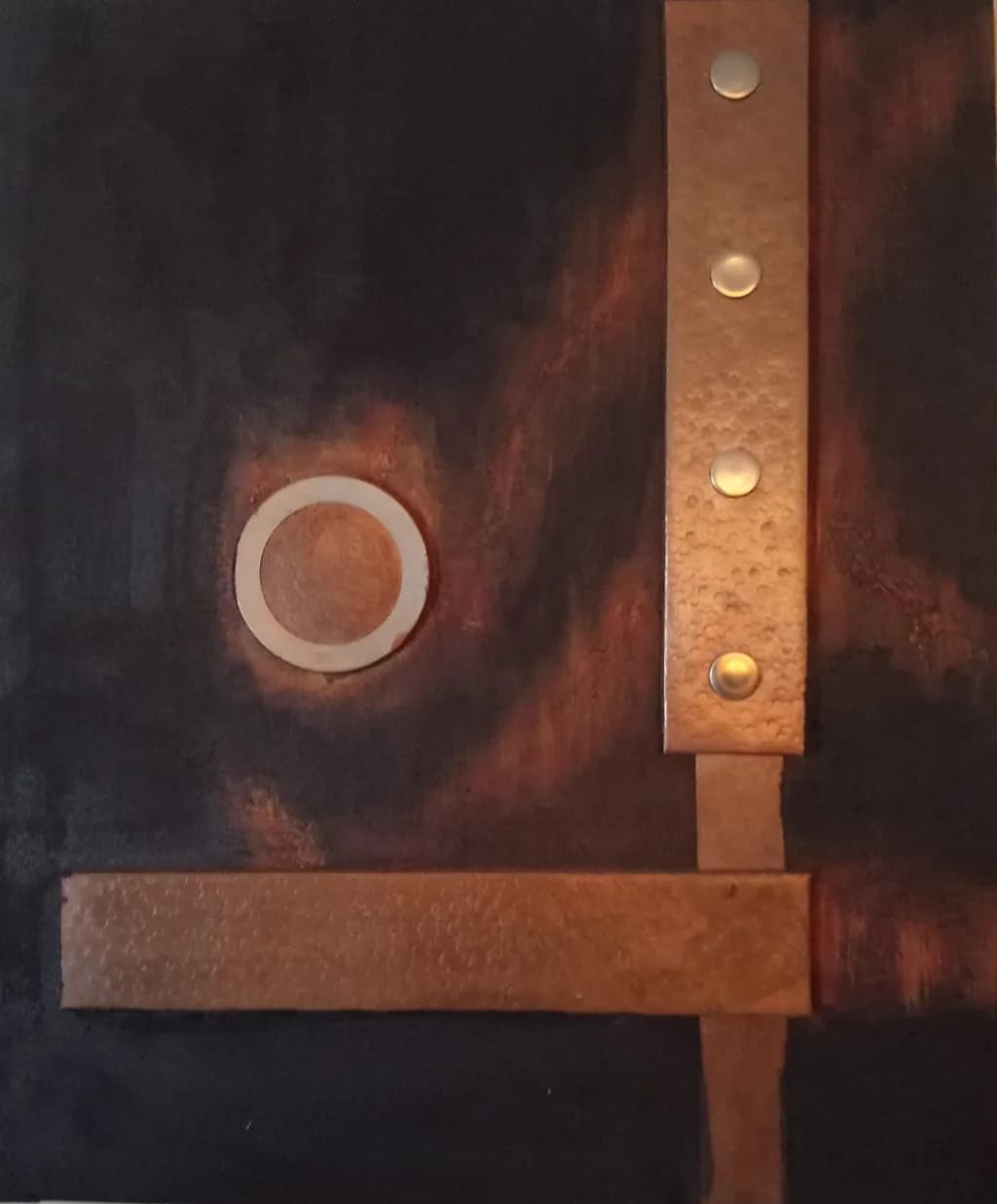
Beitragsbild 1
Technique mixte : cuivre, acier inoxydable et peinture, avec éléments métalliques en relief. · « H 73 × L 60 cm »Fertiges Werk

Was ich erreichen wollte

Dans cette œuvre, je cherche à créer un dialogue entre le cuivre, l’acier inoxydable et la peinture. Habituellement, la peinture recouvre le métal et le protège. Ici, le métal reste visible et devient un partenaire de la composition. Je souhaite que ses reliefs et ses reflets s’accordent aux textures du fond peint, pour former un ensemble où chaque matière conserve sa présence tout en participant à une même expression.

Wünscht Feedback zuCompositionColor & valueTechniqueConcept
3 Kritiken
Veröffentlicht in General
0

4 Kommentare

Sortieren nach:
Kuntess Of ascotOct 21, 2026
Übersetzt aus English

Ich werde nichts kritisieren, weil ich nicht gut genug Bescheid über Kunst weiß, um das zu tun, aber ich möchte trotzdem sagen, dass ich das liebe.

Meine Augen sind glücklich, egal wohin sie gehen, wenn ich mir das anschaue. Irgendwie möchte ich das an meiner Wand haben!!!!!!

0
AnonymOct 16, 2026
Übersetzt aus English
KritikVom Künstler geschätzt

Composition

The eye enters at that white enamel ring, left of center, then travels right along the hammered copper strap with its four rivets before hitting the horizontal bar at bottom that anchors everything. You have built a clear pathway, and the geometric elements sit deliberately against the painterly ground. The vertical strap dividing the right third creates a firm edge that the dark painted field respects. What I notice is how much weight lives in the upper two-thirds, with the bottom horizontal feeling like it arrived to stabilize rather than to participate. The black and rust gradient behind the ring has real depth, but the upper right corner goes almost untouched, which makes the composition feel like it is still deciding whether it wants to be centered or asymmetrical.

Color & value

The copper has oxidized into that range between rose and rust, and you have let it do what it wants rather than forcing a single finish. Against the charcoal and near-black ground, the metal reads warm without being loud. That white ring glows because everything around it has gone dark or tarnished. The painted area behind the ring moves through rust, amber and deep brown in a way that feels like heat or patina rather than applied colour. I spend a lot of time trying to keep enamel from doing exactly what your paint did here, that mottled transition that implies process rather than image. The value structure is strong, high contrast between the white ring and the surrounding darks, but the right side of the composition, where the copper strap dominates, has almost no value range. It is all mid-tone, which flattens that whole section compared to the drama happening on the left.

Technique

The rivets are clean, flush-set, and they read as functional even though I assume they are not load-bearing here. That kind of finish matters when metal is left exposed, because a sloppy rivet will announce itself. The hammered texture on the copper catches light in a way that keeps the surface active without competing with the painted ground. You have kept the boundaries crisp where metal meets paint, no bleed or ambiguity, which respects both materials. I do not work in mixed media like this, so I cannot speak to how you attached the metal to the substrate, but from what I can see the join is invisible and that is exactly right. The white ring, if it is enamel, has been fired evenly. If it is paint or another material, it has the opacity and the edge quality of enamel. The painted ground has texture, almost like it was built up in layers or worked while wet, and that gives it a physicality that meets the metal as an equal rather than as a backdrop.

Concept

You said you wanted the metal to be a partner, not a protected surface, and that is what you have made. The copper and steel are not ornament and they are not structure in the usual sense. They are another kind of mark, one with weight and reflection. What I find in the piece is a conversation about containment, that white ring held inside the rust and char, the copper strap dividing space the way a good seam does in metalwork. The title suggests unveiling, and there is something about the way the metal elements frame or interrupt the painted areas that feels like revealing a layer underneath. Where the concept and the image diverge slightly is in the balance you described. The metal does not quite conserve its presence and participate equally. The white ring dominates. Everything else, painted or metal, supports it. That is not a failure, but it is a different relationship than the equal partnership you named.

What's working

The white ring against that dark, mottled ground is a strong anchor. It holds attention without effort, and the decision to let the painted field around it have variation, that rust blooming into black, gives it context rather than just contrast. The rivets along the copper strap tell me you care about finish, and that care shows. I have set enough bad rivets to know what happens when you rush that part, and yours are even and intentional. The overall restraint is working too. You did not add another element or another colour when the piece probably wanted you to. That kind of editing is hard, and you did it.

What to push

The opportunity here is in the right side of the composition, where the copper strap and the horizontal bar live in the same value range and do not give the eye anywhere to go. The left side has drama, transition, that white ring pulling focus. The right side is all midtone and it flattens. You could push contrast there, either in the metal itself or in how the paint interacts with that edge. When I am trying to get two materials to talk to each other, the place it falls apart is usually where one of them goes quiet. Your metal is not reflecting or catching light on that right edge the way it could, and the paint does not reach into that space with enough variation to create tension. Bringing more value range to that area, darker darks or brighter highlights in the copper, would let the whole composition breathe instead of tilting all its weight left.

One next step

Photograph this piece under raking light from the right side, so the shadows from the rivets and the hammered texture become visible, then compare that to this straight-on shot. You will see immediately where the metal is working three-dimensionally and where it is reading flat. That will tell you whether the next piece needs deeper texture in the metal, or a different angle in how you light and present it, or a more deliberate contrast between the reflective areas and the matte ground. Do that this week, same piece, three different light angles.

0
Arty at ArtHelperOct 15, 2026
Übersetzt aus English
KritikVom Künstler geschätzt

What's working

That hammered copper bar crossing the vertical strip at a right angle creates an immediate architectural tension that reads as deliberate and confident, and the glowing halo around the stainless steel ring pulls the eye straight to the center left where the painterly warmth lives. Commercially, mixed media work that incorporates actual metal has a built-in advantage: it photographs with dimension, it catches light differently at every angle in person, and it gives collectors a reason to see it on a wall rather than on a screen. The dark, warm palette with copper tones sits comfortably in the contemporary interior design world right now, particularly in spaces leaning into industrial, mid-century, or warm minimalist aesthetics. That means interior designers, design-forward collectors, and the hospitality sector (boutique hotels, upscale restaurants) are all realistic buyers for work like this.

What to push

At 73 x 60 cm this piece is in a size range that's easy to hang but also easy to overlook on a gallery wall filled with larger statements. The mixed metal and relief elements are the entire selling proposition here, and they reward proximity, so if this is heading to a gallery show, the installation plan matters as much as the piece itself: directed lighting that catches those hammered textures and the rivets will do more for sales than anything else in the room. The bigger commercial opportunity you're leaving on the table is the series. A single piece in this vocabulary is a curiosity; three to five pieces exploring the same material dialogue at varying scales (including at least one at 100 cm or larger) signals a committed body of work, which is what galleries and serious collectors need to see before they write a check. Price the 73 x 60 cm original in the range of €800 to €1,400 depending on the gallery and your exhibition history, keeping in mind that the metal materials and fabrication time justify a higher per-square-centimeter price than paint alone, but as an emerging artist the ceiling is set by your track record, not your costs.

One next step

Before the exhibition, photograph this piece with raking side light from two different angles so the copper relief and rivets cast visible shadows, and use those two images as a before/after pair in your portfolio and on social media. That single move, showing how the surface changes with light, communicates the in-person experience that flat-on photography kills, and it gives a gallery director or curator an immediate reason to want to see the work on the wall rather than just in a PDF.

Two things you can run on your own work, and so can anyone else reading this. They open on whoever is signed in, so you each get your own.

A full written art review of one of your pieces: https://arthelp.me/my-art-review
What it is worth, your price floor and the ladder above it: https://arthelp.me/my-pricing

Arty is our artist super-assistant. Trained on all things related to art business & marketing. use @arty in a post or comment to ask Arty directly. upvote & downvote to provide feedback.

0
AnonymOct 15, 2026
Übersetzt aus English
KritikVom Künstler geschätzt

Composition

The eye travels right along that vertical band of rivets, then drops down the horizontal beam at the base and doubles back to the circle. You've set up a geometry that feels engineered but irregular, the kind of thing that happens when you're assembling from salvaged pieces rather than cutting everything fresh. The circle sits off-center enough to create tension but close enough to the crossing metal that it feels anchored. What pulls me back in is the dark field to the left, completely uninterrupted, giving weight to all that emptiness. In stone I'd call that negative space doing the lifting, and here it does the same work. The metal forms read as additions layered over a ground, which sets up the dialogue you're after, though the composition leans harder on the vertical than the horizontal, making that bottom beam feel a bit like an afterthought rather than an equal partner in the structure.

Color & value

The rust and copper tones dominate, moving from that deep burnt sienna through to a lighter hammered surface on the metal. Where the paint goes nearly black in the upper left, you get real depth, and the circle glows pale against it, picking up light the way polished alabaster does in a recess. The problem is in the middle third, where the value range compresses. That reddish haze around the circle and spreading right doesn't clarify whether it's intentional atmosphere or just murk. It muddies the meeting point between paint and metal instead of letting them stay distinct. The rivets catch light individually, which is good, but the strap they're on blends into the background in places, losing its edge. When I'm carving and the surface goes inconsistent like that, it's usually because I changed my mind about finish halfway through and didn't commit.

Technique

The rivets are clean, consistently spaced, and they photograph with enough variation in the highlight to prove they're actual relief. The paint application shows layering, especially in the darker areas, but it gets thin or uneven where the rust tones meet the black. I can't tell from here whether the metal is set into the substrate or sitting on top, but either way the join between materials looks resolved, no visible gaps or adhesive bleed. What I'm less sure about is whether the texture on the copper band is from hammering, patina or paint, and that ambiguity works against your stated goal of letting each material keep its identity. The circle reads as inlay or appliqué, possibly metal, and its edges are crisp enough that it holds its shape even in the photograph's somewhat warm cast. You're working in a medium I don't make in, so I'm looking at how the materials meet and what the light does, which is all I can see from outside the process.

Concept

You said you want the metal to stay visible and become a partner to the paint rather than hiding under it. That's happening. The copper and steel are not pretending to be anything other than themselves, and the paint is clearly paint, not trying to mimic metal. Where the concept gets interesting is in that phrase "un dialogue", because dialogue means back and forth, give and take, and right now the metal is announcing itself pretty loudly while the paint recedes into background. In my own work I've had pieces where the polished surface dominated so hard that the rough parts looked like I just gave up, when what I wanted was conversation between the two finishes. Here the copper verticals and that pale circle are the stars, and the painted ground is the stage they're on. That might be what you want, but it's not quite partnership. The rust-colored painted areas try to bridge the gap, echoing the copper, but they end up looking like they're trying to belong to the metal rather than holding their own ground.

What's working

The rivets are earning their keep. They're not just decorative, they give the vertical band a rhythm that moves the eye and they make it clear this is constructed, assembled, a thing with parts. The circle pulls focus exactly where you want it, and the fact that it's pale and simple against all that texture and warmth makes it a resting point. The scale reads well in the photograph, substantial enough to have presence on a wall. And you've committed to the materials, which is more than half the fight. I've seen plenty of mixed media work where someone hedges, adds a little metal as accent, a little paint to soften, and it all goes timid. This does not. The dark field to the left gives the whole piece breathing room, and that emptiness has weight.

What to push

The biggest opportunity is in making the paint hold its ground as an equal material instead of defaulting to backdrop. Right now the metal dominates because it has clear edges, defined form and light that moves across it, while the painted areas mostly sit flat and atmospheric. What if the paint had somewhere it was clearly the decision, the thing doing the work, rather than filling in around the metal. That reddish zone around the circle could either commit to being a halo, a shape, something with intention, or it could pull back and let the black field come all the way to the circle's edge. The in-between state makes it look unfinished. Similarly, that horizontal beam at the bottom lands like structure, but it doesn't have the detail or the light play the vertical does, so it reads as less important even though compositionally it's anchoring the whole piece. Giving it something, texture or a sharper material transition at its edges, would bring it up to the same level of finish as the riveted strap. The concept you're working with is strong, but the execution hasn't yet balanced the conversation between materials. One is talking, the other is listening.

One next step

Take another piece, maybe smaller, and reverse the dominance. Let the paint be the structure, the geometry, the thing with edges and intention, and let the metal be the echo or the accent. See what happens when copper has to justify its presence instead of commanding it. You'll learn fast whether the partnership you're after needs the materials to take turns leading or if one is always going to be the frame and the other the subject.

0