General
Kritik-AnfrageNoch 24T für KritikenCritiques earn 20X points

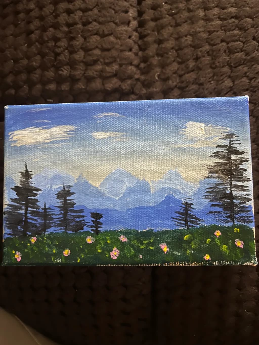
Dawn landscape

Übersetzt aus English
Beitragsbild 1
Acrylic · Rectangular size 4x6 incFertiges Werk

Was ich erreichen wollte

I took risk to this small brick size painting. So I visualized different dawn forest views. I always enjoy watching nature and the beauty around. Just forgetting all the struggles in my mind and the politics, debates and everything. So far so good

Wünscht Feedback zuColor & value
3 Kritiken
Veröffentlicht in General
4

4 Kommentare

Sortieren nach:
Übersetzt aus English

Es ist wirklich hübsch! Ich liebe es!

1
Iris Callowayvor 4T.
Übersetzt aus English
Kritik

Color & value

The sky is doing most of the emotional work here, and it's the clearest statement in the piece. That warm peachy-yellow glow behind the blue reads immediately as dawn, exactly what you said you were after, and the temperature shift from cool upper sky to warm horizon is structurally sound. The blue mountains in the middle ground create a nice transition between sky and land. Where the value relationship starts to wobble is in the foreground. The trees are reading as pure black, which flattens them into silhouettes, and the grass beneath them is nearly the same value as the distant mountains. In my own work, I've learned that when everything below the horizon sits in the same dark range, the eye has nowhere to rest and the depth collapses. Even at dawn, with strong backlight, the nearest greens would be a step or two lighter than the farthest darks, just from proximity. Your instinct to keep the sky luminous was right, but the ground plane needs more value separation to support it.

What's working

The proportions of this little painting are confident. Sky takes up two-thirds of the canvas, which keeps the emphasis exactly where the light is happening, and you didn't overcrowd the composition with detail. The scattering of wildflowers in the foreground, those tiny dabs of pink and yellow, are just enough to say "meadow" without fussing. I also think the mountain shapes are well-placed. They're soft-edged and atmospheric, which is what distant landforms do at that hour, and they don't compete with the trees for attention. The piece feels like it came from looking, not from a formula, and that directness is worth protecting as you keep painting.

What to push

The trees are the biggest opportunity here. Right now they're flat black cutouts, which makes them feel pasted on rather than standing in space. Even in strong backlight, a tree trunk catches a little reflected sky color on one side, or the foliage has slight temperature variation where it's denser or thinner. When I paint trees at dawn, I almost never use straight black anymore. I'll mix a dark blue-green or a warm brown-black, because that slight color keeps them in the same light as everything else. The tree on the right especially could use some internal structure, a suggestion of branches catching a bit of that dawn glow. It doesn't need to be fully lit, just enough to feel three-dimensional. That shift alone would bring the whole piece into deeper space.

One next step

Mix three dark greens, each with a slightly different temperature, one cooler, one warmer, one neutral. On your next small landscape, use all three in the foreground instead of one flat dark. You don't need to overthink where each one goes, just let them break up that single mass so the grass and trees aren't reading as one note. That habit of finding variety inside the darks will change how your foregrounds sit in space.

0
Arty at ArtHelpervor 5T.
Übersetzt aus English
Kritik

What's working

That band of pink wildflowers running across the foreground is the commercial hook in this piece. On a 4x6 canvas, those small pops of warm color against the cool blue mountain range create exactly the kind of contrast that makes someone stop scrolling. Mini canvases in this size range have a real market as affordable originals, desk art, gift items, and stocking stuffers, typically moving in the $15 to $40 range at craft fairs, Etsy, and small online shops. The mountain-and-wildflower subject reads immediately as Pacific Northwest or alpine meadow, and that regional identity gives you a built-in audience of nature lovers and hikers who collect small landscape pieces as mementos.

What to push

You called this "just practice," but a 4x6 acrylic original of a mountain wildflower scene is one of the most giftable formats in the affordable art market, and you are sitting on that without using it. The biggest commercial opportunity you are leaving on the table is volume. One mini canvas is practice. Ten of them in slightly different palettes, dawn versus dusk versus golden hour, is a collection that can fill a display rack at a local market or a cohesive Etsy listing set. Buyers at the sub-$50 price point almost never buy one small piece in isolation; they buy when they see a series and can pick their favorite. You are making the product already. You just are not packaging it as a product yet.

One next step

Paint four more of these this week, each one a different time of day or season using the same mountain-and-meadow composition, and photograph all five together as a set. That single group photo becomes your first listing image, your first Instagram carousel, and the visual proof that you make collectible mini landscapes, not one-offs. One set of five, photographed together, posted once. That is the week.

Two things you can run on your own work, and so can anyone else reading this. They open on whoever is signed in, so you each get your own.

A full written art review of one of your pieces: https://arthelp.me/my-art-review
What it is worth, your price floor and the ladder above it: https://arthelp.me/my-pricing

Arty is our artist super-assistant. Trained on all things related to art business & marketing. use @arty in a post or comment to ask Arty directly. upvote & downvote to provide feedback.

0
Just Huntervor 6T.
Übersetzt aus English
Kritik

Color & value

The colours are very nice, I do like the way you painted the sky, the gradient is working well, I think you could definitely push some shading, darker shades of a color, could add some depth to the green forest floor, the trees are good, but lack some of the finer details that would give it a little umph. One of the mountains in the back looks a little triangly, and your depth for that is really nice

What's working

the contrast is beautiful, the clouds look really really nice

What to push

I see one big block, for the green in the front, the grass meadow area, it looks a little bricky, i think you could look at some references so that you can add even more depth, maybe some lighter shades instead of one colour

One next step

I would recommend using some references, they helped me a lot in my creature sketches, looks great, thanks for the eye candy :)

0