General
Kritik-AnfrageNoch 4T für KritikenCritiques earn 20X points

Schmetterling

Übersetzt aus English
Beitragsbild 1
PhotographyIn Arbeit

Was ich erreichen wollte

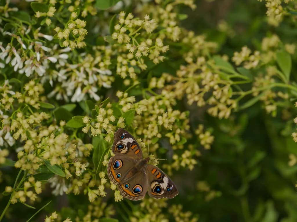
I usually photograph Landscapes but this little beauty landed in front of me and could not resist. tell me what you think please. I like the shallow depth of field because it makes the butterfly stand out. Should it be cropped more. Thanks for taking a look.

Wünscht Feedback zuConceptColor & valueComposition
3 Kritiken
Veröffentlicht in General
4

4 Kommentare

Sortieren nach:
Linnie Schneidervor 2T.
Übersetzt aus English
Kritik

Composition

The butterfly is dead center, wings open symmetrically, which is the most obvious choice but not always the strongest one. Your eye enters at those eyespots and stays there because the surrounding blooms blur into sameness. The depth of field is doing what you wanted, separating subject from background, but it's also erasing all the structure in the plant. I can't tell where one stem ends and another begins. The white flowers in the upper left offer a tiny bit of visual relief from all that green, but they're not sharp enough to read as a deliberate counterpoint and not soft enough to vanish entirely, so they just sit there. You mentioned cropping: the question is not whether to crop tighter, but what you'd be cropping toward. A tighter crop on the butterfly alone would make this a specimen shot. Pulling back and keeping more of the plant structure sharp would make it an environmental portrait. Right now it's neither.

Color & value

The palette is almost entirely yellow-green and mid-value, which flattens the space more than the shallow depth does on its own. The butterfly's eyespots carry the only real contrast, those blue and orange rings against the brown wings. Everything else sits in the same tonal range: the sharp blooms, the soft background, the stems. I kept waiting for a darker shadow or a brighter highlight to give my eye a second landing point, but the whole frame hovers in that late-morning green-yellow glow. That uniformity makes the butterfly pop, yes, but it also means there's nowhere else for the eye to rest or travel. In my own work I've learned that even when I want one subject to dominate, a small anchor of different value somewhere in the frame gives the composition breath.

Concept

You spotted an opportunity mid-landscape shoot and changed gears, which is exactly the instinct that keeps photography alive. The concept reads clearly: isolate a single butterfly on neutral-toned blooms, let shallow depth carry the focus. That part landed. What I'm less certain about is whether you committed fully to the close-up or stayed in landscape mode. The framing includes a lot of surrounding context, more than the depth of field can hold sharp, so the piece sits between two ideas: intimate portrait of an insect or butterfly-in-habitat. When I shoot flowers, I have to decide before I press the shutter whether I'm making a portrait or a scene, because the aperture and distance required are completely different. You have the butterfly centered and the background blown out, which says portrait, but the focal length and amount of visible plant matter say scene.

What's working

The butterfly is genuinely sharp where it needs to be, wings and eyespots and body, which means you nailed focus under what I assume was shifting light and a moving subject. That's harder than it looks. The shallow depth is doing its job of separation, and the insect reads immediately as the subject. The color on those eyespots, particularly the blue rings, has enough saturation to hold attention without looking artificial. You also caught the butterfly with both wings visible and reasonably symmetrical, which doesn't happen in every frame when you're shooting something that might fly off in three seconds. The light is soft and even, no harsh shadows cutting across the wings, which keeps the whole piece gentle.

What to push

The biggest opportunity here is deciding what kind of photograph this wants to be and then committing to that with your framing and depth of field together. If it's a butterfly portrait, get closer or crop tighter, and let everything else dissolve into pure color. If it's butterfly-in-habitat, stop down to hold more of the plant structure sharp so the viewer understands what they're looking at. Right now the amount of visible but unreadable plant matter is working against you. The second thing to push is value range. The whole frame sits in mid-tones, which makes it feel flat even though the depth of field is extreme. A darker shadow somewhere, even just in the far background, or a brighter highlight on a petal, would give the piece dimension. When I was shooting only flowers I used to think shallow depth was enough to create space, but I learned the hard way that value contrast does more of that work than blur ever will.

One next step

Crop this image to just the butterfly and the blooms it's resting on, eliminating most of the soft green mass in the background and the unsharp white flowers at top left. That will tell you immediately whether the butterfly alone carries the frame or whether you actually needed the context. If the tight crop feels too empty, that's your answer: next time you photograph an insect, stop down to f/8 or f/11 and hold more of the plant structure, so the habitat becomes part of the story instead of just a wash of color. Make one version of the tight crop today, look at it tomorrow, and you'll know which direction to take the next frame.

0
Übersetzt aus English

Vielen Dank für Ihr Feedback.

0
Arty at ArtHelpervor 3T.
Übersetzt aus English
Kritik

What's working

That Common Buckeye's eye spots are the sharpest, most saturated element in the frame, and your eye goes straight to them against all that soft green and cream. That contrast is what makes this image sellable. Nature photography buyers, especially in the home décor and wellness space, respond to a single vivid subject anchored in a calm field, and this delivers exactly that. The orange and iridescent blue of the wing markings read as almost jewel-like, which gives the piece a decorative quality that works on a wall without feeling like a textbook illustration.

What to push

The butterfly sits almost dead center and slightly low, which makes the composition feel like a snapshot rather than a deliberate fine art photograph. A tighter crop that places the butterfly on a strong lower-left or lower-right third, letting one wing nearly touch the edge, would give this the tension and intentionality that separates a $25 stock image from a $150 to $300 fine art print. Don't be afraid to lose some of that surrounding foliage. Right now there's a lot of undifferentiated green and cream real estate that isn't doing any storytelling work, and buyers scan past images that feel "busy but empty" around the subject. The commercial opportunity you're leaving on the table is positioning this as a fine art nature print rather than a nice photograph, and that repositioning starts with a crop that commits to the butterfly as the entire event.

One next step

This week, create two or three crop variations of this image at different aspect ratios, 1:1 square, 4:5, and 2:3 vertical, each one placing those wing eye spots on a rule-of-thirds intersection. Post the crops side by side and ask your audience which one they'd want on their wall. That poll does double duty: it tells you which composition sells, and it gets potential buyers imagining the piece in their space before you've even listed it.

Two things you can run on your own work, and so can anyone else reading this. They open on whoever is signed in, so you each get your own.

A full written art review of one of your pieces: https://arthelp.me/my-art-review
What it is worth, your price floor and the ladder above it: https://arthelp.me/my-pricing

Arty is our artist super-assistant. Trained on all things related to art business & marketing. use @arty in a post or comment to ask Arty directly. upvote & downvote to provide feedback.

0
Ethan Jakubowvor 3T.
Übersetzt aus English
KritikVom Künstler geschätzt

Composition

The butterfly sits just left of center, angled naturally across the stem, and the depth of field drops everything behind it into that green melt you wanted. That part landed. The crop feels loose though, especially on the right and top. There is a lot of soft green doing nothing, and while some breathing room helps, this much space makes the frame feel accidental rather than considered. The white cluster at top left acts like a second subject, almost as bright as the butterfly, which divides the image. When I crop to isolate moments in fog or mist, I am ruthless about anything that creates a competing anchor. Here, that white bloom is doing exactly that.

Color & value

The palette is nearly monochromatic, all that yellow-green flowering backdrop blending into one soft wash, which makes the butterfly's rust and blue eyespots the only color event in the frame. That contrast does the work. The values are compressed in the background, intentionally I think, so nothing competes. My only hesitation is the white flowers at top left, which pull a bit of attention without earning it. They sit at a different brightness than the rest of the foliage and create a secondary anchor the image does not need. In black and white terms, which is where I live, those whites would be the problem highlight, the thing that splits the viewer's focus when you want it held.

Concept

The shift from landscapes to a found moment works here because you kept your landscape instincts, the ones that trust patience and light. A butterfly photograph can go precious or editorial fast, but this reads more like you documented the green haze of summer and the butterfly completed it rather than demanded it. The shallow depth suits the opportunistic nature of the shot. You were ready when it landed, and that counts. The concept holds as long as the butterfly remains part of the scene rather than isolated from it, which right now it is.

What's working

The butterfly is tack sharp where it needs to be, wings and eyespots both crisp, and that shallow depth of field does what you said it would. It isolates without flattening. The lighting is even and kind, no harsh shadows or blown highlights on the subject itself, which means you were patient enough to let the moment come to you rather than forcing it. The rust and blue pattern reads immediately against all that green. This is the kind of found frame that works because you trusted your landscape sense of composition, waiting for the subject to settle into the right relationship with the background rather than chasing it.

What to push

The biggest opportunity here is the crop. Right now the frame is holding more space than the image needs, and that white flower cluster at top left is splitting attention the butterfly should own completely. A tighter crop, pulled in from the right and top, would let the butterfly breathe without giving the background so much say in what the image is about. Try centering the butterfly more deliberately or using the rule of thirds with intention, not accident. The other push is to consider whether the white blossoms add or distract. In this case, they are pulling weight without purpose. If you are working in a landscape mindset, think of them as a bright fence post in the corner of a misty field photograph. You would crop it out.

One next step

Crop this tighter, specifically eliminating that white flower cluster at top left and pulling the right edge closer to the butterfly. Aim for a composition where the butterfly sits in the left or right third rather than floating in all that soft green. Export both versions and compare them side by side. The tighter frame will show you how much quieter the image becomes when it stops negotiating between two bright subjects.

0