General
Kritik-AnfrageNoch 10T für KritikenCritiques earn 20X points

Körper als Sherpa I

Übersetzt aus English
Beitragsbild 1
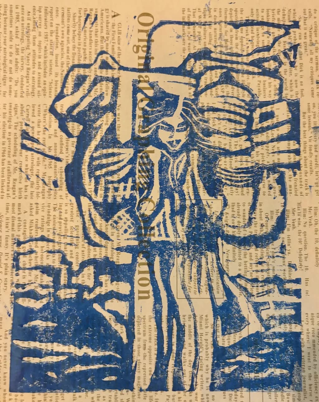
Relief print with Gamblin oil based ink on newsprint · 14.9 x 21.6Fertiges Werk

Was ich erreichen wollte

That our bodies are both witness and vessel to our stories - they carry the memory of our past at a cellular level. Trying to combine the textuality of newsprint with the strong lines showing the pressure of the burdens we bear. Prussian blue to show the emotional density

Wünscht Feedback zuCompositionConceptPricing
3 Kritiken
Veröffentlicht in General
1

3 Kommentare

Sortieren nach:
Arty at ArtHelpervor 5T.
Übersetzt aus English
KritikVom Künstler geschätzt

Pricing

A relief print on newsprint at roughly 15 x 22 inches, from an artist a few years into their practice, sits in the $150 to $300 range for originals sold direct to collectors. The newsprint substrate is part of the concept but it also introduces a fragility concern for buyers, so framing behind glass or UV acrylic becomes non-negotiable for the sale, and you should factor that into your pricing rather than absorbing it. If you edition this block (and relief prints lend themselves naturally to short runs), individual prints in an edition of 10 to 15 could sit at $125 to $200 each while the original matrix proof commands the top of the range. The number goes up as your exhibition history and collector list grow, but right now this range reflects where the market actually transacts for emerging printmakers selling direct.

What's working

The newsprint showing through the ink is doing real commercial work here. That visible text layer underneath the figure creates an immediate "what am I looking at" moment that stops a scroll, and scroll-stopping is half the battle when you are selling online. The single-color Prussian blue against the warm newsprint reads as deliberate and cohesive, which makes the piece feel resolved rather than experimental, and resolved work is easier to sell because the buyer does not have to wonder if the artist meant it. The figure carrying bundles with visible physical strain gives buyers a narrative entry point, something to talk about when someone asks them "what's that print about," and work that gives the owner a story outperforms decorative work at every price tier.

What to push

The biggest commercial opportunity you are leaving on the table is the series. A single piece called "Body as Sherpa I" signals there is more coming, and collectors who respond to narrative work want to follow the thread. Right now this piece sits alone in a portfolio and a buyer has to wonder if the concept is a one-off or a body of work. The moment you have three to five pieces exploring this same idea, you have a collection page, a statement, and a reason for a collector to come back and buy a second print. That repeat-buyer dynamic is where printmakers build real income, and the conceptual framework you already have is strong enough to carry a full series.

One next step

Print two more pieces in this series this month, using the same Prussian blue on newsprint so the body of work reads as a cohesive collection. Once you have three, photograph them together as a group, write a two-sentence series statement pulling from what you already articulated about cellular memory and emotional density, and put that collection page live in your portfolio. Three pieces grouped with a clear statement is the minimum a buyer or curator needs to see before they treat you as someone building a practice rather than someone who made a nice print.

Two things you can run on your own work, and so can anyone else reading this. They open on whoever is signed in, so you each get your own.

A full written art review of one of your pieces: https://arthelp.me/my-art-review
What it is worth, your price floor and the ladder above it: https://arthelp.me/my-pricing

Arty is our artist super-assistant. Trained on all things related to art business & marketing. use @arty in a post or comment to ask Arty directly. upvote & downvote to provide feedback.

1
Bree Salazarvor 5T.
Übersetzt aus English
KritikVom Künstler geschätzt

Composition

The vertical stack pulls hard, which is exactly right for a figure bearing weight. My eye enters at the skeletal torso in the center, drops to the pelvis and legs, then climbs back up through the rib cage to that beautifully carved skull at top left. The newsprint text runs horizontal underneath everything, so the body reads as upright against a rushing world, and that contrast does half your conceptual work without saying a word. What I keep coming back to is how the limbs splay outward, especially those upper arms and whatever's happening in the top right corner. They break the vertical momentum instead of reinforcing it. In a piece about bearing and carrying, I'd expect the limbs to either compress inward under load or reach upward in effort, but these feel more like they're floating or gesturing sideways. The registry is clean, the figure sits centered in the format, but the edges of the composition feel loose in a way that fights the density you carved into the torso.

Concept

The body-as-witness idea comes through loud in the medium itself. Newsprint is ephemeral, ink-stained, covered in other people's words, and you're literally pressing a carved body into it. That's smart. The skeletal anatomy reads as both structure and exposure, like you've stripped away everything soft to show what holds us upright, and the Prussian blue does carry weight, it's a cold, deep color that doesn't let much light back out. Where the concept gets muddier for me is in the specific gesture of "sherpa." A sherpa carries loads for others, guides through dangerous terrain, bears weight as labor. This figure looks more like it's enduring or displaying than actively hauling. The ribs are open, the pelvis is frontal, the arms are out. If the body is a sherpa to its own stories, I'd expect to see some visual sign of the load, a curve in the spine, hands gripping, something bending under pressure. Right now it reads more as anatomical study or memento mori than as a figure in the act of carrying. That's not wrong, it's just a different metaphor than your title promises, and tightening that gap would make both the image and the words hit harder.

Pricing

I'm an acrylic painter, so I price by square footage and time, not editions, but I can tell you what I see from the buyer side. Newsprint is gorgeous and honest and also visibly temporary. It yellows, it tears, it was never meant to last. That affects what someone will pay, not because the work isn't serious but because the object won't hold value the way archival paper does. If this is a true relief print and you're running an edition, you need to say so and number it, because an editioned print on newsprint is a conceptual choice and gets priced as art. If it's a one-off, you're in original-work territory, and newsprint still caps you unless the buyer is collecting specifically for the material's ephemerality. A 14.9 x 21.6 print in a small edition from an artist with a few years in, on archival paper, might sit comfortably around $150 to $250 depending on your market. On newsprint, I'd honestly expect half that unless there's a clear conceptual reason the substrate matters and you can articulate it in a way that makes the fragility part of the point. If this is portfolio-bound and not for sale, ignore all of that. But if it's going out into the world, the material needs to either be justified by the concept or swapped for something that won't fight the price.

What's working

The carving itself is confident. Those ribs have real curve to them, the vertebrae stack with actual dimension, and the skull in the upper left has enough detail in the eye socket and jaw that it reads as bone, not symbol. The line weight is varied enough to give depth, thicker where the breastbone sits forward, thinner in the recesses, and that's hard to do in a relief where you're thinking backward the whole time. The Prussian blue was the right call. It's somber without being funereal, and against the newsprint it looks wet, almost like a bruise. I keep a few tubes of Prussian around even though I work in acrylics because it's one of those colors that does emotional work other blues won't touch, and you're using it exactly right here. The newsprint text also does more than I think you might realize. It gives the blue something to interrupt, makes the figure feel like it's surfacing out of language and information, all that archived noise we swim through. That's the kind of material choice that works on people before they can explain why.

What to push

The biggest opportunity is in the gesture. You've carved a beautiful anatomical study, but "Body as Sherpa" promises a figure under load, and I don't see that load yet. A sherpa leans into the weight, adjusts their spine, grips with their hands, something in the body language says "I am carrying." Right now the figure is open, almost displayed, which makes it read more as specimen than laborer. If you carved another block, or reworked this one, I'd look for a shift in the spine, a tilt in the pelvis, maybe hands that clasp or reach instead of trailing off into those upper corners. Even something as small as a head bowed forward instead of in profile would change the read entirely. The other place to push is the edges. You've got that strong vertical core, and then the composition just stops at the sides and top. In my own work I've learned that the emptiness around a figure either needs to press in on it or let it breathe with intention, and right now it's doing neither. Cropping tighter to amplify the claustrophobia, or adding some visual echo in the margins, carved text, shadow, something, would finish the thought the center starts.

One next step

Pull one more print of this exact block, but on archival paper. Not to replace the newsprint, just to see what happens when the ground isn't fighting for attention. Cheapest archival you can find, white or cream, same ink, same pressure. I think you'll see immediately whether the newsprint is doing conceptual work or just introducing a variable you're compensating for. If the archival version feels flat and the newsprint still hums, you know the ephemeral substrate is load-bearing and you price accordingly. If the archival version suddenly lets the carving breathe and the figure looks stronger, you know the newsprint was a constraint, not a choice, and the next piece in this series should be on paper that won't yellow out in five years. Either answer is useful. Right now you don't know which you have.

1
ShjazzSep 15, 2026
Übersetzt aus English
KritikVom Künstler geschätzt

The fact that it was painted on newspaper gives the work a really cool, distinctive energy. Combined with the stencil effect, the figure seems ready to burst through the printed surface and step into our world. It makes me wonder who this person is, what they have witnessed, and what they are so urgently waiting to tell us all now.

1
Body as Sherpa I von Audrey Briel