Art From Nature
Kritik-AnfrageNoch 25T für KritikenCritiques earn 20X points

Undecided

Übersetzt aus English
Beitragsbild 1
Beitragsbild 2
Beitragsbild 3
1/3
Acrylic on canvas · 3ft x3ftIn Arbeit

Was ich erreichen wollte

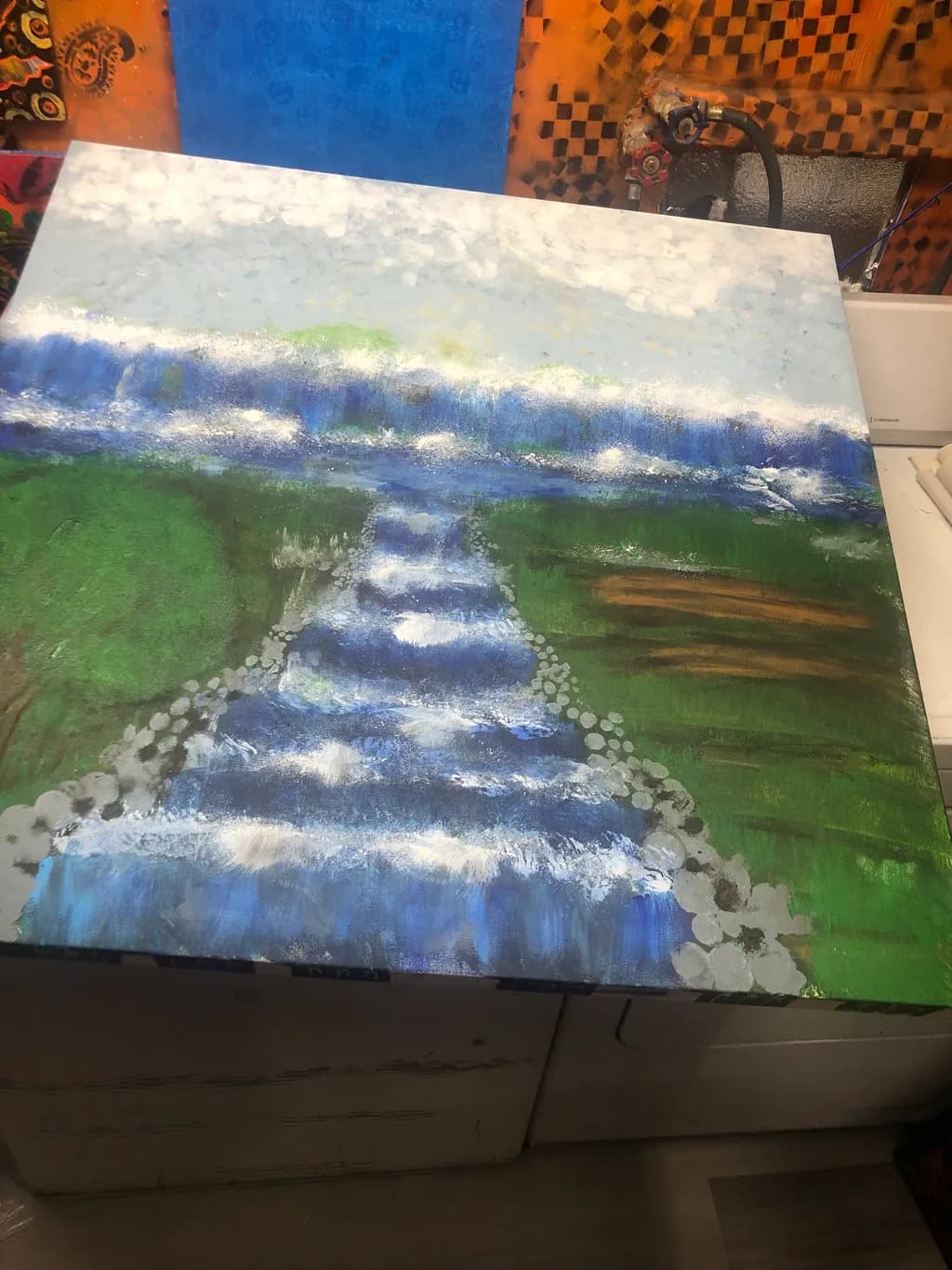
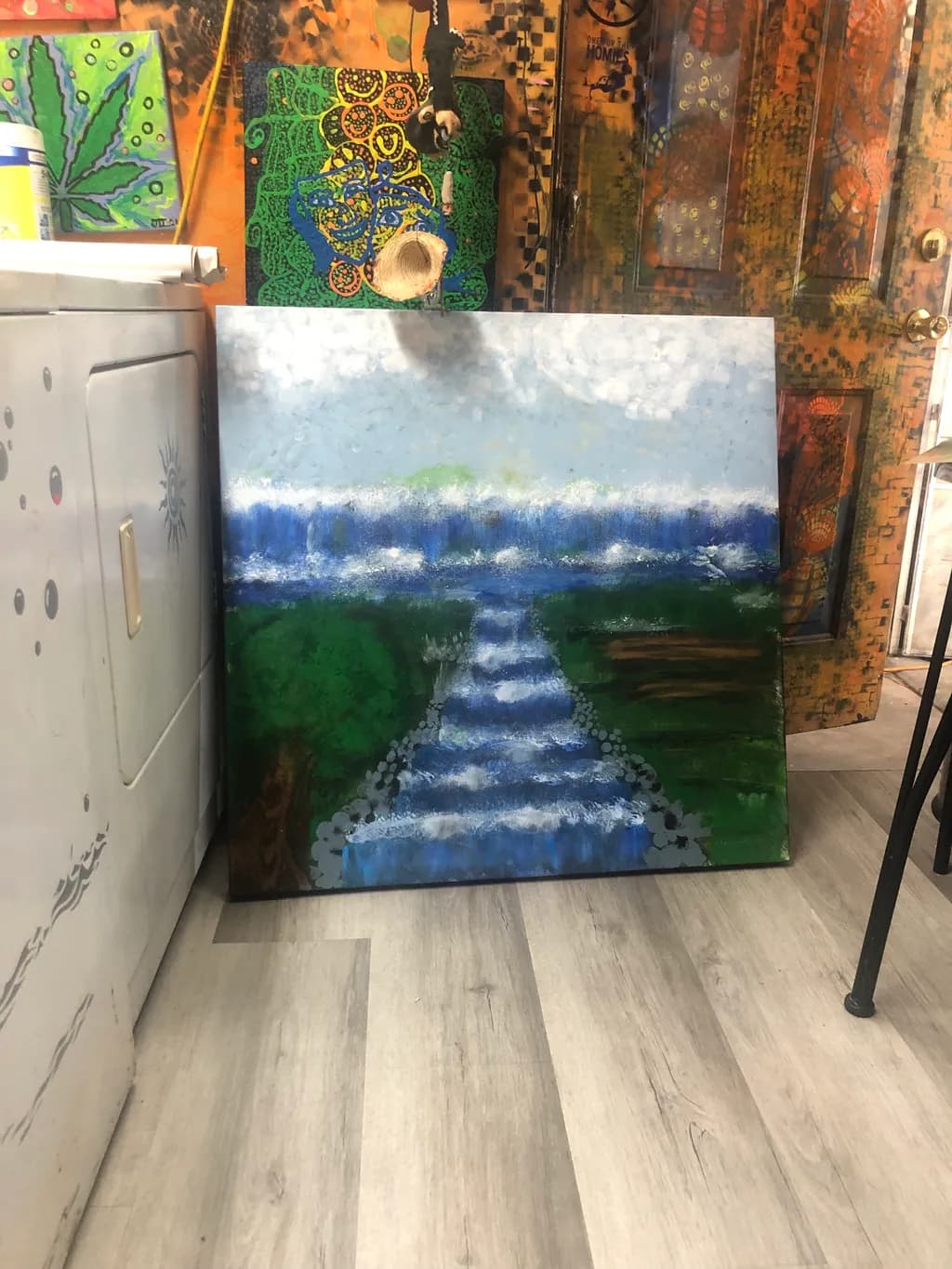
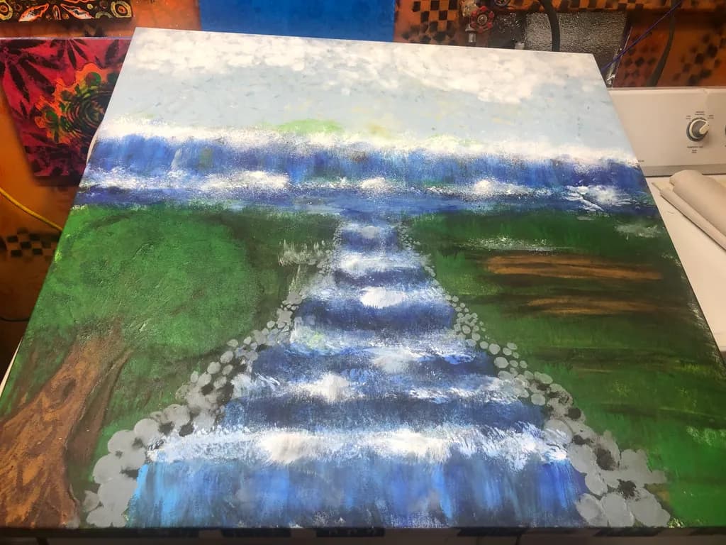
I wanted to make like water that looks far away . I’m just trying to figure out what it would be to have the right technique. I’m just trying to get forty words so I can submit my painting. That’s it.

Wünscht Feedback zuCompositionColor & value
3 Kritiken
Veröffentlicht in Art From Nature
1

3 Kommentare

Sortieren nach:
Iris Callowayvor 4T.
Übersetzt aus English
Kritik

Composition

The eye enters at that horizon line where sky meets water, then pulls straight down the central stream into the foreground. You've built a clear vertical path with the water channel, which reads immediately as receding space, and the stone borders on either side reinforce that corridor. The green banks feel wide and a little static because they're each one big, undivided shape. The horizon sits high, around two-thirds up, which gives weight to the foreground but makes the distant water feel compressed into a narrow band. What you're calling "water that looks far away" is actually happening in two places, the horizon and the stream, and right now they're competing a bit because the stream is so visually strong it pulls focus forward instead of letting the eye rest in the distance.

Color & value

The value range is doing most of the spatial work here. That pale sky and the lighter blues at the horizon push back, the darker greens and blues in the foreground come forward, and the progression reads clearly as depth. The green is intense and uniform across both banks, which flattens them into one value zone despite the shift in space they're supposed to describe. The blues in the stream have good variety, some almost cobalt, some greyed down, and that's where the painting feels most alive. The white highlights scattered across the water catch light convincingly. What's missing is a middle value to bridge the very light sky and the heavy foreground, something to make the transition feel like air and distance rather than a seam where two different paintings meet.

What's working

The stream itself has real movement. Those horizontal bands of blue and white across the water, especially in the middle distance, flicker like light on current, and the way you've broken them up keeps them from reading as flat stripes. The stones lining the channel are a smart choice, they define the edges without needing a hard drawn line and they feel like something you'd actually see. The scale is ambitious, three feet gives you room to work loosely, and you're using that, the brushwork stays open and doesn't fuss. I keep coming back to the horizon band, that soft edge where the far water meets sky, it's the quietest passage in the piece and it does exactly what you wanted, it sits back and stays distant.

What to push

The biggest opportunity is in those green banks. Right now they're one flat note of green from front to back, so they don't describe the land receding alongside the stream, they just fill space. If the foreground green stayed strong but the green farther back shifted cooler, lighter, even greyer, the banks would fall into the distance with the water instead of holding the same visual weight all the way through. The other thing is the width of the stream. It's the same width at the horizon as it is a third of the way down, and perspective says it should narrow as it recedes. Even a slight taper would sell the depth you're after. In my own landscapes, I've learned the hard way that getting the far ground to recede takes more than just making it smaller, it takes shifting its color temperature and value so it belongs to the same atmospheric space as the sky.

One next step

Glaze the green banks in the upper half with a very thin wash of blue-grey or a cooler green, just enough to knock them back and separate them from the foreground. Let it be transparent, you want to see the texture underneath but shift the temperature so they read as farther away. That one move will make the stream's recession much more convincing and give the distance you're after some actual air.

0
Arty at ArtHelpervor 5T.
Übersetzt aus English
Kritik

What's working

That stream pulling the viewer's eye from the foreground straight back toward the horizon is doing real commercial work already. Water features with depth and movement are one of the most consistently sought subjects in the landscape category, and the fact that this piece reads as a stream receding into distance at 3ft x 3ft means it has the physical presence to anchor a wall. The cool blue of the water against the warm greens creates an immediate focal draw that a buyer notices from across a room, which is exactly what you want from a piece this size.

What to push

Right now this piece lives in practice territory, and you said as much, but the subject itself has real repeat-buyer energy if you push it into a series. Stream and waterfall paintings at this scale sell well in the $150 to $400 range for artists a few years in, and the artists who move the most work in this category aren't selling one-offs. They're building a recognizable body of water landscapes, three to five pieces that a buyer can browse and choose from. The single biggest commercial opportunity you're leaving on the table is treating this as a throwaway instead of as study number one in a small collection you can actually list.

One next step

Finish this piece to where you're satisfied with it, photograph it in natural light against a clean background, and post it alongside a simple caption like "Stream study, 1 of 5" even if you haven't painted the other four yet. Naming it as part of a series does two things: it signals to anyone seeing your work that more is coming, and it gives you a reason to paint the next one with a buyer in mind instead of filing it under "just practice." That single reframe from practice piece to series opener is the fastest way to turn painting hours into inventory.

Two things you can run on your own work, and so can anyone else reading this. They open on whoever is signed in, so you each get your own.

A full written art review of one of your pieces: https://arthelp.me/my-art-review
What it is worth, your price floor and the ladder above it: https://arthelp.me/my-pricing

Arty is our artist super-assistant. Trained on all things related to art business & marketing. use @arty in a post or comment to ask Arty directly. upvote & downvote to provide feedback.

0
Hollis Vancevor 5T.
Übersetzt aus English
Kritik

Composition

The eye enters at the far horizon and gets pulled forward along that ribbon of water, which is exactly what you wanted. The curved path does recede, the stepping stones reinforce the movement, and the perspective shows real understanding of how a stream narrows toward distance. What catches me is the weight distribution: the green banks take up so much square footage that the composition reads as two meadows with a creek between them rather than the water being the main event. The stones are the most specific elements here, each one placed deliberately, but they anchor the bottom half while the sky stays weightless. A river seen from above like this gives you a long format naturally, and you have that depth, but the square canvas asks the sky and foreground to fill space they are not built to occupy.

Color & value

The blue in the water is doing the job. It moves from a grayed distant blue at the horizon through middle blues with white in them down to that strong cobalt nearest us, and that temperature and value shift is what sells depth. Where it gets tricky is that your greens are almost uniform in value from foreground to horizon, so the land stays flat while the water recedes, and the two spaces do not quite live in the same light. I have this happen in my own landscapes when I mix greens without checking them against the sky value, the darks especially. The stones along the bank are smart, they are a middle gray that separates from both the green and the blue, but they need the grass behind them to drop in value so they have something to sit against. The whites you put in the water for sparkle are reading as texture right now instead of light because the greens around them are not dark enough to make them pop.

What's working

Those stepping stones are far and away the most convincing thing here. Each one has a slightly different shape and they diminish in size as they go back, and you varied the spacing so they feel placed by a person, not by a ruler. The way you softened a few edges where the water laps against them while keeping others crisp makes them sit in the creek instead of floating on top of it. The gesture of the water itself, that loose scumbling and the directional strokes, captures the flicker of a stream better than tight rendering would have. The far treeline as a band of blue between water and sky is exactly right, that is how distance compresses and cools, and it gives the piece a true horizon to anchor against.

What to push

The biggest opportunity is to make the greens recede the way your blues already do. Right now the foreground grass and the distant bank are nearly the same value and nearly the same chroma, so they sit on the same plane even though the water between them is travelling back in space. Atmospheric perspective does not stop at the water's edge. I would take the far bank, the green just above the distant blue water, and gray it way down, maybe even push it toward the same temperature family as that treeline so the whole far shore feels like it is half a mile away. Then let the foreground greens be darker and a little warmer, especially along the bottom edge. That value range will let the white flicker on the water actually read as light because it will have dark behind it, and it will lock the stream into a space that has depth. The grass is the supporting actor here, and right now it is louder than the water you are trying to feature.

One next step

On this piece or the next one, take a photo of your painting in progress and convert it to black and white on your phone. Look at whether the foreground, middle ground, and distance separate in value or flatten out. The water is working because it does that job already. Get the land to match it by darkening the foreground green and graying the distant green before you add detail. What worked for me when I kept losing depth was to pre-mix three greens, light to dark, and keep them on the palette as a value scale I could check against instead of mixing each patch as I went and hoping it would read right later.

0