Kritik-AnfrageNoch 6T für KritikenCritiques earn 20X points
Unbenannt
Übersetzt aus English
Acrylic and texturedFertiges Werk
Was ich erreichen wollte
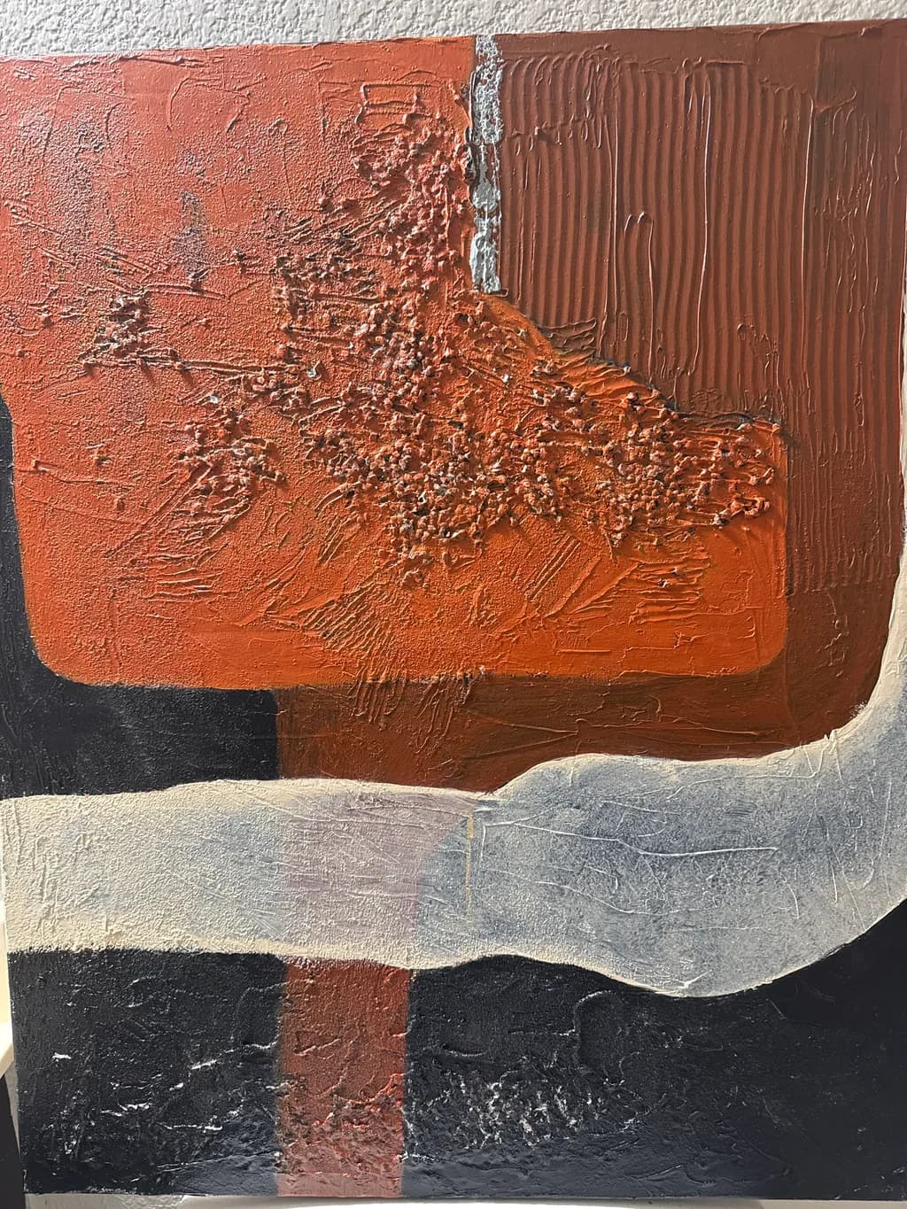
I’m really enjoying this new direction in my painting. I’m exploring gestural art while still playing with texture and shape. I can create forms without feeling like I have to stay inside the lines. There’s structure, but also room to move, experiment, and follow my own instincts. Freedom of expression is what I enjoy most.
Wünscht Feedback zuColor & valueConceptCompositionTechniquePricing
3 Kritiken
Veröffentlicht in Art Critique
4
Composition
The eye enters at that bright coral shoulder in the upper left, slides down the textured buildup, hits the white divider and bounces right into the combed verticals. That's a clear path. The gray curve at bottom acts as a visual stop, keeping everything from draining out the bottom edge, and the way it undulates gives the composition a horizon line without making it literal. The black sections below the gray want to be counterweights but they're split by that thin rust vertical, which fragments the base into three pieces instead of letting it rest as one mass. In my own work I've learned that an anchoring area needs to read as a single shape even if it has color variations inside it, otherwise the top of the painting starts to feel like it's tipping. Here, the base competes with itself.
Color & value
The terra cotta and rust range carries the weight here, running from that bright coral edge through burnt sienna into the deeper chocolate at right. Those are warm-climate colors, the kind I see on canyon walls driving north out of Santa Fe, and you've kept them from going muddy even where they overlap. The white vertical stripe reads as a break, almost architectural, and that cooler gray band at bottom anchors the heat above it. What's missing is a real dark. The black sections at the base want to be your value floor but they're reading mid-dark at best, possibly because of the texture catching light. In a face I'd need that deepest shadow to make the lit planes sing, and the same logic applies here. Without a true black or near-black somewhere, the oranges don't have their full range.
Technique
Acrylic with heavy texture, built up in some areas and scraped or combed in others. The right side shows controlled mark-making, those vertical drags are consistent enough to read as a pattern, and the paint is thick enough to hold the ridges. The left side has a more spontaneous surface, stippled and pushed around, which gives it air. That white stripe is interesting technically because it sits on top of everything, looks like it was laid in with a palette knife, and it's got enough body to cast a shadow in the photograph. Where the technique gets uncertain is in the transitions. The boundary between coral and rust in the center is built up and energetic, but the edge where gray meets black at the bottom is muddy, like the two colors were wet when they touched and you didn't want them to bleed so you left it. I still overwork edges sometimes when I'm nervous about them, and I see that hesitation here.
Concept
You said freedom of expression without staying inside lines, and the piece delivers that. The combed texture in the rust block at right is clearly deliberate, controlled, while the coral area to the left breaks loose with scumbled, almost eroded marks. That contrast between tight and wild is the concept made visible, not just talked about. The white stripe dividing them reinforces the idea that you're setting up a structure and then letting one half of it breathe. I'm curious whether the gray curve at bottom is landscape or pure shape, it hovers right on that edge, which keeps the abstraction from floating off into decoration. This feels like the start of a vocabulary you could use across multiple pieces, which is what a direction needs.
Pricing
You didn't include dimensions, which makes pricing impossible to assess accurately. If this is 16 by 20 inches, you're in one market. If it's 30 by 40, you're in another. Textured abstract work in acrylic generally prices lower than representational oil unless you've got a gallery track record or a strong collector base, and "a few years in" suggests you're still building that. For portfolio work at an emerging level, I'd look at $200 to $400 for a medium-sized piece depending on where you're located and whether you're selling direct or through representation. Anywhere above $500 and you need exhibition history or press to back it up, because gestural abstraction has a crowded field. Don't underprice the texture, it's real labor, but don't overprice the concept when the technique is still solidifying.
What's working
The relationship between the controlled right half and the loose left half is the spine of the piece. You've set up a rhythm where the eye can rest in those combed verticals and then move into the more chaotic area without feeling lost. The color palette is cohesive, everything belongs to the same family, and that keeps the gestural freedom from turning into randomness. The texture is doing real work, it's not decorative buildup, it's creating the forms you mentioned wanting to explore. That white stripe is a confident move, it could have split the painting in half but instead it's holding the two sides in conversation. The gray curve at the bottom is the most interesting shape in the composition because it's the only one that moves horizontally with real intention.
What to push
The biggest opportunity is in the bottom third. Right now the black sections are sitting there as background, almost like they're just filling space until the interesting parts show up, but they're taking up a quarter of the canvas. If those black areas were truly dark, with maybe a slight temperature shift, cool black versus warm black, or if they had some of the texture vocabulary from above, they'd become part of the composition instead of a mat underneath it. The other place to push is in the transitions, particularly where the gray curve meets the rust and coral mass above it. That boundary is soft and uncertain, like you weren't sure if it should blend or break. In my portraits I've learned that a soft edge only works if the adjacent hard edges are really hard, otherwise everything goes soupy. Pick which edges are breaks and commit to them.
One next step
Before you photograph this piece for your portfolio, add one more layer to the black areas at the base. It doesn't need to be pure black, but it needs to go a full two values darker than it is now, enough that it stops catching the light and starts absorbing it. Use a thin layer, scraped or dragged with a card so you get some of that texture vocabulary down there, and consider letting a sliver of the rust or gray show through in one spot so the bottom connects to what's above it. That single move will make the warm areas advance the way they're trying to, and it'll give the composition a floor it can stand on.