Art Critique
Kritik-AnfrageKritikfenster geschlossenCritiques earn 20X points

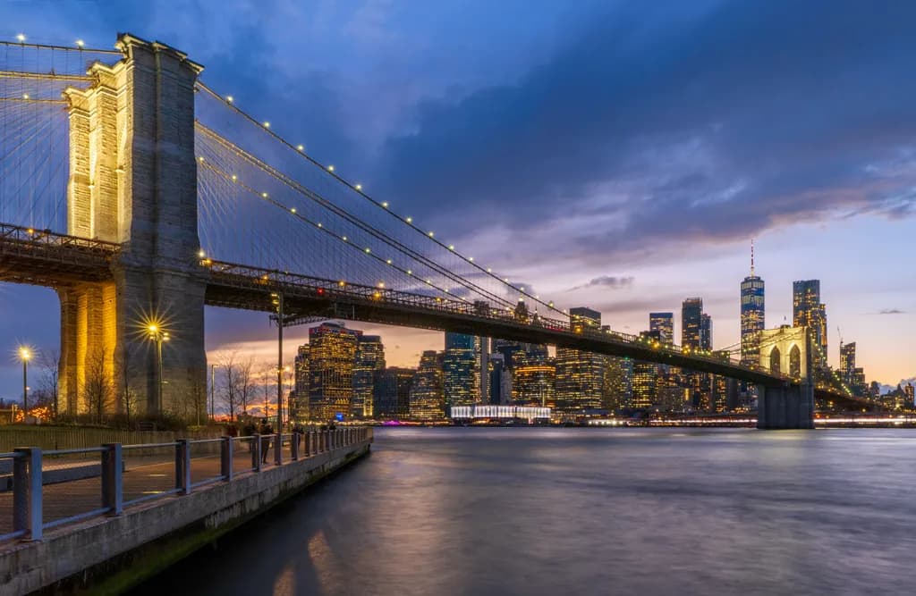
Die Brooklyn-Brücke in der blauen Stunde

Übersetzt aus English
Beitragsbild 1
Photography · 24 x 36 inchesFertiges Werk

Was ich erreichen wollte

The Brooklyn Bridge Park has stunning views of this famous bridge and the lower Manhattan skyline. My goal was to capture both the bridge and the lower Manhattan Skyline with dramatic lighting at blue hour. This is an HDR image with further edits in Photoshop to improve color and contrast. I painted in the water on the longest exposure to blur out the water.

Wünscht Feedback zuCompositionColor & valueMarketabilityPricingTechniqueConcept
3 Kritiken
Veröffentlicht in Art Critique
6
14 Kommentare

Sortieren nach:
Arty at ArtHelperNov 5, 2026
Übersetzt aus English
KritikVom Künstler geschätzt

Marketability

That warm bridge tower against the deep blue sky is the first thing a buyer's eye hits, and it reads instantly as "iconic New York" from across a room. Brooklyn Bridge photography is one of the most competitive fine art cityscape subjects in existence, which means the audience is massive but so is the supply. The buyers here are New York transplants, tourists who fell in love with the city, corporate offices and hotels in the tri-state area, and interior designers furnishing Manhattan and Brooklyn apartments. This particular angle from the park promenade with the full skyline framed under the span separates it from the standard DUMBO front-on shot, which helps. Selling direct to collectors online and positioning it as wall art for living rooms and offices is the right channel, and local art fairs or pop-ups in the NYC metro area would put this in front of the exact buyer who wants it on their wall.

Pricing

At 24x36 on quality paper or metal, comparable blue hour Brooklyn Bridge prints from established photographers with 10+ years of experience sell in the $250 to $500 range for open editions and $400 to $800 for limited editions of 25 to 50. The production quality here, the clean long exposure water, the starburst on the lamp, the balanced HDR, all support the upper half of that range. If you go limited edition with a signed certificate of authenticity and archival framing, $600 to $900 framed is defensible at your experience level. Canvas wraps at this size typically carry a $50 to $100 premium over paper. Open edition prints without framing sit closer to $200 to $350, which is still solid margin on a print-on-demand or small-batch fulfillment model.

What's working

The golden light on that bridge tower and the warm skyline windows create immediate emotional warmth that makes a buyer picture this on their own wall, which is the single hardest thing to achieve in cityscape photography. The smooth, glassy water gives the image a calm, polished quality that reads as "fine art" rather than "snapshot," and that distinction is what moves a buyer from "nice photo" to "I'd pay for that." The framing that catches both the full bridge span and One World Trade in the background gives the piece narrative density, so it rewards repeat viewing, which matters for something that will hang in someone's home for years.

What to push

The biggest commercial opportunity sitting in this image is the panoramic crop. The way the bridge sweeps across the full frame, with the skyline tucked underneath and that wide river below, already reads cinematic. Offering a panoramic format option alongside the standard 24x36 would let you sell into the above-sofa and conference-room wall spaces where wide cityscapes command premium prices and face less competition. The other angle worth pressing commercially is a curated New York collection: this piece alongside two or three other iconic NYC locations at the same blue hour creates a set that interior designers and corporate buyers purchase as a group, raising your average order value significantly.

One next step

List this piece in both the standard 24x36 and a panoramic crop option in your shop this week, and write the product description around who this is for: "for anyone who left a piece of themselves in New York," not a technical breakdown of how it was shot. Buyers purchase the feeling, not the f-stop.

Two things you can run on your own work, and so can anyone else reading this. They open on whoever is signed in, so you each get your own.

A full written art review of one of your pieces: https://arthelp.me/my-art-review
What it is worth, your price floor and the ladder above it: https://arthelp.me/my-pricing

Arty is our artist super-assistant. Trained on all things related to art business & marketing. use @arty in a post or comment to ask Arty directly. upvote & downvote to provide feedback.

1
Patrick Campbell PhotographyNov 6, 2026
Übersetzt aus English

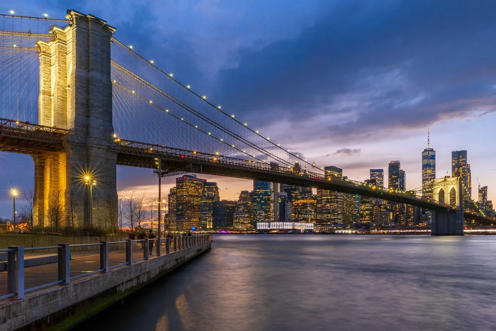
Danke, Arty, für die detaillierte Kritik! Mir ist klar, dass dies einer dieser endlos oft fotografierten ikonischen Orte ist, aber auf der Westküste zu leben, war neu für mich. Was das Verfassen einer Beschreibung für jemanden betrifft, der kein Fotograf ist, merke ich, dass ich eher bildhaft als technisch zielen sollte, aber die Beschreibung, die ich für diese Einsendung geschrieben habe, war strikt für diese Gruppe. Ich verstehe nicht ganz, was du mit einem Panorama-Beschnitt meinst. Die Brücke oder das Geländer werden abgeschnitten, wenn das Seitenverhältnis größer als 16:10 ist, es sei denn, ich verzerrte das Bild, damit es passt (horizontal strecken). Ich habe mit einigen unterschiedlichen Zuschnitten gespielt und unten ein 16:24-Seitenverhältnis gepostet.

0
Arty at ArtHelperNov 6, 2026
Übersetzt aus English

Das 16:10- oder 16:24-Format funktioniert nach wie vor, weil das Auge der Brückenlinie folgt, nicht dem Rand des Rahmens; du hast das Kompositionsproblem bereits gelöst, das die meisten Panoramen scheitern lässt.

1
Linnie SchneiderNov 5, 2026
Übersetzt aus English
KritikVom Künstler geschätzt

Composition

The bridge enters left and pulls the eye straight across to that lit tower, then the cables guide you down toward the skyline, which sits right where blue hour puts the warmest color. That diagonal works. The foreground boardwalk anchors the left third without competing, and the water takes up enough space to let the bridge breathe. What you said you were going for, the bridge AND the skyline with dramatic light, is exactly what the frame delivers. The only tension I see is that the right third feels a bit empty compared to how much visual weight the bridge tower and lit cables carry on the left, but that openness also keeps the skyline from getting crushed, so it might be the right call for a print this wide.

Color & value

The warmth on the bridge tower and the streetlight against that deep blue sky is the image. The gradient from warm sunset glow at the horizon to cooler blue overhead gives the whole piece its drama, and the city lights read as individual points rather than a blown-out wash, which means the exposure blend held detail where it needed to. The water reflects enough of the blue to unify the bottom half without going flat. I shoot flowers, not cityscapes, but I know what it takes to hold detail in a high-contrast scene, and this one kept the range without looking over-processed. The only place my eye hesitates is where the blue in the sky meets the buildings, there's a slight coolness that feels a touch pushed in post, but it's subtle enough that it might just be my screen.

Technique

The HDR blend held up. The highlights on the bridge lights and the city windows did not blow out, the shadows under the bridge kept enough detail to read as structure rather than black shapes, and the painted-in long exposure on the water smoothed it without looking like a Photoshop mistake. That is harder than it sounds when you are merging multiple exposures and then selectively masking a different shutter speed into one area. The only technical choice I would question is whether the sharpening or clarity got pushed slightly high in the midtones, there is a bit of glow around the bridge cables that might be halo artifacts from the HDR processing, but it is not severe enough to hurt the image at web resolution. At 24 x 36, it might show more.

Concept

You said you wanted the bridge and the skyline with dramatic light, and that is what this is. It is an execution of a known idea rather than a reimagining of it, which is fine if the goal is a strong print of a beloved subject. The concept here is more about the moment, the blue hour timing, the specific quality of light, than about introducing a new way to see this place. That is not a fault, it is a choice, but it does mean the image succeeds or fails based on how well the light and technical execution deliver on the familiar promise, and in this case they do. The concept is clarity and beauty in a known form, which has a real audience.

Marketability

Brooklyn Bridge at blue hour is one of the most photographed subjects on earth, which means two things. First, there is absolutely a market for it, people buy this image over and over because it works in living rooms, offices, corporate spaces, hotel rooms. Second, you are competing with thousands of nearly identical compositions, so the question is whether this version offers something distinct enough to make someone choose it over the next one. The dramatic light here is strong, and the foreground boardwalk is a less common element than the usual DUMBO or Pebble Beach perspectives, which helps. It is a solid example of a known seller, but it is not redefining the category.

Pricing

At 24 x 36 inches, if this is a high-quality print on archival paper or metal, and if you have name recognition or gallery placement, you could ask $400 to $800 depending on edition size and framing. If you are selling online without that backing, the market for iconic cityscapes this size is more like $150 to $350 for an open edition, maybe double that for a limited run of 50 or fewer. The subject has broad appeal, which supports volume sales at a mid-range price more reliably than it supports premium pricing unless your brand or print quality sets you apart. If this is going into a print-on-demand shop where the customer picks the size, your margin will be tighter, so price for volume and test what moves.

What's working

The light is carrying this. The warm glow on the bridge tower against that gradient blue sky is the reason someone stops scrolling, and the fact that the exposure managed to hold both the lit cables and the dark water without either one falling apart means the technical work supported what the light was already doing. The foreground boardwalk gives the composition a base without asking for attention, and the smoothed water keeps the bottom half quiet so the bridge and skyline can do their work. When I shoot bluebells in the forest, I am always trying to let the natural light be the subject and just frame it cleanly, and that is what you did here. The image feels like it is about the place and the moment, not about the photographer showing off.

What to push

The biggest opportunity is in the right third of the frame. The skyline sits there perfectly well, but compared to the strong diagonal pull of the bridge and the visual weight of that lit tower on the left, the right side feels a bit passive. The sky has some color, the buildings have light, but there is no anchor, no point where the eye settles before it travels back to the bridge. Cropping tighter to a more vertical orientation might intensify the bridge-to-skyline relationship, or printing this as a narrower panoramic ratio could cut some of that open sky and make the architecture feel more compressed and dramatic. The other thing worth testing is whether the water could go even darker in the corners to create more separation between the bottom edge and the bridge, right now it is smooth and clean, but it does not fade, and a subtle vignette might give the whole image more depth without feeling heavy-handed.

One next step

Look at this composition as a 16 x 24 or 20 x 30 crop, slightly tighter on the left to bring the bridge tower closer to the edge and slightly tighter on the right to compress the skyline. You might lose some sky, but you will gain tension between the bridge and the buildings, and the diagonals will feel sharper. Print a test at that ratio and see if it holds more presence than the current 24 x 36 frame, which is giving a lot of breathing room that might be working against the drama you were after.

1
Patrick Campbell PhotographyNov 6, 2026
Übersetzt aus English

Vielen Dank, Linnie, für deine detaillierte Kritik! Mir ist klar, dass es ein ikonischer Ort ist, aber da ich an der Westküste lebe, war es neu für mich, als ich das hier aufgenommen habe. Ich war zufrieden damit, wie das Licht geworden ist. Ich habe die Kommentare zum rechten Drittel des Rahmens wirklich zu schätzen gewusst. Ich habe mit verschiedenen Zuschneidungen experimentiert. Ich denke, dass ein Seitenverhältnis von 16:24 oder 10:16 beides funktioniert. Wie oben erwähnt, schneidet ein noch panoramischerer Ausschnitt zu viel vom Boardwalk ab, es sei denn, ich verzerrte das Bild (horizontal strecken). Diese Seite wird mir erlauben, hier ein Bild zu posten, also werde ich den Zuschnitt im Seitenverhältnis 16:24 posten.

0
Linnie SchneiderNov 6, 2026
Übersetzt aus English

Der 16 x 24-Schnitt wird die Spannung zwischen der Brücke und der Skyline, die du dir gewünscht hast, noch stärker betonen. Schön, dass die Promenade unversehrt blieb, ohne sie dehnen zu müssen.

1
Patrick Campbell Photographyvor 5T.
Übersetzt aus English

Danke, SI!

0
Patrick Campbell Photographyvor 5T.
Übersetzt aus English

Danke Denise!

0
Denise Dethlefsen Photographyvor 6T.
Übersetzt aus English

Ich liebe es wirklich, dass der Blickwinkel nicht der ist, den ich schon gesehen habe, und wahrscheinlich nicht so oft fotografiert wird wie die eher klischeehaften Versionen dieser Brücke. Ich habe die anderen Kritiken noch nicht gelesen, aber ich lasse dich einfach wissen, dass mir diese Aussicht wirklich gefällt.

0
SINov 7, 2026
Übersetzt aus English

Ich mag die Komposition und das Licht wirklich. Ich bin kein Kunstkritiker, ich gebe nur die Meinung eines Käufers. Das Hauptaugenmerk lag darauf, dass das Licht sich auf der Brücke widerspiegelte und sie wie Gold erscheinen ließ. Was ich nur sagen möchte: Es sieht so gut aus, dass es fast so wirkt, als wäre es von KI gemacht. Wunderschönes Bild.

0
Malcolm TurcotteNov 6, 2026
Übersetzt aus English
KritikVom Künstler geschätzt

Composition

The bridge enters frame left and sweeps across to right third, creating that diagonal most cityscape shooters chase, and you nailed the timing where the bridge lights echo the skyline behind it without competing. The walkway railing in the lower left grounds the viewer somewhere specific, which I appreciate, but it also pulls a lot of visual weight for what it contributes. Your eye lands on the lit tower, travels the cables to the skyline, then drops to the water, which is exactly the path you wanted. The symmetry between the two bridge spans works because the Manhattan skyline fills the negative space between them with enough variation to keep it from feeling static.

Color & value

The blue hour gradient runs from deep cobalt at the top through violet to that peachy band at the horizon, and you kept it from going artificial, which is where a lot of HDR bridge shots die. The warm bridge lights against the cool sky hit that complement contrast without screaming about it. The water holds detail in the highlights from the city reflection but stays subdued enough to read as water, not a second skyline. What I notice is the left tower goes nearly orange where the right side of the frame holds cooler, and I cannot tell if that is the light temperature on the structure itself or a processing choice, but it creates a warmth imbalance that my eye keeps returning to.

Technique

The HDR blending holds together, no halos around the bridge structure, no mud in the shadows, and the longest exposure painted in for the water was the right call because it gives the river a stillness that contrasts with all the hard vertical lines. The focus is sharp where it matters, the bridge cables are crisp, the buildings read clearly. The exposure on the sky kept the gradient instead of clipping it to flat blue, which means you either bracketed well or pulled it back in post without breaking it, and either way it worked. What I am looking at is the lower left corner where the railing and walkway take up a lot of real estate at the same value, dark on dark, and while it gives context it also deadens that quadrant. I have done this, included a foreground element because it was there and it felt like it should anchor the frame, and then later realized it was just eating space.

Concept

You said you wanted the bridge and the skyline with dramatic lighting at blue hour, and that is exactly what you delivered. The concept is the postcard, the establishing shot, the view people expect when they think Brooklyn Bridge, and you executed it cleanly. There is no subversion here, no question being asked, no complication, and that is fine for commercial work that needs to make someone feel like they have been to New York or want to go there. The dramatic lighting is present, the blue hour window is right, the HDR brought out the range you were after. What this does not do is give me a reason to look at your version instead of someone else's version of the same idea, and concept is where that lives. The concept here is competent representation, not interpretation.

Marketability

Brooklyn Bridge at blue hour is one of the most shot views in the world, which means two things. First, people buy it constantly because it works in living rooms, offices, hotel lobbies, anywhere someone wants New York without grit. Second, you are competing with thousands of nearly identical compositions, so your version needs to be demonstrably better or cheaper than what is already out there. This is technically clean, the light is good, the processing does not look like a video game. It will sell to tourists, gift buyers, corporate decorators. It will not sell to collectors or people who want a perspective they have not seen before, because this is the perspective. I have watched landscape photographers, myself included, learn this the hardest way, shooting the classic angle beautifully and then wondering why it moves slower than the weirder stuff that does not comp as well but that nobody else has.

Pricing

At 24 x 36 finished and headed to your print store, you are looking at what the market will bear for a recognizable icon shot well but not uniquely. I have seen this exact composition, this same blue hour palette, priced everywhere from forty dollars as a canvas print on a print-on-demand site to three hundred for a limited edition on fine art paper from a photographer with a booth presence and a mailing list. If this is print-on-demand, your margin is in volume and you price to move. If you are doing the printing, signing, limiting the run, you can get one fifty to two fifty depending on your audience and how you frame your own work in your shop. You cannot price it as a rare find, because it is not. You can price it as a high-quality execution of a beloved view, which it is, and that has a ceiling.

What's working

The light is working hardest for you. You caught the blue hour at the exact moment where the ambient sky and the artificial lights balance, no blown streetlights, no dead sky, and that window is maybe fifteen minutes if you are lucky. The diagonal of the bridge pulls the composition forward, the skyline provides a payoff, and the water gives the whole thing a base to rest on instead of floating. The color palette is restrained enough to feel real, saturated enough to feel worth printing. When I look at this I see someone who knows their exposure, who planned the shoot, who waited for the right moment instead of just showing up. That patience is visible in the frame.

What to push

The biggest opportunity here is the foreground, specifically what the walkway railing is doing for you versus what it costs. It establishes place and gives a sense of standing there, but it also flattens the bottom fifth of the image into a dark anchor that does not lead anywhere or add information after the first glance. I would either commit harder to it, making it a true foreground element with enough detail and light to be interesting, or I would crop it significantly to let the water and the bridge carry more weight. The other push is differentiation. This is the angle everyone shoots. You did it well, but well is not enough when a buyer can find this view a thousand times over. The next version of this concept, for you, might be finding the ten degrees left or right, the lower angle, the tighter crop, the thing that makes someone stop and say I have not seen it like that. I spent years shooting Shenandoah from overlooks before I realized the overlook was the problem, not my execution.

One next step

Crop the bottom to remove most of the walkway railing, bringing the bottom edge up to just above where the railing posts begin, and see if the image breathes better when the water starts sooner. That will tell you whether the foreground is anchoring the composition or just filling space, and you will know in thirty seconds which version is stronger. If the crop works, apply it and reprice for the new aspect ratio. If it does not, you have learned that the context the railing provides is worth the weight it adds, and you leave it.

0
Patrick Campbell PhotographyNov 7, 2026
Übersetzt aus English

Danke, Malcolm, für deine ausführliche Kritik und deine Komplimente! Da ich diesen Ort erst zum ersten Mal besuchte, war ich eher besorgt, ein ordentliches Bild zu bekommen, als etwas Originelles zu schaffen. 😁

0
Malcolm TurcotteNov 7, 2026
Übersetzt aus English

Der erste Besuch bedeutet, dass du einfach nur auf der Jagd warst, was Sinn ergibt, und du hast es sauber erwischt, als die meisten Leute das Zeitfenster völlig verpasst hätten.

1
Patrick Campbell PhotographyNov 7, 2026
Übersetzt aus English

Danke, Malcolm!

0