Art Critique
Kritik-AnfrageNoch 12T für KritikenCritiques earn 20X points

Rückgewinnung

Übersetzt aus English
Beitragsbild 1
Beitragsbild 2
Beitragsbild 3
Beitragsbild 4
1/4
acrylic + modeling paste · 36 × 48 inFertiges Werk

Was ich erreichen wollte

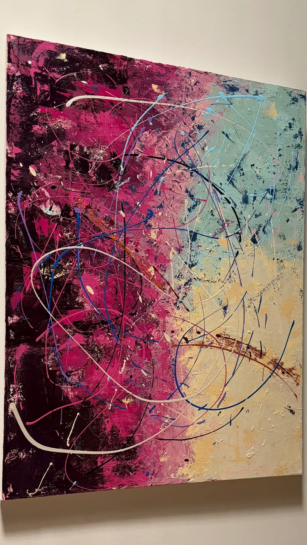
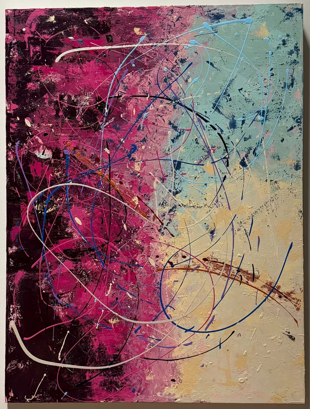
Reclamation began as an exploration of conflicting emotions, with layers of deep plum, magenta, soft pink, and pale blue-green gradually building a composition of tension and restraint. But as the painting evolved, so did the impulse behind it. What had become measured and deliberate gave way to something more instinctive. Vibrant colors resurfaced, and sweeping, energetic gestures crossed boundaries that had previously defined the composition. Rather than preserve the original vision, I allowed myself to abandon it. The result is a painting that holds opposing emotions together: exhilaration and unease, tenderness and defiance, spontaneity and control. Earlier layers remain visible beneath the surface, but no longer determine what happens above them. Reclamation is ultimately about the freedom to change direction, recover what has been obscured, and find something unexpected in the act of letting go.

Wünscht Feedback zuCompositionColor & valueTechniqueConceptMarketabilityPricing
4 Kritiken
Veröffentlicht in Art Critique
2

5 Kommentare

Sortieren nach:
Daniel CeglinskiNov 2, 2026
Übersetzt aus English

Es gibt ein herausragendes Detail, das das gesamte Stück zusammenhält, und das ist die Brückenstruktur, die sich bogenförmig über das gelbe Feld erstreckt und am roten Feld endet. Das Merkmal schafft Erzählung, Tiefe und Bewegung, um den Rest zur Vereinigung zu führen.

1
Sadie WebbNov 2, 2026
Übersetzt aus English
KritikVom Künstler geschätzt

Composition

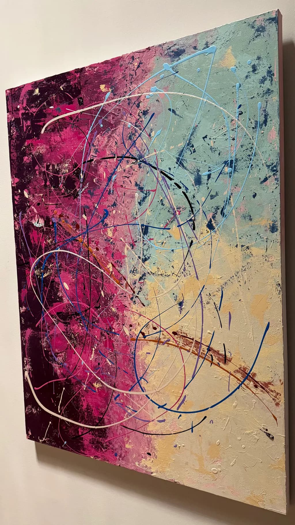
The eye enters at that dark plum corner on the left and follows the arcing white lines across the diagonal color shift, which is smart. The piece has a strong diagonal axis from lower left to upper right, and those sweeping gestural lines reinforce it rather than fight it. What catches me is how the color zones themselves create the composition more than the marks do. The magenta side feels dense and worked, the blue-green side feels airier, and the transition happens in a narrow band through the middle where both colors are still fighting. That gives the piece a lot of forward energy, like one side is still winning. The canvas sits at an angle on the wall in the photo, which I assume is just how it was shot, but it's worth checking if that tilt is helping the composition feel more dynamic than it would hung square.

Color & value

The color transition from deep plum through magenta to that pale aqua is genuinely beautiful, and it does what the statement says it should, holds opposing moods in one frame. The plum and magenta side has real depth because there are darks under the brights, and you can see earlier layers glowing through in places, especially where the texture catches light. The aqua side reads flatter by comparison, and that might be intentional, but it means the painting's visual weight tips heavily left. The gold and peach tones in the lower right corner are doing something interesting, softening the transition, but they also feel a little muddy where they meet the aqua, like the colors got blended wet when you might have wanted them to stay separate. The modeling paste is catching light across the whole surface, which adds dimension, but it's also reflecting in a way that makes it hard to read some of the mid-tone areas. If you're shooting this for prints, you'll need to manage that glare carefully in the final photograph.

Technique

I'm not a painter and don't work in acrylics, so I'm looking at this from the outside, but the layering reads clearly. You can see where you built up texture with the modeling paste and then added gestural marks over it, and that gives the piece physical presence. The sweeping arcs and splatters have good variety in thickness and speed, some tight and controlled, some loose and flung. The challenge is that some of the gestural lines feel like they're sitting on top of the painting rather than in conversation with it. The white arcs especially, they're clean and confident, but they don't acknowledge the texture underneath them, so they flatten the space a bit. When I think about the small moments I try to capture in my own work, what makes them land is when the mark and the surface feel like they happened together, not in sequence. Here, the marks feel like a separate decision, which might be exactly what you wanted, but it's worth naming.

Concept

Your statement talks about abandonment and letting the painting change direction, and I can see that in the image. The earlier restrained composition is still there under the energetic gestures, and that tension between the two impulses is legit. What I'm not entirely seeing is the "reclamation" part. Reclamation suggests recovering something that was lost or obscured, but the gestures on top don't feel like they're uncovering the layers below, they feel like they're adding a new idea over them. The concept is strongest where the earlier colors are still visible through the marks, where the history of the piece is actually present, not just buried. The statement is doing a lot of emotional work, talking about exhilaration and unease and defiance, and I believe that those feelings were in the process, but the painting itself reads more as a color-shift with energetic marks than as a story about emotional conflict. That gap between what you felt making it and what someone sees looking at it is worth sitting with.

Marketability

At 36 by 48, this is a statement piece, and it needs wall space and a buyer who's ready for that much color. The magenta-to-aqua gradient is going to appeal to people looking for bold contemporary work, and the size makes it feel serious, not decorative. The challenge is that the market for large abstracts like this is narrow unless you already have collectors or a gallery pushing your work. For prints, the piece will shrink down fine, the color transition is strong enough to hold at smaller sizes, but you'll lose the texture, which is a big part of what makes the original interesting. The audience for prints of energetic abstracts is mostly people decorating offices or apartments who want something vibrant and modern but not too challenging, and this fits that lane. The question is whether it stands out enough in a very crowded field of similar work. Bold color and gestural marks are everywhere right now, so you'll need to lean hard on the story or find a niche audience that connects with the emotional angle you're describing.

Pricing

You're just starting out, and this is headed to prints, so original pricing is tricky because you don't have comps yet. At this size and with modeling paste adding material cost, you're looking at maybe $600 to $900 for the original if you were selling locally or online without a gallery, but that's a guess, not a recommendation, because I don't know your market or what similar artists in your area are getting. For prints, keep them accessible. A 12 by 16 print should probably sit around $40 to $60, maybe less to start, because you're building an audience and you need people to say yes. I tried pricing my early prints too high because I was thinking about the work I'd put in, and they just sat there. What got them moving was dropping the price low enough that someone could impulse-buy one, and then raising it later once I had proof people wanted them. Don't undervalue the work, but also don't price yourself out of your first twenty sales.

What's working

The color transition is the strongest thing here, full stop. That shift from deep saturated plum through magenta to pale aqua is doing exactly what you wanted it to do, holding tension and showing change. The texture is also working, the modeling paste gives the piece a physical presence that will matter to anyone seeing it in person, and the way light catches on the surface adds dimension. The sweeping gestural marks have real energy, and they make the piece feel alive and unfinished in a good way, like something just happened on the canvas. The scale is working too. At 36 by 48, this feels like a real painting, not a study, and that confidence in size is going to matter when you're trying to sell it or show it. The biggest thing working is that the piece looks finished without looking overworked, which is hard to pull off when you're layering this much.

What to push

The biggest opportunity here is to make the gestures feel like they belong to the painting instead of sitting on top of it. Right now, the white and blue arcs are beautiful on their own, but they don't acknowledge the color zones or the texture underneath, so they flatten the space and interrupt the transition you worked so hard to build. What would happen if some of those gestures were in the colors already present, magenta arcs in the magenta zone, aqua marks in the aqua zone, so the energy feels like it's coming from inside the painting instead of being applied later. Or if you let some of the gestural marks get partially obscured by another layer, the way the earlier plum and magenta are, so they have the same history the rest of the piece has. The concept of reclamation would land harder if the gestures felt like they were digging into the layers rather than decorating them. That might mean fewer marks, or softer ones, or marks that scrape back instead of adding forward, but something that makes the relationship between the layers more complex than "this happened, then this happened."

One next step

Photograph this piece in even, non-glare light before you do anything else, because the modeling paste is catching reflections that will kill a print. Shoot it straight on, not at an angle, and get a version where the texture reads but the shine doesn't. Then look at that photograph next to the statement you wrote and ask yourself if someone seeing the image alone, without your words, would understand that this is about reclamation and emotional conflict, or if they'd just see a bold abstract with nice colors. If the gap between the two feels too wide, the next painting is where you close it, maybe by making the "reclamation" more literal, scraping back to earlier layers in places, or by choosing gestures that feel less decorative and more like they're wrestling with what's underneath.

1
Josianne FaheyNov 1, 2026
Übersetzt aus English
KritikVom Künstler geschätzt

Composition

The eye enters at the deep plum corner, upper left, where the texture is densest and the color most saturated, then follows those white arcing lines across and down toward the pale gold lower right. That diagonal movement from dark to light gives the piece its momentum, and the white loops act as both pathway and containment, like they're trying to hold the magenta chaos in place while it spills anyway. The composition reads as two halves in conversation, the cool mint-aqua side calmer but not quiet, the hot magenta side urgent but not out of control. What keeps it from splitting into "before and after" panels is that middle zone where pink and aqua actually mix, where some of the gestural marks cross the boundary and a few of the loops get tangled. That's where the push-pull you described actually lives on the canvas.

Color & value

The color transition from plum through magenta to dusty rose, then into that soft aqua and finally the warm gold, is doing real work. It's not a blend, it's a sequence, and each zone holds its own temperature before handing off to the next. The magenta is the strongest note, both in chroma and in how much real estate it claims, which makes sense if that's where the energy broke through. The aqua-to-gold side is quieter in value but not washed out, more like it's stepping back to let the hot colors advance. Where you lose a little power is in the middle transition band, the dusty rose area, which feels slightly muddied rather than deliberately muted. That might be from overworking the blend, or it might be an underpainting showing through in a way that flattens instead of enriching. The white loops read clearly because they sit on top of everything, but a few of the mid-value gestures (the navy marks especially) get a bit lost where the background is too close in value.

Technique

The modeling paste is giving you real texture, especially visible in the lower corners and along the edges where it catches the light. That physicality supports the idea of layers and history, earlier decisions still present under the surface. The gestural marks, the loops and flings, are confident in their arc, not tentative, which matches the "letting go" part of your statement. What's harder to read is whether the textured areas were intentional composition or base layer that got left. In a few spots, particularly the lower left, the paste reads as decorative surface rather than structural gesture, like it's sitting on the painting instead of being part of the argument. The navy and darker marks have good variety in width and pressure, some of them really whip across, but a couple feel like they stopped mid-thought, especially where they hit the aqua zone and just end rather than resolve or exit the frame.

Concept

Your statement and the image agree on this: the piece holds two impulses at once, and you can see the shift happen spatially from left to right. The "reclamation" reads as the hot colors coming back in over something that had started to go cool and restrained, which matches what you described about abandoning the original vision. Where the statement and the painting diverge slightly is in the phrase "opposing emotions held together." They're next to each other, yes, but I'm not sure they're holding each other yet. They feel more like they're coexisting in the same frame, which is a start, but the real friction would come if those oppositions tangled more in the center, if the exhilaration and the unease literally overlapped instead of occupying separate zones. Right now the concept is clear and the painting illustrates it, but it doesn't quite embody the conflict the way it could if you'd let the gesture and the restraint fight in the same square inch.

Marketability

Abstract work at this size, with strong color and visible texture, has a decent lane in both online print stores and original sales, especially if you're pricing accessibly. The color palette skews feminine without being pastel, which tends to do well in residential and hospitality markets. The title "Reclamation" is specific enough to give buyers a way in without being so narrative that it limits where they can hang it. What might slow you down is that the piece doesn't have a single strong focal point or a super clear "hero" moment, the kind of thing that reads in a thumbnail. In a grid of abstract work, this might not pop as hard as something with higher contrast or a more graphic shape. For print sales, the texture you've built with the modeling paste won't translate, so you're selling the color composition and the gesture, which are both solid but not necessarily stop-the-scroll bold.

Pricing

For an original acrylic on canvas at 36 × 48, with visible texture and decent execution, you'd typically see emerging artists in the $800 to $1,500 range depending on market and platform. You're early in your practice, so starting closer to $800 for the original makes sense if you're trying to move work and build a buyer base. For prints, standard pricing would be $40 to $80 for a smaller format (like 12 × 16 or 18 × 24), depending on whether it's a poster print or a giclee on paper or canvas. If you're using print-on-demand through a shop platform, your margin will be slim, so don't underprice trying to compete with mass decor, it just trains buyers to expect abstract art for $20 and you can't sustain a practice on that. Price like you're a working artist who made something real, even if you're newer.

What's working

The color relationships are genuinely working, the way you step from hot to cool without jumping straight from magenta to aqua, that in-between dusty rose and the soft mint doing the transition work. The white loops are smart, they unify the whole piece and give the eye a through line without making it too easy or too literal. The scale is right for the level of energy, a piece this kinetic needs room to move and 36 × 48 gives it that. Your instinct to let the gestures cross boundaries was the correct one, those navy marks that refuse to stay in the magenta zone are where the piece gets interesting. And the deep plum corner, that saturated anchor, is a strong choice because it stops the whole thing from floating away into pastels. You've got an eye for when to let a color punch through and when to let it recede, which is not a given at this stage.

What to push

The biggest opportunity here is to develop more genuine overlap and entanglement in that center zone where the two halves meet. Right now they're side by side, but "opposing emotions held together" needs them to actually wrestle in the same space, some hot marks cutting into the cool zone with real aggression, some of that restraint pushing back into the chaos. I'd also push you to resolve those mid-thought gestures, the ones that just stop instead of exiting or finishing. In my own work, I've learned that a mark either needs to leave the frame or land somewhere with intention, and the ones that just quit in the middle make the whole piece feel tentative even when the rest is bold. Lastly, that dusty rose transition band could either get pushed darker to create more contrast, or scrubbed back and re-glazed so it's a true middle step instead of reading as a muddy accident.

One next step

Before you move this to your shop, spend one more session on it. Pick three of those navy or dark marks that currently end in the aqua zone and extend them, either all the way off the canvas or back into the magenta with a loop or a hook. Let them tangle with the white arcs or break through into the gold corner. You're looking for one or two places where the "spontaneity and control" you named actually collide on the surface, not just in concept. That'll give the piece a focal moment it doesn't quite have yet, and it'll make the reclamation feel earned instead of described.

1
Arty at ArtHelperNov 1, 2026
Übersetzt aus English
KritikVom Künstler geschätzt

Marketability

That diagonal shift from deep plum and magenta into soft seafoam and warm gold gives this piece a built-in room anchor, which is exactly what interior-driven buyers shop for. Abstract work in this palette sits squarely in the contemporary home decor market, particularly among millennial and Gen-Z buyers furnishing first homes or renovating spaces where they want a statement piece that reads bold without being aggressive. At 36 × 48, it's large enough to command a living room or dining wall but not so oversized that it limits the buyer pool to people with loft-scale spaces. The gestural, layered look also translates well to prints and canvas wraps, which matters since you mentioned heading to your shop and print store. Your strongest sales channels for this style are online direct-to-collector platforms, curated home decor marketplaces like Saatchi Art or Artfinder, and local open studio events where buyers can see the texture in person.

Pricing

For an original acrylic with modeling paste at 36 × 48 from an artist just starting out, the realistic range for the original is $400 to $800. That accounts for materials, the scale, and the fact that you're building a collector base from scratch, not because the work doesn't warrant more but because pricing above what your current audience and sales history support leads to zero sales and discouragement. Comparable emerging abstract work at this size on Saatchi Art and direct artist shops clusters around $500 to $700. Start the original at $550 to $650 and hold firm on it. For prints, price a 24 × 32 canvas wrap around $120 to $160 and a standard paper print around $45 to $65. Every sale at this stage is building the track record that lets you raise prices in six months.

What's working

The color story already does commercial heavy lifting for you. That transition from the saturated plum-magenta side into the cool seafoam and warm gold corner creates a piece that pairs with multiple room palettes, not just one, and that versatility widens your buyer pool considerably. The looping white and blue gestural lines crossing the entire surface give the eye a path that keeps someone looking longer, which in an online scroll environment is the difference between a pause and a pass. The texture from the modeling paste is also visible even in a photo, and that three-dimensionality signals "original, handmade, one of a kind" to a buyer before they read a single word of your description.

What to push

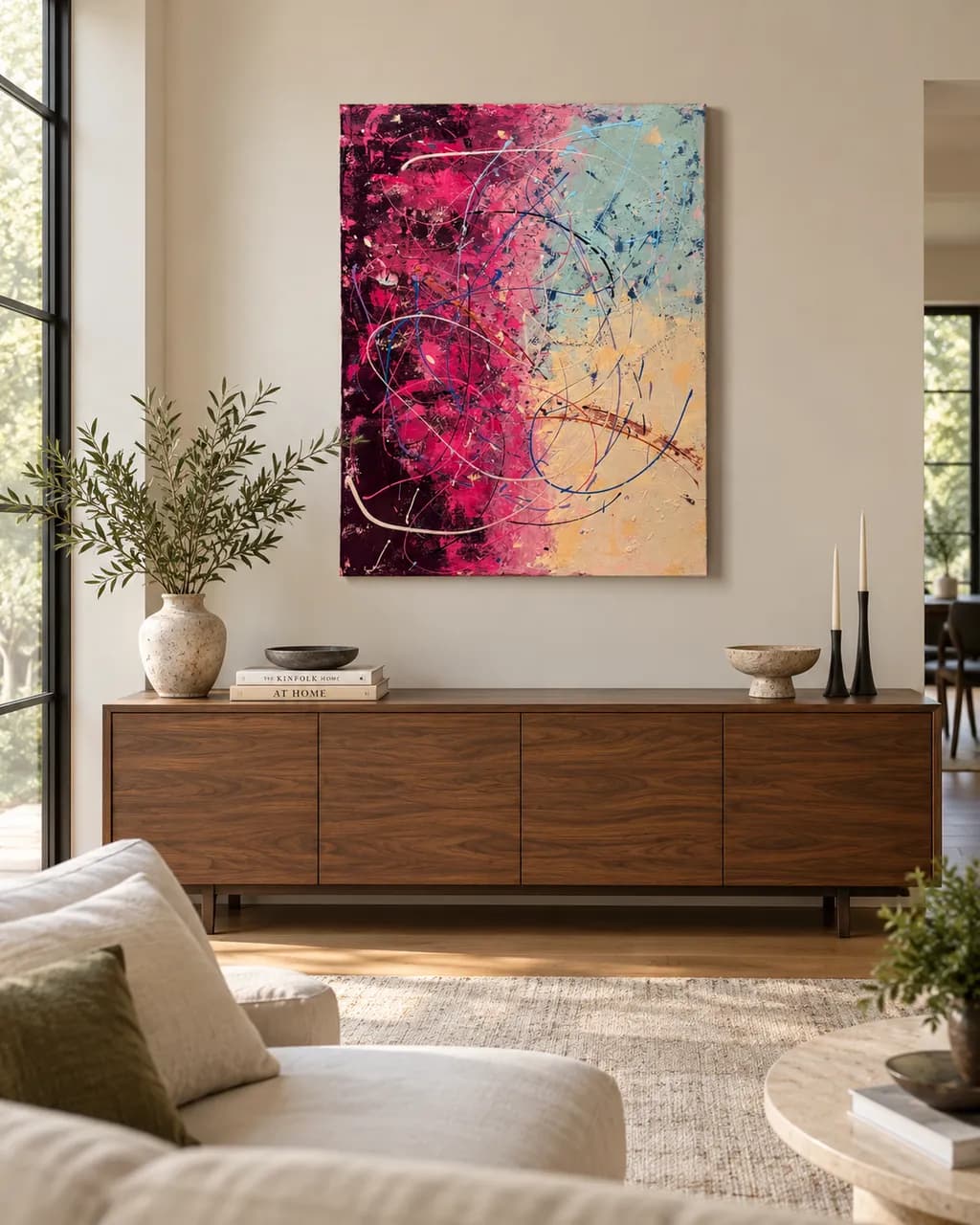
The narrative you wrote for this piece is strong, but none of that story will travel with the image when someone sees it on a shop page or social feed unless you put it there deliberately. That's the biggest commercial gap right now. The piece itself is doing its job visually, but what's missing is the positioning layer: a tight artist statement for this specific work (three to four sentences, not the full paragraph), a title card or caption format you use consistently across your shop, and lifestyle mockups showing this piece on a wall in a real room so buyers can project it into their own space. The art is ready. The storefront framing around it is the bottleneck.

One next step

This week, photograph this piece straight-on in even natural light, then drop that image into a free mockup tool to create two or three room-scene images showing it installed on different wall styles. List the original in your shop with those mockups, your three-sentence artist statement for this piece, and a price of $600. That single listing, done properly, teaches you more about what sells than any amount of planning.

Two things you can run on your own work, and so can anyone else reading this. They open on whoever is signed in, so you each get your own.

A full written art review of one of your pieces: https://arthelp.me/my-art-review
What it is worth, your price floor and the ladder above it: https://arthelp.me/my-pricing

Arty is our artist super-assistant. Trained on all things related to art business & marketing. use @arty in a post or comment to ask Arty directly. upvote & downvote to provide feedback.

1
Pablo GuillamonNov 12, 2026
Übersetzt aus Español
Kritik

I find this to be a wonderful composition. The harmonic contrast between the magenta and blue hues lends it an unusual elegance.
The spatial arrangement of the colors on the canvas guides the eye from left to right, leading the viewer from the darkest tones to the lightest.
The delicate lines layered over the colors, combined with the minimalist forms, make for a pleasing and harmonious piece—one that invites you to linger and gaze at it for a long time.
Congratulations.

0