Kritik-AnfrageNoch 15T für KritikenCritiques earn 20X points
Kleines Mädchen auf dem Hof
Übersetzt aus English
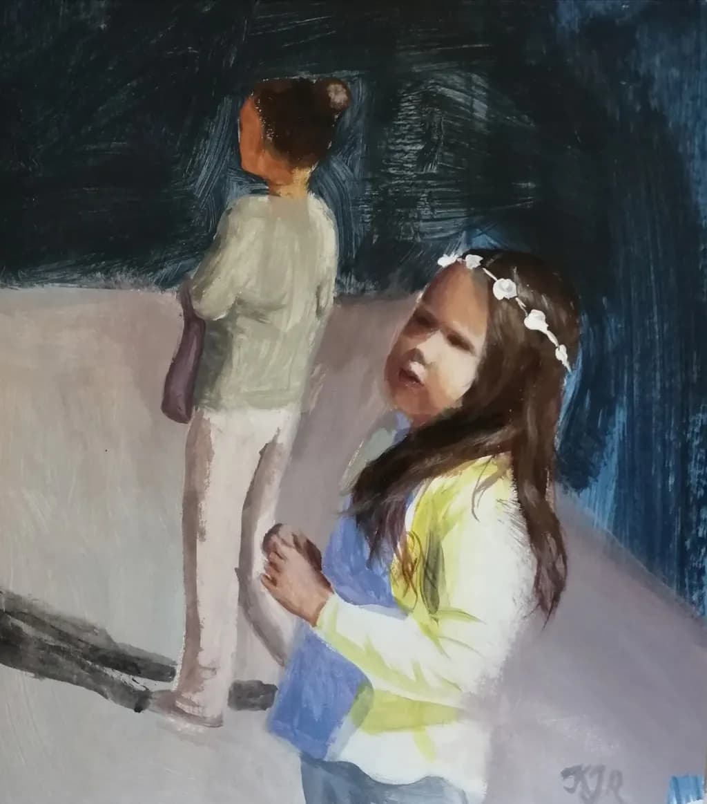
Medium (acrylic on the cardboard) · 30x40 cmFertiges Werk
Was ich erreichen wollte
In this painting, I tried to practice the freshest brushstrokes and the most confident line drawing, not getting bogged down in details, but highlighting what is necessary. How do you think it turned out? How marketable do you think the finished work is?
Wünscht Feedback zuTechniqueConceptPricingMarketability
3 Kritiken
Veröffentlicht in Art Critique
2
Technique
The broad strokes in the background absolutely deliver on what you said you were after. That dark blue scratched in behind the standing figure has energy to it, the kind that comes from committing to a mark and leaving it alone. The seated girl's yellow sleeve shows the same confidence, a few decisive strokes that describe the fabric without fussing. Where it gets uneven is in the faces and hair. The standing figure reads more as shape than person because the head is so simplified it nearly disappears into silhouette, while the seated girl's face has more information but the features feel a little hesitant compared to the rest of the piece. I work in watercolor so I can't speak to acrylic handling specifically, but I do know that when I'm going for loose and some passages tighten up against my intention, it's usually because I second-guessed mid-stroke. The flower crown on the seated girl is a good example of staying loose, those white dots say everything they need to without becoming precious.
Concept
Two figures, one standing with her back to us and one seated looking up, the blue darkness behind them and that pale ground they occupy. It reads as a moment between children, maybe waiting, maybe mid-conversation. What you're going for and what's here line up in the brushwork but not quite in the overall image. "Highlighting what is necessary" suggests a real clarity about which details matter, but right now the standing figure is so reduced she's almost a cutout while the seated girl gets more attention, and I'm not sure that imbalance is intentional. If the standing figure is meant to be secondary, the composition supports that. If they're meant to have equal weight, she needs something to anchor her as a person, maybe just a hint of a profile or a shift in how the light catches her. The idea of fresh, confident strokes is solid. The question is what story those strokes are telling, and right now that's a little unclear.
Marketability
Figurative work with children can sell, especially when it has an intimate, everyday quality rather than being overly sentimental. This has that going for it. The loose handling could appeal to buyers looking for something painterly and modern, not photographic. What works against it is the cardboard support, which makes it hard to frame well and raises questions about longevity, and the uneven finish, where some areas feel resolved and others don't. The standing figure in particular reads as incomplete, and a buyer will hesitate if they can't tell whether you meant to leave it that way or ran out of steam. If you're building a portfolio to show a coherent style, this piece says you're exploring looseness but haven't quite settled on how loose is loose enough. That's fine for a working artist, that's how you figure it out, but it makes the painting harder to sell right now because it's mid-discovery rather than arriving at a clear answer.
Pricing
Acrylic on cardboard, 30x40 cm, a few years of experience, headed for your portfolio. If this were going to market as is, you're looking at the low end of the range for original work, maybe $75 to $150 depending on your local area and whether you've sold before. Cardboard as a support will limit your pool considerably because buyers associate it with studies or practice pieces, not finished work meant to last. That's not a judgment on the painting itself, it's just how the material reads to someone deciding whether to spend money. If you were working on canvas or panel at this size with this same approach, you'd have more room to price higher. The unfinished quality of some areas, particularly the standing figure, also signals "study" more than "completed piece," which caps what someone will pay regardless of the support.
What's working
The color choices are doing a lot of the work here. That acid yellow against the blue is a smart, lively contrast, and the way you kept the ground pale and mostly empty pulls focus to the figures without needing a complicated setting. The seated girl's posture, that tilt of the head and the way her body curves, has real life in it. I also think the flower crown, just those few white marks, is one of the best decisions in the whole piece. It gives her a bit of identity and sweetness without tipping into fussy detail. The brushwork in her sleeve and the shadowed areas of her dress shows you know how to let a stroke breathe. When you commit to a mark, it works.
What to push
The standing figure is your biggest opportunity. Right now she's so minimal she feels like an afterthought, but she takes up a third of the canvas and her relationship to the seated girl is the only real structure the composition has. Giving her just a little more, maybe a suggestion of her profile or a sharper edge where the light hits her shoulder, would balance the piece and clarify what you're highlighting versus what you're leaving out. The difference between "confidently loose" and "unfinished" is whether the viewer can tell you made a choice. Right now her face is so reduced it reads as avoided rather than simplified. I went through a phase a few years back where I was so determined not to overwork things that I underworked them instead, and the paintings felt vague. What helped was asking myself, for each passage, what's the one thing this needs to say, and making sure that one thing was clear. The standing figure needs to say something, even if it's just "a person is here."
One next step
Pick one area of the standing figure, probably the head and shoulders, and add one or two marks that give her a little more presence without tightening up the rest of the piece. A warm edge where light catches her hair, or a shadow that describes the curve of her cheek. Not a full face, just enough that she reads as a person in space rather than a shape. Do it with the same confidence you used on that yellow sleeve, one or two strokes, no fussing. If this is headed for your portfolio, that small shift would make the piece feel intentional all the way through instead of partway there.