Kritik-AnfrageNoch 22T für KritikenCritiques earn 20X points
Lianen im Chaos
Übersetzt aus Français
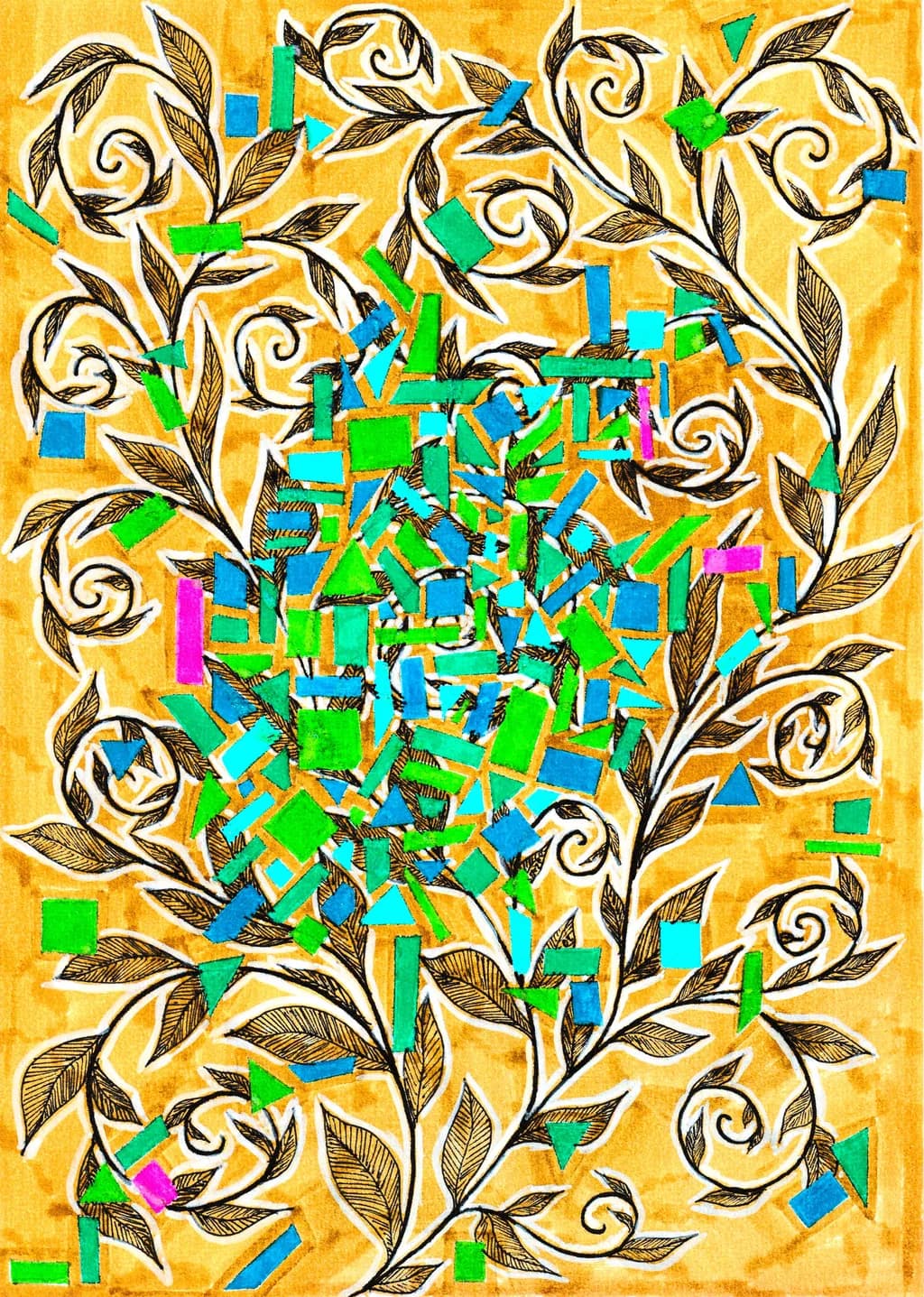
encre et acrylique sur papier à dessin · 21x29.7 cmFertiges Werk
Was ich erreichen wollte
Je souhaitais travailler mes lianes sur un fond préparé, et garder cette idée de pavés dont certains de mes dessins sont faits. Mais j'ai des doutes sur: le rendu, les couleurs, la lecture de ce dessin. Je n'arrive pas à savoir s'il fait partie de ceux que je peux présenter ou s'il faut que je el garde pour moi (bon c'est raté vu que je vous le partage). Bref, j'ai besoin de vos avis, par avance merci
Wünscht Feedback zuColor & valueCompositionTechniqueConcept
3 Kritiken
Veröffentlicht in Art Critique
2
Composition
My eye enters at that dense center and spirals outward through the vines exactly the way you drew them to move, those curling terminals pull me around the edge and back in. The symmetry is gentle, not rigid, the vines frame without strangling. What's tricky is that the most complex, highest-contrast area is the center pile of rectangles and they're also the hardest to read as a single form. I'm seeing individual sticks of color rather than a mass or a structure. The decorative border of vines has more clarity than the thing they're framing. When you say you have doubts about the reading of this drawing, I think that's what you're sensing, the eye lands in the middle and then hunts for a shape to hold onto.
Color & value
The gold ground reads immediately, that mottled wash has depth in it, and the white serves as real negative space rather than just paper showing through. Your greens and blues hold their own against all that warmth without muddying, which tells me you mixed them opaque enough or let layers dry between passes. The magenta bits, though, those two or three spots on the left and that one brighter pink lower right, they're reading as afterthoughts rather than intentional punctuation. They don't repeat enough to feel like part of the palette and they're not bold enough to work as pure surprise. The value range inside the central tangle is tight, lots of mid-tones, so the eye has to work to separate the geometric pieces from each other. That textured gold field behind the vines has more value contrast in it than the focal area does, which flips the hierarchy.
Technique
The ink work on those vines and leaves is confident, the line weight is consistent, the crosshatching inside the leaves gives them just enough dimension without overworking them. You clearly know how to draw a flowing line. The geometric center looks like cut or torn paper layered over ink, or maybe tape that got pulled up, I can't tell if it's collage or painted shapes but either way the edges are clean. Mixing ink and acrylic on drawing paper can buckle the sheet or make the ink bleed, and you've avoided both. What I'm not seeing is much layering or transparency inside those colored rectangles. In my own acrylic work I'd glaze a few passages so some shapes feel like they're behind others, that depth in space helps a cluster read as one thing instead of fifty.
Concept
You said you wanted to work the vines over a prepared ground and keep the idea of pavers from some of your other drawings. Both of those goals are clearly here, the gold field is prepared and those colored rectangles are reading as geometric units. The collision between the organic border and the geometric center is deliberate, I can see that. What's less clear is whether the pavers are exploding out of the vines, growing into them, or just occupying the same picture plane by accident. The chaos in the title suggests energy and disorder, but the vines are orderly and the rectangles are just overlapped, not actually chaotic. I keep wanting the concept to have more tension, more of a reason these two systems are in the same image beyond "I like both."
What's working
The gold ground was the right call, it's warm and alive and it makes everything else pop without competing. Those vines have real elegance, the way you varied the curl radius and the leaf sizes keeps them from feeling like a rubber stamp pattern. The white outline around each vine keeps them lifted off the background even where they cross each other. The piece has presence, it reads from across a room because of that contrast between the detailed linear border and the chunky center. Your line quality in ink is the strongest element here, those confident curls and the crosshatching that stays inside the lines without going fussy.
What to push
The center needs to be a shape, not a pile. Right now I'm counting rectangles instead of seeing a form. What unlocked this for me in my own layered work was asking what the whole mass is doing, is it rising, exploding, settling, compressing, and then adjusting a few pieces to make that motion visible. Tilt a few rectangles to echo each other, overlap more darks over lights or lights over darks so there's a sense of front and back, maybe let a couple bleed out past the vines so the frame isn't containing them so neatly. The other push is about those pinks. Either commit to them as a third color and scatter six or eight more through the center so they make a path for the eye, or pull them out entirely and stay with the blue-green-gold triad.
One next step
Print this image small, thumbnail size, and squint at it. If the center dissolves into noise instead of reading as a single shape, that tells you it needs structure. Take one more sheet and do just the center, same colors, but this time stack and tilt the rectangles so they make a triangle or a column or a spiral, some larger gesture that the individual pieces add up to. You don't have to change the vine drawing at all, just give the focal area a backbone. Then drop the vines around it again and see if the whole piece locks in.
Danke, vielen Dank dafür, dass du dir die Zeit genommen hast, mir all das zu schreiben. Ich brauchte wirklich einen fachkundigeren Blick und ehrliche Kritiken. Ich verstehe jetzt besser, warum mich bei dieser Zeichnung etwas stört. Das hilft mir sehr, und ich werde deine Empfehlungen zu Nutzen ziehen!!! Nochmals vielen Dank.
Freut mich, dass es geklappt hat — jener Moment, in dem das, was dich stört, ins Blickfeld rückt, ist der ganze Grund, warum ich diese langen Antworten schreibe.