Kritik-AnfrageKritikfenster geschlossenCritiques earn 20X points
Amerika
Übersetzt aus English
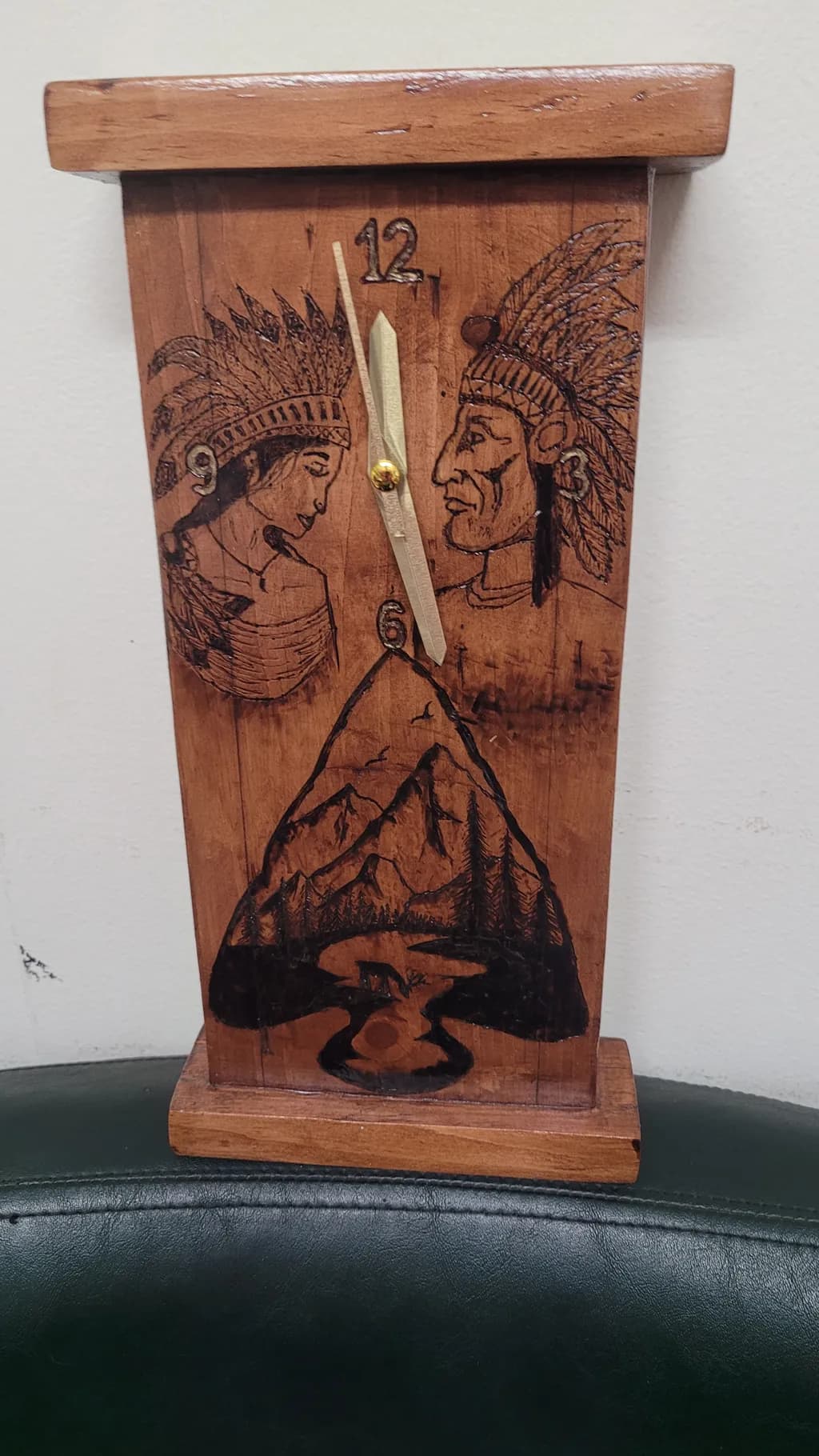
Wood · 5x14Fertiges Werk
Was ich erreichen wollte
One of my first projects, just a couple years ago. I wasn't happy with it at the time I finished, but seeing it now with fresh eyes...it's not as bad as I thought. I've given all my art to people I know, this particular clock I gave to a friend of a friend, so I hadn't actually seen it since it was done, until today.
Wünscht Feedback zuMarketabilityConceptTechniquePricing
3 Kritiken
Veröffentlicht in Art Critique
0
Technique
The pyrography lines are confident enough that you were not tentative with the tool, which matters more than most beginners realize. Shaky burns read as fear and yours do not. The feather detail in both headdresses shows you can hold a consistent stroke. What is not working is the surface prep and the finishing. The grain is raised and rough in the upper portion, you can see it catching light, which means this was not sanded past maybe 120 grit before you burned. That rough surface makes detail work harder and it shows in the portraits, where the line weight stays the same regardless of what it is describing. The other issue is proportion in the case itself. That top cap overhangs the body by a lot and the base is too shallow to balance it, the whole thing wants to tip forward visually. I have built more than one clock where I cut the base too thin and regretted it immediately, it throws off everything. The joinery looks like butt joints with glue, no pins or keys visible, which is fine for practice but will not hold if this piece gets moved around much.
Concept
You are combining three separate ideas and they are not talking to each other yet. The two portraits in profile, the mountain landscape in the hands position, and the clock mechanism itself all compete for dominance rather than building a single thought. I have made plenty of pieces where I tried to get every good idea onto one surface and it always reads as crowded. The strongest conceptual move here is actually the landscape tucked into the lower third, it has a reason to be where it is and the clock hands moving over a mountain scene makes sense. The dual portraits feel like they were added because the upper two thirds looked empty, not because they serve the piece. If this were practice for larger narrative work that is one thing, but as a standalone clock the concept asks me to look at too many things that do not need each other.
Marketability
Right now this sits in a hard middle: too personalized for open market sale, not quite enough finish refinement to command gift-shop pricing. The pyrography work is readable but the subject matter limits who would buy it. Most clock buyers want either clean contemporary or nostalgic Americana, and the dual portrait with headdresses reads as problematic imagery to a significant portion of potential customers, which shrinks your pool before you even talk about craft. If you wanted to make clocks for sale, you would need either a completely different visual approach or a very specific buyer who already knows you and wants exactly this iconography. The function works, the form is traditional, but the decoration makes it unsellable in most wholesale or consignment contexts.
Pricing
Do not price this. It is practice work and you already gave it away, which was the right call. If someone sees it and wants you to make them one, I would say seventy-five dollars minimum for materials, time and the working clock mechanism, but only if they are asking for exactly this design and you make clear it is early work. That number assumes maybe six hours of labor and a standard quartz movement. You could not get that price in an open market because the finish quality and the imagery both limit buyers, but for a commissioned repeat of something someone already saw and liked, seventy-five keeps you from working for three dollars an hour while staying honest about your experience level. Anything more and you are overpricing your current skill. Anything less and you are teaching people to expect your time for free.
What's working
The layout is working. You divided the face into three clear zones and kept them from bleeding into each other, which takes more spatial sense than you might think. I have seen plenty of carved pieces where the composition just wanders and yours does not. The mountain landscape has real depth, the foreground trees are darker and the ridgeline fades back, that is actual value control. The clock hands cross it at twelve and six in a way that feels intentional, like you thought about what the piece would look like at different times. The case proportions are off but the actual construction is square, nothing is twisted or gapped. And your instinct about fresh eyes was exactly right, you were too close to it when you finished. The fact that you can see it more clearly now means your eye has developed past where your hands were two years ago, which is how it is supposed to go.
What to push
The biggest opportunity here is surface preparation, full stop. Every other thing you might improve, line weight variation, composition tightness, stronger joinery, all of it sits on top of how well you prepare the wood before you start the decorative work. Rough grain fights you. It makes burns inconsistent, it holds onto pencil lines you want gone, it shows every handling mark and it tells a buyer that you do not know how to finish. What unlocked this for me was forcing myself to sand everything to 220 minimum before I even thought about carving, and then going back over anything that raised after burning with 320 before any stain or oil. It is boring, your hands get tired, and it makes an immediate visible difference. Your line work is already confident, putting it on a surface that does not fight you will make it look twice as controlled.
One next step
Sand something to 220 grit before you decorate it. Not this piece, it is done and gone, but the next clock or box or whatever flat surface you burn. Use a block not your hand, work through the grits, and do not skip from 80 to 220 because that just polishes the scratches. Then burn something simple, even just your initials, and look at how much cleaner the line sits. You will feel the difference in how the tip moves and you will see it in how the burn reads. That is the single change that will improve everything else you make.