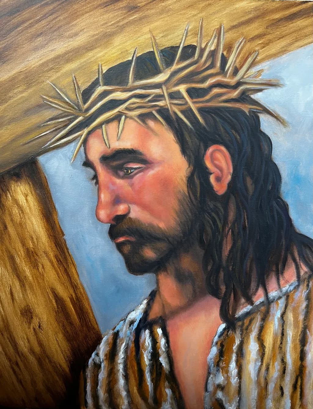
This one is in the drying stage, is there anything that jumps out at you that needs to be corrected or enhanced? I personally think the crown of thorns looks a little flat. ???
Your thought to do a few more shadows/shades in the crown is good. Maybe add a trickle of blood down his temple and maybe on his chest. He was probably pretty roughed up at this point. And the comment to make his ear less bright is a good idea, too. Really nice painting. His face and hair are really nicely portrayed/painted.
Coming along nicely, Theresa. If this were mine, I might play with three things: 1) push back the blue background a bit, 2) tone down the ear (the contrast with hair draws my attention away from the face, eyes), and 3) I would look at the highlight of his mouth, as it makes him look like he's jutting it out a bit. Otherwise, it is looking good. : )