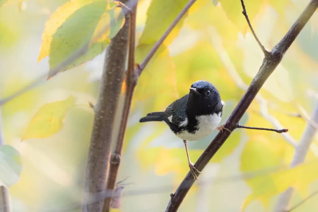
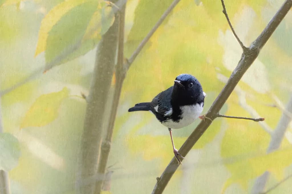
Which image of the black-throated blue warbler do you prefer?
1/2
Hello everyone. I recently got back from a trip to PA where I was photographing fall warblers. I took most of them at Hawk Mountain. I would like your help with two versions of the black-throated blue warbler. The basic issue is the hotspots. For version one I used an empty layer, the color picture tool and a large soft brush to work on the areas. I selected a color adjacent to the hot spot and then brushed it. Sometimes I brushed with several colors. In the second version, I masked the bird, inverted the mask and placed a pattern layer underneath. I created the pattern from the background of the image. Do you have a preference for a version? Do you have another strategy for dealing with hotspots? Thank you for your help.
Posted in The Wild Photographer
7
For my part, I prefer the first image, with somewhat warmer tones, and given their placement, they draw my gaze directly to the bird.
For the second, I find too great a mismatch between the bird, which is very sharp, and the background, which is much blurrier.
But that's only my opinion and it doesn't take away from the work done on the two images 😉
Thank you O2, your opinion is valuable to me. You are very clear about which processing draws you more in and that is exactly the type of comment I'm looking for.
I'd be happy to help if that can help you. I'm not an art critic, and given my art, I'm far from understanding photography. I just spoke about what I felt.