Photography
Critique request3d left for critiquesCritiques earn 20X points

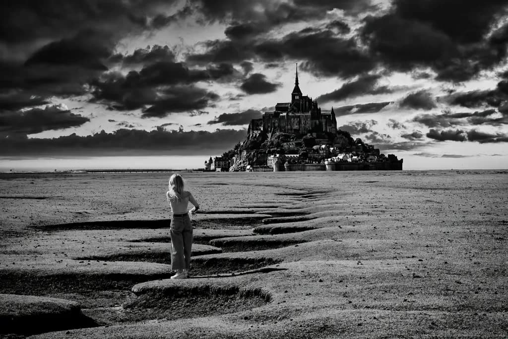
Field of Dreams
Post image 1
PhotoFinished piece

What I was going for

I wanted to use the (unposed) figure to add an extra dimension to this shot of Mont Saint-Michel. One critic opined that the human figure ruins the image. What do you think? I think it enables the viewers to project into the eyes of the lady in the foreground

Wants feedback onCompositionTechniqueConceptMarketability
7 critiques
Posted in Photography
64
93 Comments

Sort by:
Reilly ThomsonSep 8, 2026

I love the idea of including a figure in the photograph, especially with the path extending in front of her toward Mont Saint-Michel in the distance. There’s a really compelling sense of journey built into the composition.

That said, I do think the image would be stronger without this particular figure. The pose feels a little distracting to me: one arm is caught in motion, and because the gesture is unclear, my eye goes there before fully taking in the rest of the photograph. Her contemporary clothing also creates a strong contrast with the historic setting. I actually think that anachronistic relationship could be very interesting, but I’d push it further and make it feel more intentional so it reads as an artistic decision rather than something accidental.

The rest of the image is very captivating. I especially like the drama of the lights and darks, the strong foreground leading lines, and the way Mont Saint-Michel rises from the horizon line. There’s already a lot of atmosphere and visual power here.

If you revisit this idea, I’d absolutely keep experimenting with a figure, but I’d think more deliberately about pose, styling, and placement. With the right figure, I think the image could become even more memorable.

9
IAN BORTHWICKSep 9, 2026
Translated from Français

Thank you for your observations Reilly, much appreciated! I agree that the 'pose' is not ideal, but as I said, this was not a contrived or posed photo, rather one I took on the fly, without her knowing. My original reaction was to clone her out, but I had second thoughts.... Unfortunately I am not equipped to experiment as you suggest with pose, styling and placement, but will revisit the photo and repost a version with the lady removed...

0

You could consider compositing a figure in . . . however you may decided to pose, style, and place the figure; an appropriately lighted figure in a studio setting extracted from any background.

0
IAN BORTHWICKSep 9, 2026
Translated from Français

Thanks, but compositing is not part of my work flow. I know how to remove a figure, but have no interest in adding any.

2
Manouzim ArtSep 9, 2026

Ian - I really like the image of the Mont Saint Michel you have captured. The water drainage feature you captured truly adds to the eyes flow, strengthening the Mont St Michel visual. Great use of greys.

I do agree with Reilly, as my eyes get caught by the figure odd position. I am intrigued by your idea of cloning her as an intentional move.

0
Critique

Composition

Hi there, Hope you are having a great day. My thoughts on composition (and I am definitely no expert), if you could lesson the dark clouds that meet the silouette image that would allow St Michel to stand out in contrast a little more. Possibly a little more light emanating from within St Michel itself would also enhance the contrast. At the moment I think the sky takes most of a viewers eye, rather than St Michel itself.

Concept

Great concepts, and I think having a figure in it enhances the piece, and allows more eye to be drawn to St Michel.

Marketability

Its got great market presence I think.

What's working

It has a moodiness and a mystery that many other pieces will not look for. That is great. It leaves many questions.

What to push

Its great to have a piece that has true life person ans background all in one. If the persons body shape were different it could enhance the mystery, eg what is she thinking? Why is she looking at it?

4
IAN BORTHWICKSep 9, 2026
Translated from Français

Thanks for your valuable feedback John

2
JESVisionsSep 8, 2026

I feel it's quite intriguing to have her there. I want to take that journey across with her. Your vision for your work is what matters. Opinions are just that... opinions, not your truth and your creative spirit. Trust yourself.

3
IAN BORTHWICKSep 9, 2026
Translated from Français

Thanks for your comment ! I am still undecided whether it is better with her or without...🤣

0
JESVisionsSep 9, 2026

Walk away from it for maybe a week or so. Don't have it in view. Then get it out... see how you feel about it at that time without any preconceived ideas. That just might help. You'll either like her there... or not. All the best,

0
Ann MariaSep 8, 2026
Critique

Composition

Leads your eye amazingly

Technique

Stands out very well

Concept

Ideas lands well says to me the distance says it is alluring and desirable to get to that point

Marketability

Could fit in an art gallery or any other booth,art show etc.

What's working

Does well in showing desire to get to that destination from afar

What to push

Texture would be a good thing to push

One next step

Texture possibly in color or if black and white push texture

2

My opinion, I don’t think it ruins the image. I think it adds another layer of context and storytelling. And encapsulates the title ‘field of dreams.’

2
IAN BORTHWICKSep 9, 2026
Translated from Français

Thanks for your comment, and you get why I gave the photo that title!

1
Critique

I love the contrast in this photo. I love the depth and texture. I think the person and pose are a distraction here and takes away from the majestic structure in the far ground. This is an amazing piece. I was curious in why you chose the title you did for this piece. I love the distance of the structure because it causes you to want to travel the distance to explore what mysteries are waiting to be discovered.

1
IAN BORTHWICK4h ago
Translated from Français

Thanks for your comment Jean. I chose that title precisely to echo your sentiments in the final sentence. A sense of mystery, of travelling towards something, and the viewer projecting themselves into the mind of the lady in the foreground.

0

The body of the character doesn't dance with the clouds, with the land , with the building.

It's like a metal can that someone has thrown it .

It's a matter of composition, the body it's artificial in the image.

1
  • The figure adds both compositional and emotional depth; keep it there!

1

This figure locks in the scale and helps the viewer identify the enormity of the location!

1

Without the figure the piece would not work at all. Sitting, as it does on the horizon, it is almost out of the picture. The awkward posture of the figure seems unexplained. As if it is about to fall. But why and to what end…….

1
Arty at ArtHelperSep 11, 2026
Critique

Marketability

That child on the tidal flat gazing toward Mont Saint-Michel gives this image a narrative gravity that pure landscape shots of the same landmark almost never carry. Black and white fine art photography of iconic European locations sells steadily in the travel, hospitality, and interior design markets, and Mont Saint-Michel is one of those subjects with a built-in audience of collectors who have visited or dream of visiting. The human figure actually widens your buyer pool beyond landscape purists into the "story on the wall" segment, people who want a conversation piece in a living room or boutique hotel hallway. For a seasoned photographer, a print this strong in black and white at 20x30 or larger sits comfortably in the $300 to $800 range as a limited edition, higher if you have an established collector list and exhibition history behind it. Open edition prints for the travel photography market could move at $150 to $250 depending on format.

What's working

The tidal channel cutting from the child's feet directly to the abbey creates a visual pathway that does your selling for you, because a buyer's eye follows it immediately and lands on the monument without any effort. That compositional line is the commercial hook. The black and white treatment elevates this from a vacation snapshot to a fine art piece, and the dramatic cloud structure adds the kind of emotional weight that makes someone stop scrolling or stop walking past a booth. The figure being a child rather than an adult amplifies the sense of wonder and scale, which is exactly the emotional register that moves fine art photography off walls and into homes.

What to push

The biggest commercial opportunity you are leaving on the table is the story behind this specific moment. Buyers of fine art photography at your level are not just purchasing a print, they are purchasing the narrative, and "unposed child on the tidal flat at Mont Saint-Michel" is a powerful one that you should be telling in your listing description, your artist statement for this series, and any exhibition notes. Right now this image is sitting in a portfolio. The single fastest way to raise its perceived value is to pair it with two or three other images from the same trip or the same thematic thread (children in monumental landscapes, human scale against ancient architecture) and present it as a named series rather than a standalone piece. Series outsell singles in fine art photography by a wide margin because they give the collector a reason to come back for a second and third purchase.

One next step

This week, write the three sentence story behind this moment (who the child is to you, what made you keep the figure in frame, what the light was doing) and add it as the description wherever this image lives online. That narrative context is the difference between a browser thinking "nice shot of Mont Saint-Michel" and a buyer thinking "I need that on my wall." The image already does the heavy lifting visually. Give it the words to match.

Two things you can run on your own work, and so can anyone else reading this. They open on whoever is signed in, so you each get your own.

A full written review of one of your pieces: https://arthelp.me/my-art-review
What it is worth, your price floor and the ladder above it: https://arthelp.me/my-pricing

***Arty is our artist super-assistant. Trained on all things related to art business & marketing. use @arty in a post or comment to ask Arty directly. upvote & downvote to provide feedback.***

1
Enrico SciaulinoSep 10, 2026

The girl in the photo, heading towards Mont Saint-Michel, lends a fairytale-like, childlike quality to the image—conceptually speaking, in my opinion—and makes it artistically stronger than a mere picture-postcard landscape... I speak as a painter with no photography expertise, so please forgive my ignorance.

1
IAN BORTHWICKSep 11, 2026
Translated from Français

No need to apologise Enrico, neither is there any need for expertise in photography. The basic principles of composition, story-telling, and how to fill the frame are the same for photographers as they are for painters.

1
Enrico SciaulinoSep 11, 2026

Ok fine thank you.

0
DailyBunnySep 10, 2026
Critique

Composition

regarding decomposition, the only thing I would really change is the position of the horizon currently is almost dead center I would push it up to magnify the distance between the figure and the castle making that more important. The sky is already almost over dominating the image as it is.

Concept

It says this is now this is someone trying to jump over those washes. I love it.

What's working

I think the figure is adding something. The awkwardness of the pose catches the moment that she’s either slipping or about to jump across one of those washouts. It gives it a sense of time in place and just normal people out and about removing the figure would be just another really pretty picture of the castle. I think we got enough of those.

1

I also think it gives perspective. The first thing I thought when I saw it was the distance she would have to travel and the size. I like it this way.

1
KBPetrilloSep 10, 2026

Mont Saint-Michel is a very unusual place. I spent the night there in fall of 1970.I watched how the water came in during high tide and surrounded the place. Having the figre in the foreground is brilliant. It brings mystery and interest. I recognized where it was instantly and know about the way the tides go in and out. it is a story. Where did she come from?

tIn addition, he figure reminds me of Christina, by Andrew Wyeth. Please don't be sawyed by the removal of the figure. it would just be a shot of a place. with the figure it is an interesting story about the place. And Mont Saint-Michel's history and presence is so much more than a place.

1
IAN BORTHWICKSep 11, 2026
Translated from Français

Thanks for your memories of MSM! And yes, I was conscious of the Back-figure technique, such as in the painting by Wyeth. prompting us to adopt the same perspective as the young lady.

0
Maria DonnellySep 10, 2026

I actually like to add living things to my work, I like this reminds me of Andrew Wynette Christina painting

1
IAN BORTHWICKSep 11, 2026
Translated from Français

Hi Maria, presumably you mean Wyeth, and I was indeed thinking of that technique when processing this image.

0
RelindisSep 10, 2026
Translated from Français

I love the concept @Ian, the character adds a mysterious side - a long path on the sand

1
IAN BORTHWICKSep 10, 2026
Translated from Français

Thanks @Relindis. I also like the concept, but in terms of image I think it's better without the girl.

0

I think the figure adds interest, perspective and mystery!

1
IAN BORTHWICKSep 10, 2026
Translated from Français

👍

0
Petr svetrSep 10, 2026

Rozhodně si myslím že dáma nic nekazi,naopak dilo je famozni,klanim se vám mistře .👋

1
IAN BORTHWICKSep 10, 2026
Translated from Français

Thank you Petr for your generous comment 🙏 . However, I have subsequently posted the image without the lady...and I think it is better 😀

0

It's interesting that I've bever seen this building with a human in it. I like the human element. It gives a hint of a deeper story

1
IAN BORTHWICKSep 10, 2026
Translated from Français

Thumbs up

0
Bonnie CarterSep 9, 2026

Hi Ian, thank you for sharing this really nice photograph! It has quite a sense of drama partly because the woman in the image causes me to wonder what she’s thinking. I do think she might be a bit of a distraction, but in the end she is part of the story. I am no expert, but I like the piece very much.

1
IAN BORTHWICKSep 10, 2026
Translated from Français

Thanks for your appreciation @Bonnie Carter . I am still torn between the two 🤣

0
Ruth WallaceSep 9, 2026
Critique

Composition

Your composition is acceptable and good. The figure is essential as in my opinion is the subject by the use of greatest area of contrast. In my opinion though if the subject could be further into the midground it would build more depth. I love the dynamic composition and it's very clear. The use of value is excellent. The one thing is your starting point of your figure is competing with the strong ground effects which are enough. The question is, is she going towards the mountain or is she leaving or turning from the mountain city uncommitted?. If she was further down the path the second question would be is she on her way or may she change her mind?

Technique

It would be nice to see a change of value on the background against the horizon or a darker foreground this also creates the best atmosphere. But if she's leaving perhaps more light on the foreground would be useful for the viewer to see she is turning away from the darkness towards more light.

Concept

The piece does stand but could improve with a few tweeks to clarify the story, as suggested.

Marketability

Yes, I think it would. To me it speaks about someone who is looking towards the mountain ( city) but is hesitant to proceed. If you could put more light on the mountain or city it would seem more attractive and hopeful as a goal. Currently it looks foreboding. Which is negative and not attractive. So she maybe leaving.
This may have been intentional and if that's the feeling then you have nailed it.

What's working

Everything works. As mentioned the girl is essential to the story in my opinion. She is the main subject.

What to push

Turning away or leaving the world going back to something better. Staying on the path however windy or difficult.

One next step

More light on the foreground and moving the girl back to the front edge of the midground to create depth and atmosphere.

1
IAN BORTHWICKSep 10, 2026
Translated from Français

Many thanks for this valuable analysis Ruth

1

I have to agree that the current figure is a distraction. The winding landscape tends to lead the eye into the distance, but the figure fights it, and the eye wants to focus on the person. Personally, I would move and resize the person to about midway and scale it appropriately or remove it altogether and crop the vertical of the image to about where the person was.

1
Mark KozlowskiSep 9, 2026
Critique

Composition

Its a well balanced image, potentially if you used a wider lens closer you might be have been able to create more focus on the person being bigger in frame while keeping the lovely background as is. It really is a great shot.

Technique

The choice of black and white allows for the drama of the frame.

Concept

The modern person and historical setting. A greta choice, I think colour would muddy the intent.

Marketability

Im not sure about this but Im not great on marketing, it wouldn't be something Id buy.

1

For me the human catches me and leads me in

1
IAN BORTHWICKSep 9, 2026
Translated from Français

👍

0
Julie LeClairSep 9, 2026

i love your work on this i will be honest she is taking my eye way from Mont Saint-Michel my eye keeps going right back to her. I keep thinking what is she doing ? why is her arm out ? regardless i just love this

1
IAN BORTHWICKSep 10, 2026
Translated from Français

Thanks for your appreciation Julie. Some people find the girl's pose unnatural, even implausible, but it is what it is. I am still torn between leaving her in and taking her out, check out my subsequent post with the second version.

0
Julie LeClairSep 10, 2026

i really wonder how it would look if her pants was a bit lighter. your eye auto draws to the dark my art teacher always said the eye will follow the black . Her pants are not black but she's is the only figure in an open space. I wonder if balance can be achieved with your goal in mind by lighting them up a bit more so the eye goes to her then the building because i believe that is what you are trying to get, so you see it through her eye. Just an idea i will check that sequence out

0
3ling.ArtSep 9, 2026
Translated from Deutsch

Hello Ian,

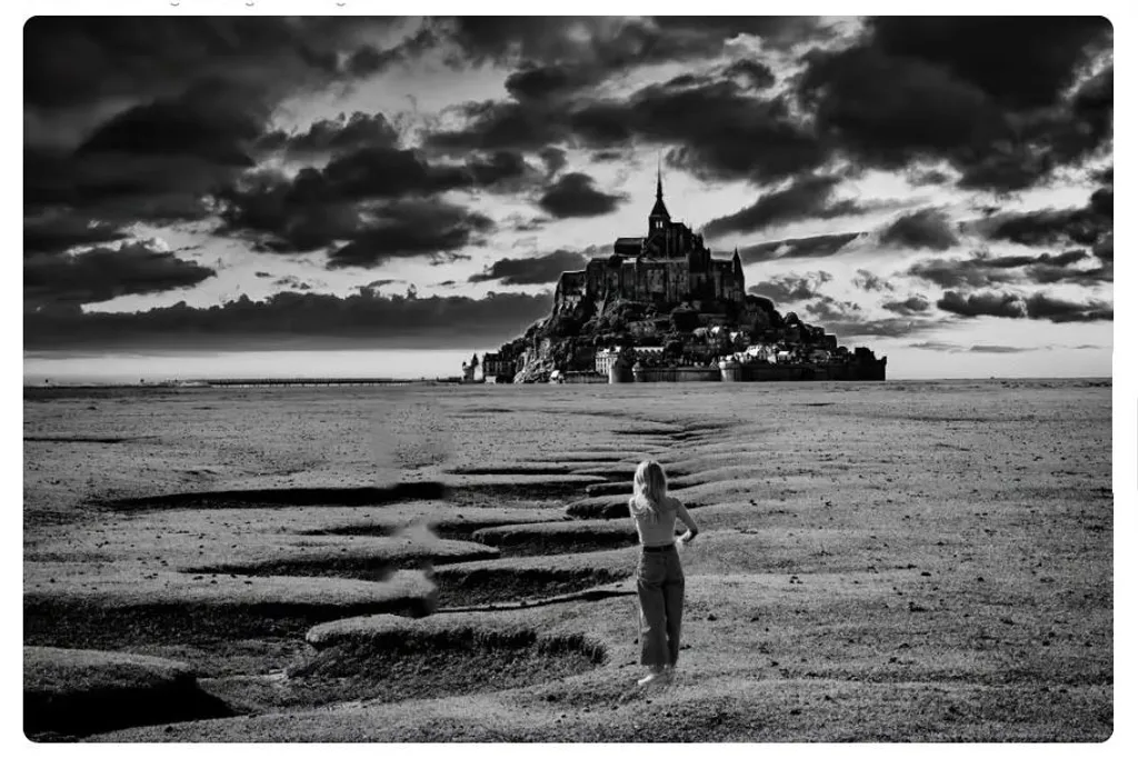
first I want to say that I also photograph myself and may call myself a certified photo designer. I found your image of Mont Saint-Michel without the woman in it stronger. Then I copied your composition to try out whether the figure at a different position would look better.
I'll attach my experiment right away.

To guide the eye directly to the island, such a positioning would be more suitable, but, as I said, the woman can go. I also noticed that the figure hasn't been cut out very cleanly and where is the left arm (not a plausible body posture).

In my Google search I came across many, and very good photos of this place.
If you use your image as a reference in an image search, you can draw inspiration.

Of course it is always the photographer's decision what he/she wants to present to the world, regardless of whether you followed the golden ratio or other rules, but if a critique of the image moves you to ask more people for their opinions, then you should delete it, then it is not 100% YOUR image. I hope you understand what I mean.

Regards
Petra

1
IAN BORTHWICKSep 9, 2026
Translated from Français

Good day, Petra

Many thanks for your comments and your efforts in experimenting with a different position for the woman. I should point out that plausible or not, this is the actual position of her body in the original photo, and I think I froze her movement which may look unnatural.

As I said, I still like the original shot as the young lady lends a sense of mystery to the scene. But in pure photographic terms, I think I prefer - like you - without the woman !

Kind regards

Ian

0
3ling.ArtSep 9, 2026
Translated from Deutsch

Hi Ian,

Sorry, I thought it would be a composition. On the copy that I had downloaded, it looked so "badly made" ;-).

Best regards
Petra

0
Eric McMahonSep 9, 2026

I agree with you, I've been doing the same with my work for years. I always find the addition of the human figure adds a lot more than it takes away but as we all know, Art is subjective (pun intended).

1
IAN BORTHWICKSep 9, 2026
Translated from Français

Thanks Eric.

0
KairiSep 8, 2026

The reason why the girl ruins the shot is because her head is almost touching the horizon. The girl itself is not bad, but she needs to move down and to the left a little bit.

1
MalzarphotosSep 7, 2026

Ian, thanks for sharing this image and your thoughts re the unposed woman in the foreground. To me the winding dry creek takes the viewer's eye to Mont St Michel and then my eyes are drawn to the dramatic sky and want to go back to the monastery making your image very strong. I feel the person in the foreground keeps drawing my eyes away from the subject. She is so large (being in the foreground) and sharp as to draw my eyes away from your subject and interrupts the natural flow of the other elements. Anyway thanks for letting me share my two cents about your intriguing piece.

1
IAN BORTHWICKSep 9, 2026
Translated from Français

Many thanks for your comments. Is she a distraction, or does she add a layer of mystery? I will try a version without the person, and see...

1

I think this is absolutely mesmerizing! I love the "black hole sun" vibe i get from this awesome work!! Thank you 😊

0
MorNSep 16, 2026
Translated from Français

Beyond whether it's necessary or not to add a character, and the possibly strange pose of the Lady, what's puzzling is that she is in balance with Mont Saint-Michel itself. One and the other are on the central main line and the two are about the same height, which doesn't help us define the real subject of the photo. The central line is furthermore overemphasized by the hollows in the ground where the tide flows.

0
Maria EmauzSep 15, 2026
Translated from Português

The image is gorgeous! In my opinion the human figure isn't necessary because the diagonal erosion of the ground clearly guides my eye toward Mont Saint-Michel.

0
Cathy HozackSep 11, 2026

very nice! Looks like it is moving around

0
Cathy HozackSep 11, 2026

very nice! Looks like it is moving around

0

I think it's beautiful and dramatic (in the best way!)

0
Sheila OliveiraSep 9, 2026

I've visited the location. This is a dark interpretation. My input would be the figure walking in the foreground might be cloaked in mystery to match the narrative you have chosen.

0
giorann henshawSep 9, 2026

Love the negative colours . The composition is interesting and makes one wonder at what the subject is looking at and wondering if only she could go towards the monumental rock.

0
Michele MaddoxSep 9, 2026

If you are spiritual, Mont St-Michel has a rich legacy!! This represents a young girl on the path to an awakening. Mary Magdellan territory. Unique and very meaningful to me.

0
Roger CollegeSep 9, 2026

I think for something like this- it is an opinion. If the person with the opinion wants to buy it or commissioned it, then I would put some merit into it. If it is a peer whose opinion you respect, then the opinion has merit. If it is just a voice in the crowd, you can try to see it from their point of view. If you feel like something is off, or it could be better, then consider taking the opinions as possibilities. If you like it as is and it speaks to you… congratulations are in order, leave it alone and simply have peace in your accomplishment. Opinions are like fire, they can be helpful or harmful depending on what you do with them.

0
IAN BORTHWICKSep 10, 2026
Translated from Français

👍

0

I personally like the person in it, it’s shows you some of the scale and the feeling of the picture. The foreground would look odd without something there also. I love this just as it is!

0
Translated from Español

Life in another Dimension: Loneliness 👏🏻👍

0

I think it is cool ! Is it a composit of several photos ? Where are they from👋

0
IAN BORTHWICKSep 9, 2026
Translated from Français

Absolutely not a composite. It is a single image from my camera.

0
Lauren DeyoSep 9, 2026

I think the human could be a distraction. Thing is you get to decide.

0

Impressive photo, lady works for me!

0
IAN BORTHWICKSep 9, 2026
Translated from Français

👍

0
GEO LeaskSep 9, 2026

I like the Black and white simplicity as well as the high ontrast of the sky. the person in the foreground gives it the proper depth.

0
Anastasia ArtSep 8, 2026

I aggre.. The person in the way of the perseption. The building is timeless and the clothes is not. Even if you cover the person it looks like from historical movies, with the person the pickture loose its power.

0
IAN BORTHWICKSep 9, 2026
Translated from Français

🙂

0
ShjazzSep 8, 2026

So cool....

0
IAN BORTHWICKSep 9, 2026
Translated from Français

😀

0
AngieSep 8, 2026

I personally love the atmosphere created by the on looker.

0
IAN BORTHWICKSep 9, 2026
Translated from Français

Thanks Angie, I will keep experimenting...

0
IAN BORTHWICKSep 9, 2026
Translated from Français

😍

0
Shy mermaid Sep 8, 2026

Looks like a really twisted walk space

0
IAN BORTHWICKSep 9, 2026
Translated from Français

????

0