Photography
First post from Edvard Piper!

Feedback

Looking fore some feedback if you would like to give it.
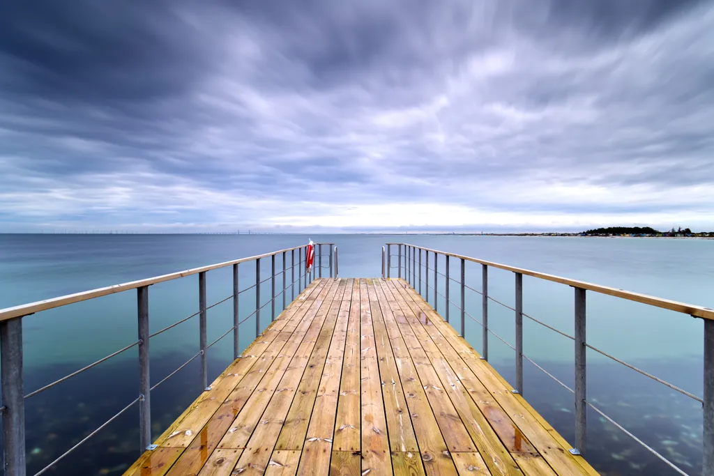
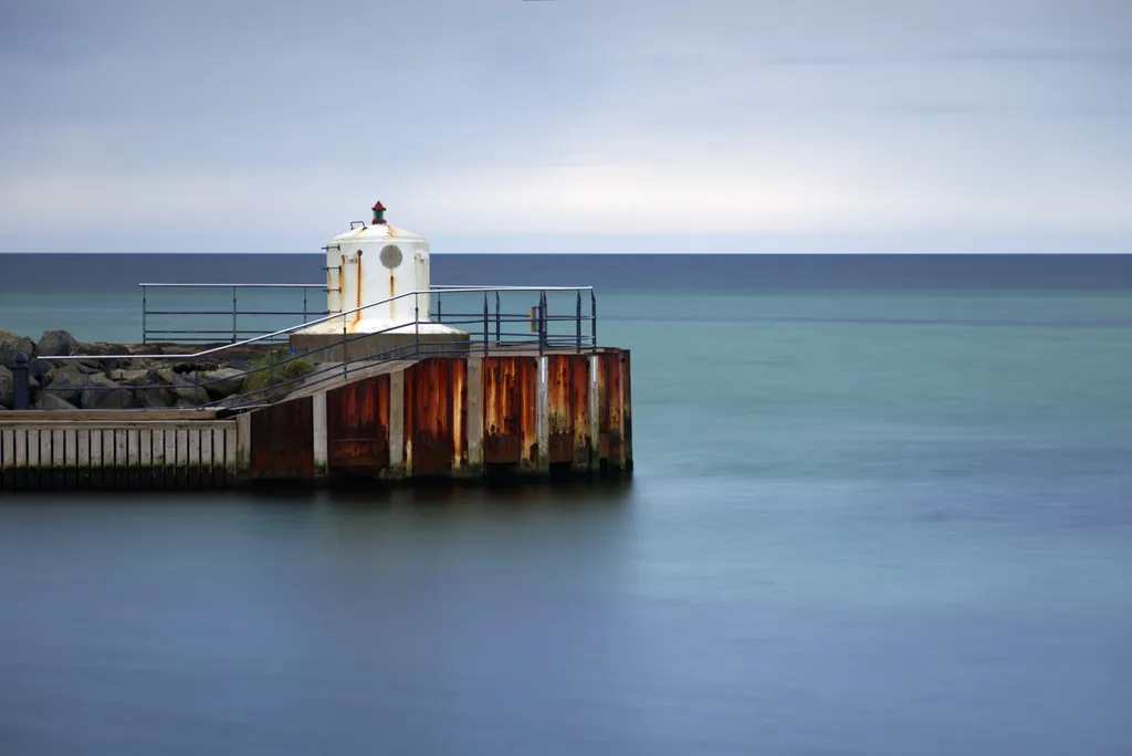
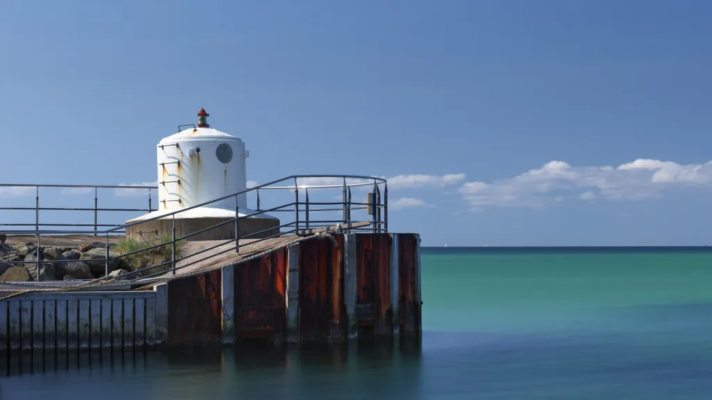
Which of these three images is strongest, and why?
Posted in Photography
13

22 Comments

Sort by:
Indra CastilloMar 19, 2026
IMO, No 1.

First, let me tell you why I don't think 2 or 3 made the cut.

No. 2, while it gives me all the blues, it's too focused on the structure, leaving my mind little room to wander.

No. 3. It's beautiful, but too centered. Leading lines don't take me all the way to the horizon line, nor to the island on the right, so I'm stuck looking at a dock.

Now, why is No 1 the winner for me? Because I can see the structure is a part of something bigger, because I can see it has a story, since the rust is clear and visible, the years are telling a story. The horizon line, flat and perfect, only interrupted by the top of the structure, gives me an edge. Like something is about to appear and make the whole scene whole, but the secret is that what makes it whole is that clear spot on the sky that looks whiter than the rest...
2
Edvard PiperMar 20, 2026
Thank you :)
0
Jeri GroverMar 19, 2026
I Love #3 the most because it breaks the rule of 3rds with the horizon line being in the center but it works for me. Really quit exquisite. The dock is centered too, so maybe the balance on #3 comes from the the two. I also love #1, all 3 are calming to view with #3 being the most interesting for me, the lines keep my eyes moving around, very nice to image being there.
1
Edvard PiperMar 20, 2026
Thank you :)
0
dougbrazApr 2, 2026

#3 by a landslide - to me anyway. It's just more dynamic than the other two. I'm glad the pier doesn't meet or pass over the horizon, no worries there. The clouds zoom into the view whis os great.

#2 just does not really grab my attention at all: a nice slice of green water and a sail way in the distance. The railing goes along the same line as the clouds (being nit picky) and there is not much in the main subject to hold my attention.

#1 better than #2 certainly, nicely balanced.

0
Heather Ebey PhotographyMar 21, 2026
%1 and #3 are the ones that capture my eye, particularly #1. I love this Minimalist style. If I were doing it, I would probably pull back even more if it adds only water, distant land and sky and makes the pier smaller. Take a look at Helen Trust on IG.
0
Edvard PiperMar 23, 2026
Thanks for the feedback, it is appreciated. And great pictures on your profile!
1
Michael RochardeMar 21, 2026
I like them all, but #3 is the one I'd buy.
0
Edvard PiperMar 23, 2026
Thanks for the feedback, it is appreciated.
0
April MacsMar 20, 2026
Love #1 which gives a full view of the ocean
0
Edvard PiperMar 23, 2026
Thanks for the feedback, it is appreciated.
0
ANnewMar 20, 2026
#1. Love #3 but feel like it is a more common view. #1 has an uniqueness and the broader view conveys connectedness or potentially tension between the structure and environment.
0
Edvard PiperMar 20, 2026
Thank you :)
0
Lynda GoldmanMar 19, 2026
They are all very powerful!
0
Edvard PiperMar 20, 2026
Thank you :)
0
Allan WeitzMar 19, 2026
One of the goals and challenges of composing a strong photograph is to create a visual tension, which you achieve by getting close into your subject, eliminating unnecessary visual data that distracts the viewer from what it is you are centering on. It's also important to give the viewer a visual anchor that leads the eye. This can be a strong shape of form in the foreground or background. Sometimes this is achieved by breaking away from our standard eye-level perspective. The photograph on the dock could have been strengthened by shooting from a lower angle - even ground level. This is a long discussion. Just let me know if you want me to go on. Regardless, keep shooting!
0
Edvard PiperMar 20, 2026
Hi, good points thank you, on going lower, one problem that ment going in to a danger zone :) (in Case 1-2)
1
Allan WeitzMar 20, 2026
You might not have been able to physically get closer but nothing stops you from either zooming in tighter optically, or if that's not possible - crop the photo to an optimum composition. I know there are many who consider cropping to be an act of anarchy, but in my eyes you are 'cropping' when you change focal lengths, or choose format for that matter. You compose differently with a 35mm camera (2:3) as compared to a medium format Hasselblad or Rolleiflex (1:1). All food for thought. Most importantly, enjoy taking pictures.
0
Nikola BozilovicMar 19, 2026
I think the second slide looks the most professional, with a great balance of colors. That said, I'm instantly drawn to slide #3. It feels inviting, the sky has a sense of motion, almost like it's calling me forward. It also feels more open than the first two, which makes it even more emotionally engaging for me (but they're all equally amazing shots!!) 😊
0
Edvard PiperMar 20, 2026
Thank you :)
0
Linnie AikensMar 19, 2026
I want to second Indra's entire reply. I was also really struck with the first one and its feeling of loneliness or even stoicism in the vastness of sea and sky, which is lost in #2. In #3, while the sky is stunning and the dock lovely, I too felt trapped on the dock that led to no where.
0
Edvard PiperMar 20, 2026
Thank you :)
0