New York City Art Scene
Post image 1

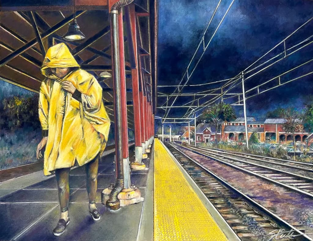
"Off-Peak ©," a completed original done with pastel, about 15" x 22" unframed, rendered on a sheet of Canson Mi-Teintes rag paper, Steel Gray, using a mix of soft pastel brands, mostly Rembrandt, and NuPastel hard pastel. Some detail work rendered with CarbOthello pastel pencil. This was my first original pastel painting outside my classroom studies at the Art Students League. The source is a scene I composed at the New Canaan Metro North train station with my wife as the model. (Family works for free, yes?) Curious about more of my work? Visit my website: RandySteelePortfolio.com


Posted in New York City Art Scene
7

7 Comments

Sort by:
Translated from Deutsch

You can practically feel that a thunderstorm is brewing. Great.

1
Bree SalazarOct 5, 2026

The choice to use your wife as the model for your first independent piece says something about how you work. No hired model, no demo setup from the League carrying over, just figuring it out with someone who'd stand there while you solved the problems. That steel gray ground for a train platform scene makes sense once you say it, but I never would have thought to reach for it first. Most of us grab white or a warm mid-tone and fight our way back to neutrals.

1
Suki AderintoOct 5, 2026

Your first outside-the-classroom piece and you went straight to a composed scene with a figure at a train station. That's brave. I spent my first year after any structured learning just painting objects on tables because I was terrified of failing at anything with narrative weight. The Metro North light has this specific industrial flatness that either works or kills a piece, no middle ground.

1
Randy SteeleOct 5, 2026

Suki, no bravery required. I would say to everyone including myself, don't be afraid to fail. I mean, really, what's the worst that can happen? Are they going to put you in jail for bad painting?

0
Suki AderintoOct 5, 2026

The jail comment made me laugh because it's true, but I noticed I still armor myself with process talk before posting anything uncertain. Like explaining the piece to death somehow makes the failure smaller. Your version is cleaner.

1
Randy SteeleOct 5, 2026

Bree, the first best choice I learned at the League about surfaces is to use a mid-tone, preferably gray color. There are exceptions, of course. A painting with a subject that needs a lot of bright white throughtout is difficult to paint on a gray background, which I learned the hard way.

0
Bree SalazarOct 5, 2026

Gray ground straight up makes sense for that reason, you're building up toward light instead of burning it away. The League teaching stuck with you.

1