First post from Dirk Emmenecker!
Hi, I'm Dirk Emmenecker! 👋
Translated from Deutsch
1/4
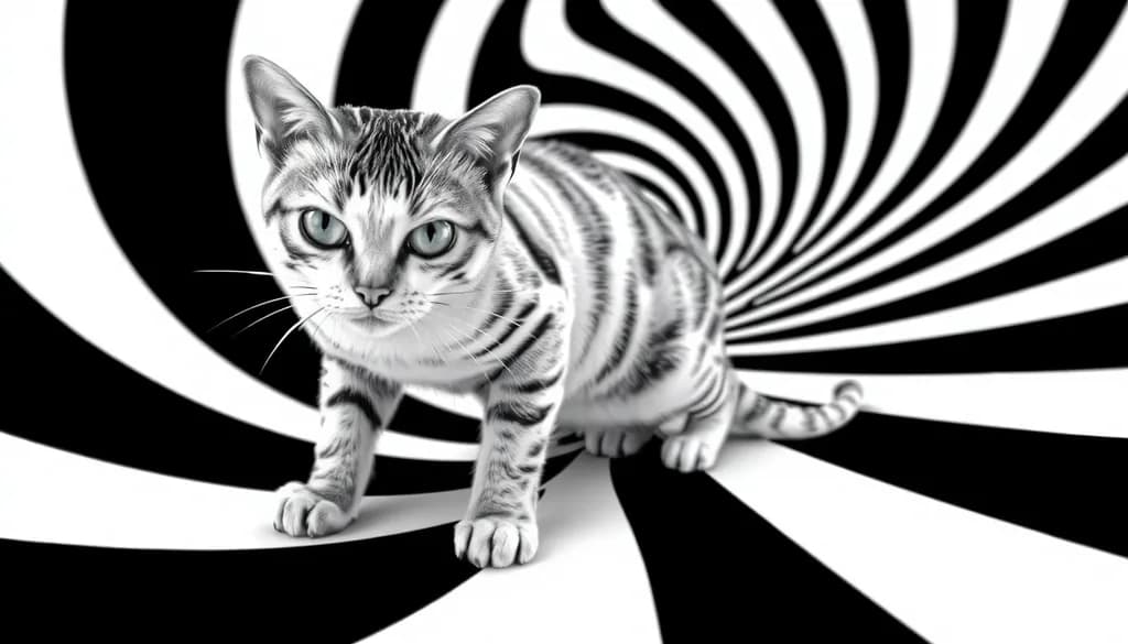
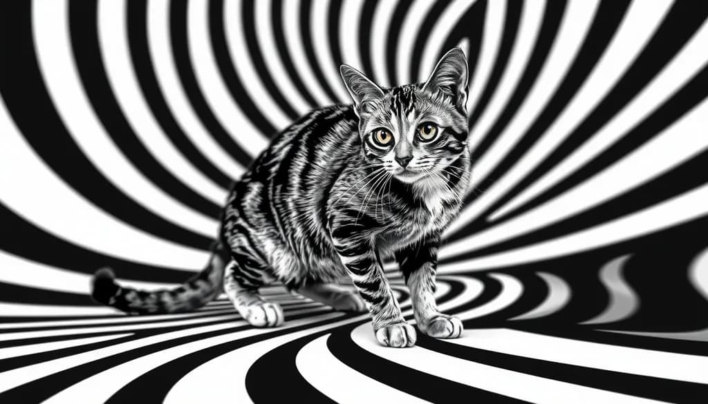
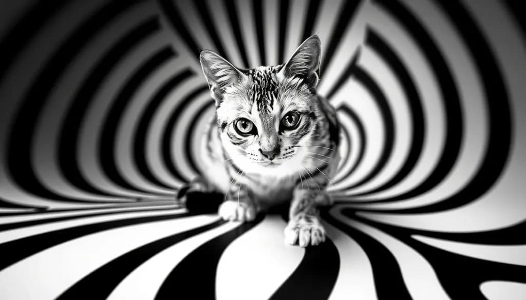
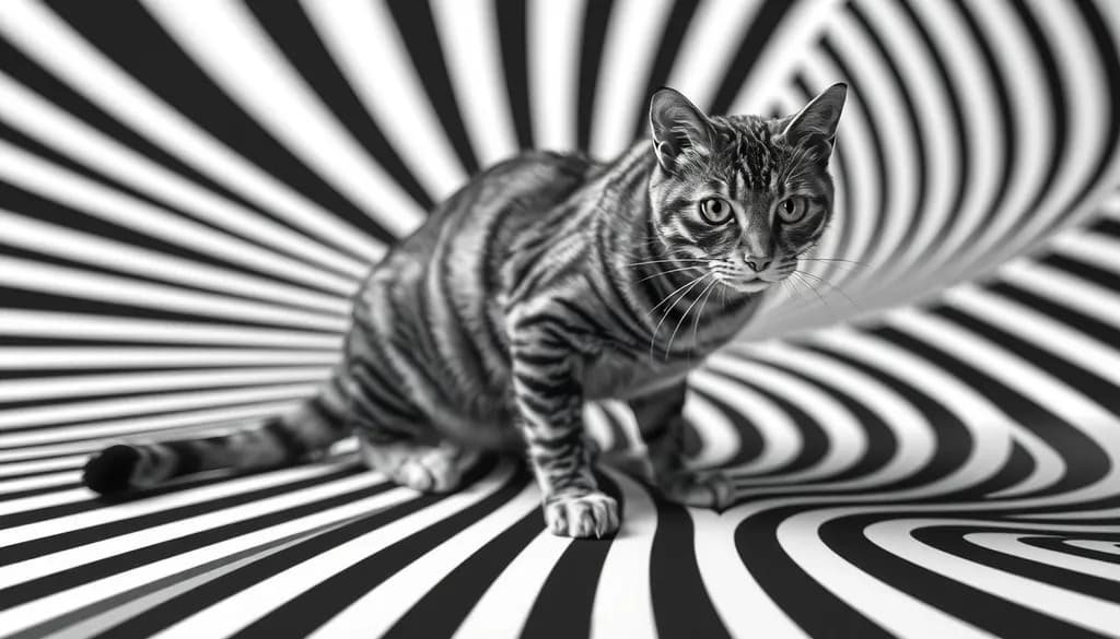
Hello everyone, I'm excited to be here! I create high-contrast black-and-white images with hypnotic cat patterns. Art is, for me, a way to make depth and movement visible. I hope to find inspiration and like-minded people here.
3
Contrast and hypnotic patterns is honestly such a good chase. Welcome in, Dirk. You're going to like it here.