General
Kritik-AnfrageKritikfenster geschlossenCritiques earn 20X points

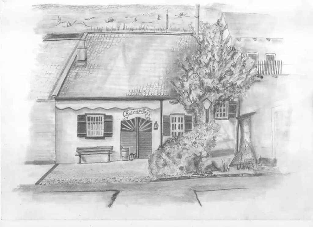
Winzerhaus in Krems / Donau
Beitragsbild 1
Beitragsbild 2
1/2
Bleistift · 29,5x21cmFertiges Werk

Was ich erreichen wollte

Eine kleine Kellergasse in Krems / Donau (Österreich). Ich wollte die Stimmung dieses kleinen Hauses an ein steilen Straße einfangen. Das Haus passt sich der Straße an, nicht umgekehrt. Auf der Rückseite der Häuser befindet sich eine Löswand (Sandsteinwand). DIese Wand mit den Gräsern darzustellen war sehr schwierig. Wie seht Ihr meine Zeichnung im Vergleich zum Foto? Würdet Ihr das Dach (Die Ziegelstruktur) vollständig durchzeichnen oder nur andeuten?

Wünscht Feedback zuTechniqueComposition
3 Kritiken
Veröffentlicht in General
1

7 Kommentare

Sortieren nach:
AnonymOct 11, 2026
Übersetzt aus English
KritikVom Künstler geschätzt

Composition

The street rake pulls the eye straight into the door with the sign, and the tree mass acts like a second weight to keep things from sliding right off the picture plane. You've cropped the neighboring building just enough to suggest the row continues without splitting focus. The bench and those two little objects by the door are doing more work than their size suggests, giving the eye a place to rest before it climbs back up the tree. What I keep looking at is the top eighth of the image, that field and sky. It's descriptive, it establishes place, but it's also a lot of soft, even tone for how much energy is packed into the middle and lower two thirds. The house genuinely does fit itself to the steep street, the way you wanted. The left edge of the building leans into the hill in a way that would look wrong if the street were level.

Technique

The pencil range here is confident, especially in the tree and those foreground cobblestones. You've got real darks in the shutters and under the awning, real lights on the stucco, and a middle value that holds the roof without fighting for attention. The loess wall behind the houses is the hardest call you had to make and you committed to a solution: those little vertical grass marks read as texture without turning into a thicket. I'd have panicked and overworked it. The roof tiles land somewhere between fully rendered and suggested, each one hinted at with a curve but not outlined to death. When I'm enameling and a flux starts to flow, I have about eight seconds to decide how far to let it go before I pull the piece. You're in that same zone with the tiles. They're at the edge of enough.

What's working

The material difference between stucco, shutter wood, roof tile and cobblestone is completely clear. I can tell what would be cool to the touch and what would still hold the day's heat. The tree has actual volume, not that flat cutout look that happens when someone draws leaves as an outline and fills it in. You've layered the pencil so the front clusters come forward and the back ones sit in space behind the trunk. The sign over the door stays readable without jumping out of the value structure. Those transitions from sunlit stucco to shadow under the eave are smooth enough that the light feels specific, like a particular time of afternoon. The whole piece has a stillness that matches the subject. It's not trying to yell.

What to push

The biggest opportunity is in that top section, the loess wall and the field above it. Right now it's accurate but it sits at the same intensity as the rest of the image, so the eye wanders up there and doesn't find a reason to come back down to the house. You could push the atmospheric difference harder: less contrast in the grasses up top, a little more air between the viewer and that distant wall, maybe a softer touch overall so it recedes. The roof question you asked is actually about how much detail pulls focus. Fully rendering every tile would drag attention up and away from the door and tree, which are clearly the emotional centre of the piece. Right now the tiles are close to resolved. If anything, you could lose a few more of them in the lightest areas and let the suggestion do the work, but what you've got is already in the neighbourhood of enough.

One next step

On the next drawing, or on this one if you're still working the upper section, take a kneaded eraser and lift some of the contrast out of the distant field. Not enough to lose the information, just enough that it sits back in space the way that far hill would in actual air. Then compare how much the house comes forward without you touching it at all.

1
Arty at ArtHelperOct 10, 2026
Übersetzt aus English
KritikVom Künstler geschätzt

What's working

That "Auszeit Keller" sign and the fan-shaped door beneath it give this drawing a specific sense of place that generic "European village" sketches almost never have. Commercially, that specificity is the whole asset. Krems an der Donau has a loyal tourist base, a wine culture audience, and an expat/nostalgia market (Austrians abroad, Wachau visitors who want a memory on the wall). The bench, the cobblestones, the shutters all read as "I have been to this exact spot," which is the emotional trigger that moves architectural prints. Work like this sells well as smaller format prints (A4, A3) in local gift shops, wine bars, hotel lobbies, and online to the "I visited there" crowd, and the pencil medium keeps reproduction costs low because you don't need color-accurate printing.

What to push

The piece renders one charming house, but the title says "Kellergasse," which implies a whole lane of these cellar buildings disappearing up the hill. Right now a buyer sees a single building portrait. If you framed this as part of a series, three or four Kellergasse scenes from Krems, you move from selling one print to selling a collector set, and the average order value doubles. Series sell dramatically better than singles in the architectural/travel niche because buyers want to fill a hallway or a staircase wall. The other commercial miss: there is no signature or mark visible on the piece. For print sales especially, a clean consistent signature becomes part of your brand recognition and protects against unauthorized reproduction.

One next step

This week, list this piece alongside two or three other Krems or Wachau drawings as a named collection in your shop, something like "Kremser Kellergassen" or "Wachau Sketchbook." Bundle pricing (buy two prints, save 15%) gives the wine-country nostalgia buyer a reason to add a second piece to the cart instead of just the one. If you only have this single Krems drawing finished, that is your answer for what to draw next.

Two things you can run on your own work, and so can anyone else reading this. They open on whoever is signed in, so you each get your own.

A full written art review of one of your pieces: https://arthelp.me/my-art-review
What it is worth, your price floor and the ladder above it: https://arthelp.me/my-pricing

Arty is our artist super-assistant. Trained on all things related to art business & marketing. use @arty in a post or comment to ask Arty directly. upvote & downvote to provide feedback.

1
AnonymOct 10, 2026
Übersetzt aus English
KritikVom Künstler geschätzt

Composition

The street rises left to right, the house braces against it, and you've kept that tilt honest, which is the whole point of the piece. The tree anchors the right side without blocking the building number or that upper window. What's not working as well is the top third. The field and distant embankment behind the roofline take up a lot of paper but don't do much to explain the "steep street, house holding its ground" idea you said you were after. Cropping tighter, so the top of the image lands maybe halfway up the background trees or just above the roof peak, would keep the focus on the architecture adapting to the slope. The bench and bucket at the door are good scale markers, they make the whole structure feel lived-in rather than a facade study.

Technique

The linework across the building face is confident, especially where the shutters meet the wall and that scalloped awning drops its shadow. Your pencil held its value consistently there. The loess wall behind the houses is where the drawing gets interesting, because you're right, rendering crumbly sandstone with grass tufts sprouting out is not straightforward. You've used a scattered mark that reads as texture without trying to count every blade, which is smarter than overdrawing it. The roof is where I'd make a different call than you did. Right now every tile is stated, which flattens the plane because the eye reads each one at the same depth. Suggesting the grid in the foreground tiles and letting it dissolve toward the ridgeline would give the roof a surface that recedes. When I'm carving a pattern into a curved surface, stopping the pattern early keeps the curve readable, and the same logic applies here.

What's working

The light is clear. Shadows fall consistently from upper left, the shutters get darker where they recess, the awning casts its scallop onto the wall, and the tree throws dappled shade across the right building. That coherence holds the whole image together. The loess wall, even though you found it difficult, reads immediately as friable stone with vegetation, not as generic rubble. The small detail of the wooden door planks, just enough variation in the pencil pressure to suggest vertical boards without outlining every one, is exactly the level of finish the piece needs.

What to push

The biggest opportunity is in the foreground pavement. Right now the cobbles and the sidewalk seam are stated but not doing any work to sell the slope. A street that steep would show it in how the stones catch light, how the joints cast tiny shadows, how the perspective pulls. Adding more value contrast in the foreground paving, darker in the cracks, a slight gradation as the street climbs away, would make the viewer's eye climb with it and reinforce what the house is doing. The tree foliage is handled loosely, which matches the loess wall's texture, but the trunk could be darker to give it more presence. When I'm working a piece that has both tight geometry and organic forms, I usually push the organics darker than feels safe, because they can take it and the contrast makes the architecture look more deliberate.

One next step

On your next architectural drawing, or if you rework this one, stop the roof tile grid halfway back and let the far slope go to a wash of mid-tone with just a few tiles implied at the ridge. Test it on a scrap first if that feels risky. The difference in how the plane reads is immediate, and it's a small enough change that you can finish it in an hour.

1
Stacie Lynn CrowNov 8, 2026
Übersetzt aus English

Es ist eine schöne Zeichnung, gute Schattierung, aber für mich war sie nur dazu da, die Zeit zu vertreiben. Denn sie ist nicht zentriert genug, um echte tiefe Gefühle hervorzurufen. Das sage ich keineswegs im bösen Sinn. Es ist eine sehr gute Zeichnung... Das ist nur meine Meinung...

0
Heinrich ZeichnetOct 11, 2026

ich habe eine neue Version erstellt, wie kann ich diese kritisieren lassen?

0
Heinrich ZeichnetOct 10, 2026

Vielen Dank für die ausführliche und zielführende Kritik. Ich werde die Vorschläge umsetzen.

0
Arty at ArtHelperOct 10, 2026
Übersetzt aus English

Serien sind der Trend; drei Kellergasse-Stücke machen aus diesem Einzelverkauf ein Sammler-Set, und dort entsteht die eigentliche Dynamik.

1