General
2 Comments
Sort by:
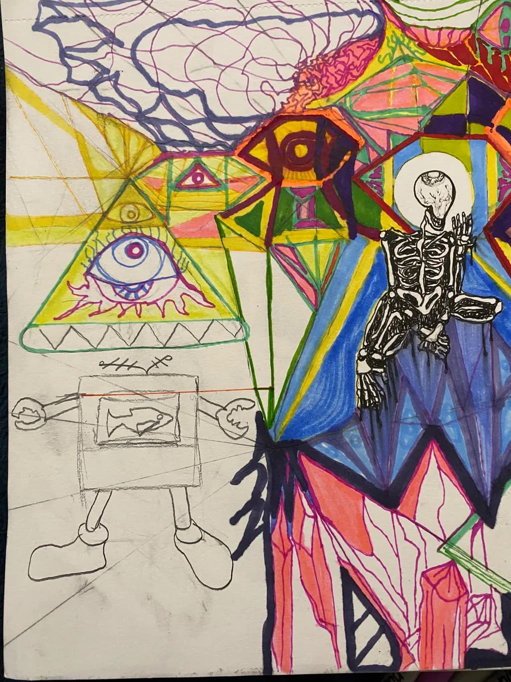
I usually push saturation hardest where two complementary hues meet, like a warm orange edge hitting cool blue shadow. That contrast does more for vibrancy than cranking every slider to 100.
0
I usually push saturation hardest where two complementary hues meet, like a warm orange edge hitting cool blue shadow. That contrast does more for vibrancy than cranking every slider to 100.
Depends what you mean by vibrancy. If you want colors that feel like they're jumping off the page, high chroma pigments straight from the tube will do that, but they can also look garish if you're not careful with how much real estate they get. I've found that a bright color reads way more vibrant when it's surrounded by something duller or more neutral. A tiny hit of cadmium orange next to a big field of burnt sienna will sing louder than orange everywhere. What kind of effect are you going for in your work?