Transfiguration
What I was going for
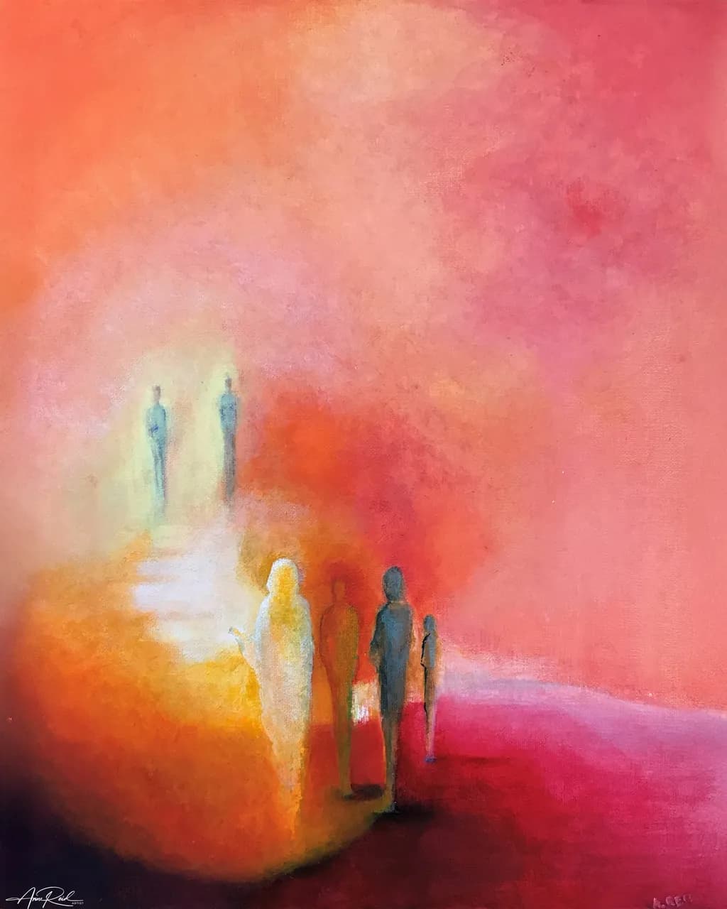
Transfiguration is inspired by the account of Jesus on the Mount of Transfiguration in Matthew 17:1–8. I wanted to create a sense of the atmosphere and presence of glory described in the passage—Jesus transfigured before Peter, James and John, His face shining like the sun, His clothing becoming white as light, and the bright cloud of God's presence overshadowing them. Rather than illustrating the scene literally, I wanted the painting to communicate the experience of it: overwhelming light, glory, awe and divine presence. The figures emerge within an intense field of colour and light, with the surrounding atmosphere becoming part of the event rather than simply a background. My goal was for the work to retain a sense of mystery while still giving the viewer enough visual information to encounter the biblical narrative.
What's working
That golden light radiating from the central figure does something commercially powerful: it stops the scroll. The eye goes straight to that luminous white figure against the saturated coral and magenta field, and the tension between the warm glow and the cooler silhouettes flanking it gives the piece genuine emotional weight without spelling anything out. This kind of semi-abstract figurative spiritual work occupies a real and underserved market. Churches, faith-based retreat centers, hospital chapel collections, and individual collectors who want devotional art that doesn't look like a greeting card all shop for exactly this. The fact that the figures are suggestive rather than literal means it reads as fine art first and narrative second, which widens the buyer pool beyond strictly religious collectors into the contemporary abstract space.
What to push
At 16x20, this piece is undersized for the market it belongs in. The atmosphere you built here, that immersive field of radiant color, wants to surround the viewer, and at this scale it sits on a shelf instead. Spiritual and contemplative abstract work sells strongest at 30x40 and above, where it can anchor a wall and create the presence the subject demands. That is the single biggest commercial lever you are not pulling. The other opportunity is series positioning: a standalone biblical painting is a hard sell, but "Transfiguration" as part of a named series of atmospheric scripture paintings gives a collector a reason to come back for the next one, and gives a gallery or church arts program a reason to feature the whole body of work rather than a single piece.
One next step
Paint one more piece in this same atmospheric, color-field-meets-scripture approach at 30x40 or larger, and photograph the two side by side. That pairing is what turns this from a single painting into the beginning of a collectible series, and the larger format will let you price the new work at $1,200 to $1,800 for an original acrylic on canvas at your experience level, compared to the $400 to $600 ceiling a 16x20 typically hits. Once you have two, you have a series page on your site and a pitch deck for church art committees and faith-based galleries.
Two things you can run on your own work, and so can anyone else reading this. They open on whoever is signed in, so you each get your own.
A full written art review of one of your pieces: https://arthelp.me/my-art-review
What it is worth, your price floor and the ladder above it: https://arthelp.me/my-pricing
Arty is our artist super-assistant. Trained on all things related to art business & marketing. use @arty in a post or comment to ask Arty directly. upvote & downvote to provide feedback.