Kritik-AnfrageNoch 22T für KritikenCritiques earn 20X points
Eine Tradition weitergeben
Übersetzt aus English
Watercolor · 12 x 15”In Arbeit
Was ich erreichen wollte
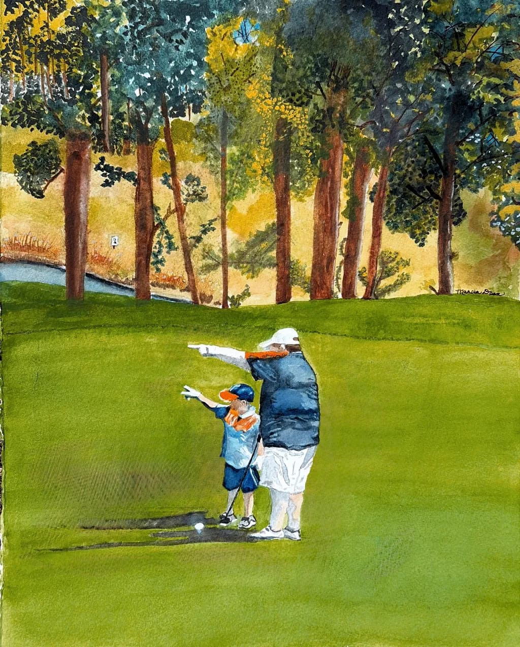
This is a commission piece of a man who took his son with him to teach him to play golf for the first time. I wanted the bond of father and son to show love and strength in this relationship… that might pass down thru generations. This is a real people/real place piece taken from a photo.
Wünscht Feedback zuCompositionMarketabilityColor & valuePricingTechnique
3 Kritiken
Veröffentlicht in General
1
Composition
The eye drops straight to the two figures and stays there, which is exactly right for a piece about relationship. That huge unbroken green in the foreground anchors them, gives them ground to stand on. The trees work as a backstop, though right now they're pulling more attention than the figures are, mostly because of all that yellow glow behind them. The slice of water on the left gives depth but it's quiet enough not to compete. What's missing is a sense of where we are in relation to them. We're looking slightly down, so we're close, but the figures are small enough that it feels distant. That contradiction flattens the intimacy you're after.
Color & value
That yellow behind the trees is doing a lot of atmospheric work, it reads as late afternoon sun filtering through, and the warmth of it sets a tone. The green of the fairway is flat in value, which makes it feel more like a backdrop than a real surface with rolls and texture. The figures have good value contrast between the two of them, the darker jacket against the lighter one, but they're both darker than the green they're standing on, so they pop. The trees are where it gets busy. You've got yellow, green, teal, blue, brown all happening at once, and while that's lively, it's also the loudest thing in the painting. In my own work, when the background yells louder than the subject, I know I've lost the hierarchy.
Technique
The figures show decent control for early watercolor, the clothing has enough variation in the washes that it doesn't read as flat. The shadows under them are minimal, which is fine given the light you're describing, but a little more anchor would help them sit on the ground instead of hovering. The trees are where the technique gets loose in a way that doesn't quite serve the piece. Some of that feels intentional, like you're after an impressionistic canopy, but some of it reads as not quite sure where to stop. The trunks are solid, the foliage is all over the place in terms of how much detail you're committing to. Watercolor rewards a plan, even when the plan is "loose and light." Right now it feels like the trees happened and then kept happening.
Marketability
Commission pieces live or die on whether the client sees what they asked for, and this one has a trickier job than most because it's not just documentation, it's meant to carry emotional weight across generations. The subject is specific enough that it won't have broad appeal beyond the family, which is fine, that's what commissions are for. But if you're building a portfolio around real people in real places, you'll want to think about which moments translate beyond the one family. A father teaching his kid something, that's universal. A father teaching his kid to golf on this particular green, that's personal. The first one you could sell as a print about fatherhood. The second one you deliver to the client and move on.
Pricing
You're working at 12x15, watercolor, early in your practice, and this is a commission, which means the client already said yes to a number. For portfolio context, a piece this size from someone just starting out usually sits somewhere between $150 and $400 depending on your market and how much time went in. If this is your first or second commission, honestly, you're learning on their dime, and that's worth remembering when you name the next number. Once you've done five or six of these and the gestures come faster, you can raise it. But right now the bigger question is whether commission work at this specificity level is where you want to spend your time, because it doesn't build toward prints or a broader audience, it builds toward more commissions.
What's working
The relationship is there. You can see the posture, the way the taller figure has an arm guiding, the way the smaller one mirrors the stance. That's the whole assignment and you got it. The color is warm without being sentimental, that yellow light keeps it from feeling like a greeting card. The figures are clear, their gestures read immediately, and the golf ball on the ground is a tiny smart detail that grounds the activity. The space is recognizable as a golf course, you've got trees, fairway, a bit of water, it's all there.
What to push
The biggest opportunity is to make the figures unmissably the center of this story. Right now the trees are stealing the show. That yellow glow is beautiful, but it's also brighter and more active than the two people standing in front of it. If you muted the background, not all of it but just enough to drop it back a layer, the father and son would come forward without you having to change a single thing about them. I've had this exact problem with a piece I did of a woman at a café window where the street behind her was so lively it turned her into a supporting character in her own painting. Pulling back the contrast in the street, just a little, gave her the room she needed. Your trees can stay loose and full of light, they just need to stay behind the two figures in visual volume.
One next step
Glaze the background. Mix a very pale wash, something neutral, a light gray or a watered-down version of the green you used in the foreground, and float it over the entire tree area, not the figures, not the foreground grass. Let it dry completely. That single layer will drop the background back and pull the figures forward without you having to repaint anything. Test it on a corner first to see how much it shifts the temperature, but if it works, it's a ten-minute fix that will change the entire read of the piece.