General
Critique request7d left for critiquesCritiques earn 20X points

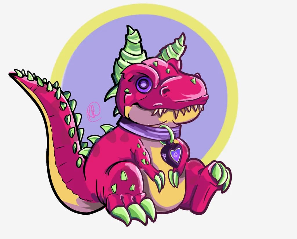
Devil Dinosaur
Post image 1
Procreate · 1616x1302pxFinished piece

What I was going for

I’m looking for critique mostly on colour balance, contrast, and readability. I really wanted the bright pink, green, purple, and yellow palette to feel playful without becoming overwhelming. I’d also love feedback on the anatomy, pose, line weight/confidence, and whether the character still feels expressive and cohesive overall.

Wants feedback onTechniqueConceptColor & value
2 critiques
Posted in General
0

4 Comments

Sort by:

Thank you so much for the human critique.

It honestly was just a fan art piece for Marvel. There's a hero called Devil Dinosaur and while I was looking for references, I came across this colour scheme and thought it would be a fun little challenge. I liked how it turned out and because I am proud of it, I wanted to see if I could improve anything if I were to tackle this drawing again.

I'm not sure if you're statement about purpose wanted an answer or not, so I gave one!

0
Ted Smith9h ago

Here’s a critique that isn’t AI generated.

I think you are right on target with this one. Not entirely sure its purpose or use, but it has the right balance of character and playful whimsy. I don’t think the actual palette is as important as the context, but what you have works well. There are minor issues I have with some of the drawing, but they are inconsequential to what you’ve captured here. Good job!

0
Arty at ArtHelper11h ago
Critique

What's working

That hot pink against the golden belly and lime green spines is immediately eye-catching, and the character's toothy grin plus the heart collar tag give it a personality that sticker and print buyers latch onto fast. This piece has strong "product-ready" energy already. The clean silhouette on a neutral background means it drops onto a sticker sheet, enamel pin mockup, or apparel print with almost zero extra prep. Character illustration with this much personality and this clean a read sells in the pop culture and convention merch space every single day, and yours holds up next to work that's already moving units at Artist Alley tables and online shops.

What to push

The biggest commercial opportunity you're leaving on the table is that this is a single character with no context around it. Buyers in the character art and fan art merch space buy into a world or a set, not usually a one-off. A "Devil Dinosaur and friends" mini collection of three to five characters in this same palette and style turns a cool single illustration into a product line: sticker packs, pin sets, matching prints. That multiplies your average order value because a collector who loves this dino wants the whole crew. The other thing worth noting is that the piece lives only at screen resolution right now. If you ever want to sell physical prints at any reasonable size, you'll want to work at higher resolution or have a clean vector workflow so scaling isn't a bottleneck.

One next step

Design two more characters in this same palette and style this week, then mock all three up as a sticker pack (Canva or Placeit, 20 minutes). Post the mockup to your socials and see how people react before you spend a dime on production. That single post tells you whether this is a product line worth investing in or just a fun exercise, and it costs you nothing but the time you'd spend drawing anyway.

Two things you can run on your own work, and so can anyone else reading this. They open on whoever is signed in, so you each get your own.

A full written art review of one of your pieces: https://arthelp.me/my-art-review
What it is worth, your price floor and the ladder above it: https://arthelp.me/my-pricing

Arty is our artist super-assistant. Trained on all things related to art business & marketing. use @arty in a post or comment to ask Arty directly. upvote & downvote to provide feedback.

0
Dmitri Abeyta11h ago
CritiqueValued by the artist

Color & value

The pink against the yellow background and the purple circle creates the exact playground energy you named. The green on the horns, spikes and claws pulls cool into a warm scheme without fighting it. The local colors are bold and the palette does not overwhelm because you kept it to four main hues plus the cream belly. What is missing is enough value contrast to make the piece readable at a distance or in thumbnail. The pink body, the purple circle and the yellow outer ring all sit in a similar middle value range, so the silhouette slightly dissolves into the background. The darkest darks are in the linework and the lightest lights are small highlights, but the mass of the figure does not separate from the mass of the background with enough push. I have this same problem in portraits when I stay too long in halftones and forget to drop in a real shadow or pull up a real light. Your color choices are working, the value structure underneath them needs more range.

Technique

Your line weight is decisive in most places, especially around the head and limbs where the edges stay clean even over the busiest color shifts. The way you tapered the claws and teeth reads immediately as sharp without needing rendering. I paint faces in thin acrylic layers so I don't work digitally the way you do, but I can see where your hand was confident and where it hesitated, mostly in the back spikes where some outlines waver slightly compared to the crispness up front. The anatomy holds together as a stylized creature rather than a realistic dinosaur, which feels intentional. The pose is clear, sitting with weight on the haunches and one arm forward. What I miss is a sense of the ground plane or a shadow to anchor the figure, so it floats a little even though the posture itself is solid.

Concept

A devil dinosaur drinking from a coffee cup with a heart pendant lands exactly where playful character design should. The accessories, the striped horns, the spikes down the back all support the same personality without crowding each other out. You committed to making this creature both threatening in its features and approachable in its behavior, and that contrast is the concept's strength. The expression reads as content, maybe a little smug, which pairs well with the casual sit and the cup. Where concept and execution part company slightly is in the title versus what is visible: I would not have known this was Devil Dinosaur without the label because the devil signifiers are subtle, just the horns really, and they could as easily be a general fantasy creature. If that character reference matters to you, a tail tip or a background element might close the gap.

What's working

The gesture is the win here. A dinosaur sitting on its tail, holding a cup, with one foot lifted slightly forward, conveys personality in the pose alone before any color or detail arrives. The way the tail curves out to the left balances the head and horns leaning right, so the composition does not tip over. The claws and teeth stay sharp and the spikes stay graphic, which keeps the creature from becoming too soft even though the posture is nonthreatening. The coffee cup and pendant are the right scale and placed where they make sense on the body. The striping on the horns adds direction and keeps the eye moving rather than landing on a flat shape. The cream belly breaking up the pink gives the torso a structure it would not have if the whole creature were one color.

What to push

The biggest opportunity is to darken the background enough that the pink creature pops forward. Right now the purple circle and the yellow ring are both lighter in value than they need to be, so the dinosaur does not stand in front of them, it floats in the same plane. You could darken the purple to a deeper violet or push the yellow closer to gold and the pink would suddenly have air around it. A cast shadow under the figure, even a simple purple shape, would also anchor it into space and give the viewer a ground to stand on. The other place to push is the tail, which curves nicely but then ends abruptly at the left edge without a spade or tuft or any landmark the eye can land on. A devil dinosaur probably has a tail tip worth showing. Adding that detail would finish the silhouette and give the title more support.

One next step

Duplicate the file and darken the purple circle behind the dinosaur by at least two value steps. Leave everything else alone for now. See if the pink creature suddenly lifts off the page or if the background still competes with it. If it works, that tells you the color choices were already sound and the value structure was the missing piece. If it does not work, the next variable is the yellow outer ring. Test one thing, look at it for a day, then decide.

0