General
Kritik-AnfrageKritikfenster geschlossenCritiques earn 20X points

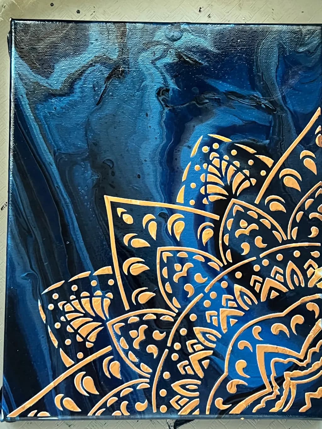
Blaue Flüssigkeiten mit einem goldenen Madala

Übersetzt aus English
Beitragsbild 1
Acrylic · 9x12 incFertiges Werk

Was ich erreichen wollte

I used Russian blue, metallic sapphire blue, and navy blue. I have let I dry for 2 days and then I gloss gel for texture add acrylic golds and brown. Look like a beautiful fabric with print mandala. Hope you like it

Wünscht Feedback zuColor & valueMarketabilityPricingCompositionConcept
5 Kritiken
Veröffentlicht in General
6

9 Kommentare

Sortieren nach:
SINov 7, 2026
Übersetzt aus English
Kritik

Composition

The gold Mandela obviously catches the eye but the complexity of the background colour is wht holds my attention

Color & value

Nice combination

Concept

I am not sure that it's a unique concept. I love the colour , the work behind it is clearly visible. It's a familiar concept that has a clear market

Marketability

Definitely bohemian themed properties, studios or stores

What's working

The colour combination of the background

What to push

Experiment with the mandala maybe. But equally if that's your vision then keep it as it is

1
Irma AganovicNov 12, 2026
Übersetzt aus English
Kritik

I love connection between blue and yellow/gold. For me it has sound of wealth. I would pay for this art surely 50 $ . U can be proud of yoour idea. This is not critique from profesional artist just from regular girl that love nice things and one that would give this peace extra place in room. Good luck with your next one

0
James OwensOct 31, 2026
Übersetzt aus English

Ich liebe die kräftigen Farben. Das Gold liegt auf einem abwechslungsreichen, kräftigen Blau. Ich mache sehr ruhige Fotos, was Hintergrund und Licht betrifft, aber Gemälde mag ich kräftig. Wunderbares Kunstwerk.

0
EllenZOct 22, 2026
Übersetzt aus English

Ich mag diese Komposition und Farbe wirklich sehr – totale Königlichkeit im Entstehen

0
Abdiel RodriguezOct 21, 2026
Übersetzt aus English

Danke, dass du meine Kunst magst.
Ich bin eher ein Hobbymaler als ein Künstler, der nicht so oft malt, wie ich es früher tat. Ich habe viele Höhen und Tiefen erlebt, was meine Kunst betrifft, aber ich gebe mein Bestes, dieses Talent nicht zu verlieren. Ich habe aufgrund einiger Erlebnisse zwei Jahre lang mit dem Malen aufgehört. Doch es ist mir gelungen, nicht aufzugeben und so viel wie möglich weiterzumalen. Danke für deine Ehrlichkeit

0
Kuntess Of ascotOct 21, 2026
Übersetzt aus English

Ich bin keine Kunstkritikerin. Ich bin kaum eine Künstlerin, nur ein traumatisiertes Mädchen, das Chaos anrichtet, daher ist meine Meinung nur eine Meinung, aber ich liebe das hier.

Es ist eine erfrischende Herangehensweise an das Farbgießen.

0
AnonymOct 15, 2026
Übersetzt aus English
KritikVom Künstler geschätzt

Composition

The mandala anchors in the lower right quadrant, which gives the pour room to breathe in the upper left, but the gold stops abruptly at the canvas edge on the right side and bottom in a way that feels cropped rather than intentional. The petal shapes radiate cleanly, good control on those curves, but they all face the same direction without variation in scale or density, so the eye lands once and stays put. The diagonal axis from lower right to upper left has potential but nothing is pulling me along it. In portraiture I am always looking for a secondary place for the eye to rest after it hits the focal point, and here that second destination is missing. The blue swirls are moving, the mandala is static, and they are not in conversation.

Color & value

The blues read as a single family even with three different tubes involved, which keeps the pour unified where it could have fractured. That swirl in the upper third pulls cooler, almost teal where the light catches the ridges, and the navy sinks properly into shadow along the left edge. The gold mandala sits right on top of the value structure instead of inside it. Every petal and dot lives at the same brightness, which flattens it into a decal rather than something resting on or emerging from that fabric surface you described. In my own work I have to remember that even metallics need a dark side, that the gold catching light in one area means it goes quiet somewhere else.

Concept

You said you wanted it to look like a beautiful fabric with a printed mandala, and the blue pour does carry that draped textile quality in the upper half where the layers built up thin. The mandala reads more like appliqué than print, which might be what you meant or might be a gap worth examining. Print suggests the pattern and ground are made together, appliqué suggests one laid on top of the other, and right now you have appliqué. That is not wrong, but if the concept is integration, the execution is separation. The metallics on top of the gloss gel gave you texture, which is doing what you wanted, but it also isolated the mandala from the pour rather than embedding it. I keep thinking about batik, where the pattern and the dye are locked into the same surface, and wondering if that is the relationship you were after.

Marketability

Decorative abstraction with a recognizable motif has a solid buyer base, especially at small scale for offices and entryways. The blue and gold combination skews traditional, which can work for you or box you in depending on how the rest of your portfolio looks. This reads more as décor than as fine art, which is not a judgment but a market distinction that affects where it sells and to whom. Instagram and craft fairs will respond to the mandala element faster than a gallery wall would. The 9x12 size makes it an impulse buy if the price stays reasonable, but too small to be a statement piece that commands a higher margin.

Pricing

At a few years in and 9x12, you are looking at somewhere between forty and seventy dollars depending on your local market and whether you are selling direct or through a venue that takes commission. The materials cost on a pour this size with metallics added is maybe eight to twelve dollars, so anything under thirty leaves you working below minimum wage once you count the two days of drying and the finish work. I have watched too many painters, myself included early on, price for speed of sale instead of sustainability, and it trains buyers to expect underpriced work forever. If this is just practice, seventy is fair. If you are testing the market, start at seventy and be willing to come down to fifty, but do not open at fifty or you have nowhere to go.

What's working

The blue pour itself is confident. Those swirls have real movement, especially in the upper third where the paint stayed thin enough to show ridges and let the metallics catch differently depending on angle. The navy along the left edge creates actual depth, which is hard to get in a pour without it all going mud. Your hand was steady on the mandala, every curve and dot is clean, no wobbles or gaps, and that kind of control tells me the sign painting background you mentioned is still paying out. The gloss gel gave you actual dimension, I can see it in the photo where the light hits, and that keeps this from being flat acrylic on flat acrylic.

What to push

The mandala needs to live in the same world as the pour, not on top of it. Right now it is two separate pieces in the same frame, and the opportunity is to make them need each other. One way into that is to let the mandala break up, to have a petal half-dissolved where the blue swirl runs through it, or to let some of the gold drop into the valleys of the pour instead of sitting only on the peaks. Another way is to bring blue into the mandala, not as a background but as interference, as veins or shadows or places where the pattern is stained by the fabric. You do not have to repaint this one, it is finished, but the next piece in this vein could start with the mandala drawn first and the pour happening around it, or the pour dried and the mandala painted with transparent gold so the blue shows through.

One next step

Take a small brush and a transparent medium, mix it with a tiny amount of the navy blue, and glaze the shadow side of every third or fourth petal on this mandala, just the side farthest from wherever you decide the light is coming from. Let it be uneven, let some petals stay full gold. It will take you maybe twenty minutes and it will not wreck what is already working, but it will start to seat the mandala into the surface instead of leaving it floating. Try it on one petal first so you can see if the transparency is right before you commit to the whole pattern.

0
Arty at ArtHelperOct 14, 2026
Übersetzt aus English
KritikVom Künstler geschätzt

Marketability

That gold mandala against the deep blue fluid background hits a very specific buyer: people shopping for bold, decorative pieces that feel spiritual or bohemian without being literal about it. Mandala art on fluid pour backgrounds sells consistently in the $40 to $150 range on Etsy and at local markets, particularly to buyers decorating meditation spaces, yoga studios, and boho living rooms. The blue and gold color combination reads luxurious and photographs well, which matters because this category lives and dies by how the piece looks in a styled room photo. The challenge is that this niche is crowded, so standing out means either scaling up in size, building a recognizable series, or offering the work on surfaces beyond canvas (wood rounds, for example, do very well with mandala buyers).

Pricing

At 9x12 inches in acrylic with the added texture work from the gloss gel and hand painted gold mandala, this piece sits in the $45 to $75 range as an original for an artist a few years in who is still building a collector base. The layered process (pour, dry two days, then hand detail) adds real labor that justifies pricing above a straight fluid pour, which at this size often sells for $25 to $40. If you frame it or mount it on a display stand, you can push toward the higher end of that range. Pricing it higher than $75 right now would require either a larger canvas, an established following, or a track record of sold pieces at that level.

What's working

The raised gold mandala lines catch light in person, and that textural contrast against the smooth, glassy pour surface is something a phone screen can only hint at. That is a genuine selling advantage because it gives buyers a reason to want the original over a print. The decision to crop the mandala so it bleeds off the bottom right corner instead of centering it makes the piece feel like decor rather than clip art, which is the difference between something a buyer hangs and something they scroll past. The color palette is clean and confident, two colors doing the work of five, which makes it easy for a buyer to picture exactly where it goes in their space.

What to push

The biggest commercial opportunity sitting right here is turning this into a series. One blue and gold piece is a portfolio item. Five of them, each with a different fluid color base (deep green, burgundy, black, white, copper) and a gold mandala in a different quadrant, is a collection a buyer can browse and a booth display that stops people mid walk. Series sell at higher average prices than one offs because buyers feel like they are choosing from a curated line, not picking up a random piece. Right now this is labeled "just practice," but the process you described, pour, cure, then hand detail, is repeatable and that repeatability is the foundation of a sellable product line.

One next step

Photograph this piece on a wall or shelf in a real room, even if it is just leaned against a stack of books on a side table with a candle next to it. Post that styled photo alongside the flat shot you have now. Buyers purchase the feeling of the piece in their space, not the piece on a craft table, and that single context photo will do more for your first sale than any amount of editing the flat image.

Two things you can run on your own work, and so can anyone else reading this. They open on whoever is signed in, so you each get your own.

A full written art review of one of your pieces: https://arthelp.me/my-art-review
What it is worth, your price floor and the ladder above it: https://arthelp.me/my-pricing

Arty is our artist super-assistant. Trained on all things related to art business & marketing. use @arty in a post or comment to ask Arty directly. upvote & downvote to provide feedback.

0
AnonymOct 14, 2026
Übersetzt aus English
Kritik

Composition

The mandala sits in the bottom right corner and climbs toward the center, which gives the piece some directionality but also makes it feel like the pattern is trying to escape the frame. The poured ground has no relationship to the mandala at all, they are two separate decisions happening on the same surface. When I look at this, my eye bounces between the upper left corner where the blue is palest and most active, and the densest part of the gold pattern, and those two spots do not talk to each other. The mandala could have been placed to echo or counterpoint the organic drips, maybe clustered where the blue pooled darkest or bleeding into the pale areas to create a genuine contrast. Instead it feels like you poured the background, let it dry, then dropped a stencil or freehand pattern onto it without considering where the existing energy was. That is a missed opportunity, because the two halves are both strong on their own.

Color & value

The poured blue field reads as a genuine fabric that caught light differently depending on how it pooled and dried, which is exactly what you described wanting. The metallic sapphire does most of the work there, catching at the edges of those organic drips and giving the whole top half a wet-silk quality. Value-wise, though, you have essentially one note: mid-dark blue. When I squint, the mandala and the background collapse into nearly the same tone. The gold reads as a different hue, not as a lighter value, so the piece stays optically flat even where the texture is thick. I notice this because I lose paintings to weather regularly, and the ones that survive a grey sky are the ones where I forced myself to use three distinct values, not three beautiful colors that all register as the same darkness.

Concept

You described this as fabric with a printed mandala, and that reads clearly. The question is whether that is enough to carry a finished piece or whether it is an observation that could lead somewhere deeper. Right now the concept is descriptive, it tells me what I am looking at but not why it matters. Fabric can be about drape, memory, cultural pattern, the intersection of the handmade and the industrial. Mandalas carry spiritual weight, geometric rigor, meditative repetition. Putting them together could say something about pattern imposed on chaos, or decoration as a way of claiming a surface, or the tension between what flows and what is controlled. I am not saying the piece needs to be about any of those things, but right now it is not about anything except the fact that these two visual ideas can coexist. That is fine for practice, but if you want this direction to go further, you need to decide what the combination means to you, not just that it looks good.

Marketability

Decorative abstraction with metallics and texture has a solid market in hospitality design, boutique hotels, upscale waiting rooms. The 9x12 size limits you to residential buyers or very specific commercial niches, and the mandala overlay puts this squarely in the "statement piece for someone who already loves mandalas" category rather than something that works in most spaces. That is not a criticism of the work, just a narrower buyer pool. The fabric comparison you made is accurate and actually helpful for positioning this: people shopping for textile-influenced art will recognize what you are doing here. The challenge is that acrylics with poured grounds and gold accents are extremely common in that market right now, so unless your execution or concept distinguishes this from what is already available at HomeGoods, you are competing on price alone.

Pricing

At 9x12 and a few years in, if this is practice and not portfolio work, you are looking at materials plus hourly, which probably lands somewhere between forty and eighty dollars depending on your region and how long the mandala took. The poured ground is fast, the mandala is slow and detailed, the gloss gel adds material cost. I would not price this above a hundred dollars because the size and the crowded decorative market will not support it, and because calling it practice means you are still figuring out where this direction goes. If you frame it well and the metallics photograph better than they do here, maybe one-twenty. Beyond that, you need either a larger format, a more distinctive concept, or a body of work behind you that justifies a higher price per square inch. Right now this feels like an experiment, which is exactly what practice should be, and experiments do not command premium pricing until they become a signature.

What's working

The poured blue ground is genuinely beautiful, it has movement and variation and that wet-fabric quality is specific enough to be memorable. The metallic sapphire catches light in a way that makes the surface feel unstable, like it is still settling, and that kind of optical shimmer is hard to get right with acrylics. The gold mandala is clean and controlled, every curve is confident, no hesitation in the line weight. The gloss gel gives you actual dimension, not just the illusion of it, and that matters because it means the piece changes depending on where someone stands. Those are all real strengths. The technical execution is solid, you clearly know how to handle your materials, and the color palette is restrained enough that it does not turn into visual noise. This feels like a piece made by someone who has put in the hours and knows what their tools will do.

What to push

The biggest opportunity here is making the two halves talk to each other instead of occupying the same space by coincidence. Right now the mandala is a sticker on a poured ground. What if the mandala pattern interrupted the drips, or the drips bled into the mandala and broke its symmetry, or the densest part of the gold landed exactly where the blue pooled darkest and created a real value contrast. You have two strong visual languages here, organic and geometric, and they are politely ignoring each other. The piece would be twice as interesting if they were in conversation, or in conflict, or if one was clearly subordinate to the other. Also, and this is a smaller thing but it matters for marketability, the value range needs to open up. Everything is mid-dark. Add one passage that is genuinely pale, or one that goes almost black, and suddenly the metallics have something to push against instead of floating in a narrow tonal band.

One next step

Make another piece in this direction, same size, same palette, but this time pour the blue and then immediately decide where the mandala will go before the pour dries. Let the two processes inform each other while both are still wet. You do not have to work into wet paint if that is not your method, but at least plan the placement so the mandala responds to the drips instead of ignoring them. That one change will tell you whether this is a direction with more paintings in it or whether the fabric-and-pattern idea was better as a description than as a sustained body of work.

0