Pedido de críticaJanela de crítica encerradaCritiques earn 20X points
Outono
Traduzido de English
1/2
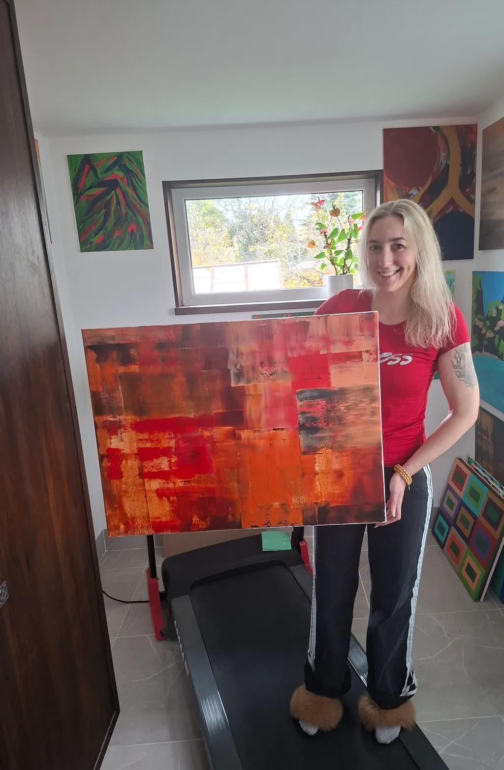
Oil on canvas · 60×80cmObra finalizada
O que eu buscava
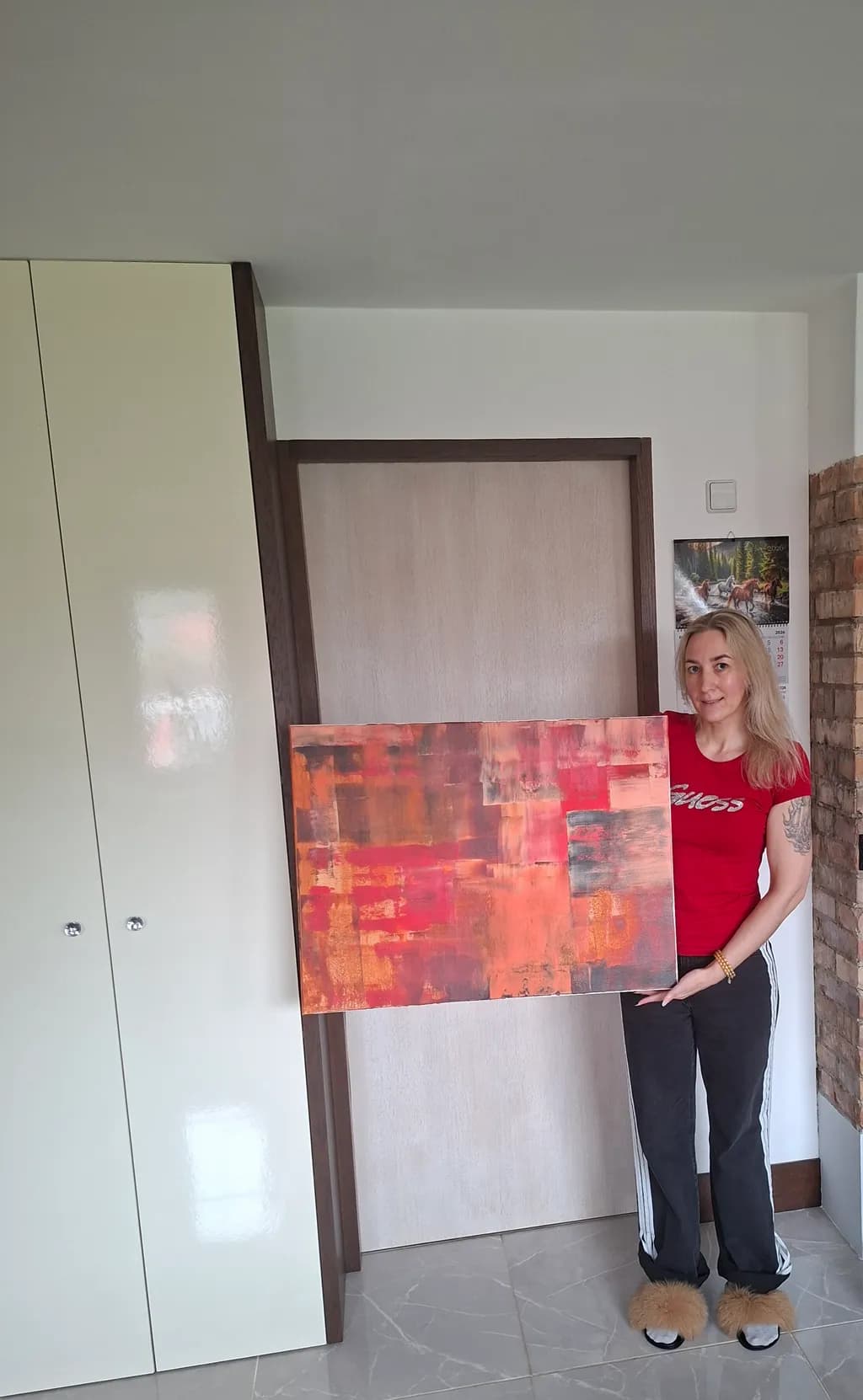
I wanted a sense of warmth and coziness to come across when viewing it. Is this what the painting looks like? What is your opinion on the color combination? Where would it be best to hang it? What would its monetary value be? Can you see the cozy autumn? ❤️
Quer feedback sobreCompositionColor & valueTechniqueConceptMarketabilityPricing
3 críticas
Publicado em General
2
Composition
The eye enters center-left where the deepest reds sit, then moves through warm diagonals into the upper right corner before dropping back down through the cooler brownish zones at bottom. The piece divides roughly into thirds, horizontal bands of value that shift from burnt umber through scarlet to rust, and that layered approach creates a sense of depth even though the surface is abstract. The proportions are close to square, which gives the horizontal drift of the color zones more room to settle. There's no strong focal point pulling attention to one spot, which works for an atmospheric piece but also means the eye wanders without quite landing anywhere.
Color & value
The palette delivers warmth, no question. Reds, burnt oranges, deep ochres, some cooler maroon in the darks. The value range is narrower than it first appears, mostly mid-tones with a few punches of lighter peach and some true darks tucked into the lower left and scattered through the reds. That compression keeps the mood unified but also flattens the space a bit. The coolest passages are those brownish areas at the bottom, and they read more neutral than cool, so there's not much temperature contrast to push against all that heat. When I'm working in a narrow value range like this, the thing that usually rescues it for me is one area of real light or real dark to anchor the rest, and this piece is missing both extremes.
Technique
The brushwork is gestural, broken into blocky horizontal zones that suggest landscape without representing it. Layering is visible in places where lighter passages sit over darker ones, and that builds some texture, though the surface reads fairly even overall. Oil gives you a long working time, and it looks like you used that to blend edges in some spots and leave them sharp in others, which adds variety. The finish appears matte or satin, not glossy, which suits the earthy palette. One thing I notice is that the transitions between zones feel soft, almost ambient, which reinforces the cozy read but also makes the composition feel a little loose structurally. In my own work I've found that even abstract pieces benefit from at least one hard boundary somewhere to give the softer areas something to rest against.
Concept
You asked if the cozy autumn comes across, and yes, the warmth is absolutely there. The palette and the horizontal drift both suggest end-of-day light, harvest colors, the feeling of settling in. Where it gets less clear is whether this is landscape-derived abstraction or pure color field work, and that ambiguity isn't a flaw but it does affect how someone reads the piece. The title points toward a season, which nudges the viewer to see horizon lines and earth, but the piece itself doesn't commit to that reading. That openness can be a strength in abstract work, it lets the viewer bring their own associations, but it also means you're asking the audience to do some of the conceptual lifting.
Marketability
Warm abstract work in the 60×80cm range has solid demand, especially for residential buyers looking for something that works over a sofa or in a dining area. The palette is versatile, it would sit comfortably in spaces with wood furniture, warm neutrals, even some industrial interiors where the heat would offset cooler materials. The lack of a strong focal point makes it easy to live with, which is an asset in the decorative market. Where it might struggle is in competing with more dramatic abstract pieces that use higher contrast or unexpected color pops to grab attention in an online gallery or a booth. This reads as pleasant and harmonious, which is good for a buyer's living room and less good for stopping the scroll. The piece would hang well in a bedroom, a hallway with warm lighting, or a cozy reading nook, anywhere the warmth reinforces the function of the space.
Pricing
At 60×80cm in oil, assuming this is on stretched canvas and you're an emerging artist without significant solo exhibition history, the range I'd expect to see is roughly €400 to €700, depending on your local market and whether you're selling direct or through a gallery. If a gallery takes it, they'll typically mark it up 40 to 50 percent over what they pay you, so your floor needs to cover materials, time, and overhead while leaving them room. Materials for a piece this size, decent oil paint and canvas, run maybe €60 to €100, so pricing below €300 doesn't make sense unless you're offloading old work. The upper end of that range assumes you have some track record, a coherent body of work, and buyers who've purchased from you before. If this is your first or second oil piece for sale, start closer to the middle, around €500, and be willing to negotiate down slightly for a serious buyer. Pricing too high without the market evidence to back it up just means the piece sits.
What's working
The warmth you wanted is in there, fully. The color holds together, it feels like a single thought rather than a collection of unrelated marks, and that unity is harder to pull off than it looks. The horizontal drift gives the piece a settling quality, like something coming to rest, which suits the cozy autumn idea. The scale is comfortable, large enough to anchor a wall but not so big it demands a specific architecture. And the medium itself, oil, carries a certain weight that acrylic doesn't, there's a richness to how the pigment sits on the canvas that buyers notice even if they don't name it. The piece doesn't shout, and in the right context that's exactly the move.
What to push
The biggest opportunity here is contrast, both in value and in temperature. Right now the piece lives almost entirely in warm mid-tones, and while that creates harmony, it also leaves no breathing room, nowhere for the eye to find relief or surprise. Adding one area of real darkness, not just deeper red but true dark, near-black, would anchor the whole composition and make the lighter oranges feel lighter by comparison. Same with temperature, a small passage of cool, maybe a blue-gray or a violet, even just in one corner, would make the warmth feel intentional instead of inevitable. In my own work I've learned that harmony without tension just reads as sameness after a while, and the quickest fix is almost always to introduce the thing the piece is avoiding. Here, that's coolness and darkness.
One next step
On your next abstract piece, start with a value study in three tones only, dark, mid, light, before you touch color. Map out where each value will sit on the canvas, commit to at least one area of true dark and one area of true light, then build your color on top of that structure. It takes maybe ten minutes with charcoal or a pencil, and it solves the value compression problem before it starts. You'll end up with a piece that has the same warmth and cohesion you're already getting, but with more dimension and a clearer path for the eye to travel.
Muito obrigado ❤