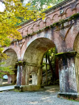
2 versions of a photo from a recent trip...which works best? Click on your fav to vote!
+Bonus points if you know where this was shot!
Tap an image to vote
Posted in General (edited)
37
+Bonus points if you know where this was shot!
Tap an image to vote
They are both good, but there is something about the atmospheric qualities with monochrome
I normally would lean towards a monochrome effect for this type of structure. However, the yellow leaves, the greenish moss and the aged brick make the "color" tell a stronger "story." Jon and Rob make good points in that the left side needs some pop. Thanks for the courage to ask for judgment it has allowed for good discussion.
Both photos are interesting in their own way; the color one is lively, while the black-and-white one is colder, more mysterious, and deeper. I think it depends on the mood.
I am going thru my Monochrome phase but I have to say as posted the color image grabs my attention as the grit and grime juxtaposition with the new leave of the tree tell me a story...
Because of the aged state of the bricks, I would favor the color image. It looks like the UK.
for Me, the color. It shows the Age of the. aqueduct/arches? The Black and white looks "dirty" like it hasn't been cleaned. Just my tastes. Good eye for getting this shot.
The black and white, I feel it shows more depth and showcases the structure's age.
The color. This is a tough decision for me. If the images were viewed individually, a day apart, the B&W would win. But displayed side by side, I find myself going to the color to answer questions about the B&W.
 Voted: Give me the color!Sep 3, 2026
I'm generally biased towards color.
The color for me.
If the B&W had a little more contrast between the leaves and the structure, maybe make the tree leaves lighter or even infrared (white). Both are beautiful.
Black and white. Because the composition can carry itself without color to aid it in my opinion. Some photos need color and this one is ok as color but I much prefer the black and white.
Both pieces are interesting but if you made pick I'll go with the black and white. Just because I love black and white.
I love the one with the color it shows ages but still alive telling histories though times
The black and with also telling history in my point of view itrospective it is i cline more to deep side inside covering a pain no room for proximity but bold both are impresive one bring you live another somthing is daying inside
I think the b&w could be the strongest with a bit of work. Currently it’s very flat, mostly grey. There are shadow details under the arches in the color version that could be pulled out in the b&w. The back ground view behind the arch should be darker than the archway but a tad less contrasty. The green limbs in the upper left could be much lighter, almost white but keep any mid-tones you have.
One of the most important things overall is to keep your vertical lines vertical. As of now the have a vert strong keystone or converging lines a no no in architectural photography.. When you correct the convergence on both sides, you will lose some of your colum on the right which in this case would be a positive in eliminating that slice of the column on the upper right side. Go for, it’s really a jewel in the making.
In many cases, following the rule that if it doesn't add, it takes away leans toward the B&W version.
the mystery and detail pops in the B&W...well done
This is the Suirokaku Aqueduct (水路閣) at Nanzen-ji Temple in Kyoto, Japan.
It was built in 1890 as part of the Lake Biwa Canal project, which brought water from Lake Biwa to Kyoto. The beautiful red-brick arches, surrounded by lush forest, make it one of Kyoto’s most recognizable historical spots.
 Location: Nanzen-ji Temple, Sakyo Ward, Kyoto, Japan
 Nearest station: Keage Station (Tozai Subway Line), about a 10-minute walk.
colour photo
I love them both and could see either in a different space for a different collector. My eye goes to the color first, but lingers on the black and white longer.
I believe that is the old city gate, in Rome.
The black and white needs more editing. There is a lack of contrast that is essential in giving Black and White images depth and dimension.
I find the color version more pleasant to look at. The green of the trees provides a contrast with the bridge.
The architecture is nice, but the values could be pushed further if represented in b&w. I love the color version because it feels like an old patina.
To my eye, both are a little overdone. The color one is a little too contrasty and oversaturated. The B&W is a little too contrasty as well. I realise that this is a personal preference, but with the current look, the subtle details in the masonry, shadows and sunlit areas are lost to the viewer. The location is Suirokaku Aqueduct.
Depends on what the end product will be. The color of the bricks vs the moss is where my eye goes first, those could use a little more vibrance and saturation within adding to the trees. In B&W the tonal variation kinda just looks dirty. I don’t think the subject matter lends itself to B&W. Then again I’m biased as a color photographer. It’s what works best for you, thanks for sharing.
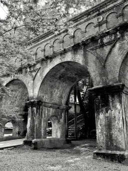
I don't think in this case the color adds a lot. I prefer the black and white here for the textures. I'd lighten up the yellows and darken the reds a bit in Lightroom to provide some contrast between the tree and the brick bridge.
What Jon said, in that the B&W needs more work. Without that emphasizing the contrast of the leaves, the color is the choice.
Thanks, I'll try that!