Digital Art



2 Comments
Sort by:
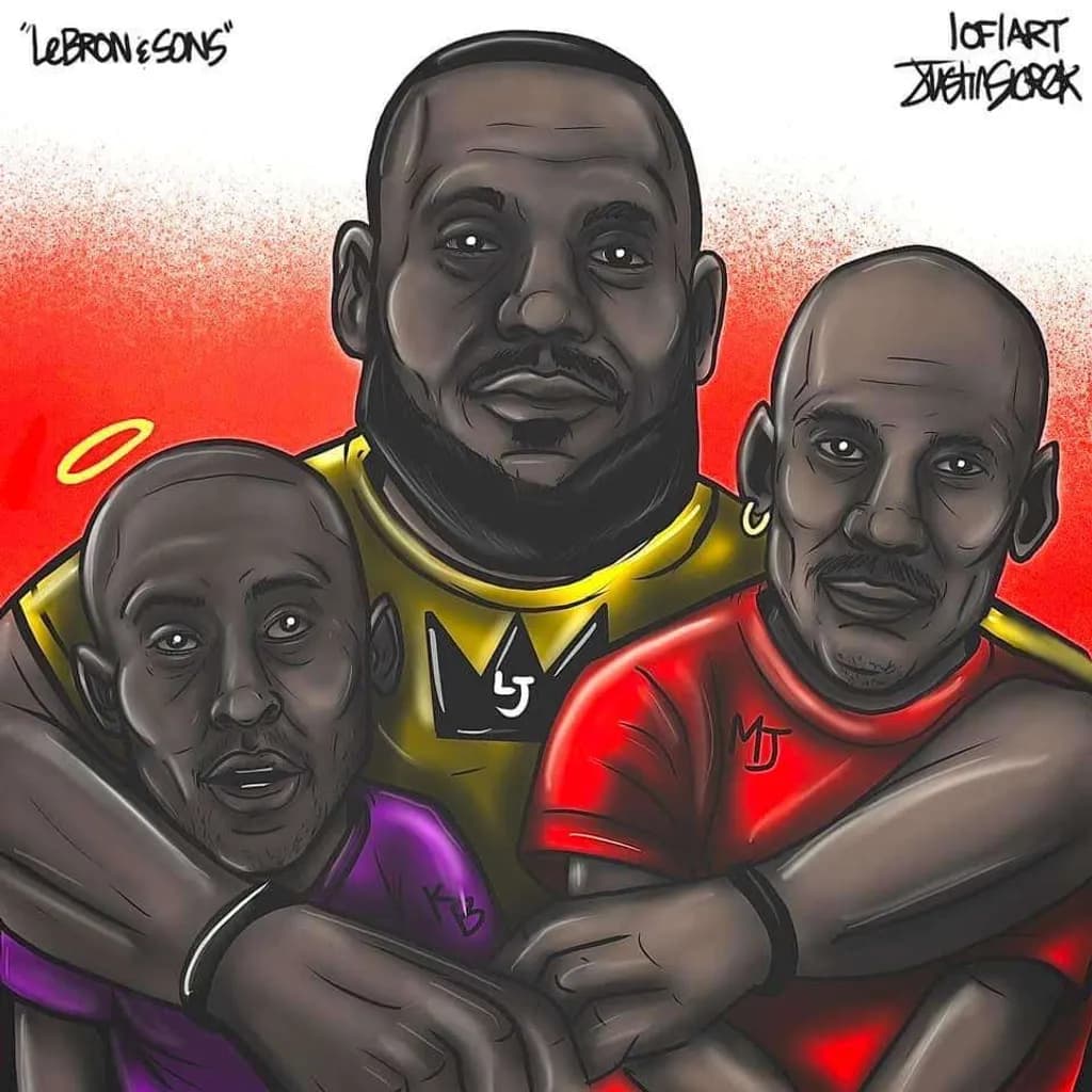
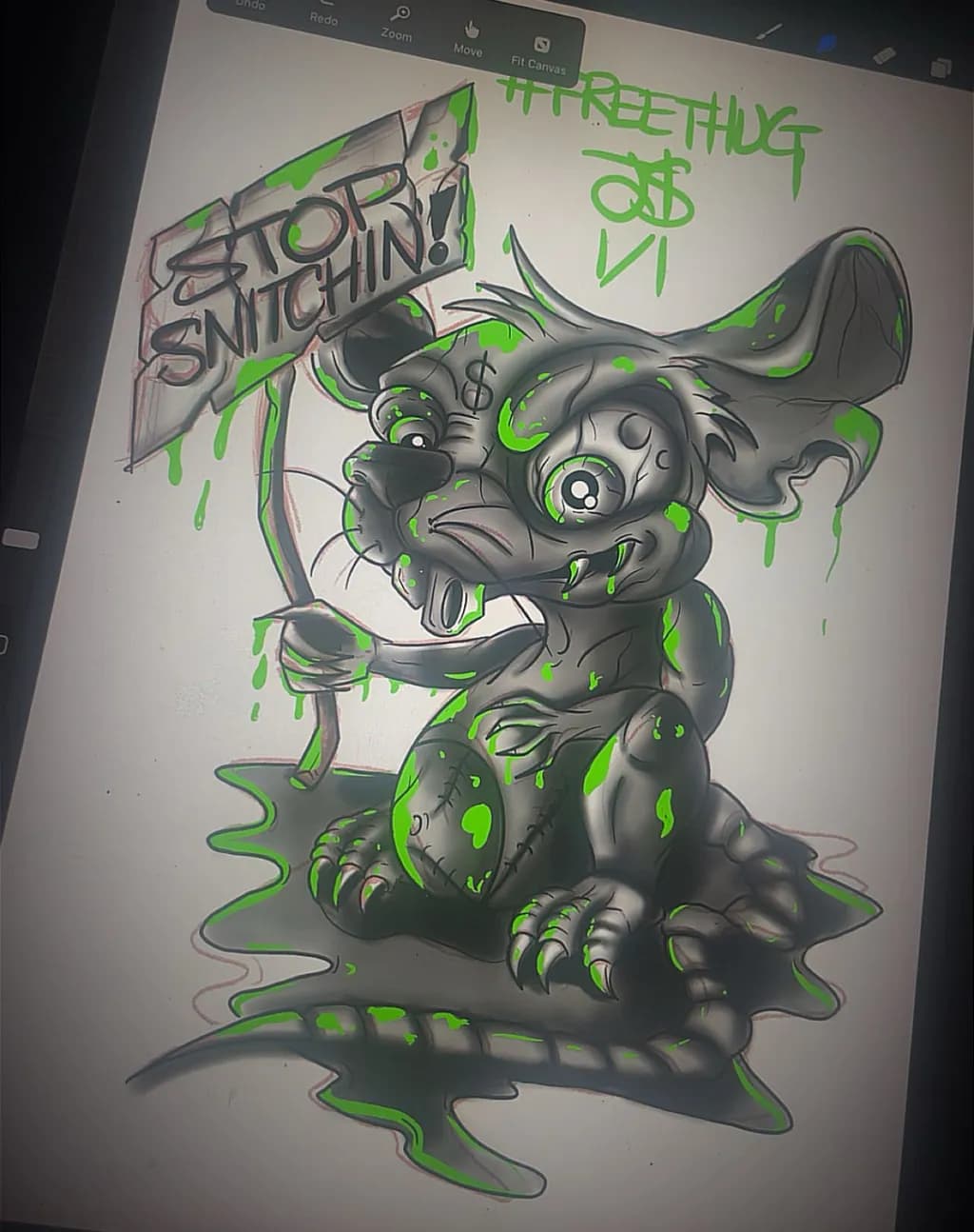
The color choices here feel really intentional, especially how the cooler tones in the background push the warmer focal areas forward. I've been working through some studies on color temperature lately and it's wild how much spatial depth you can get just by playing with warm/cool relationships instead of relying only on value contrast.
0
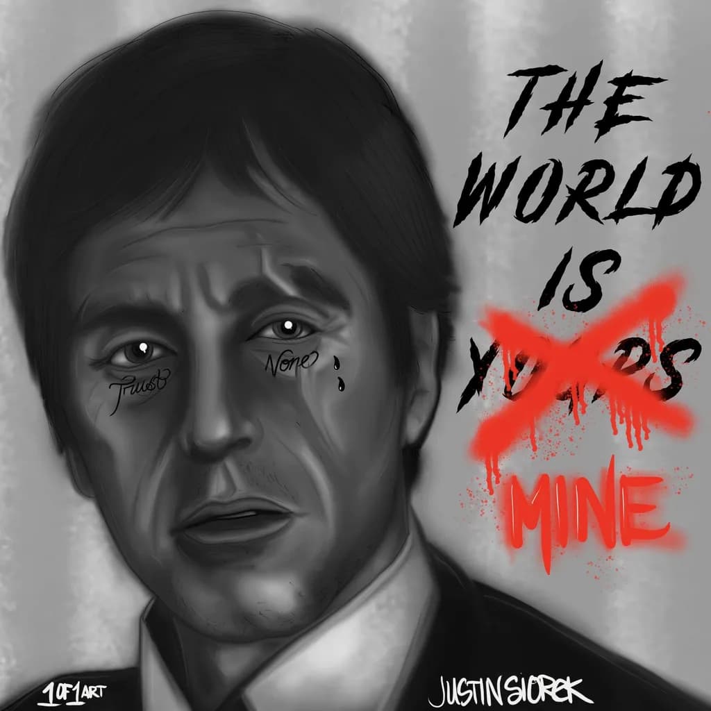
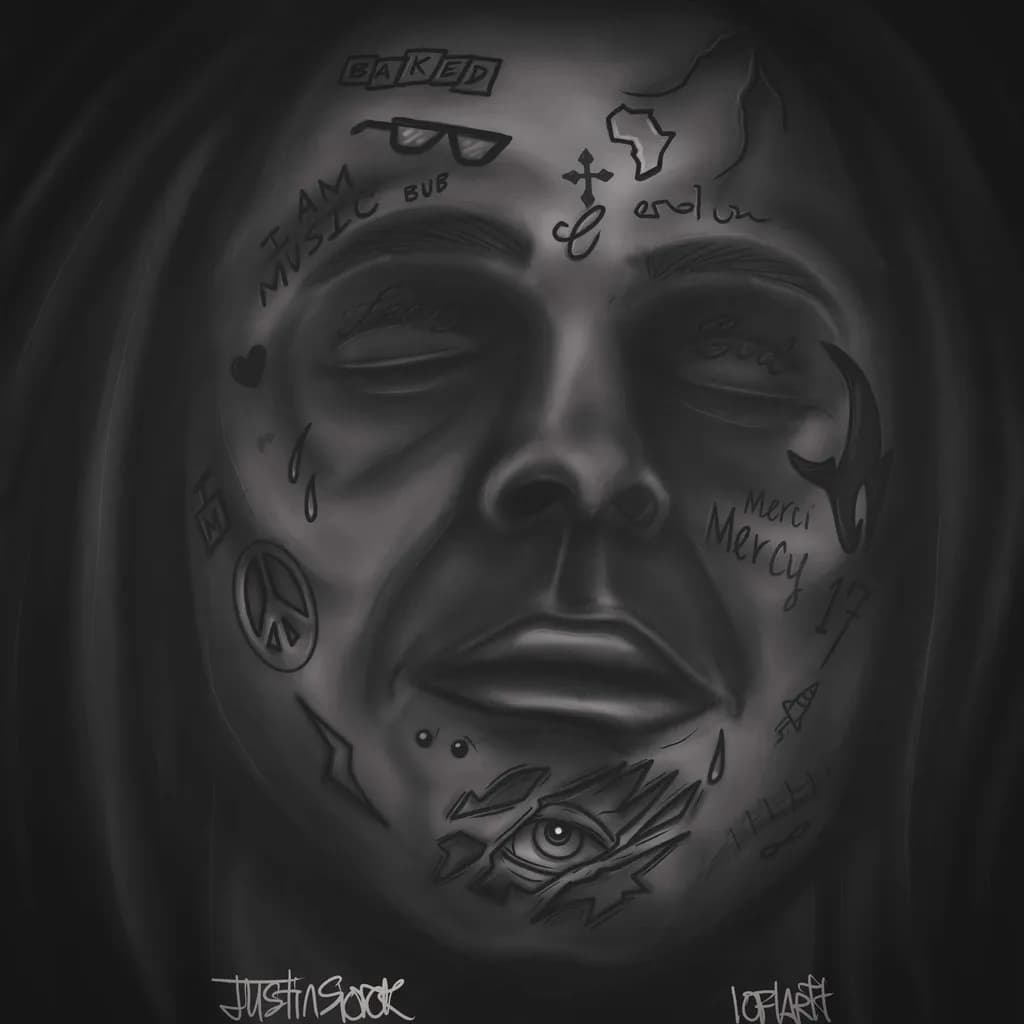
That lighting on the face is really controlled, especially around the cheekbone and nose bridge. The value transitions feel smooth without getting muddy, which is the thing that finally clicked for me after way too many overblended attempts in Procreate.