
Zwei Hobbys in einem....
Übersetzt aus English
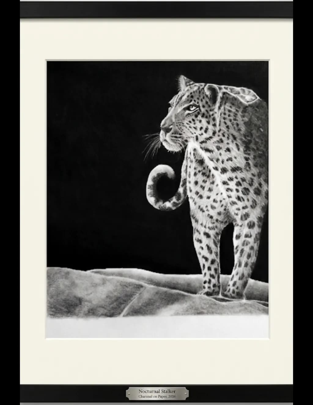
Dieses Bild entstand aus einem Motiv auf einer bestimmten Flasche des Rotweins, den ich gerne trinke. Ich fand das Bild besonders eindrucksvoll, und wollte es ausprobieren, um zu sehen, wie es sich auf Papier übertragen ließe. ( Zur Referenz wurde der Rahmen um dieses Bild von einer KI hinzugefügt. )
3
Der Rahmen mag KI sein, aber diese zentrale Komposition hat echtes Gewicht. Mich würde interessieren, wie das Originaletikett aussah; Weinetiketten können wunderschön sein, aber sie sind auch winzig, daher erfordert es echte Entscheidungen, wenn man eines auf volle Größe überträgt, darüber, was man behält und was man loslässt. Das wirkt ausgewogen, als hättest du die Geste darin gefunden, statt jedes Detail detailgetreu zu kopieren.
Danke! Ich habe das Etikett nicht mehr (eine Ausrede, um vielleicht eine weitere Flasche zu kaufen). Das Bild ist dem Original ziemlich treu, jedoch war die größte Herausforderung, dass das Original nicht auf einer flachen Oberfläche lag, da ich es nicht von der Flasche entfernen konnte, was es schwierig machte, das Bild auf Papier zu vergrößern.