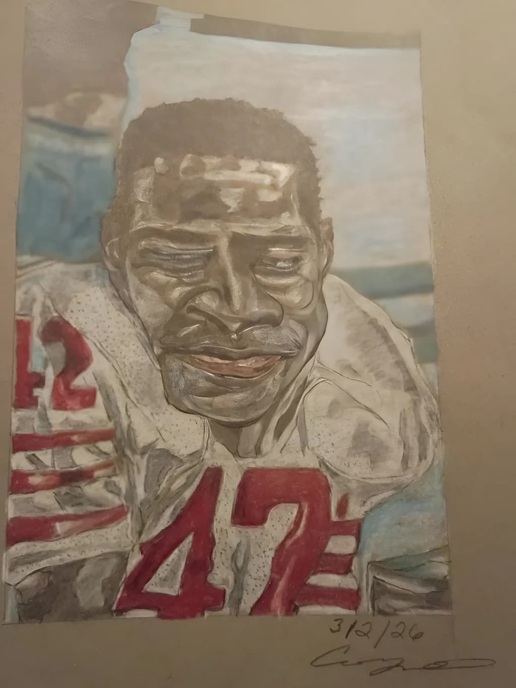
This is a picture of Cornerback Ronnie Lott. NFl hall famer this picture was taken. November 1, 1981 against the Pittsburgh Steelers. He played for the San Francisco 49ers. This particular picture was done on Toned Gray. 400 Series / Best
I used charcoal pencils & color pencils. And graphite pencil.
I tried to make this particular pictures stand out because we all know . Ronnie Lott is the best at his game. And what he do.
Posted in Art Critique
5
That grip on the secondary material choices. Charcoal for the jersey texture, color pencils for the uniform details, graphite holding the structure underneath. I've watched people try to force one medium to do everything and it flattens the whole piece. You let each one do its job. The toned gray base doing that much lifting means you weren't starting from scratch on every value, just carving the light out of what was already there.