14 Comments
Critiques are welcome as long as they are helpful. I actually look forward to suggestions that allow me to revisit my work and possibly make them more attractive or engaging. I had painted a roadway scene through a wooded area and was advised it came across as "flat". I took the suggestions to heart and now I have a much better look to my painting by applying those suggestions.
To Hans Claesson: I DO NOT paint "suggestive subjects" and I DO NOT appreciate you insinuating and insulting my work with such a suggestion. If you can't say anything nice or constructive keep your words to yourself. I am a grown woman and your remark was quite disrespectful.
Granted Hans comment was crude, but it certainly was not malicious.
If you are that sensitive and aren’t open to comments, why post to art critique?
I was going to comment but obviously any critique is not welcome.
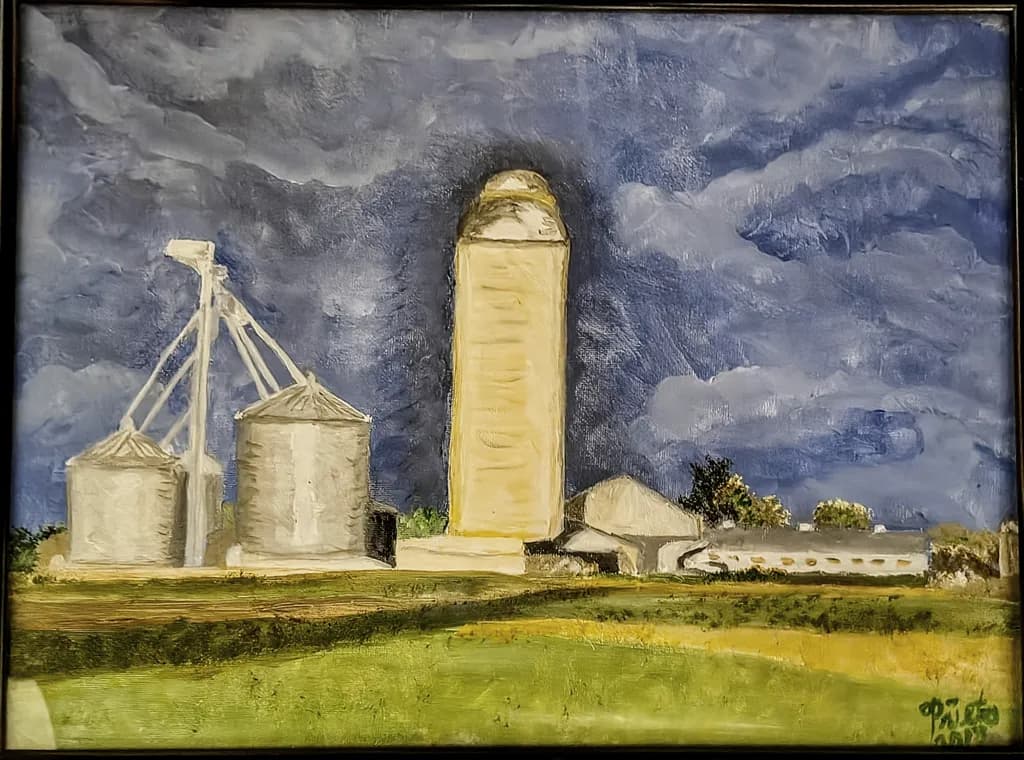
For everyone Who DIDN'T grow up in the COUNTRYSIDE, this is a farm that had a "Double Silo" for grains for the livestock.
Young Susan, what have you painted there in the middle? 🫣 Go to your room! 👉
It's called a Double Silo! Grew up in the country so not unusual and NOT what you are insinuating, good grief!
That confidence to post without cushioning it with words, to just let us see what you made and decide for ourselves. That takes more than most people think.
The piece landed here. Honestly the work speaks plenty and sometimes that's the whole move, no caption needed, just let it breathe
I meant the work doesn't need explanation. Sometimes a strong piece just exists and makes its point without text underneath it. I could be wrong about your intent, but that's what I read from it.
To clarify - when it comes to ART, I am serious about improving and learning new ways to express my passion for art. Making "jokes" really isn't something that is appropriate whereas constructive criticism on how to improve a painting IS appropriate and very much welcomed. I was shocked at your "so-called joke" , especially since it was a man directing it to a woman. I am sure that you can understand that the context was inappropriate and I can appreciate your apology.
To begin with, I can appreciate the sentiment of the gender conflict in the comment even if it was meant in jest. That is valid and appropriate. But let's get back to the critique. If, as you say, you are serious about improving and open to constructive criticism, let's test that, shall we. (Strap in because this may be long as I am prone to pontificating)
To begin, let's talk about composition. I am glad to see how you divided the canvas into thirds. One of the first things I notice about any image is composition and I am surprised how many people posting here either ignore it or don't understand it. So, you did a good job placing your horizon and it sets up the subject well. Keep in mind the rule of thirds works vertically as well as horizontally. You have all your elements in a straight line evenly spaced apart from each other. Move it's to the left or right to make use of that same rule of thirds. That said, when depicting any object – whether it's a house, barn, tree or cow, whatever – it is always more interesting to view it in perspective. Not only does it add interest and dynamism to the composition, it gives it depth and atmosphere. Viewing anything straight on flattens the forms both physically and pictorially and makes them less interesting.
I should point out here and now that just because an object or scene is physically one way, that does not mean you are obligated to honor it. "Artistic License" is meant for a reason. If you don't like where things are, move them; make them larger or smaller; bring them forward or push them back; a different color; or even take them out entirely. I was doing a plein air painting of an old pickup parked in a field next to the road with a hay wagon opposite it in the same field. Try as I might, I could not get that hay wagon to work and I eventually just painted it out. The composition instantly came together. So, decide what the important elements are to the composition and arrange them in a manner that best works for the painting. Real life be damned. No one is going to look at the painting and say, "But that silo is over there, behind the barn and it's this tall." It doesn't matter anyway.
Next, give the elements some volume. Show the buildings from a 3/4 view. Move some closer, some behind. Overlap them. Put tractors or trees or bushes in front of them. Anything to give them more volume and dimension. Make use of perspective, higherarchy of size, and diagonals that lead you into and around the painting. I took the liberty of making a quick sketch to show what I mean. I'm not sure what some of the elements were so I approximated shapes. That is not to say you have to do this, but look at how much more interesting the composition is with a little bit of change.
Let's talk about the sky. Skies are very dynamic; they have clouds, they have temperature, color and value change. You've attempted to do this, but you've limited the palette and the values which has made it flat and confusing. The sky should go from a deep blue almost violet sometimes to a near white as you go down and back in distance. This is physics, refraction. It's a change in value as well as color. Sometimes the horizon will be greenish or reddish, but it is always lighter toward the horizon.
Clouds are not flat, they have shape and size and volume; highlights near the top and edges where they catch light, darker at the bottom or in dense areas. They also change color: cooler and bluer in the distance, warmer in the foreground. Never just one or two colors, rarely just grey, even on overcast days. You've started to make cloud shapes, but you didn't go far enough; be more assertive and definitive in their size and shape. Watch out for the "halo" around the grain silo. Its unnatural.
For the buildings, be aware of the light source and keep it consistent throughout. Everything has shadow, highlights and reflective light; it's what gives things shape and volume. You have some elements painted with shadows and some with none. The light is also changing direction across the painting. The feed silos have light that is almost straight ahead, the large grain silo no light and the barn in the back has light coming from the upper left. You have a nice cast shadow on the barn; use that same sensibility on the other elements. Be aware of value changes in the buildings as they come into and out of the light.
Make the road flatten and expand as it comes forward, maybe give it a small curve to accentuate distance and lead you into the painting. You did a nice job on the fields, but kinda got the colors backwards, Generally colors get lighter and grayer as they go back in space. Your brightest colors will be in the front and changes in color and value move your eye into the painting.
Keep aware of your focus. If you want to draw attention to the structures, let your details be there, not in the foreground. let the foreground and the background trees be a little "soft". You can suggest items in the foreground or background like bushes or trees, but don't use too much detail. Let the viewer's mind create the details.
Now all of this is subjective and the particulars of what you are trying to convey in a painting will dictate things that might be quite the opposite of what I am saying. I am approaching this from the standpoint of your trying to be at least somewhat realistic in the pictorial, whether photo real or impressionistic. If that is not the case, then everything changes.
You can mean to be more graphic in your style, in which case objects may flatten, colors and values lose range. You may want a more primative, "Grandma Moses" style feel which accentuates exaggerated perspective. You may want to be more expressive in which case colors may be bolder, strokes more powerful. There is a world of difference between a Corot and a Van Gogh, between a Sargent and a Picasso. You have to decide that direction as you paint and adapt accordingly.
I hope this helps and that you take it in the spirit that it is meant. I have been painting and drawing for decades, but that is not to say I am a pro and/or the definitive authority on art. I am trying to give you the value of my experience given the way that I paint. It may not be your vision and you can tell me that. If you disagree, fine. Tell me so and explain why. Telling me, "You paint your way and I'll paint mine" as one member here said to me, is both dismissive and counter productive.