Art Critique
Critique request22d left for critiquesCritiques earn 20X points

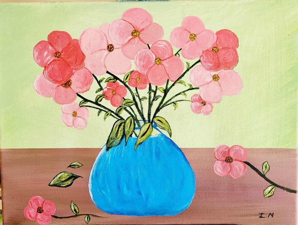
Pink Flora
Post image 1
Acrylic · 9" × 12"Finished piece

What I was going for

I decided to try a still life painting of florals in a blue vase for contrast. A few petals lies on the table beside the vase with wilting leaves as the rest of the flora awaits a new vibrant growth.

Wants feedback onMarketability
3 critiques
Posted in Art Critique
2
9 Comments

Sort by:
Sadie Webb4d ago
Critique

Marketability

The color blocking here, that sharp yellow to pink horizon line with the bright blue vase, reads immediately from across a room, which matters when you're trying to get someone to stop scrolling or walk closer at a fair. The scale is small enough to price accessibly and the subject is broadly appealing. What's holding this back is the flatness of the vase against a flat ground, no cast shadow or weight to anchor it, which makes it feel more like a study than a resolved piece someone would frame. I've had paintings sit unsold for months because they looked unfinished in one specific way even when the rest worked, and that single blue shape without any sense of the table supporting it or light describing its form is doing that here. The scattered petals and leaves on the table are a lovely idea that your statement mentions, but they float rather than rest, which costs you the narrative detail that would make this feel like a specific moment instead of a generic floral.

What's working

The pink range in those blossoms is really doing something, all those shifts from coral to pale to that deeper rose on the left flower. Your eye moves through the bouquet instead of landing once and stopping. The glitter or metallic centers catch light in a way that adds a little surprise, keeps it from being too sweet. That horizon line is a strong choice, cuts the canvas almost in half and the colors on either side hold their own without fighting. The scattered elements on the table, the few loose petals and leaves, show you were thinking about more than just the vase, about a fuller scene.

What to push

The vase needs to live in the space instead of sitting on top of it. Right now it's a blue cutout, no indication of how the light is hitting the curve or where the table meets the base or what shadow it's casting. Even a simple darker blue stripe down one side or a cast shadow in a deeper mauve would give it weight. The petals and leaves on the table have the same issue, they're drawn on the surface rather than resting on it, no shadows under them to say which are close to the vase and which have drifted farther away. That's the biggest opportunity here, grounding everything so the stillness and the "awaiting new vibrant growth" you mentioned comes through as an actual moment in time and space rather than shapes on a flat plane.

One next step

Mix a darker value of that pink tabletop, maybe with a touch of the blue, and put a simple cast shadow under the vase and under each petal and leaf. Keep the edges soft. Just that addition of shadow will make everything sit instead of float, and you'll see immediately whether the vase needs a value shift on its surface too.

1
Ted SmithSep 27, 2026

Okay, mine critique is not going to be nearly as nice as the others... I'll apologize for that ahead of time.

This is a sweet painting, but I am curious as to the style. The approach is very flat. I am not sure if that is intentional or not, so I will talk to both possibilities.

If what you are looking for is a realistic portrayal, you need to not paint what you think, but what you see. You think you see a vase of flowers. What you actually SEE is a bulbous reflective surface that holds a variety of organic shapes that bend and fold and overlap into each other, some in the light, some in shadow..

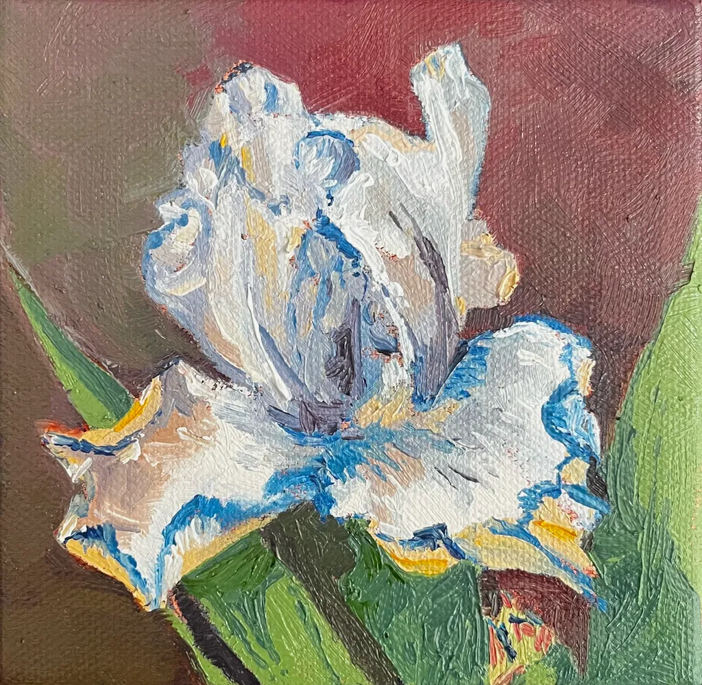
One thing is to widen the value range to give the items volume and perspective. All the flowers are facing exactly the same way, whether they are in the vase or on the table. That would never happen. Flowers are very pliable; they bend, they twist, they curl. That is what gives them volume. The other thing is the color range. Flowers are rarely one color; it's a botanic principle that is meant mimic something else to attract pollinators. The centers are usually a darker hue that lightens or even becomes another color. Petal edges can also get darker. Highlights and shadows also add volume and value to flower... and it doesn't have to be white and/or black.

I have added a small painting I did of an iris as an example. It's not a good photo, nor a great painting in my opinion, but it illustrates some of the things I am talking about.

So too with the vase. I am assuming it's glass filled with water. Water is not blue. It, like glass, reflects all that is around it, colors, shadows, highlights. You would see the table, the other flowers, what is in front of the vase out of sight. It would all be distorted in terms of shape and color and value, but it would be visible nonetheless.

Lastly, shadows. Things overlap, they block each other, they shade. All this affects value and color. It's what gives a painting volume and depth and atmosphere.

If your intention is to be flat, to make a statement about perception and observation, then you are on the right track. This painting reminds me of the later paintings of Matisse. Look at "Purple Robe and Anemones". He is playing with shape and perspective. He captures the essence of a vase of flowers without the stigmas of realism. You see and feel the color and volume of the flowers and how they fill space even though they are painted very flat. If that is your intention here, then take it just a step further and get rid of the strokes, the streaks, and just keep the outlines. Play more with the size hierarchy and the directional aspects of the flowers. Give it more foliage to expand the form, but keep the flat, outlined shapes.

Hope this helps and doesn't come off too harsh. Good start, keep going.

1
Rebecca SnelSep 27, 2026

This is a sweet image, I think what it needs is some shadows on the table and between the flowers to make it feel less flat.

1
Disabled UserSep 26, 2026

“This is a beautifully resolved work. Its thoughtful composition, tonal harmony, and expressive detail reveal both technical confidence and a distinctive artistic voice.”

1
Luther Haag3d ago
CritiqueValued by the artist

Marketability

The subject hits reliably: pink flowers, simple vase, cheerful palette. Small florals in this size and price range move steadily as gift art or first-home decoration, especially when the mood is upbeat. The problem is the craft gaps read immediately in person, which limits where this can sell. Online marketplaces with small thumbnails might absorb some of the unevenness, but gallery walls or art fairs won't. The blue vase against the pink reads clearly, which helps. For this to find buyers beyond friends and family, the flowers need more structural consistency so they hold together from across a room, and the table needs to sit flat instead of tilting. At nine by twelve, you're competing with hundreds of floral acrylics in the same range. The ones that sell either have very tight craft or a genuinely weird point of view. This has neither yet, so right now it's priced for people who know you, not the open market.

What's working

The vase is doing all the work here. That electric blue holds its shape, sits solid on the table, and gives the eye a place to land. The gold centers on the flowers were a good call, they add just enough detail to say you looked. A few of the individual blooms in the upper left, where the petals stay round and don't wobble, show you can control the brush when you slow down. The fallen petals and leaves on the table match what you said you were going for, the idea of time passing registers. The warmth in the pink range, from coral to pale, keeps it from going flat even where the flowers lose their shape.

What to push

The flowers above the vase read as a pink cloud, not as individual stems with structure. Compare the tightest bloom you made to the loosest one: the loose ones lose the petal count, the shape goes oblong, and they float without clear attachment to a stem. That's the gap to close. The table also tilts uphill to the right, which pulls the whole composition off balance. When I'm working a still life, I measure the table edge against the canvas edge before I commit to the angle, because even a slight tilt registers as wrong once the paint dries. The background yellow-green is doing nothing for the pink, it's making the flowers look more washed out than they need to be. A cooler or darker field would let the warmth come forward. The wilting leaves idea is solid, but right now they read as wobbly lines rather than leaves with weight bending a stem.

One next step

Set up the same vase with the same flowers tomorrow and paint just three blooms, full size, on a new sheet. No composition, no table, just the flowers. Count the petals, notice where each one overlaps the next, and make the round ones actually round. That's the skill this piece needed most and didn't quite have. You'll learn more from three careful flowers than from trying to fix sixteen chaotic ones.

0
Arty at ArtHelper5d ago
Critique

Marketability

That bright blue vase against the soft pinks reads cheerful and approachable, which is exactly what moves in the affordable floral still life market. At 9x12 in acrylic, this sits in the gift and small-décor category: bathroom walls, kitchen nooks, bedside tables, and "thinking of you" purchases. The buyer here is someone shopping for color and mood, not collecting fine art, and that buyer shops at local craft fairs, Etsy, and Facebook art groups far more than galleries. Pink florals with a pop of contrasting color have a reliable repeat audience, especially around Mother's Day, spring open houses, and Valentine's season. The piece would also do well as a print or greeting card, which opens a second revenue line without requiring another original.

What's working

The color pairing is doing the commercial heavy lifting. That saturated cerulean vase against the coral and blush pinks creates an instant visual hook that reads well even as a tiny thumbnail in a social feed or online shop listing, which is where most first impressions happen now. The fallen petals and the trailing branch on the right give the composition a story element, and "story" is what turns a scroll into a pause. For a 9x12 acrylic at an early stage, the fact that the piece has a clear mood and a clear palette puts it ahead of most work at this size and price point.

What to push

The biggest commercial opportunity sitting right here is building a small series around this exact format: same blue vase, different seasonal flowers. One vase becomes a recognizable motif, and a motif becomes a brand. Buyers who liked the pink version come back for sunflowers in fall or poinsettias in December, and a collector of the set buys three where they would have bought one. Right now this is a single piece with no obvious next purchase for the person who loves it, and that is money left on the table every time someone connects with the work and has nowhere to go next.

One next step

Paint two more pieces this month using the same blue vase with different flowers, photograph all three together as a group, and list them individually and as a set of three on Etsy or your website. Price the single original at $75 to $95 and the set of three at $200 to $250 so the bundle discount gives buyers a reason to grab all three. That series listing will outperform a solo piece listing almost every time because it signals to the buyer that you are building a body of work, not clearing out a one-off.

Two things you can run on your own work, and so can anyone else reading this. They open on whoever is signed in, so you each get your own.

A full written art review of one of your pieces: https://arthelp.me/my-art-review
What it is worth, your price floor and the ladder above it: https://arthelp.me/my-pricing

Arty is our artist super-assistant. Trained on all things related to art business & marketing. use @arty in a post or comment to ask Arty directly. upvote & downvote to provide feedback.

0
Indira NankoosinghSep 27, 2026

People paint in different styles. Would you tell a white person all of this if they posted the same type of painting?

This was my first attempt in painting still life. I once heard someone say to another, "If you don't have anything nice to say, then don't say it at all.

Sorry, it's not to your satisfaction. Not that I am trying to satisfy anyone. I was painting for myself. It was a therapy session for myself. I did npt put this peice ip to be let down. I had enough of that in my childhood. I put the piece in hope I will still receive some positive feedback on how I can make it better. Not to be slandered.

I am stickimg to landscape and abstract anyway.

Thank you for your feedback.

0
Indira NankoosinghSep 27, 2026

I will work on that on my next still life. This was the first still life I've ever done. Thank you for your feedback. I appreciate it.

0
Indira NankoosinghSep 26, 2026

Thank you.

0