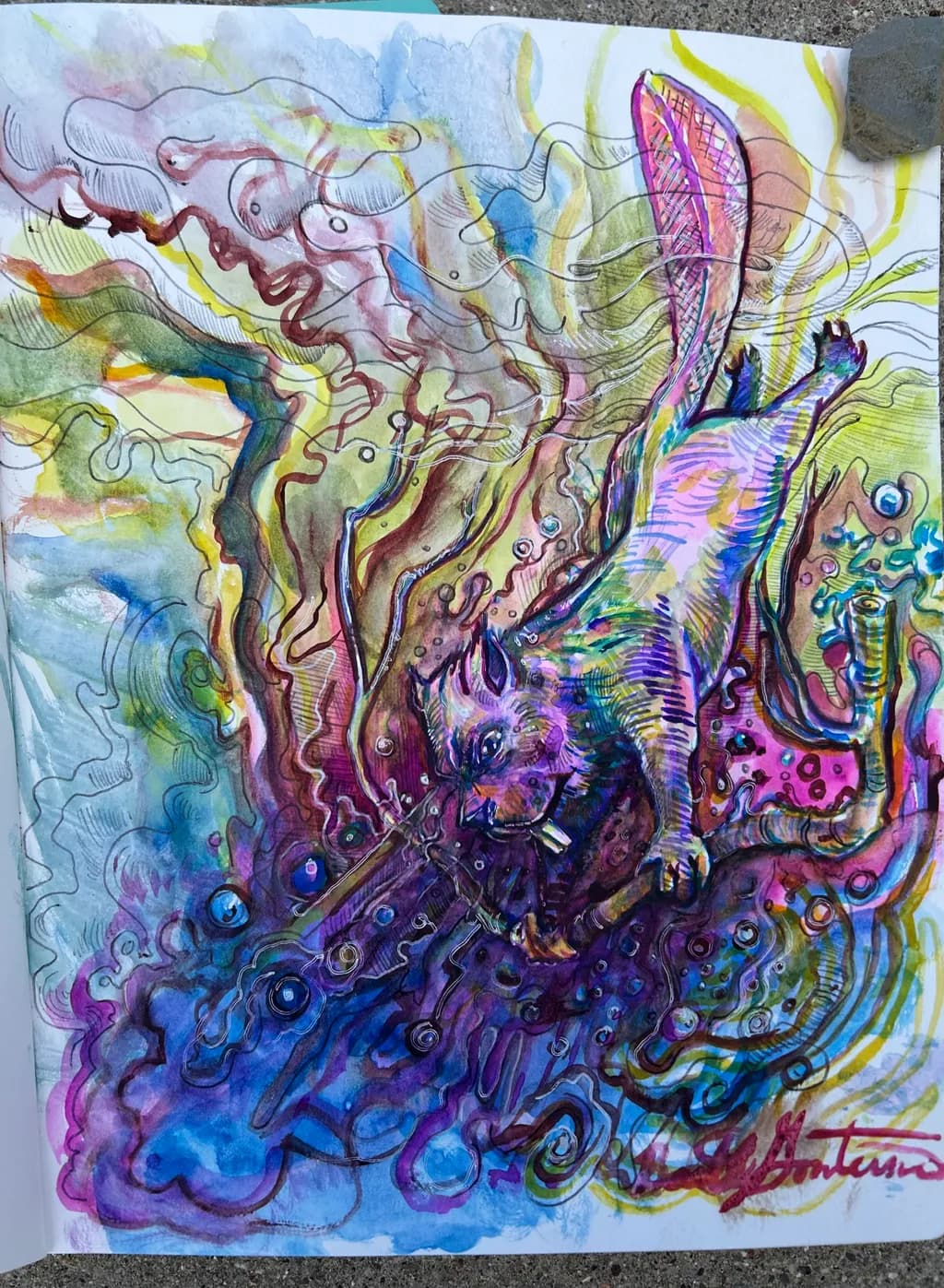
I have always enjoyed critiques. I just finished this on my vacation. I see things that I could do better. But I think it would be fun to get some blind perspective from people.
Posted in Art Critique
5
I have always enjoyed critiques. I just finished this on my vacation. I see things that I could do better. But I think it would be fun to get some blind perspective from people.
I think you are right on the draftsmanship it’s always been a problem. The colors are high contrast and I get that they would not be for everyone. The AI thought it was an octopus. It is supposed to be a beaver carrying a stick down to the depths of presumably its lodging. Thanks for taking the time to comment. I also thought the teeth were too bright. I would like the far arm to not be so muddy. This might be over worked.
In terms of the palette, I don’t see anything necessarily wrong with it and it works for the style of this piece. BTW - what is the medium? Watercolor?
I think the only thing that bothers me is the teeth, which seem comically out of proportion and indeed a tad bright.
Overall, I like the piece as is.
Admittedly, I find the color palette a little disturbing as I am more of a realist in terms my own work, But I thoroughly like the energy and spontaneity of this piece. I have small issue with some of the draughtsmanship, but it is inconsequential and frankly immaterial to the meaning and intent of the piece.
It’s water color and some ink pen.