Translated from Français
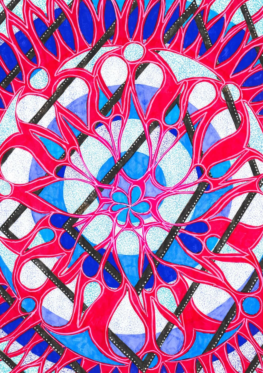
Here's one that I really like; the colors are softer and more beautiful in real life, but it's one of my favorites. What do you think?
Posted in Art Critique
3
Here's one that I really like; the colors are softer and more beautiful in real life, but it's one of my favorites. What do you think?
The softer colors in person must be beautiful. What you're describing, that favorite-piece feeling when the palette works just right, I know that one. It's hard to photograph sometimes but you can still see what drew you to it here.
Love this! Very dynamic. And impressive with the way the design shows being "woven" through, with such a beautiful pattern. It is truly captivating to the eye. I can see why it's one of your favorites. Well done. 😊
Thank you for your comment. I've done several drawings with these interlacing patterns—it's perhaps in this style that I have the most of them, but it's really the one that speaks to me the most. In any case, thanks again 😊
The softer palette you're describing must be something, even through a screen the warmth comes through. Favorite pieces usually are the ones where you notice light differently each time you look.