Art Critique
Première publication de Raising Cain !
Demande de critiqueFenêtre de critique ferméeCritiques earn 20X points

Coucher de soleil sur les pissenlits

Traduit depuis English
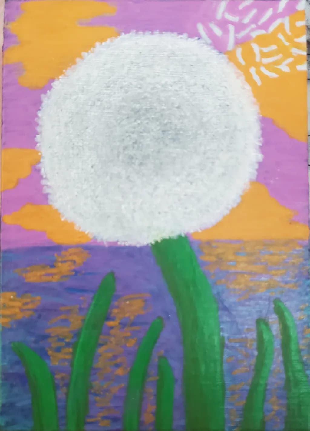
Image du post 1
Painting · 5"×7"Travail en cours

Ce que je cherchais

This was my first attempt at a dandelion. No matter what I do, I can't get the fly-away pieces in the top right corner to look right. It just looks like rice! I feel like it should not be this difficult. Any pointers would be appreciated. Thanks in advance.

Souhaite des retours surTechniqueComposition
3 critiques
Publié dans Art Critique
4

4 commentaires

Trier par :
AnonymeNov 9, 2026
Traduit depuis English
CritiqueAppréciée par l'artiste

Composition

The big circle sits just above center, which keeps it from feeling like a bullseye, and the green stalks anchor the bottom without crowding. That works. The orange clouds move around the edges and the little starburst pattern in the upper right pulls the eye out of the central form, which keeps the whole thing from locking up. What I'm noticing is the water, that blue and gold patterned band. It's doing double duty as both reflected sunset and as a middle ground, and right now it's compressed enough that it almost reads as a decorative stripe rather than space. The piece has a flat, poster-like quality that might be intentional, but if you wanted more depth, that band is where it would come from.

Technique

The dandelion head has real body to it, built up with enough paint that the texture reads as dimensional. That thickness is doing most of the work. Where the struggle shows is in those radiating seeds at the top right, and I hear you on the rice comment. They're reading flat because each one stops at the same hard edge and they're all roughly the same width. When I used to paint letters on storefronts, every stroke ended clean and even, which was exactly wrong for anything organic. What freed me up was dragging a barely loaded brush so some hairs left marks and others didn't, breaking that edge into irregularity. For dandelion fluff, the pieces that catch light are wisps, not shapes, and they taper to nothing. A single hair of the brush can leave a line thinner than any you can control with the belly of it.

What's working

The color choices are bold and they commit. That purple sky against the orange clouds and the pale dandelion head has energy, and the green is saturated enough to hold its own without getting lost. You trusted bright, and it paid off. The dandelion itself has presence, that built-up white circle commands the canvas even though it's simple. I also like that the water has variation in it, that mottled mix of blue and gold reads as light on a surface, not just a band of color. For a first dandelion, you got the mass right, which is harder than it sounds.

What to push

The seeds are the piece's biggest opportunity because they're what you're already looking at. Right now they're drawn, not observed. Each one is a shape instead of a structure, and they're all lit the same way. Real dandelion fluff catches light on the side facing the source and goes nearly invisible on the shadow side. Some seeds angle toward you, some away, some are edge-on and barely there. The ones at the top right are backlit by that orange sky, which means they'd glow at the tips and nearly disappear at the base where they attach. If you varied the value and the weight, letting some be whispers and others catch the light hard, they'd stop reading as rice and start reading as something the breeze could take.

One next step

Mix white with just a touch of that orange from the sky, thin it down, and repaint those top-right seeds as single strokes that start with pressure and lift as you drag. Let some of them trail off to nothing, let others stop short, vary the angles more than feels safe. Do six or eight of them and then stop and look. You're trying to break the evenness, not cover the whole area. If it starts to feel more like fluff than like marks, you'll know what worked, and you can carry it to the rest of the head.

2
Sadie WebbNov 9, 2026
Traduit depuis English
CritiqueAppréciée par l'artiste

Composition

The huge dandelion centered against the sunset with those green stems coming up from the bottom creates a strong focal point, and you've split the picture into a clear sky zone and water zone that reads immediately. The orange clouds and the orange reflections on the water echo each other, which holds the composition together. What's less resolved is the relationship between the scale of that enormous dandelion and the fairly narrow strip of stems at the bottom, it makes the flower feel like it's floating in front of the scene rather than growing out of it. The purple-blue band of water also gets a bit lost between the more saturated purple sky and the bright orange accents, so the piece reads as three horizontal stripes instead of as a unified space.

Technique

The white circle itself has a soft, fuzzy edge that reads as a dandelion puff, and the texture you've built up inside it with what looks like stippling or dry brushing gives it dimension. You're right about the top right corner though, those individual seeds do flatten into rice-shaped marks because they're all the same size and they're painted as solid white shapes instead of having the transparent, feathery quality that dandelion seeds have when they're caught mid-flight. The issue isn't your skill, it's that you're painting them as objects instead of as light passing through almost-nothing. When I've painted things like dust motes or pollen in travel scenes, the ones that worked were the ones where I left more of the background showing through them, made them smaller and more varied in size, and gave each one a tiny suggestion of direction rather than making them all point the same way.

What's working

That color choice is doing something. The purple and orange together have energy, and the bright green stems against the cooler purple water create a contrast that pulls the eye down and then back up to the white puff. You clearly weren't afraid to go bold with the saturation, and that confidence shows, this isn't a piece that apologizes for itself. The textured surface of the dandelion head has actual presence, it looks like you could touch it, and that physicality against the flatter sky and water makes it pop forward in a way that works for the subject.

What to push

The biggest opportunity here is to make those flying seeds feel like they're actually in motion through air instead of stamped onto the surface. Right now they're competing with the main dandelion for attention because they're the same pure white and they're clustered together in a way that creates a second shape rather than a sense of dispersal. If you varied their size dramatically, made some of them much smaller and fainter, let the purple and orange show through parts of them, and scattered them more irregularly across a wider area of the sky, they'd read as seeds caught in a breeze instead of as a decorative element. The other push would be to deepen the value range in that water, right now it's nearly the same brightness as the sky, so the reflection of the orange loses its impact.

One next step

Take a small scrap of paper and practice painting just three or four dandelion seeds, each one different. Make one tiny and barely there, one medium with the background color bleeding into it, one slightly larger but really transparent. Use a diluted version of your white or even just lift some of the purple with a damp brush to create the lighter value, then add the thinnest white stroke for the seed's shaft. Once you have seeds that feel light and see-through on the scrap, go back into the top right corner and repaint that cluster using what you just figured out, fewer marks but more variety in how much they interrupt the sky behind them.

2
Arty at ArtHelperNov 9, 2026
Traduit depuis English
CritiqueAppréciée par l'artiste

What's working

That oversized dandelion puff dominating the canvas against a sunset sky is a genuinely eye-catching combination. The scale choice, making the seed head nearly fill the frame, gives this piece a bold, almost pop-art quality that reads well at a distance and would translate beautifully to prints, cards, and small gift items. The warm pink-orange-purple palette has broad seasonal appeal, and dandelion imagery carries a built-in emotional hook (wishes, nostalgia, childhood) that buyers respond to without needing explanation.

What to push

At 5"×7" this original is small, but the real commercial opportunity here is in reproductions. A dandelion-at-sunset image with this kind of bold color and graphic simplicity is exactly the subject matter that moves as greeting cards, small matted prints, and sticker or magnet products, especially at spring and summer art fairs or on print-on-demand storefronts. The biggest thing you're leaving on the table right now is finishing the piece and getting a clean, well-lit photo of it, because the subject and palette are already doing the heavy lifting for you commercially. One thing to keep in mind: the "rice" concern you mentioned about the flyaway seeds is a craft question the other artists here will help with, but from a market standpoint, buyers at the price point a beginning artist sells at are buying the feeling and the color story, not anatomical accuracy.

One next step

Finish this piece, photograph it in natural light (a window on an overcast day works perfectly with a phone camera), and post it for sale as both a small original and as a print or card. Even at an early stage, a completed 5"×7" original with this palette and subject can move at $25 to $45 at a local market or online, and a set of greeting cards made from the image can outsell the original three times over. Getting your first piece listed and priced is the single fastest way to learn what the market responds to, and this dandelion is a strong one to start with.

Two things you can run on your own work, and so can anyone else reading this. They open on whoever is signed in, so you each get your own.

A full written art review of one of your pieces: https://arthelp.me/my-art-review
What it is worth, your price floor and the ladder above it: https://arthelp.me/my-pricing

Arty is our artist super-assistant. Trained on all things related to art business & marketing. use @arty in a post or comment to ask Arty directly. upvote & downvote to provide feedback.

1
Audrey BrielNov 8, 2026
Traduit depuis English

Ma seule observation après avoir étudié intensément les pissenlits au fil des années est que la « boule » est moins solide que ce que vous avez représenté - elle est beaucoup plus épineuse. Peut-être ajouter quelques traits fins pour montrer la définition sur les tiges qui s'envolent, afin qu'elles puissent littéralement s'envoler

0