Descrição
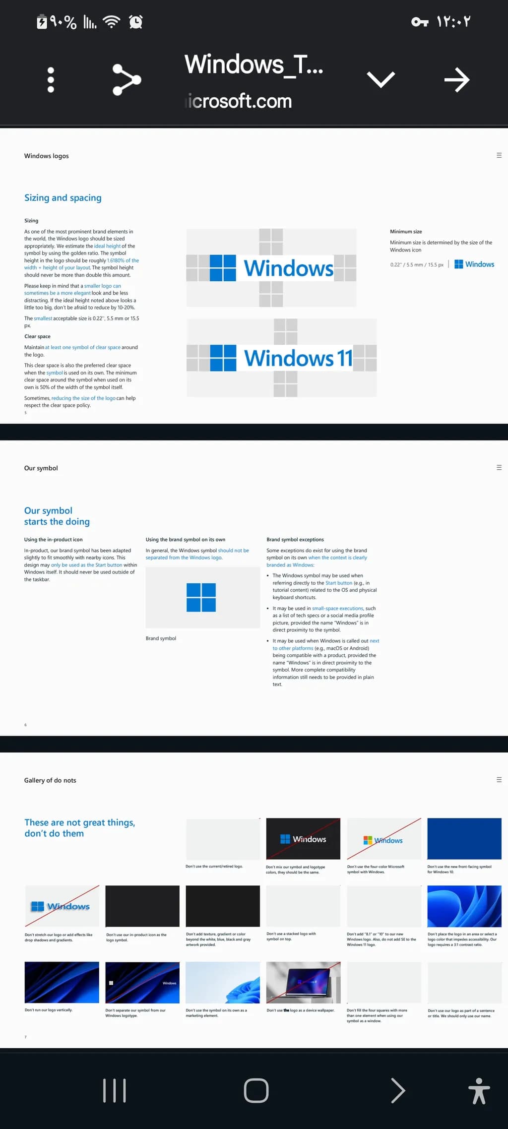
This guide presents the proper sizing, spacing, and usage rules for the Windows logo to maintain brand consistency. It explains the ideal proportions, clear space requirements, and appropriate contexts for using the symbol both with and without the Windows logotype. The section also highlights common mistakes to avoid, ensuring the logo remains visually clear and recognizable. This clear and precise set of guidelines makes it a useful reference for maintaining a polished and professional appearance.