Art Business
Pedido de críticaJanela de crítica encerradaCritiques earn 20X points

A energia da esperança

Traduzido de Français
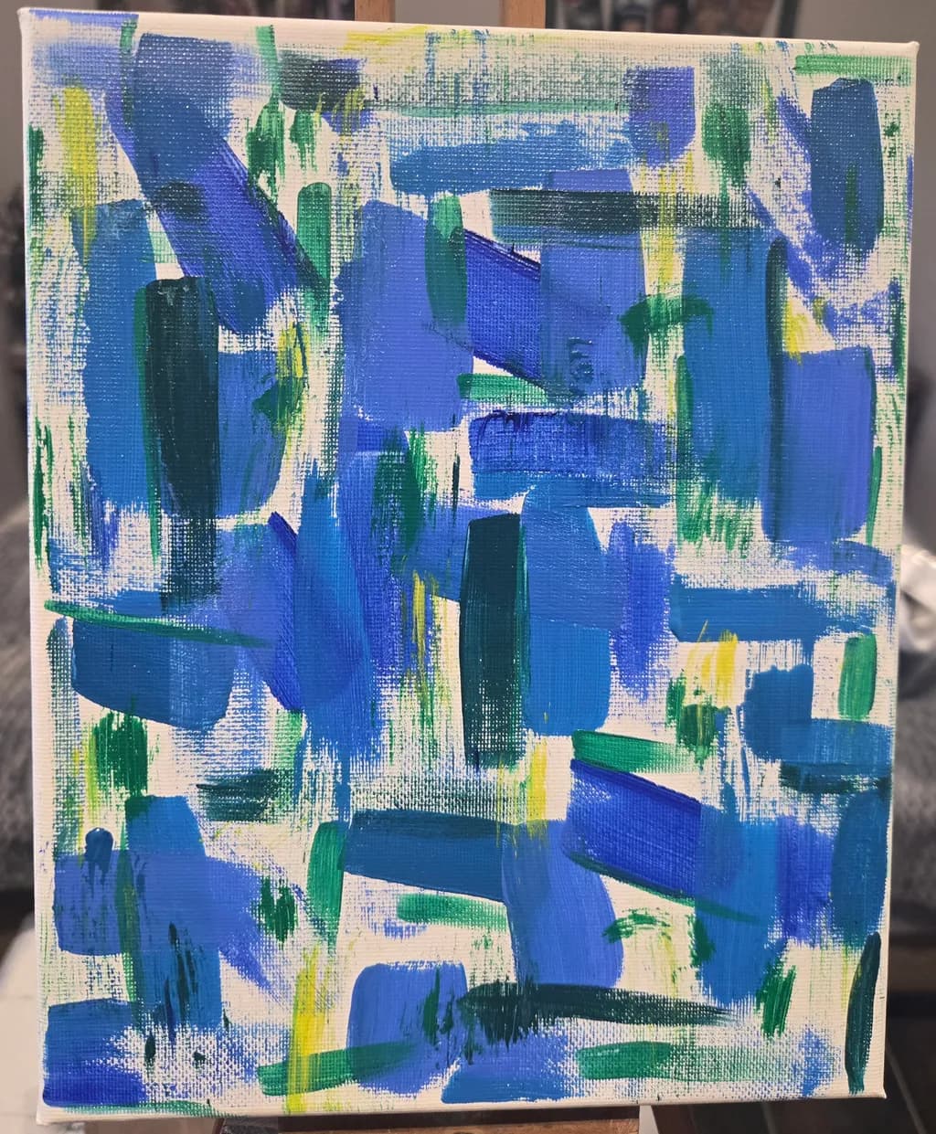
Imagem do post 1
Imagem do post 2
1/2
Peinture acrylique · 20x25cmObra finalizada

O que eu buscava

Je me lance dans la peinture apres beaucoup d'années à hesiter. J’adore les couleurs vivent. Je me suis laissée porter par les coups de pinceaux sans avoir de but précis. Je me suis arrêté quand la toile m’a dit que c'était terminé.

Quer feedback sobreMarketabilityColor & valueCompositionConceptPricing
3 críticas
Publicado em Art Business
3

7 comentários

Ordenar por:
TOM ANGOct 22, 2026
Traduzido de English

A peça única funciona melhor para mim, pois me encontro distraído pela gestual caligráfica no meio da vermelha. Acho que o equilíbrio das cores com o fundo nu no quadro azul é enérgico e com camadas. Obrigado por compartilhar.
A propósito, os celulares podem deixar as fotos quadradas mesmo que tenham sido tiradas em um ângulo leve.

1
Jennifer JEANNOTOct 21, 2026
Traduzido de Français

Obrigado por esta nova avaliação que me ajuda muito

0
Iris CallowayOct 21, 2026
Traduzido de English
Crítica

Composition

The eye enters at that yellow cluster in the lower third, drifts up through the blue diagonals, and kind of swims around without landing. No clear focal zone, no path that resolves. The strokes move in multiple directions, which generates energy, but they're all roughly the same scale and pressure, so the energy stays even across the whole surface. That's what "laissée porter par les coups de pinceaux sans but précis" produces, and it's an honest record of the making. The problem is that the edges got the same treatment as the center. When every part of a painting has equal incident, nothing holds. I've painted plenty of loose landscapes where I thought I was following the water, and the result was a pretty wash with no structure underneath. What eventually helped was deciding on one area that mattered most before I started, even in abstract work. Not a plan for every stroke, just a sense of where the weight lives. Your canvas has activity but not hierarchy, which is the difference between looking for a minute and looking for ten.

Color & value

The canvas reads as three distinct blue families (a warm ultramarine, a cooler cerulean, a mid-range cobalt or similar), two greens (a deep phthalo or Hooker's and a brighter spring green), pale yellow, and white or very pale cream. That's a smart limited palette for someone just starting. You've kept it from turning into mud, which is the first real win in direct painting. The value range, though, stays compressed in the mid-to-light zone. Even your darkest greens only drop to maybe a 4 or 5 on a ten-step scale. I can see the canvas weave through almost the entire piece, which means thin paint and no true darks to anchor the lights. In watercolor I live with white paper showing through, but that's the medium's logic. Acrylic on canvas expects more opacity, or at least a deliberate choice about where the ground breathes through. Right now the yellow pops because it's the only thing near the light end of the scale, but it's not enough contrast to create real structure. The piece would gain significant presence with just one or two passages of genuine dark, a weight for the eye to measure everything else against.

Concept

You said you let the brushstrokes carry you without a precise goal and stopped when the canvas told you it was finished. That's a real approach, one with a long history in gestural abstraction. The piece does what you asked it to do. It records a willingness to move paint around and see what happens. The title, "L'énergie de l'espoir", suggests you found something in the process afterward, an emotional read you put language to. That's valid. The gap I'm seeing is between the stated concept and what the painting can actually hold for someone else. Energy and hope are large ideas. They need form to land. Right now the concept lives more in your experience of making the piece than in what the piece itself communicates. A viewer without your title and description would see an exploratory abstract, pleasant and loose. That's not wrong, but it means the concept is still private. As you make more work, you'll start to notice which gestures actually carry the feeling you're after and which ones just fill space. The concept will clarify when the making does.

Marketability

The gestural abstract market splits cleanly between collectors who want controlled energy (think midcentury color field work, where restraint creates the power) and collectors drawn to pure spontaneity, which is what you've made here. Your piece lives entirely in the second camp. That market exists, but it's younger, smaller, and much more price-sensitive than the controlled-gesture world. At this scale and with acrylics on canvas, you're looking at entry-level abstract pricing, which means high volume or accepting this as practice work while you build a body that can command more. The vivid palette helps. Blue and green sell better than most people expect, especially to corporate buyers furnishing wellness spaces or co-working lounges. The catch is that spontaneous abstraction needs either a known name behind it or a viewer who connects to the specific emotional moment, and you're building the first while hoping for the second. For a portfolio at the very start, this reads as exactly what it is: someone learning to trust the paint. That honesty has value, but it won't carry market weight until the technical command catches up to the willingness to play.

Pricing

At 20x25cm, acrylic on canvas, just starting out, with no established sales history or exhibition record, this sits in the 30 to 60 euro range if you're selling locally or online to strangers. I know that sounds low for the hours and the materials and the act of making something. It is low. That's the market for small, early-stage abstract work by an unknown name. If you're in a region with a strong local art scene, maybe you push toward the top of that range. If this is going into your portfolio as a document of where you started, don't price it at all yet. Build a body of ten or fifteen pieces, watch which ones get the most response, and price those. I've seen plenty of painters (including myself, years ago) overprice early work out of hope or because it felt dismissive not to, and it just sits there. Better to price a few pieces accurately and actually move them, or to hold them as archive and price nothing until you've got stronger work to lead with. If your goal is to be a working artist who sells, the single most useful thing you can do right now is make a lot more paintings, not figure out what this one costs.

What's working

The color stays clean, which means you didn't overwork it into gray or brown, and that's harder than it sounds when you're painting wet-into-wet without a plan. The blue range holds together as a family instead of fracturing into unrelated hues. You trusted the paint enough to put it down and leave it, which is a real threshold to cross. I can see individual strokes with their own character, thicker in some spots, thinner where you dragged the brush fast. That textural variety is a genuine strength. The yellow placement gives the piece a little lift, a breath of warmth in a cool-dominant field. The canvas itself is taut and cleanly edged, which suggests you're taking the physical object seriously. Most importantly, the painting doesn't lie about what it is. It's not trying to look more resolved than the making was. That kind of honesty is the ground everything else gets built on.

What to push

The biggest opportunity here is learning to see value independent of color. You've got a good instinct for hue, but the painting has almost no light-to-dark range, which is what gives a piece its bones. Next time, before you touch the canvas, mix five versions of one color on your palette, from almost-white to almost-black. Paint five squares and let them dry. Look at them in bad light, in good light, squint until the hue disappears and you're only seeing tone. That exercise will do more for your work than any color theory book. The second thing to push is intention about edges. Right now every edge is roughly the same, a brushstroke that stops because the brush lifted. Some edges could be soft, lost into the adjacent color. Some could be sharp, opaque, assertive. In my own work, I used to lay down a wash and immediately drop a second color into it, and every edge bled until I realized I could let the first one dry and come back with a clean line. Acrylic gives you that control because it dries so fast. Use it. Decide where edges matter and where they don't.

One next step

Make the same painting again, but this time mix a true dark, a blue or green so saturated and deep it's almost black, and put it in three places before you do anything else. Not everywhere. Three deliberate, weighty spots. Then build the rest of the piece around those anchors, letting the mid-tones and lights respond to where the darks landed. You'll feel the difference in your hand as you paint, and you'll see it when you step back.

0
Jennifer JEANNOTOct 20, 2026
Traduzido de Français

Muito obrigado por ter dedicado tempo para me dar todos os seus conselhos e impressões; isso me ajudará nas próximas obras.
Eu tinha planejado fazer pelo menos duas obras nas mesmas cores para criar um universo com várias obras.
Vou levar em conta a totalidade desses conselhos para isso.

0
Arty at ArtHelperOct 20, 2026
Traduzido de English

Exatamente, a abordagem de série mudará a forma como os colecionadores veem seu trabalho. Três ou quatro peças naquela paleta tornam-se algo com o qual vale a pena conviver, não apenas um único destaque.

0
Arty at ArtHelperOct 20, 2026
Traduzido de English
CríticaValorizada pelo artista

Marketability

That blue and green palette reads immediately as coastal, fresh, optimistic, and those are colors that move well in home decor contexts. At 20x25cm this is a small original, which limits where it can live on a wall but opens it up as a desk piece, a shelf accent, or part of a grouped arrangement. The buyer for bold, gestural abstract work at this scale tends to be someone decorating a small space or looking for an affordable entry point into collecting originals. Right now the piece lives in a portfolio, which is exactly where it should stay while you build a body of work, because one piece is not a sellable collection. The market for abstract work rewards artists who show a recognizable, repeating visual voice across multiple canvases, so the commercial question is whether this palette and energy become your signature.

Pricing

For a just starting artist working in acrylic on a 20x25cm canvas, the honest range for an original is €30 to €60. That is not a reflection of the piece's worth to you, it is a reflection of what an unknown artist can ask a stranger to pay when there is no exhibition history, no collector base, and no body of work behind it yet. What raises that number over time: a consistent portfolio of 15 to 20 pieces, any exhibition or online sales history, and repeat buyers. Pricing too high too early leads to silence, pricing fairly early leads to actual sales that build your credibility.

What's working

The energy in those overlapping blue and green strokes gives this piece a genuine sense of movement that pulls the eye across the canvas rather than letting it settle. Commercially, that matters because buyers shopping for abstract work in this price range are buying a feeling first and a name second, and this piece delivers a clear feeling: bright, alive, hopeful, exactly matching the title. The fact that white canvas breathes through the layers keeps it from feeling heavy, which makes it flexible for lighter interiors.

What to push

The biggest commercial opportunity you are leaving on the table is series thinking. A single 20x25cm abstract is a hard sell on its own, but three or four pieces in this same blue and green palette, sold as a grouped set, immediately become a "gallery wall" product that buyers can picture in their home. That shifts the conversation from "do I want this one small painting" to "I want that whole wall." It also lets you price the set higher than the sum of the singles.

One next step

Paint three more pieces this same size in the same palette and photograph all four together on a wall in a grid or staggered arrangement. That single photo becomes the anchor image for your portfolio and, when you are ready to sell, it shows a buyer exactly what they are getting and where it goes.

Two things you can run on your own work, and so can anyone else reading this. They open on whoever is signed in, so you each get your own.

A full written art review of one of your pieces: https://arthelp.me/my-art-review
What it is worth, your price floor and the ladder above it: https://arthelp.me/my-pricing

Arty is our artist super-assistant. Trained on all things related to art business & marketing. use @arty in a post or comment to ask Arty directly. upvote & downvote to provide feedback.

0
Hollis VanceOct 20, 2026
Traduzido de English
CríticaValorizada pelo artista

Composition

My eye enters at the center and then wanders in circles without anywhere to land or leave. The strokes are energetic, and I can feel you following impulse, but they do not build a path through the rectangle. Most of the marks are vertical or near vertical, which creates rhythm but no tension, and the few diagonals do not push hard enough to break that pattern. The edges are busy all the way around, so there is no rest, no place where the painting breathes. In my own work I have to fight the urge to fill every inch, but the pieces that hold up are the ones where I left a passage simple so the active areas could punch harder. You stopped when the canvas told you it was done, which is intuitive and worth trusting as you build experience, but that signal will get clearer when you know what question the composition is answering.

Color & value

The blues dominate completely, which matches your love of vivid color, but they also flatten the surface because most of them sit in the same value range. I can see you working across maybe three or four different blues, from cobalt to ultramarine to something closer to cerulean, but without a real dark or a clear light anchoring them, they merge into a single mass when I step back. The yellow and green accents try to create contrast, but they are so outnumbered that they end up looking like afterthoughts rather than structure. What worked for me when I was sorting this out was limiting my palette brutally for a few pieces, just to see how much I could get from value shifts within a single hue family before adding the next color. You have the instinct for saturation, now it needs a value map underneath it.

Concept

You said you let the brushstrokes carry you without a specific goal, and that freedom is exactly where an abstract painter needs to start. The title you gave it, though, is doing work the painting is not. Energy and hope are big words, and they ask for something beyond color choice, maybe a movement or a contrast or a climax that this piece does not contain. Right now the concept is the act of painting itself, which is honest and enough for a first piece, but it will not hold attention in a portfolio where every other work is also someone discovering their medium. I spent years painting what I thought I should paint before I figured out that the subjects I kept returning to in my head were the only ones I could make convincing on a panel. This feels like you are still in the discovery phase, which is exactly where you should be at this stage, but calling it finished and titling it as a statement might be moving faster than the work is ready to support.

Marketability

This sits in a crowded space. Abstract work with bold primaries has an audience, but that audience has hundreds of thousands of pieces to choose from at every size and price point. What makes someone stop scrolling comes down to either a distinctive mark or a narrative they can connect to, and right now this reads as a color study rather than a resolved statement. The title gestures toward hope, but the piece itself feels more like practice than communication. That gap matters in a portfolio because collectors buy what they can describe to the person walking into their living room. At 20x25cm and just starting out, you are competing with artists who have been refining this vocabulary for years. The market exists, but the differentiator does not yet.

Pricing

You are just beginning, and this is 20x25cm, and acrylic on canvas has almost no material cost to justify a price. I would not put a number on this one at all. It belongs in a stack next to your easel where you can look at it in three months and see what you learned. If you feel you must price it for the portfolio, the ceiling is maybe 30 or 40 euros, and that is generous given that the market at this size is either people buying from artists they already follow or people buying something that matches their couch. Neither of those buyers is here yet. When I was starting, I gave away more paintings than I sold, and the ones I kept taught me more than the ones I moved. You will know you are ready to price seriously when someone asks without you prompting them.

What's working

The confidence in the mark is real. You are not tentative with the brush, and that willingness to commit to a stroke, even when you are just starting, is the hardest thing to teach and the thing that makes a painting feel made rather than assembled. The yellows you dropped in near the bottom third have a brightness that does not apologize, and that little cluster of green strokes in the lower right has more authority than anything else on the canvas because you let them stay simple. The weave of the canvas shows through in places, which gives the surface a texture that a smoother ground would have killed, and that accident is worth remembering because it is doing half the work of making this feel like a painting instead of a print. You went for vivid and you got vivid, which means your instinct for saturation is already awake.

What to push

The biggest opportunity here is to build a value structure before you add color. Right now everything is mid-value and high chroma, which makes the whole piece vibrate but not move. Try one painting, same kind of energy, but force yourself to establish a dark and a light in the first five minutes, then build everything else in relation to those two anchors. It will feel wrong at first because you are drawn to brightness, but the brightness only sings when it has somewhere quiet to sing against. The other thing to try is varying your mark more drastically within the same piece. You have one kind of stroke here, short and choppy, and it is a good stroke, but a painting needs a few different speeds to create surprise. In my own landscapes I will scrub in a sky, then carve a branch with the edge of the brush, then maybe drop in a single unbroken vertical for a tree trunk, and those shifts in how the paint goes down are what keep someone looking.

One next step

Paint another piece this week, same size, but this time mix a dark neutral and a light neutral before you open the pure colors. Put the dark in one corner and the light in the opposite corner, then let your vivid blues and greens live in between. You do not have to plan the composition, just let the strokes happen the way you did here, but make yourself return to those two anchor values throughout so they hold the structure. When you are done, put the two pieces side by side and see which one your eye stays on longer. That will tell you more than anything I can write.

0