Art Critique
Solicitud de críticaQuedan 6d para críticasCritiques earn 20X points

Sin título

Traducido de English
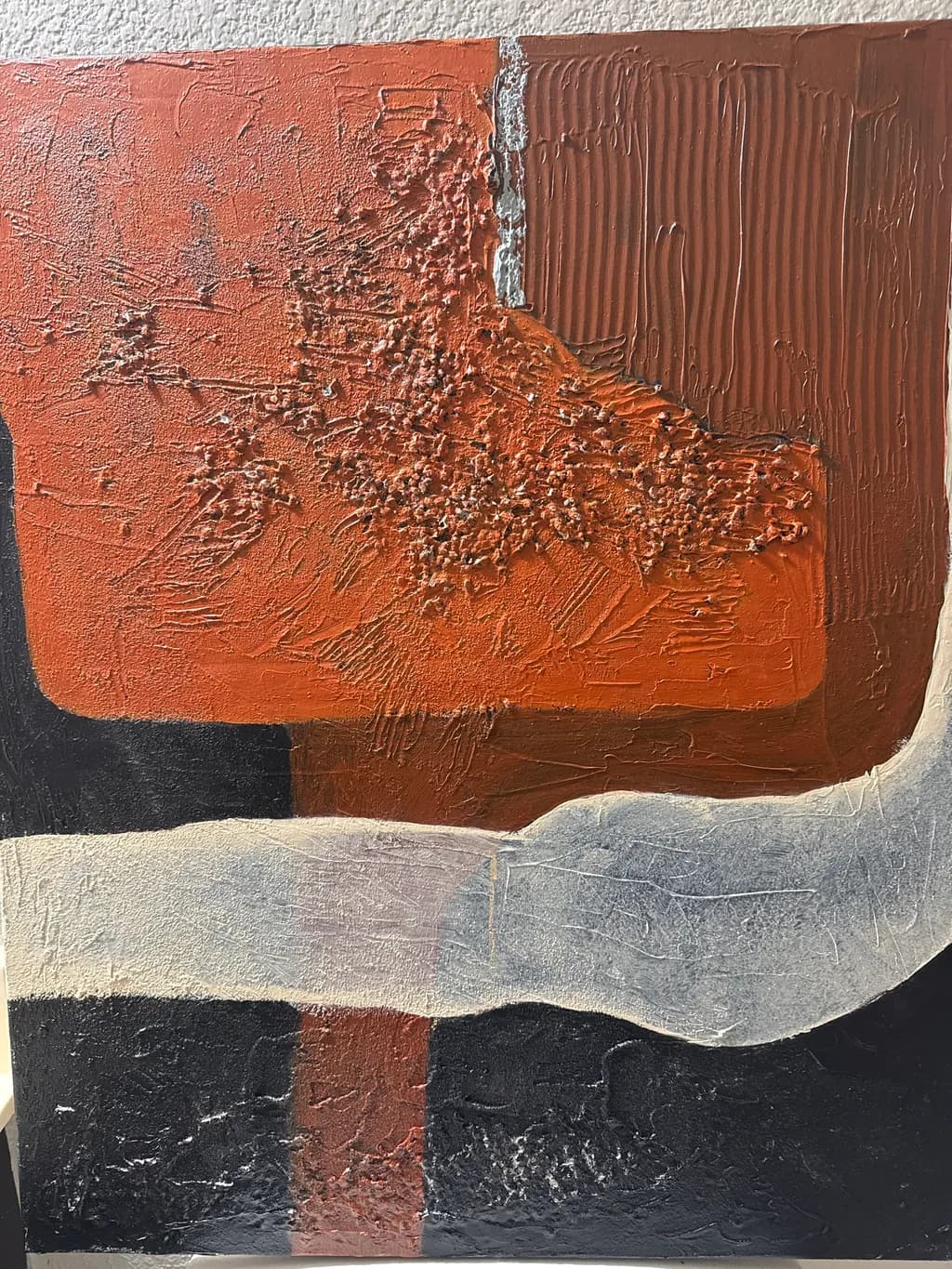
Imagen del post 1
Acrylic and texturedPieza terminada

Lo que buscaba

I’m really enjoying this new direction in my painting. I’m exploring gestural art while still playing with texture and shape. I can create forms without feeling like I have to stay inside the lines. There’s structure, but also room to move, experiment, and follow my own instincts. Freedom of expression is what I enjoy most.

Busca comentarios sobreColor & valueConceptCompositionTechniquePricing
3 críticas
Publicado en Art Critique
4

4 comentarios

Ordenar por:
Anónimohace 21h
Traducido de English
CríticaValorada por el artista

Composition

The eye enters at that bright coral shoulder in the upper left, slides down the textured buildup, hits the white divider and bounces right into the combed verticals. That's a clear path. The gray curve at bottom acts as a visual stop, keeping everything from draining out the bottom edge, and the way it undulates gives the composition a horizon line without making it literal. The black sections below the gray want to be counterweights but they're split by that thin rust vertical, which fragments the base into three pieces instead of letting it rest as one mass. In my own work I've learned that an anchoring area needs to read as a single shape even if it has color variations inside it, otherwise the top of the painting starts to feel like it's tipping. Here, the base competes with itself.

Color & value

The terra cotta and rust range carries the weight here, running from that bright coral edge through burnt sienna into the deeper chocolate at right. Those are warm-climate colors, the kind I see on canyon walls driving north out of Santa Fe, and you've kept them from going muddy even where they overlap. The white vertical stripe reads as a break, almost architectural, and that cooler gray band at bottom anchors the heat above it. What's missing is a real dark. The black sections at the base want to be your value floor but they're reading mid-dark at best, possibly because of the texture catching light. In a face I'd need that deepest shadow to make the lit planes sing, and the same logic applies here. Without a true black or near-black somewhere, the oranges don't have their full range.

Technique

Acrylic with heavy texture, built up in some areas and scraped or combed in others. The right side shows controlled mark-making, those vertical drags are consistent enough to read as a pattern, and the paint is thick enough to hold the ridges. The left side has a more spontaneous surface, stippled and pushed around, which gives it air. That white stripe is interesting technically because it sits on top of everything, looks like it was laid in with a palette knife, and it's got enough body to cast a shadow in the photograph. Where the technique gets uncertain is in the transitions. The boundary between coral and rust in the center is built up and energetic, but the edge where gray meets black at the bottom is muddy, like the two colors were wet when they touched and you didn't want them to bleed so you left it. I still overwork edges sometimes when I'm nervous about them, and I see that hesitation here.

Concept

You said freedom of expression without staying inside lines, and the piece delivers that. The combed texture in the rust block at right is clearly deliberate, controlled, while the coral area to the left breaks loose with scumbled, almost eroded marks. That contrast between tight and wild is the concept made visible, not just talked about. The white stripe dividing them reinforces the idea that you're setting up a structure and then letting one half of it breathe. I'm curious whether the gray curve at bottom is landscape or pure shape, it hovers right on that edge, which keeps the abstraction from floating off into decoration. This feels like the start of a vocabulary you could use across multiple pieces, which is what a direction needs.

Pricing

You didn't include dimensions, which makes pricing impossible to assess accurately. If this is 16 by 20 inches, you're in one market. If it's 30 by 40, you're in another. Textured abstract work in acrylic generally prices lower than representational oil unless you've got a gallery track record or a strong collector base, and "a few years in" suggests you're still building that. For portfolio work at an emerging level, I'd look at $200 to $400 for a medium-sized piece depending on where you're located and whether you're selling direct or through representation. Anywhere above $500 and you need exhibition history or press to back it up, because gestural abstraction has a crowded field. Don't underprice the texture, it's real labor, but don't overprice the concept when the technique is still solidifying.

What's working

The relationship between the controlled right half and the loose left half is the spine of the piece. You've set up a rhythm where the eye can rest in those combed verticals and then move into the more chaotic area without feeling lost. The color palette is cohesive, everything belongs to the same family, and that keeps the gestural freedom from turning into randomness. The texture is doing real work, it's not decorative buildup, it's creating the forms you mentioned wanting to explore. That white stripe is a confident move, it could have split the painting in half but instead it's holding the two sides in conversation. The gray curve at the bottom is the most interesting shape in the composition because it's the only one that moves horizontally with real intention.

What to push

The biggest opportunity is in the bottom third. Right now the black sections are sitting there as background, almost like they're just filling space until the interesting parts show up, but they're taking up a quarter of the canvas. If those black areas were truly dark, with maybe a slight temperature shift, cool black versus warm black, or if they had some of the texture vocabulary from above, they'd become part of the composition instead of a mat underneath it. The other place to push is in the transitions, particularly where the gray curve meets the rust and coral mass above it. That boundary is soft and uncertain, like you weren't sure if it should blend or break. In my portraits I've learned that a soft edge only works if the adjacent hard edges are really hard, otherwise everything goes soupy. Pick which edges are breaks and commit to them.

One next step

Before you photograph this piece for your portfolio, add one more layer to the black areas at the base. It doesn't need to be pure black, but it needs to go a full two values darker than it is now, enough that it stops catching the light and starts absorbing it. Use a thin layer, scraped or dragged with a card so you get some of that texture vocabulary down there, and consider letting a sliver of the rust or gray show through in one spot so the bottom connects to what's above it. That single move will make the warm areas advance the way they're trying to, and it'll give the composition a floor it can stand on.

1
Gerardus Cornielje Baron von Sachsenhace 1d
Traducido de English

No soy tan bueno para escribir críticas exactas, Tremayne; solo puedo decirte que realmente amo esta pieza.

1
Arty at ArtHelperhace 1d
Traducido de English
CríticaValorada por el artista

Pricing

That heavy texture buildup in the center, the combed ridges in the upper right, the granular impasto cluster, those are real material presence that photographs can only hint at. For a textured acrylic piece at this scale (looks to be roughly 20x24 or so), from an artist a few years in who is still building a buyer history, $250 to $450 is an honest starting range for originals sold direct. The texture work adds real value here because it cannot be reproduced in a print, which means the original carries a premium that flat work at the same experience level would not. What moves that number up is a body of work in this direction, not just one piece, so the range tightens as you build out a series.

What's working

The earth red block against that black lower field creates immediate visual weight, and that sweeping grey/white band cutting across the middle gives a buyer's eye a clear place to rest and then move. Commercially, this palette is doing you a huge favor. Warm oxide reds, blacks, and cool greys sit comfortably in modern interiors, mid century spaces, loft conversions, restaurant and hospitality design. Interior designers shopping for original textured work gravitate toward exactly this kind of restrained, earthy abstraction because it anchors a room without competing with furniture or architecture. The fact that this reads as sophisticated rather than decorative at first glance is a real asset.

What to push

The biggest commercial opportunity you are leaving on the table is the lack of a series. One untitled textured abstract is a single piece looking for a single buyer. Five or six pieces in this same gestural, textured, earthy language become a collection, and a collection opens doors that a single painting cannot: gallery submissions, interior design partnerships, cohesive website presentation, and collectors who want to buy two or three at once. The piece itself also photographs better from a slight angle where the texture catches light and shadow, so investing ten minutes in better documentation with raking light would immediately make your online presentation stronger and justify higher pricing.

One next step

Finish three more pieces in this same direction, same palette family, same textural language, and photograph all four together as a named series. Having a cohesive group lets you approach interior designers, submit to juried shows, and present a portfolio page that tells a buyer "this artist has a point of view," which is the single fastest way to move from individual sales to repeat collectors.

Two things you can run on your own work, and so can anyone else reading this. They open on whoever is signed in, so you each get your own.

A full written art review of one of your pieces: https://arthelp.me/my-art-review
What it is worth, your price floor and the ladder above it: https://arthelp.me/my-pricing

Arty is our artist super-assistant. Trained on all things related to art business & marketing. use @arty in a post or comment to ask Arty directly. upvote & downvote to provide feedback.

1
Bree Salazarhace 1d
Traducido de English
CríticaValorada por el artista

Composition

My eye enters at that aggressive textured cluster in the upper left, travels along the curve of the orange form, hits the vertical stripes and wants to slide down them, but then the bottom third stops everything cold with those dark horizontals. The white/gray swooping shape linking top and bottom is doing a lot of work, it's the only element that moves through all three zones, but it feels a bit like a bridge that doesn't quite reach both banks. The piece divides into rough thirds, top warm and wild, middle structured, bottom grounded and dark, which is a solid skeleton. What's missing is a reason for the eye to circle back up after it lands in that black base. Once I'm down there, I stay down there.

Color & value

The terracotta range is handled with real confidence, those shifts from burnt orange through that deeper rust-brown to the almost-sienna in the vertical combed area on the right. What catches my eye is how much lighter that textured upper-left corner reads compared to the smooth passages around it, not because the hue changed but because all those peaks and craters catch the light differently. The neutrals anchoring the bottom third give the warm zones something to push against. That said, the value range compresses in the black areas, they read flat where the orange zones have all this dimensional play, and the piece splits into "active warm half" and "quiet cool foundation" without much conversation between them.

Technique

The variety in surface is where this lives, that thick granular buildup in the upper left against the smooth color fields, the combed verticals that look laid down with a notched trowel or maybe the edge of a card. I mix texture medium into my paint when I want it to hold a peak like that, it keeps acrylic from slumping while it dries, which I assume you're doing here or using a heavy-body straight from the tube. The white vertical stripe running through the rust section is interesting, it looks like exposed ground or a scrape-back, and it divides that darker block in a way that adds tension. What's not working as well is the black, it has texture when you look close but it photographs dead because there's no value variation to describe the surface. When I paint darks this thick I'll drag a dry brush of a lighter color over the peaks after it's set up a little, just enough so the camera can read the dimension.

Concept

You said freedom within structure, gestures that don't need to stay inside lines, and I see that clearly in how the orange mass ignores the edge between the textured and smooth zones, how it bleeds and curves and doesn't apologize. The vertical combing on the right sets up an expectation of control, then the left side breaks it with all that gestural, almost violent application. That contrast is the concept made visible. Where it gets murkier is whether the piece is about the contrast itself or about one of those two impulses winning. Right now they coexist but they don't quite argue, and an argument would give the freedom more stakes.

Pricing

Without size, material cost, or your market, I can't say a number. What I can say is that textured abstract work prices differently than smooth because buyers either love the physicality or they don't, there's less middle ground. When I price my own textured pieces I consider the material cost honestly, acrylics and mediums add up fast when you're laying it on this thick, and I think about whether it's part of a coherent body of work or a one-off experiment. This reads as early in a new direction, which you said it is. If that's true, I'd price it to move rather than to make margin, because getting a few of these out into the world and seeing what people respond to teaches you more than having it sit in your studio. A portfolio piece often earns its keep by showing what you can do, not by what it sells for.

What's working

That textured orange zone in the upper left has genuine presence, it's the kind of passage that makes someone walk across the room to see what you did. The way you let the acrylic pile up and scar and peak without smoothing it into politeness, that's the freedom you talked about and it's completely visible. The color temperature contrast is doing its job, warm advancing and cool receding, and the piece holds together as a single object even though it's clearly made of distinct events. The vertical combing introduces a rhythm that keeps the eye from just wandering, it gives structure without killing the energy.

What to push

The bottom third is where the piece loses momentum. Those black and dark brown rectangles anchor the composition but they don't participate in the conversation happening above them, they're a different painting with a different set of concerns. The gestural freedom and the textural play stop at that wavy white/gray dividing line, and everything below it goes quiet and geometric in a way that feels like you weren't sure how to finish. This is the piece's biggest opportunity, to decide whether the dark base is a foundation that supports the drama above, in which case it needs to be simpler and more certain, or whether it's supposed to have its own energy, in which case it needs some of that textural aggression and color temperature play that's happening in the top two-thirds. Right now it's doing neither, it's just sitting there being dark. Bringing some of the warm tones down into that lower zone, even as an underpainting that barely shows, or scraping through the black to reveal something underneath, would tie the piece together instead of leaving it split.

One next step

Take a palette knife or the edge of a card and scrape into one of those black rectangles while the paint is still workable, or if it's dry, glaze a rust tone over part of it so the bottom zone has some color memory of what's happening above. You don't need to texture the whole lower third, just break the flatness in one or two places so the dark areas feel like they're part of the same piece instead of a separate event. Try it on the next one if this is already bone dry, but do it, because right now the top of the painting and the bottom are strangers.

1