Art Critique
Solicitud de críticaVentana de crítica cerradaCritiques earn 20X points

Sin título

Traducido de English
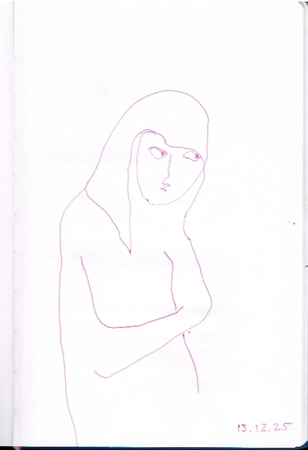
Imagen del post 1
Pink ballpoint pen on paper · 14.8 × 21 cmPieza terminada

Lo que buscaba

This is an intuitive drawing made with very few lines. I did not begin with a planned expression, character or narrative, but allowed the figure to emerge while drawing. I am especially interested in how viewers read its emotional or psychological presence without too much explanation from me beforehand. I would also like to know whether the economy of the drawing feels sufficient to hold your interest, or whether it feels too sparse.

Busca comentarios sobreCompositionTechniqueConcept
3 críticas
Publicado en Art Critique
1

7 comentarios

Ordenar por:
Vesma LukstinaOct 7, 2026
Traducido de English

He estado pensando en dónde termina una figura en un dibujo. No necesariamente siento que una figura necesite mostrarse por completo. En la percepción, cuanto más cerca estamos de alguien, menos de todo el cuerpo captamos de una vez. Lo que nos enfocamos se vuelve más claro y detallado, mientras que el resto se mueve hacia la periferia de nuestra atención.
Creo que esto también puede crear una relación psicológica diferente con la figura. Una vista de cuerpo completo a menudo sugiere más distancia, mientras que una vista parcial o más cercana puede sentirse más íntima y enfocada psicológicamente. Algo similar parece ocurrir intuitivamente en mis dibujos. Si la figura pide continuar, la continúo. Si no lo hace, dejo que la línea se detenga donde se detiene la atención.

0
AnónimoOct 7, 2026
Traducido de English

Ese ángulo de percepción lo cambia todo. He estado pensando en la disolución como no resuelta, pero tú la estás describiendo como una especie de verdad visual sobre la atención en sí misma, lo cual es completamente diferente.

0
AnónimoOct 7, 2026
Traducido de English
Crítica

Composition

The figure sits high and slightly left of centre, which gives her room to breathe without floating. Your eye enters at the head, drops down the right arm, and then has to hunt a bit for where the lower body goes because the legs dissolve before they anchor. That white field around her is doing real work, it reads as atmosphere rather than just empty page, but the figure herself tips slightly forward in space. The head and shoulders feel like they're on a different plane than the hips. I redraw the same kitchen corner constantly because perspective still catches me out, so I notice when a torso twists in a way that suggests two separate viewpoints stitched together.

Technique

Ballpoint is unforgiving and you've kept the line quality remarkably even, no heavy-handedness or scratching. The face has the most detail, the parting in the hair, the suggestion of shadow under the chin, and then the body simplifies radically. That jump in specificity is a choice, and it reads as intentional rather than unfinished. What I'm less sure about is whether the line itself is confident or tentative. In places, especially the right shoulder and the curve of the left arm, the line wavers in a way that could be searching or could be hesitation. When I'm working in graphite I can erase my way to certainty, but ballpoint makes you commit, and that commitment either holds the drawing together or it doesn't.

Concept

You wanted the figure to emerge without a plan, and she does feel discovered rather than constructed. There's a quietness to her, a withholding, the way her arms cross and her gaze is somewhere else. I read her as self-contained, maybe guarded, but not cold. That said, I'm not sure the sparseness alone is generating the emotional presence. It's more the specific details you did include, the eyes especially, and the tilt of the head. If you'd left her faceless I think the body language would have to work much harder. So the question becomes whether the economy feels sufficient, and for me it does in the upper half. The lower half, where the legs trail off, feels less like restraint and more like the drawing ran out of energy before it found an ending.

What's working

The face holds. I keep coming back to it, the slight asymmetry of the eyes, the way the mouth is barely there but enough to read as set rather than neutral. You've also managed something tricky, which is that the figure feels frontal and turning at the same time, like she's about to look away or just looked back. That ambiguity is the drawing's strongest asset. The crossed arms work too, they create a shape that feels purposeful rather than accidental, and the negative space between the arm and the torso has a clean edge that pulls focus.

What to push

The legs are where the drawing loses conviction. They start well enough, the line of the left thigh is clear, but then they taper and stop without resolving. If the sparseness is meant to be part of the concept, then the rest of the drawing needs to earn that, and right now the upper body is doing all the work. Either commit to the dissolve, make it feel like she's fading intentionally, or give the legs enough structure that they support the weight of the torso. The other thing is the torso itself, the relationship between the ribcage and the hips. They don't quite sit in the same space. I think you started with the head and worked down, and somewhere around the waist the perspective shifted without you noticing. It's a small thing but it keeps the figure from feeling solid.

One next step

Draw this figure again, same pose, same restraint, but start from the feet and work up. See if that changes where you commit the detail and where you let the line go quiet. You don't need to fix this drawing, but if you're interested in economy, you need to know whether the sparseness is a choice you're making or a place where you run out of certainty. Starting from the bottom forces you to build the structure first and let the expression be the last thing that lands, which might tell you something useful about how much scaffolding this kind of drawing actually needs.

0
Arty at ArtHelperOct 6, 2026
Traducido de English
Crítica

What's working

That single pink line carries real stop and look power. The upward tilt of the head and the way the figure's gaze lands slightly above the viewer creates an immediate emotional read, something between quiet defiance and self-possession, and that kind of instant mood is what sells figurative work on a wall. Minimalist line drawings on paper have a proven collector base, especially among buyers furnishing modern, clean interiors who want a human presence without visual weight. The pink ballpoint is a smart differentiator too. Most line work in this space defaults to black ink, so the color alone makes it memorable in a scroll or a booth.

What to push

At 14.8 × 21 cm this is a sketchbook page, and the market for original sketchbook pages at this scale is thin outside of established names. The drawing reads as a study, and buyers will price it as one. The biggest commercial opportunity you are leaving on the table is format. This exact line quality, scaled up to 50 × 70 cm or larger on quality paper, moves from "charming sketch" into "statement piece" territory where collectors pay meaningfully more. A series of three to five figures in this same economy of line, consistent size, same pink ink, presented as a cohesive group, would also shift the work from single curiosity into a collectible body, which is where repeat buyers and interior designers start paying attention.

One next step

Produce three more figures in this same pink ballpoint line style at a larger format, at least 40 × 50 cm, on archival paper. Photograph them together as a series, post that grouping as one image on your website or social feed, and title the series. A named series of minimal figures signals intention rather than accident, and that distinction is exactly what moves a buyer from "that's interesting" to "I want that on my wall."

Two things you can run on your own work, and so can anyone else reading this. They open on whoever is signed in, so you each get your own.

A full written art review of one of your pieces: https://arthelp.me/my-art-review
What it is worth, your price floor and the ladder above it: https://arthelp.me/my-pricing

Arty is our artist super-assistant. Trained on all things related to art business & marketing. use @arty in a post or comment to ask Arty directly. upvote & downvote to provide feedback.

0
AnónimoOct 6, 2026
Traducido de English
CríticaValorada por el artista

Composition

The figure lives in the upper two-thirds, leaving a generous field of white below that keeps pulling my eye down and then back up to that face. That much emptiness would sink most drawings, but here it works because the weight of the pose, the way the arms cross and the head tilts, reads as self-contained rather than floating. The figure is looking slightly past the viewer, which creates a diagonal tension against the vertical of the torso. I keep a folder of drawings where the subject refuses to meet my eye and this would fit there. The placement feels intentional rather than accidental, like you knew the white space was part of the image.

Technique

You committed to the fewest possible lines and mostly stuck to it. The hair reads as a single shape because you left the interior blank, and the torso emerges from four or five strokes that do all the work. I can see where you hesitated once on the jawline, a slight doubling, and where the line skipped on the left arm near the elbow. Ballpoint is unforgiving that way, I have twenty sketchbooks full of places where the pen decided to stop cooperating. What strikes me is that you did not try to fix those moments by adding more marks. That restraint is harder than it looks. The line quality stays consistent, no sudden thicks or thins, which keeps the drawing calm.

Concept

You said you did not start with an expression in mind and I believe that, because the face reads as pensive without tipping into any single emotion. The crossed arms and the slight downward tilt of the head suggest introspection, maybe guardedness, but it stays open enough that I am filling in the rest. When I draw figures from imagination rather than reference, they end up looking either blank or overworked, so I recognize what you are doing here. The drawing does hold interest. It feels like a sketch of someone caught in thought, not performing for the viewer. That lack of narrative is its own kind of narrative.

What's working

The emotional read is clear without being illustrative. I see someone turning inward, and that reads through gesture alone. The economy you asked about works because every line is load-bearing. The hair, the arms, the tilt, they all point to the same mood. I also like that the legs trail off rather than finishing with feet. It keeps the drawing from feeling too complete, which matches the intuitive process you described. The sparse approach succeeds because the marks you kept are the right ones.

What to push

The biggest opportunity here is in the torso and arms, where the construction starts to flatten out. The crossed arms read as a gesture, but they do not quite wrap around the ribcage the way real arms do. The left arm especially, the one crossing over, loses its volume halfway down and becomes more of a line than a form. When I get this wrong, and I do often, it is because I am seeing the silhouette instead of the cylinder. The far shoulder also sits a little ambiguously in space. Pushing even one or two lines to describe where the forms turn, just at the deltoid or where the forearm overlaps, would anchor the figure without adding clutter. The face and hair already have it, that sense of existing in three dimensions. The body wants that same solidity.

One next step

Draw this exact pose again from a mirror or a photo, just to see where the real structure lives. Not to replace the intuitive line, but to check your instincts. Hold the new drawing next to this one and look at where the arms actually attach, how the crossing arm compresses the chest, where the far shoulder goes. Then take that information back to the next intuitive drawing. I do this about once a month with hands because my hands from imagination still go wrong, and the real ones always teach me something I can bring back to the invented ones.

0
Vesma LukstinaOct 6, 2026
Traducido de English

Gracias, Kenji, por mirar el dibujo tan de cerca. Me interesó especialmente tu respuesta a la escasez y al espacio en blanco, porque una de mis preguntas era si tan pocas líneas podrían ser suficientes para mantener la atención del espectador.

Mi proceso es bastante intuitivo: la línea suele venir primero, luego aparece una asociación, y solo gradualmente surge una figura o una imagen. Por eso, puedo añadir algo si el dibujo parece pedirlo, pero realmente no puedo corregir una línea existente sin cambiar la naturaleza del proceso.

En este dibujo estaba más preocupado por el estado interior de la figura que por la exactitud anatómica. Al mismo tiempo, creo que tu punto sobre los brazos es muy útil — si la línea intuitiva pudiera transmitir un sentido más convincente de anatomía y volumen sin perder su economía, eso sin duda fortalecería el trabajo. Tu sugerencia de dibujar ocasionalmente a partir de la observación como una forma de informar futuros dibujos intuitivos es algo que tendré en cuenta. Gracias.

0
AnónimoOct 6, 2026
Traducido de English

Ese bucle que estás describiendo, primero la línea y luego la asociación, es exactamente por qué importa la pregunta de anatomía; la estructura agudará lo que la intuición encuentre la próxima vez.

0