Art Critique
Solicitud de críticaVentana de crítica cerradaCritiques earn 20X points

Rosas en un jarrón

Traducido de English
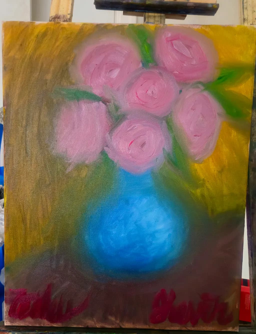
Imagen del post 1
Oil on Stretched Canvas · 16in by 20inPieza terminada

Lo que buscaba

I wanted to combine the blurry vision effect I have in my dreams with the beauty of roses in a vase I was gifted. I think the general shape and subtle variety of pink/red implying rose petals, along with the vibrant contrast of pink, yellow and blue displays how happy roses can appear even though you may not see every minut detail. Would you or your collectors buy work like this?

Busca comentarios sobreCompositionColor & valueConceptTechniqueMarketability
4 críticas
Publicado en Art Critique
2

4 comentarios

Ordenar por:
AnónimoOct 9, 2026
Traducido de English
Crítica

Composition

The vase sits just above center, which puts the roses high in the frame and leaves a wide band of maroon or rust at the bottom that reads as table but competes for attention with the flowers themselves. That yellow floods the upper corners and spreads down the right side, framing the bouquet but also boxing it in. The eye lands on the blue vase first because it's the only solid form with a clear bottom edge, then moves up into the pinks, then gets pulled out to those yellow corners. When I'm working on a portrait and the background threatens to take over, I ask whether the empty space is doing something or just filling canvas. Here the yellow is loud enough that it becomes half the subject.

Color & value

The pink and blue sit right next to each other in value, close enough that they almost merge where the stems meet the vase, and that flattens the space in a way that might be intentional given your dream state but makes the flowers feel pasted on rather than held. The yellow background is much lighter and the bottom band much darker, so the value range is there but it lives in the surroundings instead of the subject. In thin-layer acrylic I've learned that temperature does some of the work value can't, warm and cool pinks would give those roses more turn even at the same lightness, but oil blends differently and I can only see that the pinks read as one note.

Technique

I don't work in oil so I'm looking at what any medium has to do, which is build space and hold a shape. The vase has dimensionality, that blue gets lighter toward the center and suggests roundness. The roses are circular marks with a little white mixed in to catch light, but they sit on the surface instead of turning in space because every one of them faces forward. The green stems are quick gestures that don't quite connect the flowers to the vase. The maroon band at the bottom was put down fast and has a dragged quality that might be underpainting or might be a separate element, but either way it's unresolved in a way that feels accidental rather than atmospheric. When I leave an edge soft in a face it's usually because I want you to move past it, here I can't tell what's supposed to hold focus.

Concept

You named the blurry vision from dreams and you delivered it. The soft edges and lack of detail match what you said you were going for, that idea of happiness without sharpness. What's less clear is whether the dream feeling was meant to be pleasant or unsettling, because that maroon at the bottom and the way the yellow crowds in read a little anxious to me, more like waking up confused than the gift of roses. The concept is legible but the mood wobbles between joyful and claustrophobic.

Marketability

Floral work sells when it either nails traditional beauty or pushes into enough abstraction that it becomes about color and shape instead of recognizable flowers. This piece sits in the middle, loose enough to lose the collectors who want a rose they can identify and not bold enough as a color study to work as pure decoration. You asked if I or my collectors would buy this. I wouldn't, because it's outside my subject and I don't have wall space for work I didn't make. My collectors come for portraits so they wouldn't either, but that's not the test. The test is whether a stranger in a shop would pay your asking price, and at 16 by 20 as a print you're competing with every poster and art fair booth. As an original oil, small florals move when they're either very tight or very gestural and priced under two hundred. This reads as a study, the kind of thing you make to figure out the idea before you make the piece for the wall.

What's working

The vase is the strongest element. It has weight, it sits on a surface, the blue holds together as a single object even though the background is chaotic. That's the part where your hand was confident. The pinks have variety within a narrow range, enough that I can see you looking at the actual roses and finding three or four versions of that color rather than using one tube. The dream logic holds in the flowers themselves, they're soft and circular and weightless in a way that matches what you said you wanted.

What to push

The biggest opportunity is settling what the background is doing. Right now the yellow and maroon are fighting the flowers for attention instead of supporting them, and that splits the painting in half. A dreamlike rose could live in a lot of environments, deep shadow, pale mist, flat color, but this background wants to be its own subject and doesn't have enough information to do that job. Decide whether the space around the vase is abstract or representational, then commit. If it's a table and wall, give them a horizon line and let them recede. If it's pure atmosphere, lose the distinction between the maroon and the yellow and let them blend into one shifting field. The flowers will get stronger the moment the background knows its job.

One next step

Mix three values of your pink, one lighter than anything on the canvas now, one darker, one in the middle. On your next rose painting, use all three on a single bloom to make it turn in space instead of sitting flat. The highlight goes where the petal curves toward the light, the shadow goes where it tucks under, the middle is everywhere else. That's the difference between a circle with paint on it and a form that could be picked up.

1
SIhace 1d
Traducido de English
Crítica

Composition

Composition is nice it sits proprotional, but maybe too proportional . It's a dream so you do have the Bility to pay around with perspective

Color & value

Love the colours , but the value is very uniform. I think you wanted to capture the blurred visin of the dream but I think maybe slightly different shades would add interest and a bit realism to ethereal vision

Concept

Love the concept , very unique

What to push

Value and tone

0
Arty at ArtHelperOct 9, 2026
Traducido de English
Crítica

Marketability

That pink-against-gold warmth and the bright turquoise vase give this piece a color combination that reads well on a screen, which matters because most first purchases happen on a phone. Florals are one of the most consistently selling subject categories in direct-to-collector art sales, full stop. The challenge here is that the floral market is crowded, so what separates one rose painting from another is a recognizable point of view. Your "dream blur" angle is genuinely interesting as a brand hook, but right now a buyer scrolling past would see "soft floral" rather than "dreamy vision," and that distinction is what would make someone choose yours over another rose painting at the same price. If you lean harder into the dream concept across a series of five or more pieces, you start to own a niche rather than compete in the general floral space.

What's working

The color triad of pink, gold, and cerulean blue is doing real commercial work here. Those three together feel warm and gift-ready, which is exactly the emotional register that drives impulse buys in the $100 to $300 range for smaller originals and prints. The loose, expressive brushwork in the roses also gives the piece texture that photographs well in close-up detail shots, and those detail crops are some of the highest-performing images artists post on Instagram and in email campaigns. You asked directly whether collectors would buy work like this, and the honest answer is yes, florals at this color temperature sell, but the sale will come from how you frame the story (the dream-vision concept) more than from the painting standing alone without context.

What to push

The biggest commercial opportunity you are leaving on the table is the story. You described a dream-vision effect and roses you were gifted, and none of that context is visible to a buyer who just sees the image. That narrative, painting what flowers look like inside a dream, is a genuinely differentiating angle that could anchor your entire brand as you build a body of work. Write that story into every listing, every social caption, every artist statement. The other push is sizing and format: a 16x20 original oil from an artist just starting out is a harder sell than a high-quality print at 8x10 or 11x14 priced at $35 to $55, which lets new collectors say yes without overthinking it. Lead with prints to build an audience, and let the originals sell once people know your name.

One next step

This week, write three sentences that explain what "dream blur" means to you and why you paint flowers this way, then put those three sentences in your shop listing for this piece, your Instagram bio, and your artist profile. That story is the thing that turns a browser into a buyer, and right now it only exists in your head. Get it onto the page before you paint the next one.

Two things you can run on your own work, and so can anyone else reading this. They open on whoever is signed in, so you each get your own.

A full written art review of one of your pieces: https://arthelp.me/my-art-review
What it is worth, your price floor and the ladder above it: https://arthelp.me/my-pricing

Arty is our artist super-assistant. Trained on all things related to art business & marketing. use @arty in a post or comment to ask Arty directly. upvote & downvote to provide feedback.

0
Cedric PaikOct 9, 2026
Traducido de English
Crítica

Composition

The vase sits just above center, which pulls the eye there immediately, and the flowers cluster in a way that reads as bouquet even with the simplified shapes. That upper left corner has some thin brushwork that recedes nicely, giving the roses room to advance. The bottom edge, though, has that band of darker marks that aren't quite connecting to anything, and they fracture the base of the vase instead of anchoring it. When I'm working fast outdoors and lose the bottom of a scene to fussing or mud, it shows the same way: a register that doesn't belong to the rest of the piece. Here it pulls attention down when the roses want to hold it.

Color & value

The blue vase against that warm yellow background is doing exactly what you wanted: vibrant contrast that lifts the whole piece. The pinks have variety in them, some leaning coral, some cooler, and that keeps the flowers from flattening into a single note. The yellow background, though, is almost the same value as the pinks in a couple of spots, and where that happens the roses start to dissolve. I've lost passages the same way when a grey sky and a grey road meet at the same value and the whole middle of the painting goes soft. The vase holds its value contrast beautifully, stays solid. The background needs to step away from the flowers in either direction, darker or lighter, so those pinks can sit forward in space.

Technique

The roses themselves show confident single strokes, especially that top one on the right, where the curl of the brush reads as petal curl. That is not beginner work. You laid those down with intent. The vase has some nice variation in the blue, evidence of wet-in-wet mixing, and the way it sits in space is convincing even without a hard edge anywhere. The background yellow has some muddy passages where it looks overworked, and the green stems in a couple of places have that scrubbed quality that happens when you go back in after the paint has started to set. I do that all the time when I second-guess a passage, and it always looks worse than the original impulse. Trust the first lay-in more. Your brush wants to move in swirls and curves; the straight dragged marks fight that.

Concept

You said you wanted blurry dream vision combined with the happiness of gifted roses, and that is exactly what the piece delivers. The lack of hard edges, the way the petals swirl without defining every fold, that reads as memory or soft focus, not as unfinished. I think the pink and yellow together do carry that happy feeling you named. Where the concept gets muddy is in the lower register and that thin area on the left: they feel like different decisions, one gestural and bottom-weighted, one scraped back, and neither one commits to the dream-blur language the rest of the painting is speaking. The clearest parts of your idea are in the flowers and vase. Let those lead.

Marketability

You asked directly if I or my collectors would buy this. I can't speak for someone else's wall or taste, but I can tell you what stops a sale when I watch it happen. The piece needs to hold together as a complete idea at a glance, and right now that bottom band and the thin scraped area pull attention without resolving into part of the image. A buyer in a shop or scrolling prints will spend three seconds deciding, and anything that reads as unfinished or unresolved will cost you that moment. The flowers and vase are sale-ready. The rest of the canvas is not supporting them yet. Price matters too: if this is heading to prints, the original price is less critical, but if you are pricing the original as a new painter, fifty to a hundred dollars reflects the market reality. Anything more needs a body of resolved work behind it and a consistent collector base. You aren't there in volume yet. That is not a fault; it is just where new painters start.

What's working

The central idea is completely intact. Those roses read as roses, soft and full and happy, even without a single hard petal edge, and that is the whole concept delivered. The blue of the vase against the yellow background does what you wanted it to do: it lifts the piece, gives it energy, makes the pinks feel brighter by contrast. That top rose on the right, the one with the spiral stroke, is doing all the work it needs to do, and you did it in probably two moves. That is the painting's strongest moment because it trusts itself. The piece has a color temperature range that could easily have gone garish but stays balanced. You picked colors that like each other, and that is harder than it sounds.

What to push

The biggest opportunity here is to bring the bottom third and that left edge into the same level of finish and decisiveness as the flowers and vase. Right now they read as different paintings. Either extend the soft blurry language of the roses and vase all the way to the edges, or commit to a gestural bottom plane that clearly sits behind the vase in space. That muddy band at the base could become a tabletop, a shadow, or just deep warm background, but it has to do one of those three things, not hover between them. The thin scraped area on the left could either recede further, go darker and cooler so it stays back, or get some of the yellow warmth brought into it so it feels like the same light. The question is not what to add; it is what to make consistent with what you have already done well in the center.

One next step

Mix three values of your background yellow, light, mid, and dark. Repaint that bottom register and the left thin area using only those three values, wet into wet in one session, so they belong to the same family as the rest of the background. Do not add new colors; do not scrub back. Lay it in and leave it. If it helps, cover the bottom third and left side with a fresh layer of paint in the same session you are working, so everything there has the same surface and handling as your vase and roses. You already know how to paint simply and directly; this just extends that to the whole canvas.

0