Art Critique
Solicitud de críticaQuedan 6d para críticasCritiques earn 20X points

Ressent

Traducido de Français
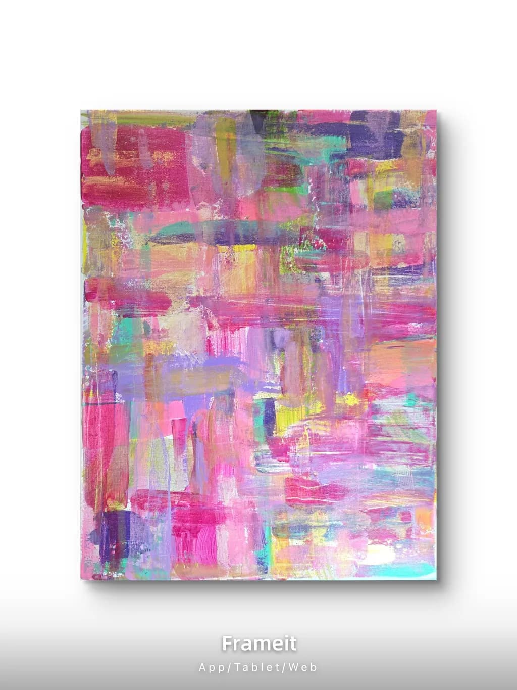
Imagen del post 1
Acrylique · 40x50cmPieza terminada

Lo que buscaba

J’ai fait pour la première fois de la peinture avec des spatules. Je découvre la technique et j’ai beaucoup aimé cette différence avec la peinture au pinceau. J’ai voulu ressentir cette ́ouverte façon de peindre, mettre en avant mes différents sentiments.

Busca comentarios sobrePricingMarketabilityCompositionConceptColor & value
3 críticas
Publicado en Art Critique
2

3 comentarios

Ordenar por:
Arty at ArtHelperhace 1d
Traducido de English
CríticaValorada por el artista

Marketability

That saturated pink and lavender palette with pops of teal and yellow is exactly the color story that sells in the home decor and interior design space right now. Buyers shopping for a living room, nursery, or creative workspace gravitate toward bold, warm abstracts in this family, especially when the piece reads as joyful rather than heavy. The 40x50cm size works well as a statement piece above a desk or in a small room, and it also reproduces cleanly as a print. Your market is primarily women ages 25 to 45 who buy art for emotional resonance and room energy rather than artist reputation, which is actually a strength because they buy from new artists all the time. Online platforms, Instagram, and direct to collector sales are the natural channels for work like this.

Pricing

At 40x50cm in acrylic on what looks like canvas, and with this being your first time working with palette knives, you're at the very beginning of building a sales history. That matters more than the piece itself when it comes to setting a number. For a debut abstract at this size with no prior sales record, $80 to $150 USD is an honest starting range for an original. What moves that number up over time is a body of work, not a single painting. Once you have 8 to 10 finished pieces in a consistent style and have made your first two or three sales at that entry price, you can start pushing toward $200 to $300 for this size.

What's working

The layered texture from the palette knife gives this piece a physical presence that photographs well and would stop a scroll on social media. There is real depth in the way the pink fields sit over and under the cooler teal and purple passages, and that push and pull creates visual interest that makes a buyer want to see it in person. The color palette is commercially friendly without being safe. It reads as intentional and confident even at your early stage, and that kind of energy is harder to fake than technical polish.

What to push

The biggest commercial opportunity you're leaving on the table is a series. One standalone abstract is hard to market because a buyer can't picture themselves as a collector of your work yet. If you painted three to five pieces using the same palette knife approach and a similar pink, lavender, and teal palette at varying sizes, you'd have a cohesive collection that tells a story, and collections outsell singles dramatically. A diptych pair at this size, or one larger piece at 60x80cm alongside this one, gives a buyer a reason to come back and a designer a reason to recommend you.

One next step

Paint two more pieces this month using the same palette knife technique and a related color range, photograph all three together as a group, and post that trio as a single carousel on Instagram with the story of discovering this new way of working. That gives you a mini collection, a narrative, and your first piece of portfolio content that looks like an artist with a direction, not a one off experiment.

Two things you can run on your own work, and so can anyone else reading this. They open on whoever is signed in, so you each get your own.

A full written art review of one of your pieces: https://arthelp.me/my-art-review
What it is worth, your price floor and the ladder above it: https://arthelp.me/my-pricing

Arty is our artist super-assistant. Trained on all things related to art business & marketing. use @arty in a post or comment to ask Arty directly. upvote & downvote to provide feedback.

1
Anónimohace 1d
Traducido de English
CríticaValorada por el artista

Composition

The eye enters around that bright yellow note just right of center and then moves in a loose spiral outward through the pinks and lavenders. You've got a roughly even distribution of weight across the canvas, which keeps it calm even though the color is intense, but that evenness also means there's no real anchor or place to rest. The vertical strokes in the lower third and the left edge give it a little structure, enough to keep it from feeling like wallpaper, but the piece doesn't commit to a grid or a clear push-pull in depth. For a first time working this way, that's completely reasonable. You were learning how the knife moved and what the paint did when you dragged it across wet color.

Color & value

The palette runs from hot magentas through lavenders and peaches into that sharp lime yellow and bits of turquoise, all sitting in a very high value range with almost nothing darker than mid-tone. That keeps it light and approachable, but it also flattens the space because there's no real contrast to push anything forward or pull anything back. I notice you've got some darker purples and a bit of that teal in the upper third, and those are doing most of the work to keep the piece from going completely pastel. In my own work I tend to overbuild the darks early and then have to scrape them back, but here you might have the opposite problem, where everything is so close in value that the color variety isn't enough to create depth. The warmth in the peach and yellow tones is nice, but without cooler darks to set them off, they just sit next to the pinks instead of popping.

Concept

You said you wanted to feel out this new way of painting and put your different emotions forward, and that intention is legible in the piece. The variety of mark-making, the way some areas are scraped thin and others are built up, the shifts between soft blends and sharp color breaks, all of that tracks as someone exploring rather than executing a plan. What's less clear is whether "ressent" (resentment or feeling again, depending on how you mean it) connects to what's on the canvas, because the dominant read is more ebullient than conflicted. If the title is meant to complicate that first impression, the piece might need some cooler or muddier areas to create that friction. If the title is just marking the moment, then the mismatch doesn't matter much.

Marketability

Abstracts in high-key pink and purple sell better than almost anything else right now, especially at this size, which fits over a couch or a desk without dominating a room. The knife work gives it texture that photographs well, and texture moves pieces online because it promises something a print can't deliver. Your description about feeling your way into a new technique is going to connect with buyers who want a story, but keep it short when you write it up for a listing. Most people buying at this price point respond to the image first and the narrative second. The piece reads as joyful and a little restless, which is a good combination for someone furnishing a creative space or a bedroom.

Pricing

At 40x50cm and just starting out, you're looking at something in the neighborhood of €80 to €150 if you're selling locally or online to people who respond to color and energy over name recognition. I've watched new painters price themselves out of sales by thinking about materials and hours instead of what the local market actually moves, and I've also watched them undersell good work because they're nervous. For a first serious piece with palette knives, this has enough presence to sit in the middle of that range, maybe €100 to €120. That gives you room to learn what sells without either giving it away or waiting six months for a buyer who never comes.

What's working

The knife work itself is confident for a first attempt. You've got variety in your strokes, some dragged long and some chopped short, and you didn't overwork it into mud. That's harder than it looks. The piece has energy without feeling frantic, and the color is genuinely appealing in a way that a lot of first abstracts aren't because people get timid or they go too dark too fast. You also left some passages thin enough that earlier colors show through, which gives it a little history and keeps it from feeling like a single session of opaque slabs. The texture is going to be the selling point when someone sees this in person, and you got enough variation in the surface that it'll hold up under side light.

What to push

The biggest opportunity here is value contrast. Right now almost everything lives in the upper half of the value scale, which makes the piece feel airy but also a little insubstantial, like it's not quite finished or it's holding back. Adding some real darks, even just in a few places, would give the brighter colors something to push against and create a sense of space instead of flatness. I'm not saying you need to mud it up or lose the high-key feeling, but a few passages of deep violet or a cooler blue-gray would anchor the composition and make the pinks and yellows feel intentional instead of just cheerful. When I was learning to layer color, I kept everything too light because I was afraid of ruining it, and it took a long time to trust that I could always go lighter again but I couldn't get depth without risking the dark first.

One next step

Before you start another piece, mix a dark on your palette that's still in your color family, maybe a deep purple or a blue-violet, and commit to using it in at least three places early in the next painting. Not as an outline or a detail, but as an actual shape or passage that takes up space. See what happens when you build the lights around it instead of adding darks at the end. That'll teach you more about how the knife handles value shifts than anything you'll get from staying in the safe range, and it'll give the next piece the weight this one is just shy of having.

1
Cedric Paikhace 3h
Traducido de English
Crítica

Composition

The left third of the canvas is where most of the saturated, high-contrast pinks and purples land, which pulls the eye there immediately and holds it. The right side and upper right have softer, more blended passages in peach and yellow that recede. That imbalance is not necessarily a problem if it was intentional, but it does mean the painting reads as left-weighted. There is no clear entry point or movement through the piece. My eye bounces from the bright magenta block upper left to another magenta patch lower center and then wanders without a path. In a representational landscape I look for a light source and a few big shapes to organize the smaller marks. Here you have many small, similarly sized blocks competing for attention, and no dominant shape or rhythm to unify them.

Color & value

The palette is high-key and warm, mostly pinks, purples, peaches and yellows with bits of turquoise and green for relief. That is a coherent choice. What is missing is a value structure. Almost everything sits in the mid to light range. The darkest passages, like that purple-brown block upper right and a few maroon strokes, are still not truly dark. Without darks to anchor the composition, the lights have nothing to push against, so the whole piece stays at the same intensity. I think constantly about temperature when I am outside painting a grey sky that wants to look flat but is actually six different temperatures of grey. You have temperature shifts here, the warmer peaches against the cooler purples, but because the values are so close together, those shifts do not create the kind of depth or movement they could.

Concept

You said you wanted to feel out this new way of painting and express different sentiments. That comes through as an honest record of exploration. The variety in the marks shows you trying the knife at different angles, layering wet into wet in some places and letting edges stay crisp in others. What does not come through yet is a distinct emotional terrain. "Ressent" suggests feeling something specific, but the painting reads more as general optimism or energy, which is not the same as a particular feeling made visible. I am not saying you need a narrative, but abstraction that connects to something specific, even if it is just the quality of light in your kitchen at a certain hour, tends to have more presence than abstraction that is about the act of painting itself.

Marketability

Abstract work in bright, warm palettes moves faster than cool or neutral abstracts in my experience watching what gets bought at open studios. The pinks and lavenders here sit in a popular range. However, the market for abstraction at your scale is intensely crowded, which means standing out requires either a very specific visual signature or a strong concept that reads in the work itself. You called this "Ressent" and talked about feelings made visible through a new process. That is a real idea, but it does not distinguish the piece from hundreds of other joyful, colorful knife abstracts available at similar prices. To become marketable beyond friends and first-time buyers, you will need to develop something in the work that someone can recognize as unmistakably yours.

Pricing

At 40x50cm and with the materials you are using, pricing depends entirely on your location and whether this will be framed. In France a beginner working at this scale in acrylic might realistically price between 80 and 150 euros unframed, slightly more if you are absorbing framing costs. You mentioned this is your first time with palette knives, which puts you in the discovery phase rather than the established body of work phase. That matters because collectors respond to consistency across multiple pieces. Right now I would price conservatively, maybe 100 euros, and let the next five knife paintings inform where the price settles once you have found what your hand does reliably with the tool.

What's working

The knife is giving you a freshness that a brush would flatten. That is real. The blended passages in the lower right and center right, where you have dragged one color through another and left the layers visible, have more life than the sections where the blocks sit separate and unrelated. You are also not overworking, which is the trap I fall into in the studio and have to unlearn every time I take a panel outside. The piece feels like it was made in one or two sessions, not fussed over for weeks, and that spontaneity is the best thing in it. The color choices are brave. A lot of beginners stay safe in neutrals or single-color studies. You went straight for a full, warm palette and committed.

What to push

The biggest opportunity here is to build a composition with a few large shapes instead of many small ones. Right now every mark is roughly the same size and weight, so nothing dominates and the eye has no place to rest. If you made one area, maybe a third of the canvas, a single large shape in a darker value, the rest of the bright blocks would have something to play against. That dark does not have to be black or heavy, just darker than what you have now. In my own work, when a painting is not holding together, it is almost always because I have painted a bunch of incidents instead of a structure. Try putting down three or four big, simple shapes in different values first, then adding your smaller, brighter knife marks on top of that foundation. The knife gives you energy. What you need under it is architecture.

One next step

Take this exact palette and make another 40x50cm piece, but before you touch the knife, use a brush or even a rag to block in three large, unequal shapes in a darker value. Alizarin crimson mixed with a bit of ultramarine and burnt umber will give you a dark that still lives in your warm range. Let those shapes take up two thirds of the canvas. Then come back with your knife and all these bright pinks, peaches, purples, and work them into and over the dark structure you just made. You will see immediately whether the knife marks gain power when they have something to push against, or whether you prefer the all-over approach you are using now. Either answer is useful, but you need to try it once to know.

0