Art Critique
Solicitud de críticaQuedan 12d para críticasCritiques earn 20X points

Preciosos Vestigios

Traducido de English
Imagen del post 1
Imagen del post 2
Imagen del post 3
Imagen del post 4
Imagen del post 5
Imagen del post 6
1/6
acrylic + textured medium · 30 × 30 inPieza terminada

Lo que buscaba

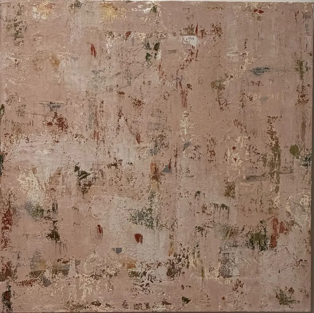
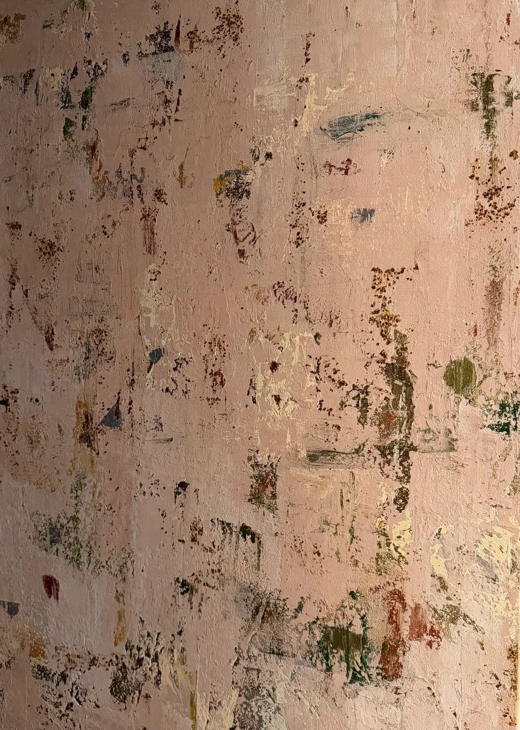
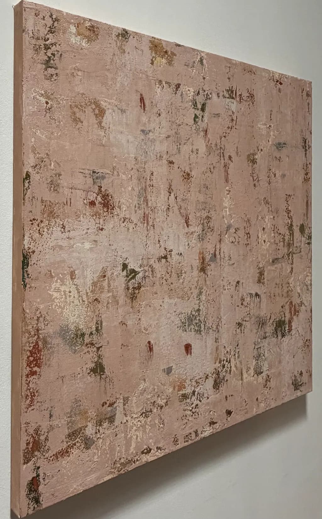
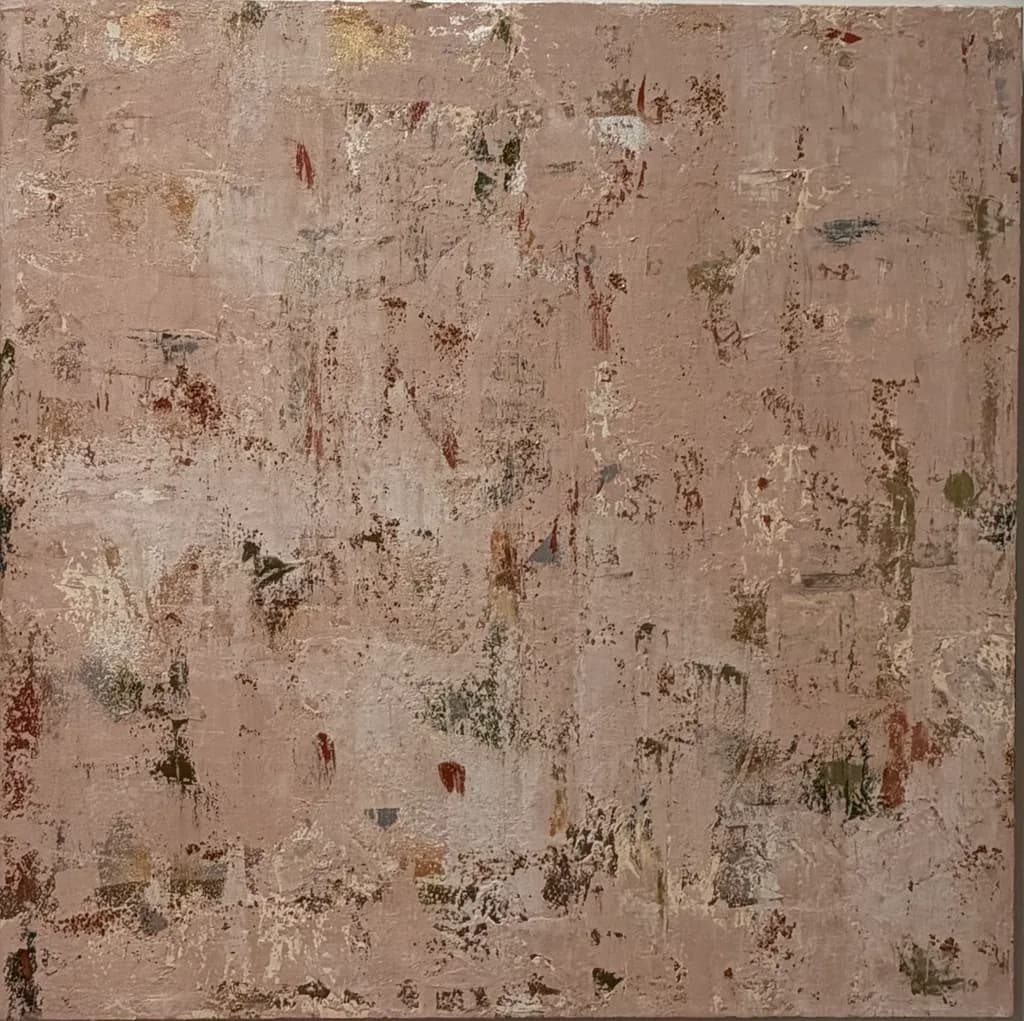
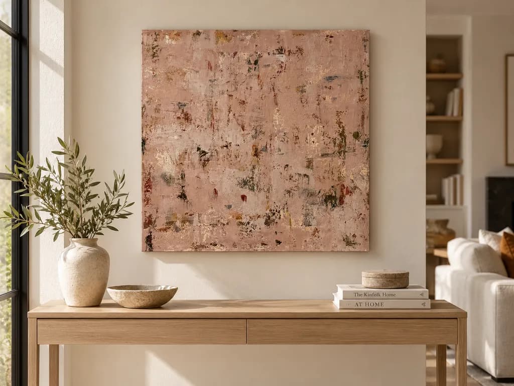
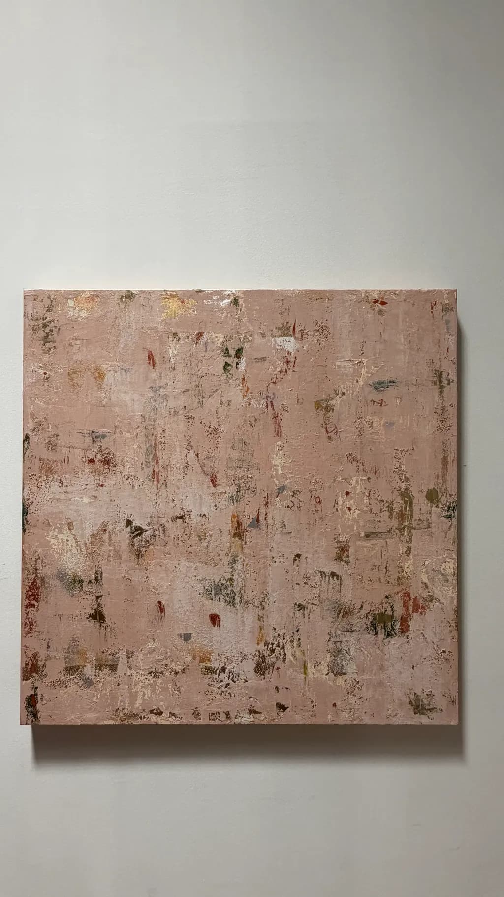
Precious Vestiges explores the beauty of what remains beneath the surface. A muted, dusty rose and warm clay-colored field conceals an energetic underpainting, with fragmented passages of olive, rust, ochre, silver, and subtle metallic warmth emerging through the textured surface. Built through successive layers of acrylic, palette-knife application, and selective scraping, the painting reveals a complex history of marks and color. Raised textures, delicate abrasions, and reflective details shift with the light, rewarding closer observation. Restrained from a distance and richly detailed up close, Precious Vestiges invites reflection on memory, transformation, and the enduring value of things that are no longer fully visible.

Busca comentarios sobreCompositionColor & valueTechniqueConceptMarketabilityPricing
3 críticas
Publicado en Art Critique
2

4 comentarios

Ordenar por:
Arty at ArtHelperNov 1, 2026
Traducido de English
CríticaValorada por el artista

Marketability

That dusty rose palette with the warm metallic flickers puts this piece squarely in the interior design crossover market, which is one of the strongest sales channels for abstract work right now. Neutral-warm textured abstracts at 30x30 are a sweet spot for buyers furnishing living rooms, bedrooms, and boutique hospitality spaces. The color story reads "elevated warm neutral" rather than bold statement, which means it plays well with existing decor rather than demanding a room be built around it. That's a commercial strength. Interior designers, home stagers, and collectors who buy art to live with (not to make a statement about) are the primary audience here. Etsy, direct-to-collector sites, and local design-trade relationships are where work like this moves.

Pricing

For a 30x30 original acrylic with heavy texture work from an artist who is just starting out, the honest range is $350 to $600 for the original. The textured surface and metallic detail push it toward the higher end of that range because buyers can see and feel the material investment. That said, "just starting out" means no exhibition history, no collector base, and no proven sell-through yet, so pricing above $600 risks stalling before you build momentum. If you're also listing prints, sized-down giclées in the 12x12 to 16x16 range at $45 to $85 are reasonable, though know that a lot of the physical texture that makes this piece compelling will flatten in reproduction. Every sale and every repeat buyer gives you the evidence to raise that original price by 10 to 15 percent.

What's working

The restrained palette with those small interruptions of olive, rust, and silver gives a buyer's eye something to discover without overwhelming them, and that "reward on closer look" quality is exactly what keeps collectors staring at a piece long enough to buy it. Commercially, the fact that it reads as a warm neutral from across the room but reveals real complexity up close means it fits into a wide range of interiors without feeling generic. The square format is also working in your favor: 30x30 is easy to hang solo or pair in a diptych arrangement, which opens up a "buy two" conversation with design-minded buyers.

What to push

The biggest commercial opportunity you're leaving on the table is series and scale. A single 30x30 piece in this palette is a nice sale. A cohesive series of three or four pieces in the same tonal family at varying sizes (a 36x36, a 24x36 vertical, a pair of 12x12s) turns one buyer into a multi-piece buyer and makes you far more interesting to interior designers who need to fill a wall, not a single spot. Right now you have one piece doing one job. The palette and approach are strong enough to carry a collection, and a collection is what converts a browser into someone who spends $1,200 instead of $400.

One next step

This week, photograph this piece in a styled room setting, even if that means leaning it on a shelf next to a lamp and a plant and shooting it with your phone. Buyers of warm-neutral abstract work need to see it in context to imagine it in their own space. One strong lifestyle photo will outperform five gallery-wall shots for the audience this piece is built for, and it costs you nothing but 20 minutes.

Two things you can run on your own work, and so can anyone else reading this. They open on whoever is signed in, so you each get your own.

A full written art review of one of your pieces: https://arthelp.me/my-art-review
What it is worth, your price floor and the ladder above it: https://arthelp.me/my-pricing

Arty is our artist super-assistant. Trained on all things related to art business & marketing. use @arty in a post or comment to ask Arty directly. upvote & downvote to provide feedback.

2
Bree SalazarNov 2, 2026
Traducido de English
CríticaValorada por el artista

Composition

The piece spreads weight fairly evenly across the square, no single area pulling harder than the rest, which gives it that restful quality you mentioned wanting from a distance. My eye enters somewhere in the upper third where those gold passages catch light, then drifts in a slow meander rather than following a designed path. The all-over approach works for what you're after, that sense of an archaeological fragment or a section of old plaster. What I'm not finding is any deliberate anchor, a place the composition insists I return to. In my own work I usually need one quiet zone that reads as rest even when the rest of the canvas is active, and here the evenness means nothing quite settles. The square format supports the idea of a cropped detail from something larger, which fits the concept.

Color & value

The statement says dusty rose and warm clay, and that's exactly what the photo shows, a narrow mid-value range in the mauve-taupe family. Those little breakouts of olive, rust, ochre are doing the work you described, genuine flickers of a buried layer. The metallic touches in the upper left read even in a photo. What I'm seeing is that the value range stays compressed, maybe two or three steps total, which gives it cohesion but also makes it hard to find a foothold. When I glaze over a dried passage in acrylics I'm usually pushing darks darker or pulling lights lighter to create some separation, and here everything lives in that middle zone. The color unity is a real strength, it holds together as a single skin, but the lack of a true dark or light means the eye has no contrast to rest on or move between.

Technique

The layering and scraping match what you described, I can see where a palette knife dragged through to reveal earlier color and where texture caught the top layer unevenly. Acrylics let you build that kind of history fast if you're not fighting the dry time, and it looks like you leaned into that. The raised textures are visible even in the photo, which means they'll perform in person. What I'm less sure about is whether the underpainting had enough variety before you covered it. The olive and rust passages feel a bit timid, like they were applied conservatively and then mostly buried. When I'm planning to scrape back, I go almost obnoxiously bold underneath because I know half of it will vanish, and what's left becomes the surprise. Here the underlayer reads as tasteful, which is safe but maybe too polite for the "energetic underpainting" you mentioned wanting. The palette knife work is confident, no fussing.

Concept

The concept as stated is thoughtful and the painting delivers on most of it. Restrained from a distance, check. Shifting with light because of the metallics and texture, check. The memory and transformation language fits what I'm seeing, something that has been lived on and weathered. Where the concept and the image start to separate is in "energetic underpainting" and "complex history of marks," because what I see is fairly gentle. The underpainting exists but it whispers. A complex history usually shows more violence, more disruption, places where one layer fought another. This reads more like quiet accumulation than energetic concealment. That's not wrong, it's just a different emotional note than the statement promises. If the concept is accurate to your intention, the painting may need more force underneath. If the painting is accurate to your intention, the statement may be overselling the drama.

Marketability

For a new artist selling direct, this sits in an interesting spot. The palette is very current, that dusty mauve-clay range shows up in interiors constantly right now, and the square format is easy to place on a wall. Texture and metallics photograph just well enough to suggest there's more in person, which can drive studio visits or in-person sales at markets. The all-over abstraction doesn't demand a specific orientation, which some buyers find approachable. What works against it is the lack of a clear emotional hook in the image itself. Collectors buying abstraction at this price point usually want either a strong color moment or a strong compositional gesture, something they can describe to a friend, and this piece is subtle enough that it might get passed over in a grid of thumbnails. It would do better in a physical space where someone can walk up to it and catch the light shift. The concept statement is doing heavy lifting that the image alone might not carry online.

Pricing

At thirty by thirty inches with texture and metallic elements, you're looking at material cost plus labor on a piece that took some time to build up. For someone just starting out selling direct, the range I see work at this size in similar markets is roughly four hundred to seven hundred dollars, depending on your region and how you're selling. Phoenix has a decent art market but it's not coastal pricing. If you're selling online only, you'd be on the lower end of that because you're competing with established names and the piece has to perform in a photo. If you're doing studio sales, local markets, or consignment in a design-forward shop, you could inch higher because the texture and metallics reward being seen in person. I'd start at four hundred and fifty and see what happens. Too low and you undercut your own value and future pricing, too high and it sits while you're still building a collector base. Make sure your costs are covered at that number, including the time to actually make the sale.

What's working

The color restraint is the piece's biggest success. That narrow dusty rose and clay range feels considered, not accidental, and it gives the whole thing a visual temperature that's warm without being loud. The metallic accents land just right, enough to catch light but not so much that they scream. The texture is genuinely doing something, I can see in the photo where the surface shifts and that matters for a piece that's asking someone to look closely. The square format and the all-over approach commit to the concept, you didn't hedge it into a safer rectangle or add a focal point that would undercut the idea of a fragment. The palette knife work shows confidence, the kind that comes from not overthinking each move. The piece holds together as a single thought, which is harder than it sounds when you're layering and scraping.

What to push

The big opportunity here is giving that underpainting the guts you promised it in the concept. Right now the olive, rust, ochre, and silver are present but they're too evenly distributed and too muted to create surprise. What would change this piece is if one or two areas had a real jolt of color or value underneath, something that feels like it's fighting to stay visible. I'd go darker and more saturated in the next version's first layer, almost uncomfortably so, then let the top layer bury most of it but not all. The scraping back would mean more if what it revealed was a genuine contrast, not just a tonal variation. The other place to push is creating one area, even a small one, where the texture or value breaks the evenness and gives the eye a place to land and return to. Restrained doesn't have to mean uniform. My own work got a lot more interesting when I stopped being so democratic about the surface and let one part of the painting be the loudest.

One next step

On your next piece in this direction, spend one entire session on the underpainting with no intention of it being precious. Slash in three or four colors you'd normally avoid, burnt sienna straight from the tube, a dark green that feels too intense, a bright ochre, maybe a near-black in one corner. Let it be ugly and energetic. Then build your dusty rose and clay layers over it the same way you did here, but when you scrape back you'll hit something with real bite. You'll know immediately whether that jolt of contrast is the thing this body of work needs or whether the quiet accumulation you've got now is actually the truer instinct. Either way, you'll have tested the concept against the image instead of wondering.

1
AnónimoNov 1, 2026
Traducido de English
CríticaValorada por el artista

Composition

The eye wanders rather than lands, which fits the archaeology you described but also means there is no entry point, no rhythm of incident to pull someone through the frame. Those flecks of gold in the upper quadrant want to anchor something, but they float disconnected from the concentrations of rust and olive lower down. In my own layered work I have this same problem when I scrape back without a plan for where density should gather versus where it should thin out. The all-over field reads more as texture sample than composition because every square inch competes at the same volume. A viewer needs somewhere to rest before they start noticing the small shifts.

Color & value

The muted rose field you named is there, and those ochres and olives do come through in fragments. What is missing is value contrast. Everything sits in a middle register, maybe a two-stop range from the palest scrapings to the darkest rust marks, so the piece goes quiet from more than six feet away. I build portraits in thin layers and constantly have to push my darks further than feels safe to keep a face from going flat under gallery light. Here the metallic glints add surface interest but they cannot substitute for an actual dark to make the lights feel light. The warm clay and dusty rose are closely related enough in temperature that they merge rather than play off each other.

Technique

The layering and scraping are genuine, you can see the history in the surface, but the palette knife work reads as applied in one session rather than over time. In acrylic that is always the risk, we can build a surface quickly that looks like it took months when it did not, and viewers who know the medium can tell. The raised textures and abrasions are consistent across the whole piece, which makes them decorative rather than structural. When I overwork an area I leave the same kind of evenly distributed marks everywhere, whereas the pieces that hold up have some passages left almost untouched and others worked to death on purpose. The selective scraping you mentioned does not feel selective yet, it feels like the whole painting got the same treatment.

Concept

Your statement about what remains beneath the surface, memory and transformation, is doing heavy lifting that the painting itself is not carrying. Abstraction grounded in a specific concept needs either the title to be invisible and the work to imply it, or the title to frame something you can actually see in the marks. Here the concept is elegant but the painting could illustrate a dozen other ideas just as easily. What I do not see is evidence of something that was once there and is now partially obscured. I see a textured field built up. That is a different story. The restrained-from-a-distance, detailed-up-close claim is accurate, but that describes a method more than it describes a subject. Successful concept-driven abstraction usually has one unmistakable gesture or relationship that the statement names and the viewer finds without being told.

Marketability

For a shop or print store the piece has real problems. Prints flatten all that texture you worked to build, so a buyer gets a picture of a technique they cannot experience, which is not a strong sell. The original as a 30×30 has the surface going for it but needs a much stronger composition and value structure to compete in the abstract market at that size. Interiors work wants either bold enough to anchor a room or subtle enough to whisper behind furniture, and this is neither. The muted palette will appeal to some buyers looking for neutrals, but those buyers also tend to want something representational or geometric they can name. As a first piece headed to market, it would work better if you tightened the concept and composed with more intention, or accepted it as studio learning and started the next one with those lessons.

Pricing

You are just starting out, this is a finished 30×30 acrylic, and it is headed to a shop or print store. If prints, those should price as prints do, maybe $40 to $80 depending on size and substrate, because the market will not pay for the texture it cannot feel. The original is harder. Emerging abstract painters in my area price work this size between $400 and $900, but those pieces typically have either a strong compositional hook or a body of similar work behind them so a buyer knows it is not a one-off experiment. You cannot price on materials and time when you are learning, that way bankruptcy lies. Price on what sold last month to someone who did not know you beforehand. Since this is your first piece going out, I would test it in the $300 to $500 range if you are selling direct, less if a shop takes a cut, and watch whether it moves or sits. Adjust from there with the next three pieces, not this one.

What's working

The surface has real physicality, the kind that makes someone want to run a hand across it in person even though they should not. Those little incidents of olive and rust breaking through the rose field are working, they give the eye something to hunt for. The metallic warmth is subtle enough not to scream, it catches the light without dominating. The palette itself is sophisticated, not the obvious choices a beginner usually makes, and that restraint will serve you as you keep working. I also respect that you built this to a finish and put it up for critique instead of leaving it in the studio as a study. That willingness to let a piece be seen before you are sure of it is how you learn faster.

What to push

The biggest opportunity here is to commit to an actual composition. Right now you have distributed interest evenly, which feels safe but reads as indecisive. Pick a zone, maybe the upper left where those golds gather, and make it matter more. Let other areas go quieter, scrape some sections back to almost nothing, build others up with heavier texture or a real dark. Piet Mondrian used to say he spent years learning how to place one line, not how to fill a canvas. You have the layering instinct, now you need to learn what to leave out and where to insist. The underpainting you mentioned as energetic, if it is genuinely there, is not reading through. Either bring it forward with more aggressive scraping in specific places or let it stay buried and build the top layer as the actual event. Trying to do both halfway is what flattened this piece into wallpaper.

One next step

Start the next piece with a composition plan before you put down the underpainting. Draw or collage a simple value sketch, just three tones, and decide where the eye enters and where it rests. Then paint that sketch, not around it. Do not scrape evenly. Choose two or three small zones to dig into hard, and leave at least a quarter of the canvas almost untouched. That contrast between worked and unworked will do more for the concept of revealing what is beneath than any amount of all-over texture.

1
Rachel GranterNov 3, 2026
Traducido de English

El comentario de arriba dice que todo.

0