Solicitud de críticaVentana de crítica cerradaCritiques earn 20X points
Lagartija en el árbol
Traducido de English
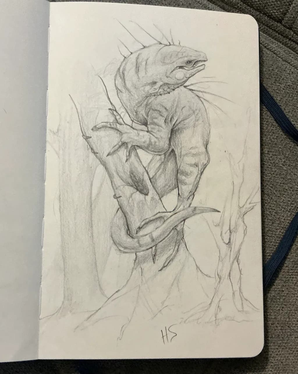
Graphite on paperObra en proceso
Lo que buscaba
I just scribbled and then there was a lizard, I drew it with 4B a while ago, on 8x5 piece of paper, whilst watching princess bride, it’s definitely not finished, I know it’s kinda mid tone grey but I liked how it looked
Busca comentarios sobreConceptComposition
2 críticas
Publicado en Art Critique
2
Composition
The iguana climbs up and left, which puts energy into the upper third and leaves the bottom half mostly as suggestion. That's a choice, intentional or not, and it's working because the eye follows the body upward and doesn't need an anchor below. The branches are indicated with just enough line to give context without competing. Where this gets interesting is the value massing on the left side, that vertical sweep of tone that could be a tree trunk or could be shadow. It grounds the lizard spatially even though it's barely there. I'd look at where the edges of the page cut the form, though. The tail runs off the bottom, the head is near the top edge, and both feel like the drawing wanted more room than the sketchbook gave it. Not wrong, just something to notice for the next one.
Concept
You said you scribbled and then there was a lizard, and I believe you. That's not a criticism, that's how a lot of my best sketchbook pages happen. The creature has presence because you let the marks lead rather than forcing a plan onto them. What you're calling "mid tone grey" is actually doing something smart: it sits the lizard in atmosphere rather than floating it in white space. The spines along the back, the way the head tilts, the clawed grip on that branch, they all read as observed even if you invented them. Watching Princess Bride while drawing is a move I respect. The best practice pieces come out sideways like this, when your conscious brain is busy elsewhere and your hand just works.
What's working
The construction of the body holds up. You've got the ribcage as a distinct mass, the pelvis tilted correctly for the climbing pose, and the limbs foreshortened in a way that suggests you were actually seeing this angle in your head rather than guessing at it. That back left leg especially, the way it tucks under and the foot grips, I redrew a similar pose six times last month and still got the toes wrong. The texture strokes across the torso give it dimension without overworking it. You also left the construction lines visible, which I always think is the right call in a sketchbook, it shows the thinking and keeps it from looking labored over.
What to push
The biggest opportunity here is in the value structure, because you've already got the beginning of it and it wants to go further. Right now the darkest darks are in the eye and a few accent lines, but the form would snap into focus if you pushed a real shadow side. Pick a light direction, probably from upper right given where your instincts put the tone already, and let the left side of the body and the underside of the limbs go another two or three steps darker. The 4B can get you there. I fight this same thing in my own studies, stopping at the first pass of tone because it looks "atmospheric" when what it actually needs is commitment to the light. You don't have to finish every branch or render every scale, but giving the creature a clear light and shadow pattern would make it feel like it's occupying real space instead of floating in charming ambiguity.
One next step
Go back into this piece or start a new lizard, same pose if you want, and before you do anything else, mark where the light is coming from with an arrow in the margin. Then put down your darkest value in one spot, the deepest shadow you can get with that 4B, and use that as your anchor. Everything else gets compared to it. You'll know when the midtones are actually midtones instead of just pale grey, because they'll sit between your white paper and that committed dark. It's a small mechanical thing but it unlocked value control for me after two years of making everything look like fog.