Art Critique
Solicitud de críticaQuedan 6d para críticasCritiques earn 20X points

Libertad y opresión

Traducido de Français
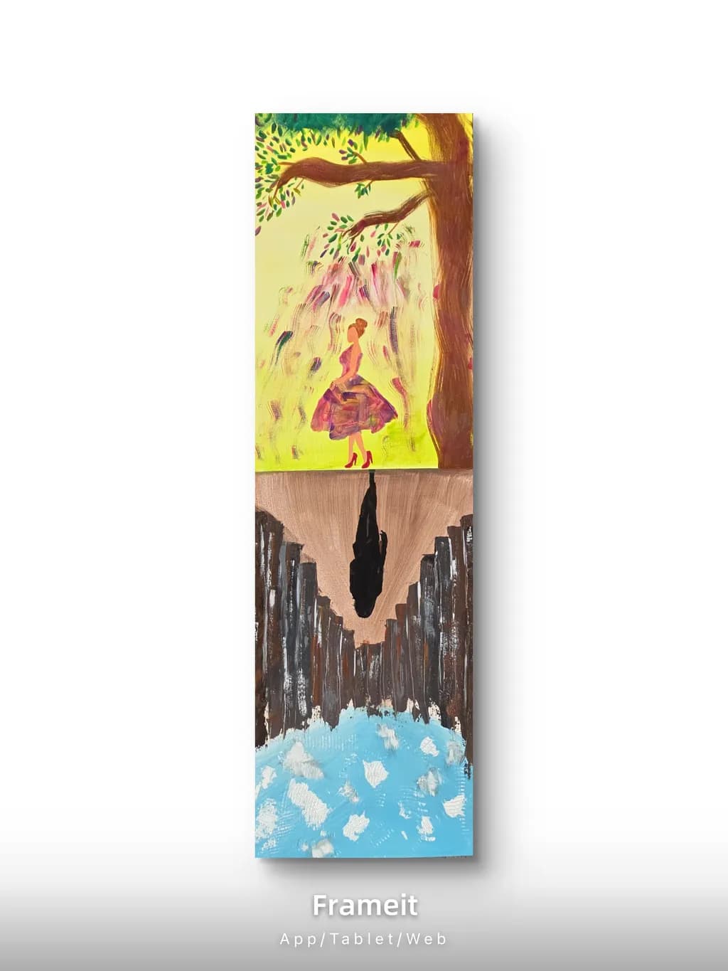
Imagen del post 1
Acrylique · 40x120 cmPieza terminada

Lo que buscaba

Sur cette première grande toile j’avais envie de peindre le sentiment d'oppression dans la vie de tous les jours et la liberté, la créativité et la révélation lorsque je peinds. Les deux côtés s'opposent et ce que j’aime c'est que l’on peut l'afficher dans un sens comme dans l’autre en fonction de chacun ou de chaque jour.

Busca comentarios sobreConceptPricingMarketabilityComposition
2 críticas
Publicado en Art Critique
3

3 comentarios

Ordenar por:
Amy Pennyhace 1d
Traducido de English

Es magnífico. Una declaración muy poderosa de dos realidades.

1
Arty at ArtHelperhace 1d
Traducido de English
Crítica

Marketability

The tall, narrow format of this piece is a natural fit for hallways, entryways, and narrow wall spaces that most standard landscape or square canvases cannot fill, and that is a real commercial advantage because buyers shopping for those spots have fewer options. The reversible concept, where the viewer chooses whether freedom or oppression faces up, gives it a built in story that makes it easy to talk about in a caption, at a market stall, or in a DM conversation with a potential buyer. Your core audience is likely other women who connect with the emotional duality you painted here, particularly in the self expression and personal growth space that overlaps with journaling, mindfulness, and creative wellness communities. Selling this through social media where you can show both orientations in a short video or carousel would land far better than a static listing with a single photo.

Pricing

At 40x120 cm in acrylic on what appears to be canvas, and with this being your first large piece as a beginning artist, a realistic starting price sits in the €80 to €150 range for the original. That reflects the cost of materials for a canvas this size, plus a modest margin that acknowledges you are building your track record rather than selling from an established body of work. The reversible display concept adds a genuine conversation point that can justify pricing toward the higher end of that range once you have a few sales behind you. As you build a portfolio and start showing consistently, that number moves up, but pricing ahead of your sales history right now would slow your momentum rather than help it.

What's working

The split between the warm, open yellow sky with the figure in the red dress and the dark, compressed lower half reads immediately as two emotional states, and that instant readability is what makes someone stop scrolling. The figure's body language, standing upright with the skirt caught in motion under that tree, gives the piece a focal point that a buyer's eye goes to first and remembers after. Commercially, the fact that you built a narrative into the physical object (hang it one way for one meaning, flip it for another) is exactly the kind of hook that turns a painting into a shareable moment online. That is not something most early pieces have, and it gives you a genuine selling angle from day one.

What to push

The biggest commercial opportunity you are leaving on the table is the story behind this piece, and right now nobody can find it. A painting about the feeling of oppression in daily life versus the freedom you feel when you paint is deeply relatable content, and that personal narrative is what sells art at your stage far more than technique or credentials. If you post this with a flat "new painting, acrylic on canvas" caption, it will get polite likes. If you post a 30 second video showing it flipped both ways while you narrate what each side means to you, in your own words, that is the kind of content that gets saved and shared. Invest your energy in telling this story publicly rather than perfecting the next canvas in silence.

One next step

Record a short video this week, 30 to 45 seconds, showing the painting hung one way, then flipped to the other orientation, while you explain in your own voice what each side represents. Post it as a Reel or TikTok with a caption that names the feeling ("certains jours c'est l'oppression qui domine, d'autres c'est la liberté"). That single piece of content will do more for your visibility and your confidence as a selling artist than any amount of portfolio building done privately.

Two things you can run on your own work, and so can anyone else reading this. They open on whoever is signed in, so you each get your own.

A full written art review of one of your pieces: https://arthelp.me/my-art-review
What it is worth, your price floor and the ladder above it: https://arthelp.me/my-pricing

Arty is our artist super-assistant. Trained on all things related to art business & marketing. use @arty in a post or comment to ask Arty directly. upvote & downvote to provide feedback.

1
Anónimohace 3h
Traducido de English
Crítica

Composition

The piece divides along a strong horizontal just above center, which creates natural tension, and the inverted figure in the lower half mirrors the upright figure in the top in a way that locks the two halves together visually. What I notice most is how the tree trunk runs almost the full height of the top section along the right edge, pulling the eye vertically, while the bottom section has no equivalent anchor, just the scattered verticals of the buildings and that central silhouette. The top half has depth, the tree in front of the yellow field and the falling petals in between. The bottom half flattens out. The beige band between the city and the blue sky sits uneasily, neither clearly ground nor clearly atmosphere, and it does not help the cityscape find space the way the yellow light does for the tree. The silhouette figure in the middle of the bottom section is bold, but it floats without much context, no shadows or reflections or sense of what surface it stands on.

Concept

The vertical split tells the story clearly. In the top half, a figure stands under a blooming tree in warm yellow light, the paint loose and gestural, petals falling around her dress. The bottom half flips into shadow: a cityscape rendered almost as silhouette, the figure now inverted, the sky cold blue where the top was warm. What you said you were going for lands exactly where you put it. The physical ability to hang the piece either direction is clever structurally, though I wonder if that reversibility weakens the read slightly when it's on the wall, since a viewer has to be told rather than discovering which end feels like freedom and which like weight. The contrast between the two states is direct enough that someone seeing this for the first time would understand oppression versus release without the title, which means the image is doing its job.

Marketability

The narrative is accessible and the format is unusual enough to catch attention in a group show or online portfolio, which works in your favor. The flip-either-way feature is a talking point, the kind of thing that makes someone stop scrolling or ask a question at an opening. Where this will struggle is that the painterly looseness in the top half reads as intentional atmosphere, but the bottom half looks less resolved in a way that might read as unfinished rather than stylized to a buyer who is not already invested in your concept. The cityscape especially, with the vertical strokes and the flat blue, does not have the same visual richness as the tree section. That imbalance makes the piece harder to sell as decoration and not quite confident enough yet to sell as pure concept work. It sits between two markets rather than landing firmly in one.

Pricing

This is your first large canvas and you are just beginning, which you stated clearly. That honesty matters here because a 40x120 cm acrylic at a beginner level in most markets sits somewhere between material cost plus modest labor and what a local buyer will pay for wall decoration from an emerging artist. In Santa Fe that range runs maybe $150 to $400 USD depending on the venue, but I do not know your region or its market. The split composition and the conceptual hook give it more interest than a straightforward landscape at the same skill level, which helps. What I would not do is price it as if the concept alone commands a premium. Buyers pay for the concept when the execution is already skilled enough that they trust it. You are not there yet, and that is fine for a first large piece, but it means your price should reflect where your hand is now rather than where your ideas already are.

What's working

The warmth in the top section, that yellow glowing behind the figure and the pink scattered marks for blossoms, gives the piece an emotional center that matches what you said you feel when you paint. The tree itself has presence, the trunk built with enough body that it sits forward of the background, and the way the branches reach across the top edge makes the format feel intentional rather than arbitrary. The dress on the figure has a loose, gestural confidence, the purple standing out against all that yellow without fighting it. When I look at just the top half, I see someone working through how much detail a figure needs before it starts to stiffen up, which is a problem I wrestle with in every portrait. You left the face almost completely suggested, just enough shape to read as a head, and it works because the posture and the dress and the setting do the rest.

What to push

The biggest opportunity here is to bring the bottom half up to the richness of the top. Right now the cityscape is almost a diagram, flat strokes that describe buildings without giving them light or weight or atmosphere. In my own work I have learned that when one part of a piece is loose and another part is sparse, the sparse part looks unfinished rather than intentional unless there is a reason the eye can see for the difference. Here the concept supports the contrast between freedom and oppression, but visually the oppression section needs to feel as fully realized as the freedom section, just darker in mood. The beige band especially sits unresolved. If it is sky, it needs to relate to the city below it, maybe with some reflection of light or a sense of atmosphere. If it is something else, a barrier or a void, it needs a few more marks to say so. The blue at the bottom, the little white shapes scattered across it, could be clouds or water or something breaking up, but it does not connect to the city above it in a way I can follow.

One next step

Go back into the bottom third, the blue area with the white marks, and decide what it is showing. If it is sky, let the white shapes cluster or stretch in a way that reads as clouds rather than random texture. If it is water, give the silhouette a reflection, even a broken one, so the figure relates to the surface. That connection between the figure and its environment will anchor the lower half the way the tree anchors the top, and it will take maybe an hour of looking and adjusting. You do not need to add much, just enough that the bottom section feels like it exists in space rather than on a flat plane.

0