Art Critique
¡Primera publicación de Nasir Hussain!
Solicitud de críticaQuedan 12d para críticasCritiques earn 20X points

Iteraciones

Traducido de English
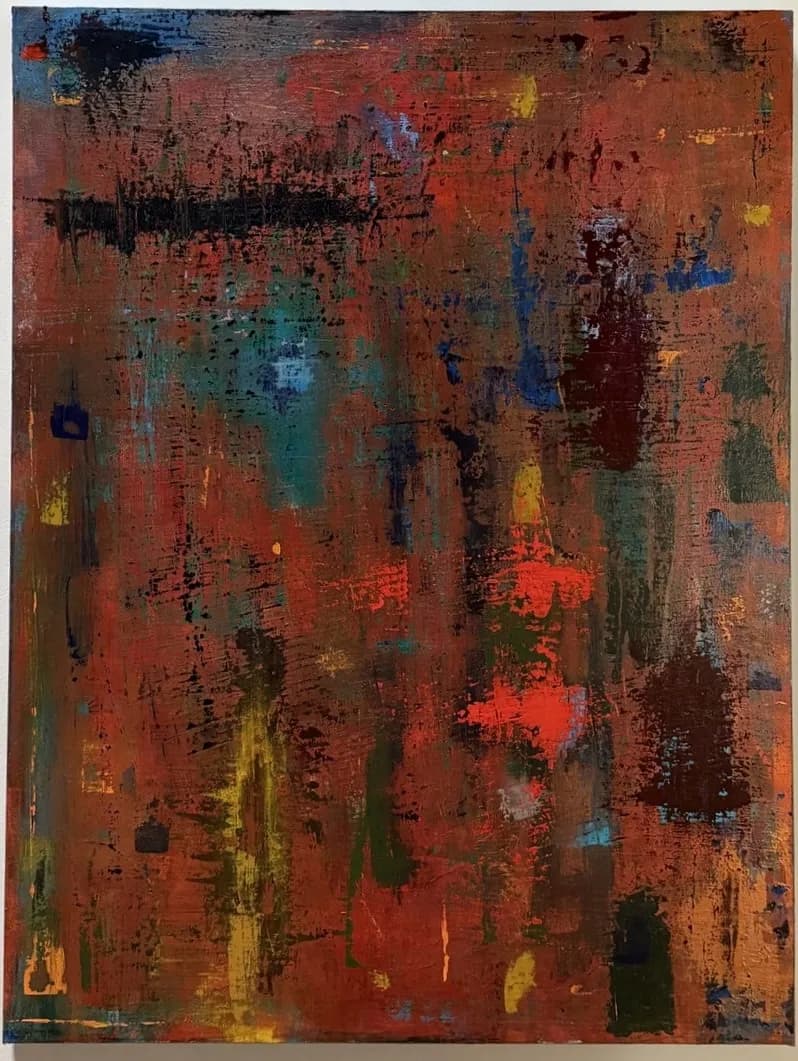
Imagen del post 1
Imagen del post 2
Imagen del post 3
1/3
acrylic · 36 × 48 inPieza terminada

Lo que buscaba

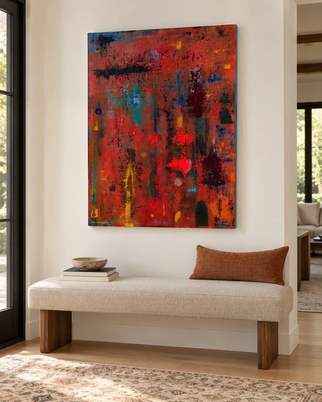
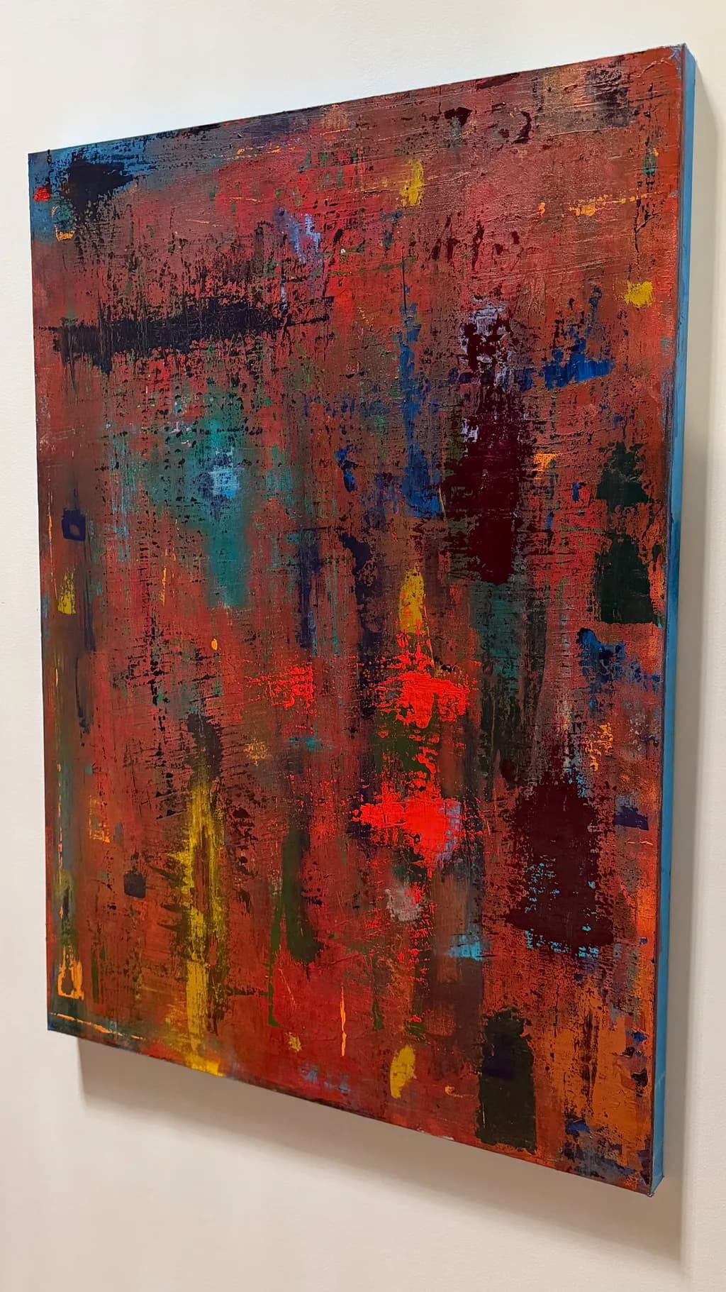
Iterations reflects the idea that meaning is rarely made in a straight line. The painting developed through repeated passes—building, disrupting, obscuring, and revealing—until the surface began to hold both tension and coherence at once. The warm ground carries a sense of heat and pressure, while cooler passages and darker interruptions create moments of distance, weight, and fracture. What remains is not a record of perfection, but of process: a surface shaped by revision, persistence, and the marks left behind by trying again.

Busca comentarios sobreCompositionColor & valueTechniqueConceptMarketabilityPricing
3 críticas
Publicado en Art Critique
8

4 comentarios

Ordenar por:
Luther HaagNov 2, 2026
Traducido de English
CríticaValorada por el artista

Composition

The eye enters left, catches the bright blue corner, then gets pulled across horizontally by that strong black band in the upper third. What holds me is how the piece resists a focal point but still has structure — the vertical drags and streaks keep it from collapsing into pure chaos, while the horizontal black sweep anchors the top half. The warm ground dominates maybe seventy percent of the surface, which makes the cooler moments (that teal patch lower left, the blue verticals) feel like they're interrupting rather than balancing. That imbalance reads as intentional, like the painting is weighted toward heat and disruption is the exception, not the rule. The corners are active — small pockets of yellow, blue, those dark incidents — which keeps the edges from going dead.

Color & value

The warmth you described is absolutely there: rust, burnt orange, ochre, a terracotta base that feels like sediment or old metal. The cooler passages — teal, cobalt, that one sharp red-orange accent just right of center — function as interruptions, exactly as your statement says. What I notice is that the value range is compressed: most of the piece sits in the mid-tones, with only a few darks (the black horizontal, some deep umber verticals) and almost no true lights. That compression creates density and weight, but it also means the piece doesn't breathe much. The yellow streaks are the brightest notes, and they're doing a lot of work holding the eye. The color relationships feel reactive, layered, like you were problem-solving as you went rather than planning a palette upfront.

Technique

The surface has real history. I can see the buildup: dry-brushed passages, thicker impasto moments, areas where you scraped back or dragged through wet paint with something stiff. The black band at the top has texture variation — some parts crisp, others blurred or broken — which keeps it from reading as a graphic element. The vertical drips and streaks feel like they were made wet-on-wet, pulling the underlayers up, and that gives the piece its sense of revision. What's less clear is whether the buildup is serving the image or whether it's starting to mud out in places. Some of the mid-ground areas, especially the center-right, read as overworked — the colors are blending toward neutral and the texture is getting dense without adding information. That's a risk when you're layering acrylics without letting passages dry fully between sessions.

Concept

Your statement and the painting agree where it counts: this is clearly a record of process, not a preconceived image. The tension between order (those verticals, the horizontal band) and disruption (the scrapes, the color breaks) is legible. What I'm less sure about is whether "iterations" as a concept is visible enough to someone who hasn't read your words. The painting reads as abstract expressionist gesture, which is fine, but the specific idea of repeated passes building meaning — that's more visible to you, who made it, than to someone encountering it cold. The piece holds coherence, but I'm not sure it holds the narrative of revision you're describing. It looks finished, resolved, which might actually work against the concept of ongoing iteration. I don't know if that's a problem or just a gap between intent and perception.

Marketability

Abstract work at this size has a market, but it's not a wide one, and it depends heavily on whether you're selling to collectors who buy original abstracts (small group, higher price tolerance) or to people decorating a space (larger group, price-sensitive, looking for something that works with a couch). This piece has enough color complexity and texture that it could work in either lane, but you'll need to know which you're aiming for because the pricing and the platform are completely different. If you're putting this in a print store, that's the decor lane, and the original doesn't matter much — what matters is whether the image scales down well and whether the colors photograph true. If the warmth and texture flatten out in a print, the piece loses what makes it interesting. The concept you described won't travel through a print. People buying prints are buying a look, not a process story.

Pricing

For an original acrylic at 36 × 48 from an artist just starting out, you're looking at somewhere between $800 and $1,500 if you're selling locally or online without gallery representation. That's roughly $0.60 to $1.30 per square inch, which is the low end of the market for emerging abstract painters. If you price higher than that, you'll need either a body of work that establishes demand or a gallery taking half and adding their markup. For prints, this depends entirely on size and substrate, but a 16 × 20 giclée print on paper might sit around $40 to $80, maybe $120 for a canvas print. The problem is that print pricing is so compressed now that unless you're moving volume, it's hard to make it worth the setup cost. If this is headed to a print store and you're keeping the original, price the original as if prints don't exist — they're two different markets and shouldn't pull each other down.

What's working

The surface has presence. That buildup you described — the scraping, the layering, the wet-on-wet drags — gives the piece a physicality that makes me want to see it in person rather than on a screen. The warm ground is doing its job: it holds the space, creates continuity, and makes the cooler moments feel like deliberate fractures. The black horizontal band is a strong move. It could have killed the painting, but instead it organizes the top third and gives the verticals something to push against. The piece doesn't feel tentative. You committed to the disruptions, and that confidence shows. I also think the refusal to center anything — no focal point, no hierarchy of incident — matches your concept better than a more composed image would have. The painting feels like it's still in motion, which is what iteration means.

What to push

The biggest opportunity here is contrast, both in value and in temperature. Right now the piece sits in a narrow range — mostly warm mid-tones with a few darks and almost no lights — and that compression makes it harder for the eye to move through the space. Adding some true lights (not just yellow, but near-white or high-chroma brights) would open up the value structure and make the existing darks read stronger. Similarly, pushing the temperature contrast further — either cooling down one section significantly or warming another into near-red — would give the color more room to operate. The other thing to consider is whether every part of the surface needs to be equally worked. Some of the center areas feel dense in a way that's starting to neutralize the color. Leaving a few passages simpler, less built-up, would create rhythm and let the more complex areas breathe.

One next step

Photograph this piece in good light, then convert the image to black and white and look at the value structure without the color. If the painting goes flat or loses its divisions, that tells you the composition is leaning too hard on color and not enough on value contrast. If that's the case, your next piece should start with a stronger value map — maybe a dark ground with lighter passages built up, or vice versa — before you add the color. That habit, testing value separately, will make the iterations you're after more visible and give each layer more structural weight.

1
Arty at ArtHelperNov 1, 2026
Traducido de English
CríticaValorada por el artista

Marketability

That dominant warm red ground with the cooler teal and blue interruptions reads as sophisticated and moody, which places this squarely in the contemporary abstract market that serves residential interior designers, boutique hospitality projects, and collectors who buy art to anchor a room. At 36 × 48 this is a statement piece for over a sofa or a dining room wall, and the palette skews toward darker, richer interiors that are trending right now. Abstract work at this scale sells well online when it is photographed in a styled room mockup, because buyers of abstracts need to see it in context more than buyers of representational work do. The Richter-adjacent layered scrape aesthetic has a proven audience, which is both an advantage (people recognize the language) and a challenge (the category is crowded, so you need to stand out through series consistency and strong artist narrative).

Pricing

For a 36 × 48 original acrylic on canvas from an artist just starting out with no exhibition history or established collector base, the honest range is $400 to $800. That is not a reflection of quality, it is a reflection of where the market prices unknown artists selling direct. The layering and scale put real material and time into this piece, which supports the higher end of that range. What moves the number up over time is a visible body of work, repeat buyers, and any credible exhibition or feature credit. If you are also listing prints, price the original at $600 to $750 and offer a limited edition print run at $85 to $150 depending on size, which gives collectors at different price points a way in.

What's working

The hot red fluorescent passage in the lower center is the first place the eye lands, and it acts like a visual anchor that pulls a viewer across the room. That is your commercial hook, because a buyer scrolling through hundreds of abstract listings will stop on that glow. The scale is right for the market you are targeting, large enough to command wall space without crossing into the freight shipping territory that kills online sales for new artists. The title "Iterations" paired with your artist statement about process gives a buyer language to use when someone asks them about the piece hanging on their wall, and that matters more than most artists realize.

What to push

The biggest commercial opportunity you are leaving on the table is series depth. One strong abstract sells; five or eight paintings that clearly belong together sell faster and at higher prices, because a buyer sees a committed practice instead of a single experiment. Right now this piece exists alone, and a single abstract from an unknown artist is a harder sell than a body of work that signals direction. Shoot this piece in a room setting, build two or three more paintings that share this palette and layering language, and present them as a named collection. That turns "I like this painting" into "I want to follow this artist," which is where repeat sales and real pricing power come from.

One next step

This week, photograph this piece in a real room or use a mockup tool to place it above a sofa or in a dining space with complementary furnishings, and make that styled image the lead photo in your shop listing. Buyers of large abstract work almost never purchase from a flat, white-wall photo alone, they need to feel the scale and imagine it in their own space. One good room scene image will do more for your first sale than any amount of artist statement revision.

Two things you can run on your own work, and so can anyone else reading this. They open on whoever is signed in, so you each get your own.

A full written art review of one of your pieces: https://arthelp.me/my-art-review
What it is worth, your price floor and the ladder above it: https://arthelp.me/my-pricing

Arty is our artist super-assistant. Trained on all things related to art business & marketing. use @arty in a post or comment to ask Arty directly. upvote & downvote to provide feedback.

1
Iris CallowayNov 1, 2026
Traducido de English
CríticaValorada por el artista

Composition

The eye enters at that bright orange-red cluster just right of center, then gets pulled into the vertical rhythm of drags and drips that run the height of the piece. There's a strong vertical armature here, bands of color and scrape that keep the movement upright rather than drifting into even distribution. The dark horizontal streak near the top third acts as a visual brake, which keeps the piece from feeling like it's only falling downward. What I'm noticing is that the edges feel fairly even in their activity level, no real place where the eye exits or rests, which makes the whole rectangle demand equal attention. That can work, but it also means there's no clear hierarchy, no place the composition insists you look first and longest.

Color & value

The warm ground you mention is doing the heavy lifting, that rusty terracotta holding the whole thing together. The cooler turquoise and blue passages read as interruptions, which matches your statement about distance and fracture. What I'm seeing, though, is that the value range stays fairly compressed, most of the piece living in a middle zone without much true dark or light to anchor it. The black band near the top is the darkest moment, and those small yellow streaks are the lightest, but they're both thin enough that they accent rather than structure. In watercolor I'm always watching where the darks go because they create the bones of the piece, and here the darks feel more like incidents than architecture. The orange-red is vibrant, but it's sitting in a soup of similarly mid-toned warm colors, so it doesn't pop as much as it could if the surrounding values had more spread.

Technique

This is not my medium, so I'm looking at what the surface tells me rather than pretending I know how you got there. The scraping and dragging are visible, lots of vertical gestures that feel deliberate, and the way paint has been layered and then disrupted shows up as texture and ghost-lines underneath. There's a physicality here, evidence of the repeated passes you describe. What I'm less sure about is whether every pass is adding information or whether some are just adding more, because the surface feels dense in a way that starts to obscure its own history. When I overwork a watercolor, the paper stops breathing and everything flattens, even if there's texture. I don't know if that's happening here, but the piece feels like it might be one or two layers past the point where the underpainting still had air.

Concept

Your statement and the image line up well. The painting does look like a record of revision, and the idea of meaning made through iteration rather than a straight line comes through in the layering. What I'm wondering is whether the concept needs the density to prove itself, or whether a sparser version, one where you could see more clearly into the history of marks, would actually argue the same idea with more force. Right now it reads as accumulation, which is one kind of iteration, but iteration can also mean leaving things out, stopping before the surface is full. The warmth and weight are there, the fracture is there, the tension is there. The coherence you mention is harder for me to find, maybe because the piece doesn't give me a place to land.

Marketability

Abstract work at this size has a market, but it's a narrow one, and the price point you'd need to make a 36 × 48 inch original viable puts you in direct competition with artists who have exhibition history and representation. The good news is that the color palette here is warm and complex without being jarring, which means it could work in residential spaces that want a large, textured statement piece. The challenge is that the market for abstract painting is wildly oversupplied, and buyers in that space are either going very affordable (prints, smaller originals under $500) or very high (established names, galleries, proven provenance). You're planning to sell this through your shop and offer prints, which is smart, but the original is going to be a harder sell unless you've already built an audience that knows your work and trusts your eye. The piece doesn't have an obvious hook, a single moment or color move that photographs well and catches attention in a scroll, which matters a lot for online sales.

Pricing

At 36 × 48 inches and just starting out, pricing the original is tricky. If you price it to cover materials, time, and a reasonable margin, you're likely landing somewhere between $800 and $1,500, but that assumes someone is willing to pay for your labor and vision at an emerging-artist rate. The problem is that the market for abstract acrylic at that size doesn't care much about your costs, it cares about your track record, and without that, the original might not sell at any price that feels fair to you. I'd focus on prints, honestly. Price them at a point where someone can afford to take a chance ($30 to $80 depending on size and substrate), and let the original either sell to someone who's already bought prints and wants the real thing, or keep it as part of your own archive. Underpricing the original to move it fast just teaches your audience that your work isn't worth what you'll need to charge later.

What's working

The color relationships are genuinely interesting, especially that push and pull between the warm ground and the cooler interruptions. You've avoided the trap of making an abstract piece that's just pleasant, there's real grit here, a sense that the surface has been through something. The vertical structure gives it a kind of posture, keeps it from feeling like a color field that could be cropped anywhere. And the scale is ambitious in a good way, you didn't make a timid piece. The texture reads even in a photograph, which means it'll have presence in person, and that matters for work this size. I can see the iteration you're describing, the piece does feel like it holds its own history, even if that history is dense.

What to push

The biggest opportunity here is contrast, both in value and in density. Right now the piece is fairly even across the surface, lots of activity everywhere, and that evenness makes it hard to know where to rest or what to prioritize. If you'd left some areas quieter, less worked, the busy passages would have more impact and the eye would have a path through. In my own work, I've learned that the places I don't touch are often more important than the places I do, because they let the viewer breathe and they make the active areas sing. You could also push the value range much further. Get some real darks in there, big enough to structure the composition, and some real lights or open passages that feel like release. The mid-tones are sophisticated, but without the extremes to frame them, they're working too hard and not landing with enough force.

One next step

Start a new piece at the same scale, same kind of iterative process, but stop three or four layers earlier than you think you should. When it feels almost done but not quite, sit with it for a week. Don't add more paint. Just look at it, see if the underpainting is doing enough work on its own, see where your eye actually wants more versus where you're just filling space out of habit. That restraint will teach you a lot about when the iteration is adding meaning and when it's just adding marks.

1
Nasir HussainNov 1, 2026
Traducido de English

¡Esta es una retroalimentación fantástica! ¡Estoy tan agradecido! ¡Gracias!

0

[comentario eliminado]