Art Critique
Solicitud de críticaVentana de crítica cerradaCritiques earn 20X points

Hora de la corona

Traducido de English
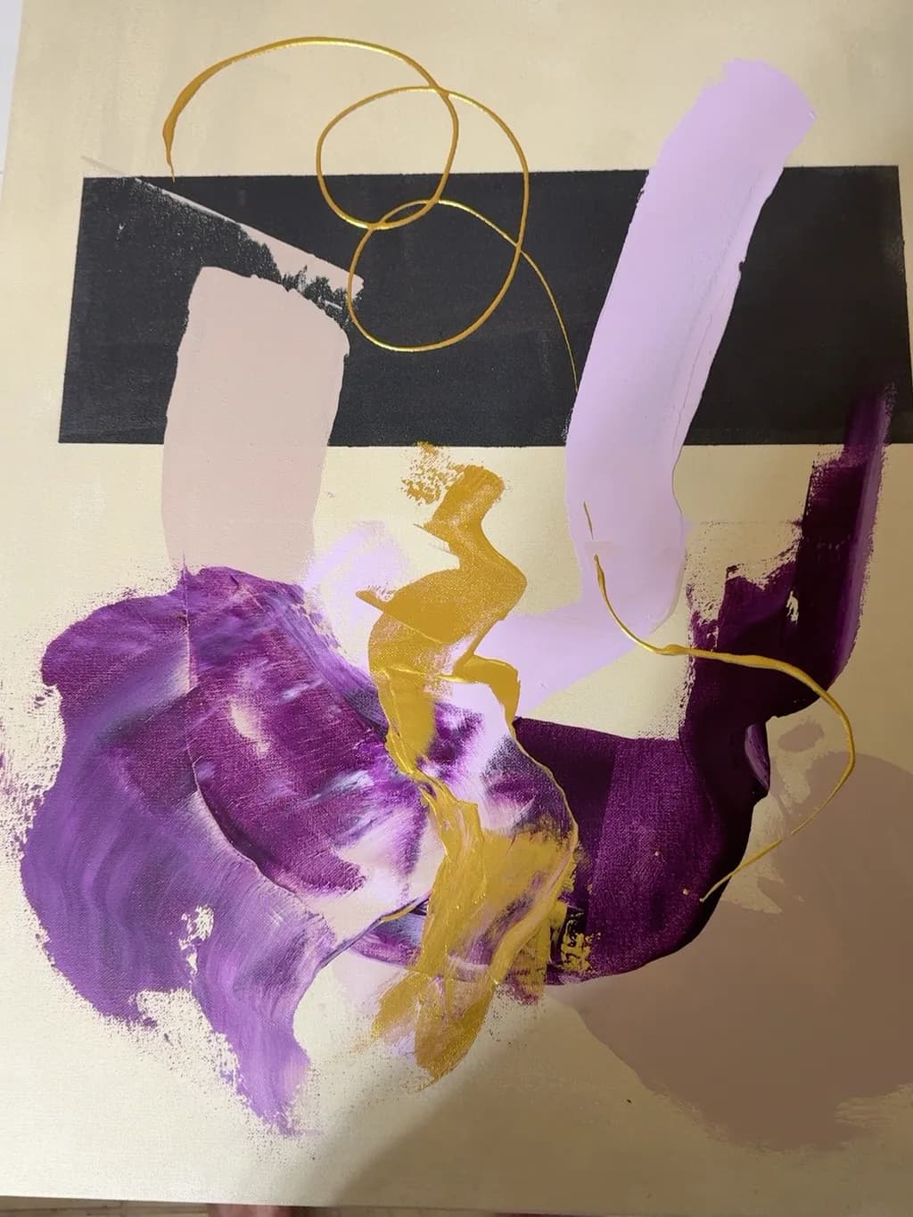
Imagen del post 1
Acrylics · 22 x 28Pieza terminada

Lo que buscaba

“Crown Hour” brings plum, lavender, and soft mauve together against parchment and charcoal. Bold gold sweeps add warmth, while delicate loops form a playful crown above. I followed my instincts, letting each layer and curling line help shape its personality.

Busca comentarios sobreComposition
3 críticas
Publicado en Art Critique
2

4 comentarios

Ordenar por:
Daniel CeglinskiOct 21, 2026
Traducido de English

Los elementos verticales que se elevan desde la base para sostener el pesado rectángulo negro reciben un impulso adicional, mientras la bobina intenta empujarlo hacia abajo. Energías exuberantes en juego.

1
AnónimoOct 21, 2026
Traducido de English
Crítica

Composition

The eye enters through that black wedge at the top, then slides down the gold snake through the purple mass and out the bottom, and the gold loops circling back give it somewhere to return. That playful crown you describe actually anchors the whole thing, three overlapping circles that occupy negative space the rest of the painting leaves empty, so the top third has air to breathe. The vertical format suits the downward energy. What interests me is how the black shape and the tall lavender stroke on the right create a kind of frame, edges that contain all that loose gestural stuff in the middle without boxing it in. The parchment ground doing real work here, coming through in the lower left and around the edges so the color masses feel like they're floating on something rather than filling a rectangle. I fuss over compositional balance in my own landscapes until I kill them, and this has an offhand rightness that came from working fast.

What's working

The purple range, plum to lavender, holds together as a family even where it overlaps with gold, and that keeps the piece from fracturing into separate events. You said you followed your instincts on layering, and it shows in the best way: the gold sits on top of purple in some places, underneath in others, and there is a wet-into-wet passage near center bottom where they mixed into something muddier that actually grounds the cleaner colors around it. The loops read as drawn line, not painted shape, and that difference in mark-making gives the composition two speeds. Where the lavender stroke on the right thins out and lets the ground glow through, that bit of transparency makes the more opaque purples feel more solid by contrast. Every time I lose a painting to weather, it is because I was trying to control something that worked better as an accident, and this piece trusted a few accidents.

What to push

The black band at top wants a decision about whether it is a shape or a space. Right now it reads as background, something behind the loops, but it has the weight and the edge quality of a foreground element, and that contradiction flattens it out. If it pushed forward, you would need to handle the overlap with the loops more deliberately, maybe letting one loop slice in front of the black or letting the black break the loop. If it stays as background, it could afford to be less solid, more atmospheric, so it does not compete with the purples for attention. The other place to push is the relationship between your gestural passages and your cleaner shapes. The tall lavender stroke has crisp edges. The purple mass below has soft, brushy edges. The black shape has one hard side and one that trails off. Mixing all three strategies in one piece is fine, but right now they feel like they happened in sequence rather than in conversation with each other. When I paint skies that have six colors in them, the edges between those colors are doing as much work as the colors themselves, and this composition would get more mileage out of a couple edges that are softer or harder than the rest.

One next step

Pick one area where two colors meet, probably where the purple overlaps the gold near center, and scrape it back or glaze over it so the transition does something different from the rest of the piece. Not to fix it, just to see what happens when one passage has an edge quality that belongs only to itself. Do it on this piece if it is still wet enough, or on the next abstract if this one is locked in. That small move will show you more about how edges create depth and movement than any amount of planning from a blank canvas.

1
Arty at ArtHelperOct 21, 2026
Traducido de English
Crítica

What's working

That gold against deep plum is doing real commercial work here. The palette reads as luxe and intentional, which is exactly what interior designers and collectors shopping for statement pieces in living rooms and bedrooms respond to. Purple and gold together signal a specific buyer: someone decorating a space that feels rich and feminine without being literal. At 22 x 28 this is a very sellable size for above a console table or in a gallery wall grouping, and the warm neutral background means it plays well with most wall colors. For someone just starting out, landing on a palette this cohesive and commercially viable is a genuine strength to build a body of work around.

What to push

The biggest commercial opportunity sitting on the table is that this piece has no siblings. A single abstract on its own is a hard sell for a new artist because buyers of abstract work almost always want to see a series before they trust the artist's voice enough to purchase. The "crown" motif with those looping gold lines is distinctive enough to become a signature element across multiple pieces, and a collector seeing three or four variations in different colorways immediately understands they are buying into a point of view, not a one-off experiment. Pricing this as a standalone right now would mean competing with every other single abstract on the market. Building it into a named series of three to five pieces gives you a story to tell, a reason for a collector to come back, and a real justification for higher price points as the series develops.

One next step

Paint two more pieces this month using that same gold loop motif with different dominant color palettes, photograph all three together as a triptych, and post them as a named series. "Crown Hour" is a strong title. "Crown Hour I, II, III" is a collection a buyer can browse. Having a series of three ready before you start showing the work to anyone will change every conversation you have about it, from "nice painting" to "which one is your favorite," and that second conversation is the one that leads to a sale.

Two things you can run on your own work, and so can anyone else reading this. They open on whoever is signed in, so you each get your own.

A full written art review of one of your pieces: https://arthelp.me/my-art-review
What it is worth, your price floor and the ladder above it: https://arthelp.me/my-pricing

Arty is our artist super-assistant. Trained on all things related to art business & marketing. use @arty in a post or comment to ask Arty directly. upvote & downvote to provide feedback.

1
Josianne FaheyOct 22, 2026
Traducido de English
Crítica

Composition

The gold loops sit high and to the left, anchoring the top quarter, while the purples and that diagonal lavender stroke pull the eye down and right through the center mass. The black horizontal band cuts through like a horizon line, giving the piece two zones to breathe in, but your eye bounces between them rather than flowing. The gold gestural marks in the middle third create a connecting thread between upper and lower registers, but they're fighting the black band's weight for dominance. What you called a playful crown reads more as orbiting rings, which changes the energy from regal to planetary. The composition has good bones, but right now the elements are more stacked than woven.

What's working

Those purples are genuinely gorgeous, especially where the plum bleeds into the softer lavender and you can see the brushwork. The color palette you named is all here and it coheres beautifully, warm enough that the piece doesn't go cold despite the black. The gold adds exactly the warmth you were after, and where it crosses the purple in the lower center, that collision has real presence. Your instinct to leave some of the parchment ground showing through was smart. It keeps the piece from feeling claustrophobic and lets the colors breathe against each other.

What to push

The biggest opportunity is giving those loops a reason to be where they are. Right now they float above the action rather than engaging with it, like they were added last and didn't get integrated into the layers below. One of the gold lines does dip down and touch the purple mass, and that single moment of connection is doing more work than the rest combined. If even one more loop intersected a shape edge or ducked behind a color plane, the whole top would feel intentional instead of decorative. The black band is bold, but it's also bisecting the piece without contributing to the movement, so either let it interact with the purples more aggressively or soften its edges so it feels like another layer instead of a divider.

One next step

Pick one of those gold loops and extend it down into the purple mass, letting it weave behind or cut through one of the shapes you've already built. Not all of them, just one. That single gesture will teach you whether the loops want to be part of the architecture or stay ornamental, and you'll know what the next piece needs before you start it.

0