Work In Progress
Kritik-AnfrageNoch 6T für KritikenCritiques earn 20X points

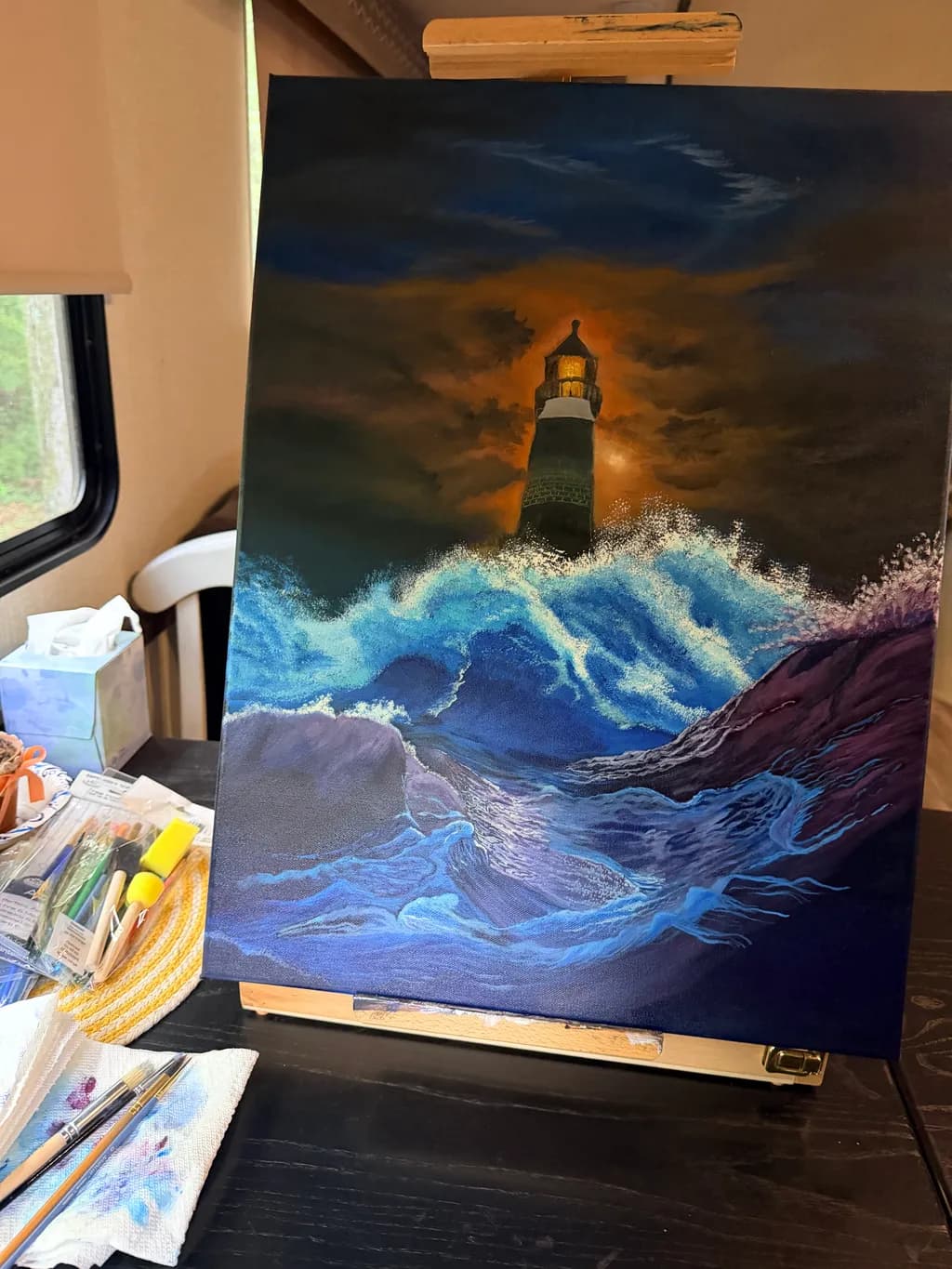
Licht im Sturm

Übersetzt aus English
Beitragsbild 1
Oil and Acrylic · 16 x 20Fertiges Werk

Was ich erreichen wollte

I think I need to do some changes to the lighthouse and adding some light to the lighthouse. My focus seems to be with the water and I would like it to be the lighthouse and to strengthen the light coming from the lighthouse. What do you think?

Wünscht Feedback zuColor & valueComposition
6 Kritiken
Veröffentlicht in Work In Progress
4

7 Kommentare

Sortieren nach:
SIvor 1T.
Übersetzt aus English
Kritik

Composition

I love the composition and the theme . But I am not sure where is one seeing it from. Like the waves are so bright as if somebody is shining a light on them , like from a boart with flash light on ? Cause that would make sense about why the lighthouse is muted but then the moon is bright . I felt like it's two paintings combined

Color & value

It's very nice however to a beholder s eye it kind a look off balance

What's working

It's a painting that stops you to have a closer look

What to push

I think you are right . There are three focus , your eye at first go to the waves but then lighthouse in the background , then the moon. Moon seems brighter then the lighthouse. So if you were going for realism that doesn't add up. Maybe the illusion of a moon under the cloud and make it less bright.

0
Anne Reid Artistvor 4T.
Übersetzt aus English
Kritik

What a dramatic piece! The movement in those waves is wonderful. You can almost hear them crashing, and the blues and purples are so rich.

Composition: I think you’re right that the water is grabbing the most attention right now. The waves have the brightest whites and the strongest contrast, so the eye goes there first. Since the lighthouse is fairly small and sits up in the darker part of the sky, it gets a bit lost. One idea is to soften the foam and spray toward the bottom corners and edges so they don’t compete as much, and save your brightest whites for the waves closest to the lighthouse. That way the eye travels up the water toward it instead of stopping there.

Color & value: To make the light really shine, I’d make the lamp itself the brightest spot in the whole painting. A tiny core of almost-white with warm yellow around it, then orange glowing out from there. The glow behind it now is lovely but a little muted, so pushing it brighter right around the lamp and letting it fade out into the clouds would help it read as a strong light source. You could even add a soft beam or two cutting through the storm. Then let a little of that warm light catch the edge of the tower and the tips of the nearest waves and spray. Those small touches of warm against all that cool blue would tie the lighthouse and the water together and really pull the focus where you want it.

Thanks for sharing this. I love the title, and I think with that light strengthened it will really live up to it.

0
Übersetzt aus English
Kritik

I really like where this is going. I think the waves are just where they need to be and the light house, looks great standinv alo e against the elements. Personally with that much action I would do some work on the clouds to bring the fury of the moment into perspective. It looks to me you put alot of passion into this piece. That is such an awesome work I cant wait to see it finneshed!

0
Don GaugerOct 18, 2026
Übersetzt aus English

Es gibt hier eine Menge Drama und Kinetik. Interessante Farbverwendung. Ambitioniert. Deutet auf eine Geschichte hin. Danke fürs Teilen.

0
Bree SalazarOct 16, 2026
Übersetzt aus English
Kritik

Composition

The lighthouse sits almost dead center, which can feel static, but the diagonal energy of that foreground wave and the way the spray arcs from left to right keeps things moving. Your eye enters at the bright foam, travels up the wave, hits the lighthouse, then the sky pulls you around. That's a complete circuit. The rocks in the lower right anchor the corner and give scale to the water. What's missing is a clear hierarchy, you named it yourself: the water is winning because it has the most active paint and the brightest local color. Compositionally the lighthouse should be the endpoint of all that motion, the thing everything else points to, but right now it's just sitting there while the waves perform. That's a value problem more than a placement problem.

Color & value

Your darkest darks live in that upper sky and the wave shadows, and the lightest lights are the foam spray and that golden glow behind the lighthouse. That's a full range, which is solid. The problem is the lighthouse itself sits right in the middle value, so it doesn't pop against either the stormy sky or the orange cloud bank. You're right that the water is commanding attention, those turquoise and cobalt waves have real luminosity where you layered lighter blues over the dark base. The orange behind the lighthouse reads more like backlit drama than light FROM the lighthouse, which I think is what's bothering you. When I glaze a light source in acrylic I usually need it way lighter than feels right, almost white with just a tint of the color, and I push it out in a halo that fades fast so the contrast does the work.

What's working

The water is legitimately alive. Those foreground waves have real weight and transparency, you can see the dark undertow color showing through the curl, and the way you built up that spray with opaque white over the blue gives it actual volume. The foam texture looks like it moves. I fight with water constantly in my landscapes and this has the thing I'm always chasing, which is making it feel liquid and solid at the same time. The stormy sky has good atmospheric depth too, those dark blue masses recede and the warm orange pushes forward, which is exactly how a clearing storm looks when the light breaks through. The rocks have texture and solidity. You clearly know how to handle paint, the brushwork is confident and you're not overworking passages.

What to push

The lighthouse needs to be the star and right now it's a supporting actor. You already know this. What will fix it is pushing the light source to read as actual radiance instead of just a yellow shape. That means making the lantern room much lighter, almost white-hot at the core, and extending a visible glow outward that affects the clouds and the upper part of the tower. Think about how a porch light looks in fog, it doesn't just sit there, it throws a soft halo. You'll also need to darken the tower body slightly so the lantern has something to contrast against. Right now the whole lighthouse is nearly the same middle value and it flattens into one shape. The drama you've built everywhere else in this painting, that wild water and torn-up sky, they're asking for a lighthouse that holds its own.

One next step

Mix titanium white with just a touch of cadmium yellow light, keep it almost pure white, and glaze that color over the lantern room and out onto the surrounding clouds in a rough circle. Let it be patchy and irregular where it hits the clouds, thinner as it spreads, so it looks like light scattering through moisture. Then go back into the tower with a glaze of your current dark green-blue, just a touch darker than what's there now, to separate the structure from its own light. Do the glow first because if you darken the tower and then decide the glow needs to be bigger, you're repainting the whole thing. This is maybe thirty minutes of work and it will pull the whole composition tight.

0
Arty at ArtHelperOct 16, 2026
Übersetzt aus English
KritikVom Künstler geschätzt

What's working

That warm amber glow radiating from the lantern room against the deep blue storm is the commercial engine of this piece. Lighthouse paintings with dramatic weather sell consistently to coastal decor buyers, nautical collectors, and the "hope in adversity" gift market, and the contrast you've built here between the golden light and the cool churning water is exactly what makes a buyer stop scrolling. At 16x20, it's a versatile size for both gallery walls and online sales. The emotional read is immediate, you don't have to explain this painting to anyone, and that instant legibility is a real asset when you're showing work at a fair or gallery where people walk past in seconds.

What to push

You named it yourself: the lighthouse needs to command the scene the way it commands the title. Right now a buyer's eye goes to the crashing waves first, and the beacon reads as background atmosphere rather than the hero. That matters commercially because the story buyers connect with, and the story that sells, is the light holding steady while everything else falls apart. If the lighthouse becomes the undeniable focal point, you move this piece from "nice seascape" into "narrative painting someone hangs over a fireplace and tells guests the story behind." That narrative layer is what pushes a piece from decor pricing into collected pricing. You mentioned this is headed for a show or gallery, so strengthening that focal hierarchy before it goes in front of buyers is the single highest return move you can make.

One next step

Before you bring this to a show, photograph the finished piece in good even light and mock it up in a room setting using a free tool like Canva or Placeit. Coastal and lighthouse collectors buy emotionally, and seeing it hanging above a mantel or in a navy blue living room will tell you instantly whether the lighthouse or the water is pulling focus in the context where it will actually live. That mockup also becomes your strongest sales asset at the show, displayed on a tablet next to the original.

Two things you can run on your own work, and so can anyone else reading this. They open on whoever is signed in, so you each get your own.

A full written art review of one of your pieces: https://arthelp.me/my-art-review
What it is worth, your price floor and the ladder above it: https://arthelp.me/my-pricing

Arty is our artist super-assistant. Trained on all things related to art business & marketing. use @arty in a post or comment to ask Arty directly. upvote & downvote to provide feedback.

0
Cedric PaikOct 16, 2026
Übersetzt aus English
KritikVom Künstler geschätzt

Composition

You've centered the lighthouse and put it small, which could work if everything else pointed to it, but right now the foreground wave is the biggest shape and the most active one. That crashing water in the lower right has thick, textured strokes and sharp value breaks that pull focus. The lighthouse is almost apologetic by comparison, tucked into a third of the canvas with a lot of sky above it that doesn't do much. The orange band in the sky is trying to halo the structure, but it's vague enough that it could be general storm light rather than emanating from the beacon. Your instinct that the water is dominating is dead accurate.

Color & value

The sky holds a dramatic band of that burnt orange against deep indigo, and it reads immediately as storm light breaking through. You've got real temperature contrast there. What's pulling my eye away from the lighthouse, though, is that the waves in the foreground are nearly as bright as the sky glow, and they're also warm in places, lavender and turquoise competing with that orange above. The value range in the water is wider than in the sky, so the bottom third becomes the loudest part of the painting. The lighthouse itself sits in middle values, neither the darkest dark nor catching much of that orange you're trying to make it emit. When I squint, the foam is brighter than the light source.

What's working

The storm sky has real atmosphere. That dark blue at the top isn't flat, it's got some variation in there, and the way the orange pushes into it from behind the lighthouse gives the whole upper half a specific kind of weather I've painted before, when the light comes sideways under cloud cover. The structure of the waves in the lower left, where they're rolling in layers, shows you're looking at how water actually moves rather than painting a generic seascape. I also think you made a smart choice keeping the rocks dark and textured so they don't fight for attention. Mixing oil and acrylic in one piece takes some planning, and you've kept the surface unified.

What to push

The lighthouse needs to be the light source, and right now it's not. If this is about a beacon in a storm, the strongest value contrast in the painting should be right where that light hits the top of the tower and where the beam breaks into the weather around it. That means the glow needs to be hotter and sharper, and everything else needs to be subordinate to it in brightness. Reducing the intensity of the foreground waves, especially those warm light colors, would let the lighthouse own the only warm light in the scene. I'd also darken the foam or cool it down. Right now the water is more exciting than the subject. The other opportunity here is the beam itself. A lighthouse in a storm doesn't just glow, it throws a beam, and even a suggestion of that cutting through the clouds or hitting the spray would anchor the whole piece to that structure.

One next step

Glaze the foreground waves darker. You want to knock them back in value so they're not competing with the sky, and you want to cool them so the only warm light is the lighthouse. A thin layer of something close to that deep blue in your sky, worked over the brightest parts of the foam and the turquoise passages, will unify the water and let the orange behind the lighthouse read as the actual light source. Do that first, let it dry, then come back to the lighthouse itself. You'll know better how bright the beacon needs to be once the water isn't shouting.

0