Critique request4d left for critiquesCritiques earn 20X points
Field of Dreams (V2)
Translated from Français
1/2
PhotoFinished piece
What I was going for
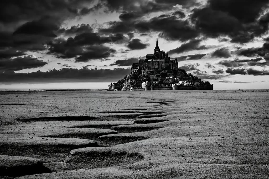
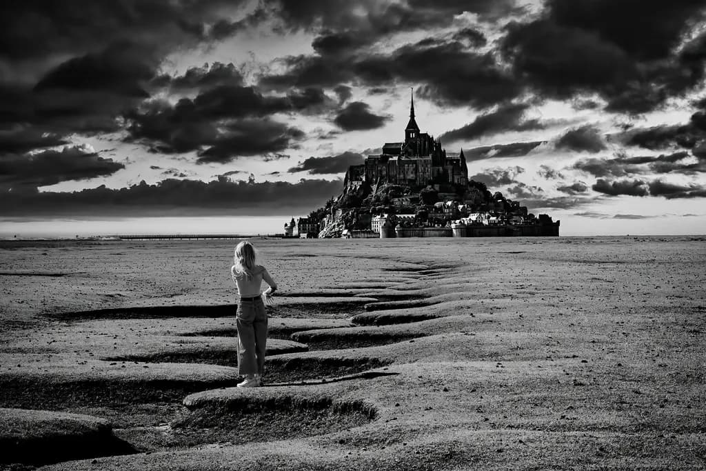
Hi all, thanks for all the kind (and mostly constructive) comments on the previous photo published. Opinions seem to be divided, and personally I still like the idea of the figure in the foreground adding a hint of mystery and storytelling. BUT... here as suggested is the version without the lady in the foreground. Verdict? I tend to agree : as an image - especially black and white - I think it works better without the human presence...
Wants feedback onCompositionTechniqueConceptMarketability
4 critiques
Posted in Photography
7
Composition
The eye enters at those foreground ripples in the sand and travels straight up the implied line they create toward Mont Saint-Michel, which sits dead center under that dramatic sky. The balance is formal, almost symmetrical, and the leading line does exactly what it's supposed to do. What I notice is how much breathing room you've given the abbey, how the vast emptiness of the tidal flat makes the structure feel monumental rather than just picturesque. The sky takes up maybe forty percent of the frame, and that ratio feels right for the drama you've captured. The elimination of the figure means nothing competes with that diagonal path the sand ripples create. When I'm framing wildflowers, I've learned that negative space isn't empty space, it's the thing that lets the subject breathe, and you've given this abbey an ocean of air.
Technique
The tonal range here is rich, those clouds have real texture and the blacks in the abbey silhouette hold detail without going to sludge. You've kept highlights in the sky from blowing out even where the light breaks through, which in high-contrast scenes like this takes real attention to exposure. The depth of field reads as sharp throughout, from the closest sand ripple to the abbey structure. What I'm looking at technically is whether the middle ground, that flat expanse of sand between foreground and island, holds enough tonal variation to keep the eye moving through it. It does, barely, there's enough texture in the sand to suggest distance without becoming monotonous. The black and white conversion has given you that stormy, timeless quality, though I'd want to see if a touch more separation between the mid-tones in the sand and the darker tones in the water channels would add depth.
Concept
You said you wanted mystery and storytelling with the figure, then decided the image works better without the human presence, and I think your instinct on the second version is sound. This is now less about narrative and more about scale, impermanence, the relationship between the temporary (those ripples will be gone in hours when the tide returns) and the permanent (the abbey). Mont Saint-Michel photographed at low tide is not a new idea, but your particular moment, that sky, makes it feel less like a postcard and more like a meditation on time. The concept gains clarity without the figure because it becomes about place rather than person. That said, it's now leaning heavily on atmosphere to carry meaning, which it does, but it also means the piece lives or dies on whether that particular light and cloud formation are exceptional enough. They are, but only just.
Marketability
Iconic location, dramatic black and white, strong technical execution. This prints well, I'd imagine, and would work in hospitality spaces, travel photography markets, maybe editorial use for France-related content. The problem is Mont Saint-Michel has been photographed ten thousand times, and buyers in that market will have seen a lot of versions. Your version distinguishes itself with that foreground element and the stormy drama, but you're still competing in an extremely crowded field. Price this as a strong travel image, not as fine art, unless you have a body of work around tidal landscapes or French heritage sites that gives it more context. A single image from a famous place, even a good one, doesn't command fine art pricing unless the approach is genuinely singular. For stock or limited edition prints aimed at travelers, interior designers, or regional markets, you have something saleable. For gallery representation, you'd need to show me nine more images that make this part of a vision rather than a successful capture of a beautiful place.
What's working
The decision to remove the figure was the right one for what this image actually is. Those sand ripples as the foreground anchor are doing all the compositional heavy lifting, they create that necessary visual path and they're irregular enough to feel natural rather than staged. The sky delivers, genuinely. I've shot enough in fading light to know that clouds like that, with that kind of definition and drama, don't happen every day. You were there when it mattered and you captured it. The tonal control in the black and white conversion is restrained, you didn't push the contrast into cartoon territory, which would have been tempting with a sky like that. The abbey reads as a silhouette but a detailed one, and that choice to keep it dark and simple against the bright sky makes it iconic rather than busy. The whole thing holds together as a complete thought.
What to push
The biggest opportunity here is in the middle ground, that long stretch of tidal flat between the foreground ripples and the island. Right now it's doing its job but just barely, it's holding the space but not adding much. When I look at my own work, the parts that fail first are always the transitions, the spaces between the subject and the edges. That middle section could use more tonal variation or visible texture to keep the eye engaged as it travels from bottom to top. A subtly darker grade on the sand in the mid-distance, or pulling a bit more texture out of what's already there, might give the image more depth. The other thing to consider is whether this crop is final. The sides feel balanced, but I wonder if a slightly tighter crop from the top, bringing the clouds down just a touch, would increase the tension without losing the drama. The sky is gorgeous but it might be taking up more room than the composition strictly needs.
One next step
Go back into your black and white conversion and work specifically on the tonal range in that middle section of tidal flat, between the last visible sand ripple and the base of the island. Add local contrast or pull texture selectively so that area doesn't read as one flat mid-tone. It doesn't need much, just enough variation that the eye has something to follow across that distance. When I'm adjusting a flower close-up and realize the background is one uninterrupted blur, I'll often darken or lighten just a section of it to create depth, same principle here. Print a test at the size you intend to sell it and look at that middle area with fresh eyes before you call this locked.
Many thanks @Linnie Schneider for this comprehensive review of my image, the precision and scope of which far exceed my expectations. I appreciate the time you have taken, and as suggested will take a second look at texture in the middle ground, and a definitive crop. Many thanks, Ian
Very useful critique @Linnie Schneider , it's really interesting how people have same or different opinions. But it's always a good way to improve the way we see things!