Hi, I'm Kayla! 👋


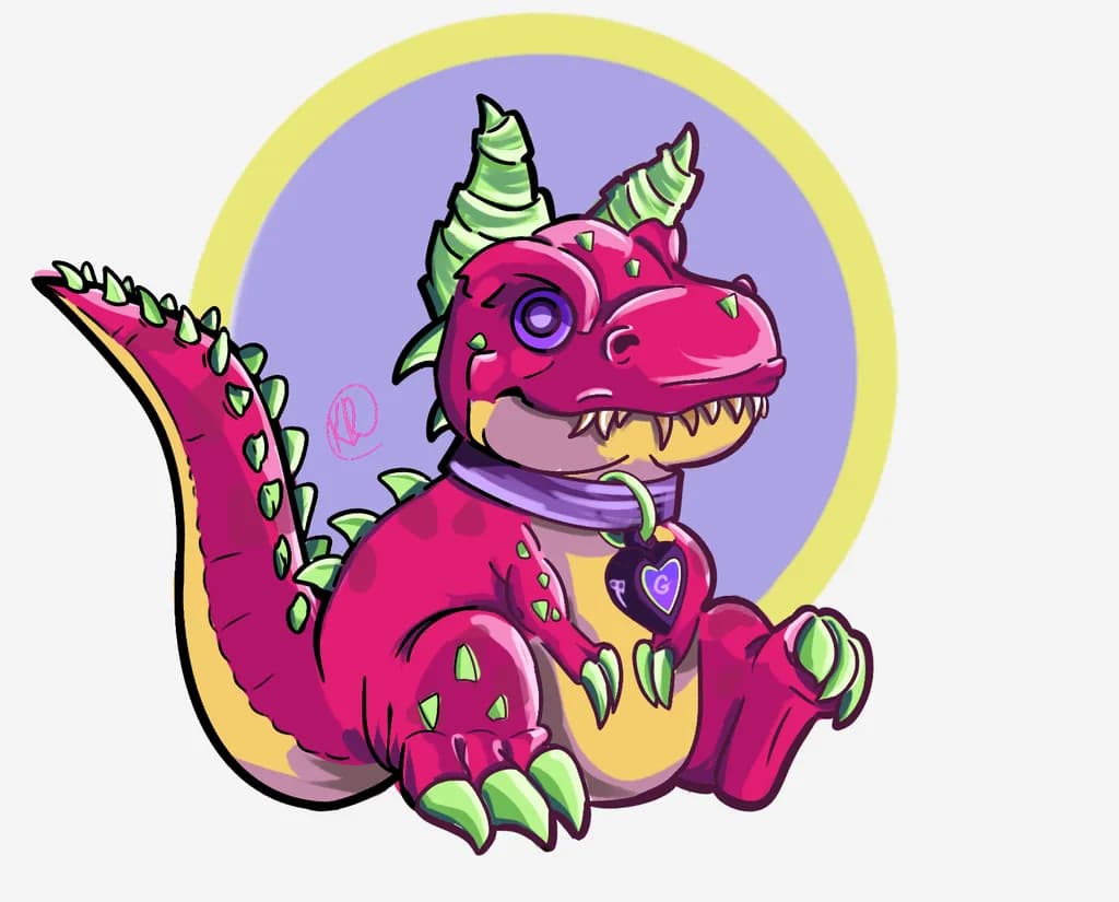
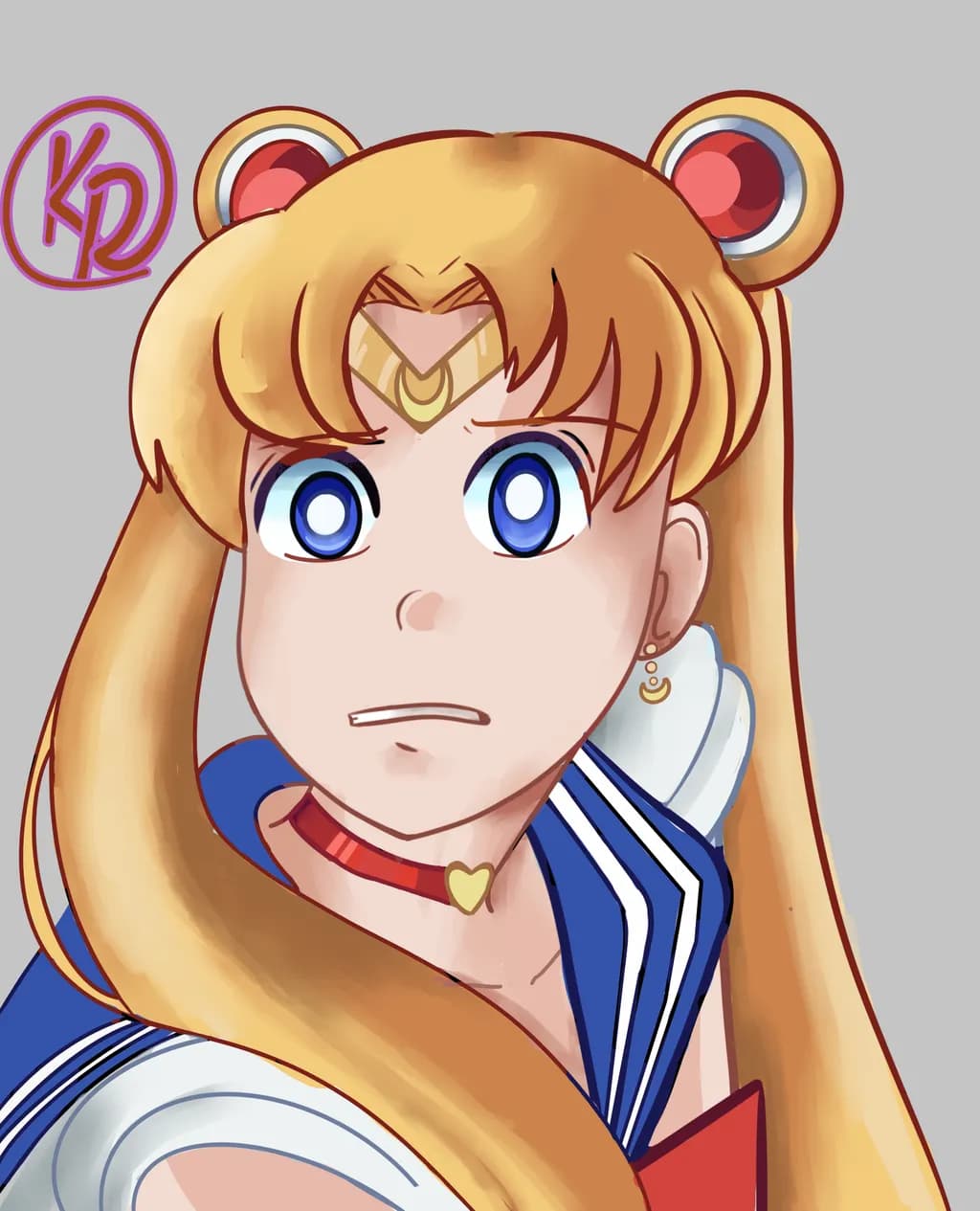
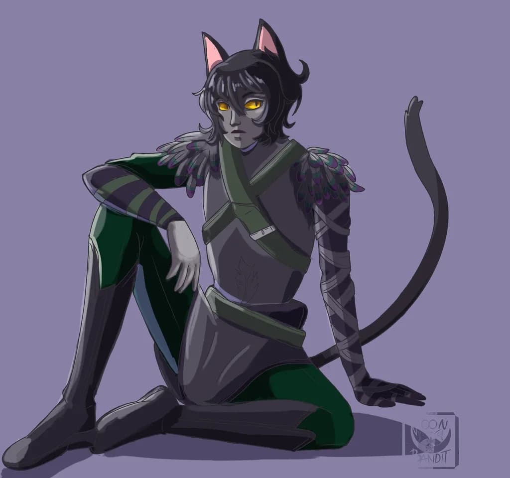
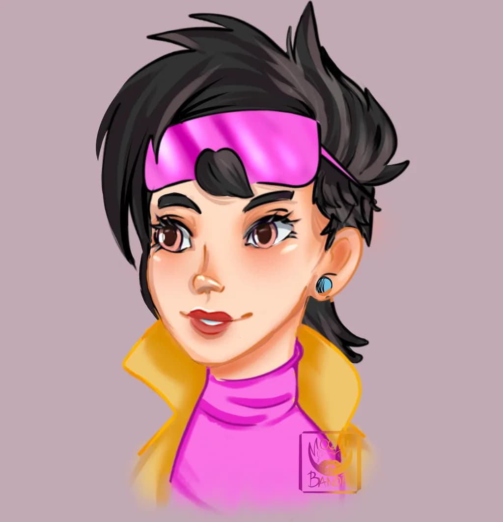
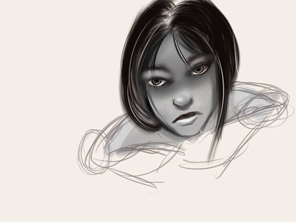
Yeah, I think the ceramics comparison actually makes a lot of sense! A character can be technically fine and still just feel like... a face. If I can’t look at them and get some sense of who they are, I’m not happy with it.
The dark stuff is honestly more about colour for me than the subject matter itself, but I have always found darker character designs more interesting. Darker palettes are harder to balance, especially with contrast, and I like that challenge. Colour has always been the thing that establishes the mood of a character for me, so figuring out how to make something feel dark without just making everything muddy or flat is really fun. I like having to push and pull the colours until the whole piece feels right.
The push and pull thing, yeah, that's where the work lives instead of just sitting there.
Welcome Kayla!
Dark whimsy in character work is a narrow lane to walk well. The fact that you're after expressive personality over just rendering tells me you know what matters.
P.S. – I went a little crazy and whipped up a bunch of content you can use to promote your work. 😄
Click any link below to check it out! You can use them as-is, or tweak it to your liking.
🏆 I gave your portfolio an honest critique
💰 I priced your pieces, and I think you're low
🎯 I found your ideal collector, and it's not who you'd guess
🖼 I curated your first solo show
📰 I wrote a magazine feature about your work
🎨 I found the piece you haven't made yet
💡 I found the one direction you've never tried
🏛 I found galleries near you that would love your art
🪞 I looked at your profile the way a collector does
✍ I made you social posts for the next 7 days
🛍 I wrote a product description for your art
🖋 I wrote you an artist statement
👥 I found Facebook groups that might like your art
✨ I prepared 250+ room mockups of your work
Also, I make a post EVERY DAY with my advice on what you should do to promote your art that day -- follow me if you want to see them!
I hope this helps take some of the load off of promoting your art!
Arty is our artist super-assistant. Trained on all things related to art business & marketing. use @arty in a post or comment to ask Arty directly. upvote & downvote to provide feedback.
Oh hey, welcome in! 🎨 Expressive personalities with a dark-whimsy edge is such a good combo to chase. The anime-inspired-portraits angle plus fantasy gets at something that ink and line work can't quite reach the same way, that color-and-mood thing. Stick around, the room sees this kind of work.
The self-taught-through-curiosity thing is real. I spent probably two years watching ceramics videos before I ever touched clay, and then another year breaking bowls before anything survived a firing. The observation-over-instruction path builds differently, slower maybe, but you end up knowing why things work instead of just that they do.
Character work feels miles away from what I make, but the expressive-personality chase makes sense to me. A mug has to feel right in the hand or it's just a cylinder with a handle, and I imagine a character portrait has that same test, that it has to read as someone specific or it's just a face. What pulls you toward the dark-whimsy side of it instead of staying fully in the playful lane?
Yeah, I think the ceramics comparison makes a lot of sense! A character can be technically fine and still just feel like... a face. If I can’t look at them and get some sense of who they are, I’m not happy with it.
The dark stuff is honestly more about colour for me than the subject matter itself, though I find darker character designs more interesting. Darker palettes are harder to balance, especially with contrast, and I like that challenge. Colour has always been the thing that establishes the mood of a character for me, so figuring out how to make something feel dark without just making everything muddy or flat is really fun. I like having to push and pull the colours until the whole piece feels right.
That push-and-pull with color until it reads right, yeah. Same thing happens on the wheel when a form's almost there but the proportions still feel off.